analysis
Brief and Research: Turning a Task into a Visual Direction
How to read a brief, research the visual field and build a direction that explains decisions instead of imitating inspiration.
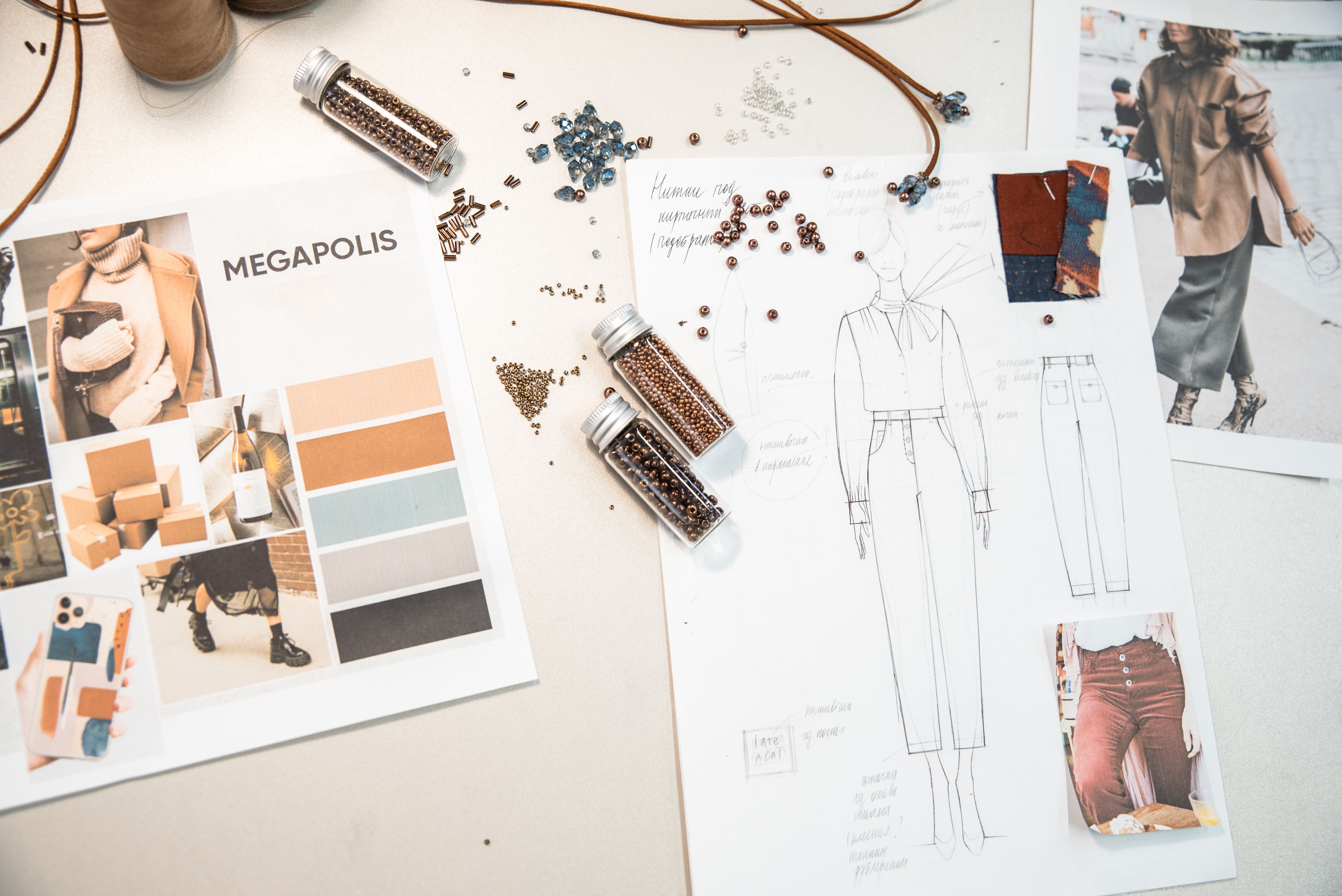
A reference is not proof of taste. It is evidence for a decision, and if it cannot explain the decision it supports, it does not belong on the board.
Editorial question
How do you move from a client phrase such as “modern, premium and bold” to a visual direction that photographer, stylist, designer, producer and client can all use to make consistent decisions?
Short answer
Good research is not measured by the number of saved images. Its job is to reduce uncertainty: clarify what the project must accomplish, which visual solutions have become clichés, where there is room for an original answer, and which criteria will guide decisions. The brief defines the task, research turns it into a map, and visual direction converts that map into deliberate constraints. If research produces more pictures but no fewer questions, it has failed.
Thesis
A reference becomes useful only when you can explain the specific job it performs. You may need an image for camera distance, light quality, background structure, human scale, fabric behavior or color rhythm — not because it is simply “beautiful.” Professional research is not taste collecting; it is decision decomposition. This is why a strong moodboard is often smaller than a weak one: every image answers a question. [source]
A reference is not proof of taste. It is evidence for a decision, and if it cannot explain the decision it supports, it does not belong on the board.
Evidence and cases
Translate the brief out of adjectives
The most expensive mistake happens before the first image is found: treating the adjectives in a brief as if they were usable criteria. “Premium,” “young,” “cinematic,” “clean,” and “natural” mean nothing without context. “Clean” can mean museum-like emptiness for a jewelry brand, lack of advertising polish for streetwear, or honest materials and low visual noise for an interior project.
The first pass through a brief should therefore translate adjectives into observable traits. What does “premium” mean in light, material, casting, camera movement or density of objects? What must remain recognisable from the brand? What does the client explicitly not want? This translation exposes contradictions early. “Natural” may conflict with a demand for perfectly controlled glossy skin; it is better to discover that on paper than in retouching. [source]
What to research
Separate research into four layers. First: brand context — previous campaigns, product, audience, tone and visual habits. Second: category — how the market looks and which compositions, colors, types and locations have become automatic. Third: cultural context — architecture, cinema, art, music, technology and local environment that may give the project its own language. Fourth: production reality — budget, time, available locations, casting, rights and output formats.
A strong idea appears where these layers intersect. Research only competitors and the project will speak their language. Research only art and you may end up with a beautiful abstraction that cannot be produced. Production research returns the idea to reality: can the required light happen in that location, does the material exist, can one shoot day realistically feed sixteen output formats? [source]
Deconstruct the reference
Instead of “we like this photo,” ask seven questions: where is the camera, what focal length does the perspective suggest, what is the size and direction of the light source, what job does the background perform, where is the primary contrast, why does the eye pause, and which part of the effect belongs to capture versus post-production?
The team often discovers that it never wanted the image itself, only one of its mechanisms: not “a photograph in the style of X,” but a low camera position and a hard strip of sunlight on cool concrete. That distinction prevents imitation and opens the door to an original scene. [source]
Moodboard as a system
Divide the board by function: light, space, person, wardrobe, material, color, movement, typography and post-production. A single reference does not have to explain everything. It is often useful to state explicitly what should be taken from an image and what should not.
A strong moodboard has hierarchy. Two or three images form the core; the rest define detail and boundaries. If half the board can disappear without changing the idea, that half was noise. If a client says “I like everything but still don’t understand what we will shoot,” the board has not yet become a direction. [source]
From research to visual direction
Visual direction is a set of statements that make choices easier: architecture dominates the person; camera height stays close to eye level; natural side light matters more than a complex rig; the palette is cool while skin remains neutral; logos are avoided; each frame contains only one active gesture; the background is never decorated merely to look rich.
These rules do not kill creativity. They stop a project from fragmenting under time pressure. If a direction exists only as mood, every participant completes it differently. If it is expressed through observable decisions, the whole team can use the same system. [source]
Practical method: research matrix
For every reference, record its role — light, casting, space, color, detail, or anti-reference — and add three columns: what works, why it works, and how the principle can be translated into this project. The last column separates research from collecting.
Anti-references are equally useful because they define boundaries: do not signal heritage through literal ornament, do not express luxury through gold, do not turn natural light into overexposed lifestyle imagery. One precise “no” can save more time than ten vague “yes” images. [source]
Case: one brief, three directions
Imagine a new minimalist clothing collection that must feel local, contemporary and international. Weak research collects fashionable concrete interiors and a few model portraits. Strong research proposes three different hypotheses.
Direction one: the city as a light system — neutral clothing, local identity created by architecture and sun direction. Direction two: locality through material — a workshop environment where wood, wool, stone and metal create tactile context without literal national symbols. Direction three: locality through scale — the person becomes a small figure inside a large spatial condition. These directions can be debated in terms of brand fit, budget and international positioning, not just taste. [source]
Where research fails
Research fails when there is no question, when references are treated as authority, when all disciplines receive the same undifferentiated board, and when no stopping rule exists. The search then becomes a substitute for decision-making.
A practical stop condition is simple: if new references no longer change the criteria by which the project will be judged, stop searching. The next step is to test the direction against the actual product, person, location and output format. [source]
Checkpoint before treatment
Before treatment, the team should be able to answer without looking at the board: what is the idea in one sentence; what dominates the frame; what light is allowed; what is forbidden; how does the person behave; what is the background doing; which three references matter most and what is each one for; how does the system scale from hero image to detail and social crop? If the answers remain vague, research has not yet become direction. [source]
Practical takeaways
Start with questions, not image search. Translate adjectives into observable traits. Analyse references by mechanism rather than mood. Separate core images from support. Use anti-references. Turn visual direction into explicit decision rules. Research ends not when the folder becomes large, but when decisions become clear. [source]
Professional checklist
Core question defined.
Adjectives translated into observable traits.
Competitor clichés identified.
References tagged by function.
Anti-references included.
Visual direction written as decision rules.
Visual analysis
The article's visual logic can be tested through «Translate the brief out of adjectives», «What to research», «Deconstruct the reference», «Moodboard as a system», «From research to visual direction», «Practical method: research matrix». Compare these signs within one object or sequence rather than judging them as an isolated style.
Practical implication
For every reference, record its role — light, casting, space, color, detail, or anti-reference — and add three columns: what works, why it works, and how the principle can be translated into this project. The last column separates research from collecting.
Anti-references are equally useful because they define boundaries: do not signal heritage through literal ornament, do not express luxury through gold, do not turn natural light into overexposed lifestyle imagery. One precise “no” can save more time than ten vague “yes” images. [source]
Limitations
“Brief and Research: Turning a Task into a Visual Direction” is limited to its stated subject: how to read a brief, research the visual field and build a direction that explains decisions instead of imitating inspiration. The analysis does not replace examination of a specific original, project, or production context.
Sources
The open sources for “Brief and Research: Turning a Task into a Visual Direction” are listed in the page panel and define the boundary of its verifiable facts.