research
MUJI: the absence of brand as a brand project
Refusing visible branding itself becomes a brand project, where value is built on rationality and ordinariness.
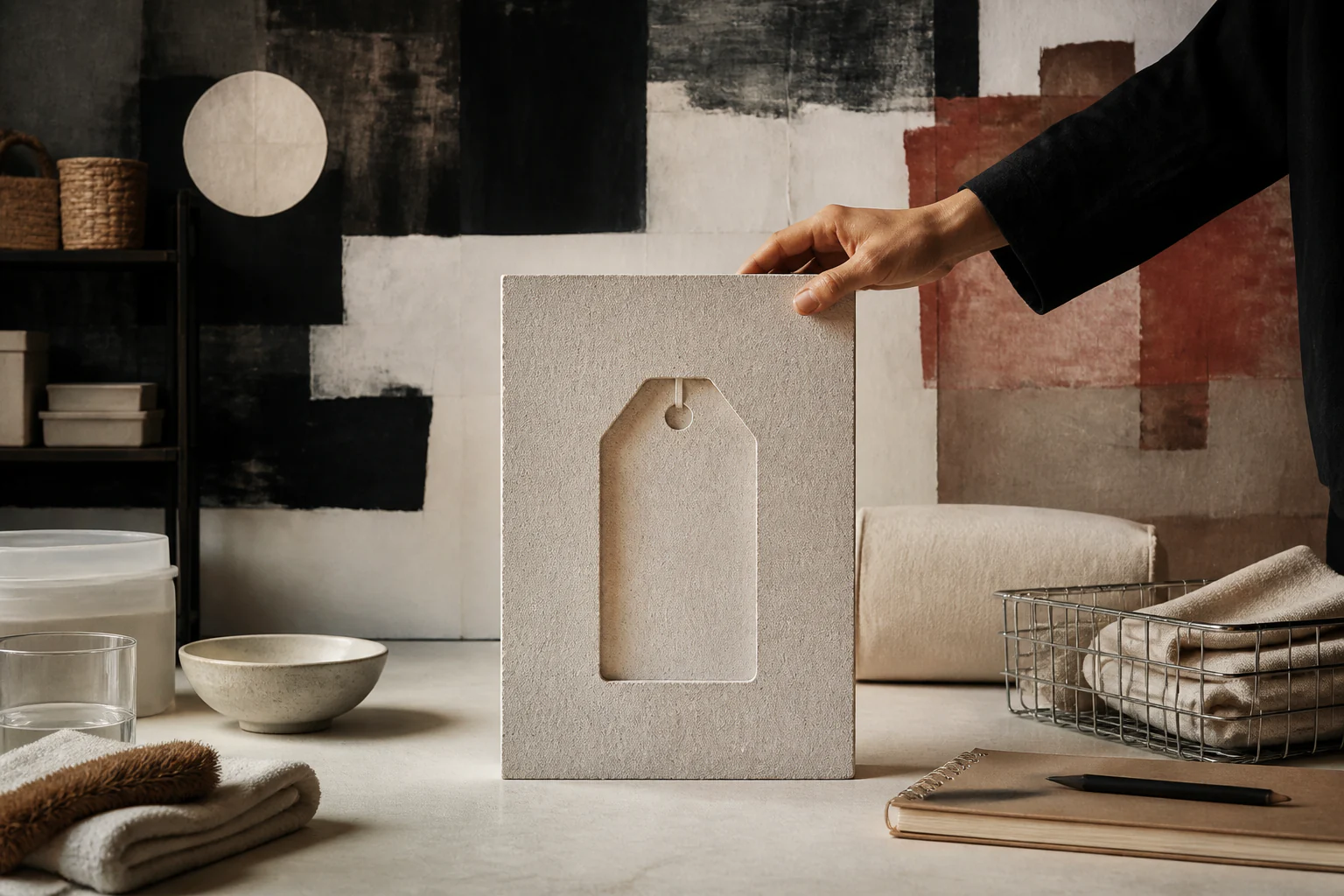
MUJI shows a paradox: refusing visible branding itself becomes a brand project, where value is built through rationality, quietness, and everyday normality.
1. Research thesis
The case is interesting as a logical trap: a consistent refusal of distinguishing marks produces the most recognisable mark of all. The absence of branding works as branding precisely because everything around it is branded.
2. Why this is more than a brand history
What matters is not the aesthetic but the justification. The rejection of decoration was explained economically — as a way to lower price — and that explanation distinguishes the case from mere minimalism.
3. Historical setup
The project began in Japan in 1980 as a retailer’s private label with a small range of goods. The name translates directly as "no-brand quality goods" — the programme is stated in the name itself.
4. The context of abundance
Its appearance coincided with a period of economic growth and excess consumption. A proposal to forgo the superfluous made sense against a background of surplus, and outside that context it would not have read.
5. Three sources of saving
The original justification was concrete: selection of material, simplification of process, simplification of packaging. Each item is verifiable and yields a measurable cost reduction — a rare case of honest argument.
6. Material as argument
Using unbleached paper, undyed cotton, and food items of non-standard size was a decision to forgo cosmetic operations. The product’s appearance is a consequence of that refusal rather than a stylistic choice.
7. Packaging as minimal carrier
Transparent film, kraft board, and a single descriptive label — packaging reduced to preservation and information. It states composition rather than promise.
8. Typography as the only graphics
The whole visual system rests on typesetting and a grid. The absence of illustration and logotype on the product turns the description into the principal graphic element.
9. The rationalisation of form
Objects are designed from use: everything not participating in the task is removed. The result resembles minimalism outwardly but was reached by a different route — through functional analysis rather than aesthetic reduction.
10. Quietness as position
The art direction formulated the task as achieving an emptiness able to receive someone else’s content. An object deliberately does not assert itself so that its owner can fill it with their own use.
11. "This will do" instead of "this is best"
The brand’s programmatic formula offers satisfaction instead of desire. It is a rare position in retail, where superiority rather than sufficiency is usually sold.
12. The range as a system
Products are designed for mutual compatibility: storage modules, containers, stationery, and textiles align in size and colour. A customer assembles a set rather than acquiring separate objects.
13. The store as continuation
Retail space repeats the logic of the product: open shelving, natural materials, absence of promotional messaging. The store states the same position as the packaging.
14. Category expansion
The brand moved far beyond household goods — into housing, hotels, and food service. The expansion tests whether the position is a method rather than a dressing for a product range.
15. The economy of form
Initially the rejection of decoration lowered price. As reputation grew, restraint became a justification for a premium — the same attribute reversed its economic sign.
16. Canon and museum
The products entered museum collections and teaching as an example of a consistent position. That consolidation turned an anti-brand gesture into cultural capital.
17. Archive and reproducibility
Programmatic texts and advertising campaigns are published, so the position can be studied from documents. The brand explains itself consistently, which makes claims easier to check.
18. Where the myth begins
The myth begins with an absence of marketing. The brand runs consistent and expensive communication: campaigns, publications, exhibitions, and architectural projects. What is absent is a logotype on the product, not promotion.
19. A second layer of myth
A second simplification is the idea of cheapness. Outside its home market positioning shifted upward, and the goods are often more expensive than comparable mass-market equivalents.
20. Where the myth blocks analysis
Talk of asceticism obscures the main point: this is a complete identity system, merely expressed through absences. An absence is also a designed attribute and demands the same discipline.
21. First key example
The packaging deserves analysis as a carrier of position. A single descriptive label on neutral material says more about the brand than any mark — and that is the result of calculation, not modesty.
22. Second key example
Expansion into housing is worth analysing as a test of the method at its limit. A house designed by the same logic shows where rationality works and where a decision is required that analysis cannot supply.
23. Comparison with adjacent systems
Unlike European product discipline, the justification here proceeds not from a set of principles but from the omission of operations. The result looks similar and was reached by opposite reasoning.
24. Link to fashion
In clothing this is a basic wardrobe without external marks: quality and fit instead of recognisability. The strategy meets the same problem — inconspicuousness sells poorly in a channel where decisions are made from a photograph.
25. Link to the image
The brand’s campaigns are built on landscape and horizon rather than on product. The image communicates a position while showing almost nothing — a rare and risky advertising device.
26. Link to architecture and space
Modular storage systems make demands of a dwelling and are calculated for a compact flat. The range answers a specific spatial situation.
27. Link to technology
The position deliberately avoids technological demonstration. This distinguishes the brand from product systems where process novelty is part of the argument.
28. Link to materials
Forgoing bleaching and dyeing yields a recognisable palette and simultaneously limits the range. It is an honest case in which appearance follows directly from a process decision.
29. Market and logistics
Compatibility across the range simplifies warehousing and display. A system conceived as consumer convenience yields operational benefit in retail.
30. Critique and limits
The critique is justified: the original promise of affordability diverges from actual positioning in export markets, and the aesthetic of quietness has become widely copied, stripped of its justification.
31. What has changed today
The restrained aesthetic has become ubiquitous, and the position’s distinguishing power has weakened. What remains is the justification — and that is precisely what imitators do not reproduce.
32. What to connect next
The material links to the entries on minimalism, design systems, the store as media, sustainability, and industrial materials.
33. Editorial conclusion
The absence of branding becomes branding when the refusal is consistent, explained, and extended to every level. Without the explanation what remains is merely an unlogotyped product that communicates nothing.
34. How to read this case today
On meeting a "quiet" brand, ask what justifies the refusal and what exactly it saves. If there is no answer, you are looking at a style borrowed from a position that is not held.