art director profile
Alexey Brodovitch
Montage, white space and modern art direction
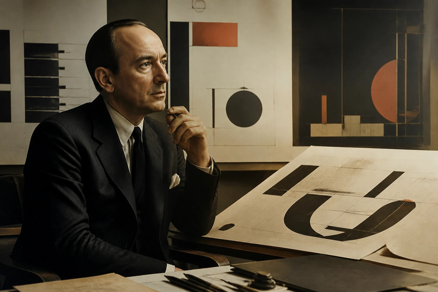
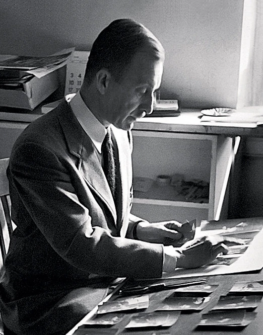
Brodovitch turned art direction from the decoration of finished material into the authorship of relationships: photography, type, white space, cropping and sequence operate as montage, and the magazine becomes a temporal system experienced spread by spread.
Editorial thesis
Alexey Brodovitch's significance cannot be reduced to the characteristic layouts of Harper's Bazaar. He changed the role of the art director itself: from someone who decorates finished content into the author of a visual system shaping commissioning, photography, rhythm, typography, print and the education of the next generation. [source]
Reader question
Why did a person remembered mainly for magazine spreads become so important to the history of photography, fashion media and contemporary creative direction?
Short answer
Because Brodovitch worked with the entire production chain of the image rather than the isolated page. He discovered authors, gave them risky assignments, transformed photographs through crop and sequence, built magazine rhythm and taught in a way that required students to find new answers rather than copy the teacher's style. [source]
1. Ogolichi, empire and a life before design
Alexey Brodovitch was born in 1898 in the Russian Empire, in Ogolichi, a locality now within Belarus. The National Gallery of Art and The Met identify him as an American artist born in the former Russian Empire. [source]
More important than the exact geographic label is the fact that his biography begins before the modern profession of art direction existed. Military education, revolutionary instability and forced movement made cultural transition a basic condition rather than an exception.
2. 1920: exile and Paris
Brodovitch reached Paris in 1920 and remained there for a decade. The NGA describes this period as the beginning of his professional life in graphic design and stage production. [source]
Paris in the 1920s offered an unusual mixture: Russian émigré culture, European avant-garde practice, theatre, advertising, decorative art and a rapidly changing print culture. Later, Brodovitch would treat the American magazine in the same way — as a collision of disciplines rather than a neutral container for text and photographs.
3. Ballets Russes: the stage as a school of montage
One of Brodovitch's early working environments was the Ballets Russes. The Met notes his involvement with sets and backdrops and connects that experience with his later ballet photography. [source]
The stage teaches sequence rather than static composition: entrance, pause, movement, shift of scale, climax. This logic later migrates to the magazine spread. A Brodovitch page is not merely attractive; it exists inside the temporal flow of reading.
4. Bal Banal, 1924: the poster as a first public breakthrough
In 1924 Brodovitch won first prize in the Bal Banal poster competition. The NGA identifies the award as his first major public recognition as a designer. [source]
The poster is an early lesson in concentration: a few forms must organise attention immediately. Brodovitch later transferred the same severity of selection to editorial work — fewer elements, each required to work harder.
5. Paris practice: advertising, textiles, furniture and display
In Paris Brodovitch worked across posters, advertising, textiles, furniture and related applied design. The NGA and Barnes both emphasise the breadth of his practice. [source]
His later art direction therefore did not emerge from typography alone. He had learned to think about material, object, space and communication simultaneously. The magazine became another designed object, assembled from paper, image, type and reading time.
6. 1930: moving to the United States and Philadelphia
Brodovitch moved to the United States in 1930 and began teaching at the Pennsylvania Museum School of Industrial Art in Philadelphia. The Barnes and NGA confirm that he was invited to develop advertising design there. [source]
What he brought to America was not simply a package called 'European style'. It was a working method: examine current visual culture, compare solutions, take them apart and demand a new response.
7. The Department of Advertising Design: design as a profession
In Philadelphia Brodovitch helped establish the Department of Advertising Design. The Barnes stresses that he introduced students to contemporary European magazines and modern design. [source]
This was part of the professionalisation of the field. Advertising and editorial work became more than layout craft; the designer had to understand audience, printing technology, image, typography and cultural context at once.
8. The Design Laboratory: an educational environment rather than a rulebook
In 1933 Brodovitch established the Design Laboratory, an experimental educational model later continued in New York. The Barnes describes the workshop as built around contemporary examples, technology and creative problem-solving. [source]
Its purpose was not to distribute the teacher's visual signature. Students were expected to break through solutions already found and produce their own. That is why authors emerging from the same environment could look radically different from one another.
9. 'Astonish me': not a slogan but a pedagogical conflict
The phrase 'Astonish me' became the emblem of Brodovitch's pedagogy. Harper's Bazaar and the Barnes connect it to a demand for surprise and a refusal to accept the already-known answer. [source]
Today the phrase can be flattened into a cult of shock. Its stronger meaning is analytical: if a solution feels predictable, the designer has not finished thinking. Surprise should grow from a precise relationship among content, form and mode of presentation.
10. Carmel Snow, 1934: the encounter that changed Harper's Bazaar
In 1934 Carmel Snow encountered Brodovitch's work at an Art Directors Club exhibition and immediately invited him to become art director of Harper's Bazaar. The magazine itself treats the meeting as one of the decisive events in its history. [source]
The Snow-Brodovitch partnership is a useful model of distributed authorship. The editor sets cultural ambition and gathers people; the art director turns material into a visual system. A strong magazine is built less by one genius than by a productive alignment and conflict among professional roles.
11. The magazine as sequence rather than a collection of pages
Brodovitch thought of the magazine as sequence. Harper's Bazaar describes his work through dramatic cuts, crops and collisions among image, text and form. [source]
The single page is therefore not the final unit. The previous spread, the next one, the density of copy, changes in scale and moments of rest all matter. Art direction becomes montage — the management of attention through time.
12. White space as active material
White space became one of Brodovitch's most recognisable tools. Harper's Bazaar connects his design with large areas of emptiness that separated the magazine from denser editorial traditions. [source]
This is not simply 'minimalism for luxury'. Empty space creates pause, intensifies scale contrast and allows photography to act without competition. The white field becomes an active component of composition.
13. Cropping as a form of editorial authorship
Brodovitch cropped photographs aggressively, sometimes changing the original composition substantially. Harper's Bazaar emphasises his obsessive use of crop, while the Barnes recounts his willingness to reframe even Henri Cartier-Bresson's photographs. [source]
A contemporary reading needs care: cropping is editorial authorship, not ownership of the image. Strong art direction changes how a photograph is read while respecting the photographer and the work's context.
14. Typography and image: neither should merely serve the other
Typography in Brodovitch does not merely caption photography. It can challenge an image in scale, extend its movement or create silence around it. Harper's Bazaar connects his revolution to the simultaneous handling of type, photography and composition. [source]
The lesson remains relevant to digital interfaces: text and image should not live as two independent layers. Their spatial relationship already creates meaning before all the words are read.
15. Scale, bleed and rhythm: how a spread begins to move
Bleed, abrupt scale changes, diagonals, repetition and asymmetry made a static spread feel kinetic. The Barnes describes Brodovitch's layouts as sequences of visual experiences, almost musical compositions. [source]
Rhythm cannot be reduced to one grid template. It emerges from alternating dense and empty, large and small, fast and slow. A strong editorial system therefore needs room for variation, not only consistency.
16. Photography becomes the foundation of Bazaar's visual identity
During Brodovitch's tenure, photography became the cornerstone of Harper's Bazaar's visual identity. The Barnes uses exactly that framing when describing his contribution. [source]
This changes the art director's role. The job is not simply to receive finished pictures but to influence which pictures are made at all. Commissioning, casting, photographer selection, cropping, sequencing and print production become one system.
17. Martin Munkacsi and Louise Dahl-Wolfe: movement leaves the studio
Before and alongside Brodovitch, the magazine was already moving toward more active fashion photography: Carmel Snow worked with Martin Munkacsi, while Louise Dahl-Wolfe moved models out of the salon and into open landscapes. Harper's Bazaar documents this transition. [source]
Brodovitch amplified that energy graphically. When the image already contains movement, design need not calm it inside a polite frame; the spread can continue the photograph's momentum.
18. Richard Avedon: student, collaborator and a new tempo for fashion imagery
Richard Avedon studied with Brodovitch and began working for Harper's Bazaar in 1945. The magazine connects their relationship with a new language of fashion photography in which the model moves, performs and exists as a character. [source]
Brodovitch's importance is not that he 'made' Avedon. He created a professional environment in which a young photographer could take risks and in which an unusual image did not have to be corrected back toward safety.
19. Lillian Bassman: the art director cultivates another author
Lillian Bassman emerged through the design environment of Harper's Bazaar and became an independent photographer with an unmistakable language. The Barnes includes her among Brodovitch's important collaborators and protégés. [source]
This is a useful measure of successful teaching: the student does not imitate the teacher's layouts. Influence operates at a deeper level — willingness to transform an image, seek a personal contrast and treat the printed page as part of the photograph.
20. Lisette Model, Robert Frank and Eve Arnold: teaching as a system of discovery
Brodovitch worked with Lisette Model and Robert Frank, while Eve Arnold brought her Harlem fashion-show photographs to his classes. The Barnes uses these cases to demonstrate the breadth of his editorial and pedagogical influence. [source]
The Design Laboratory becomes less a factory for one aesthetic than a system of discovery. An art director learns to notice an author before the market has fully explained why that author matters.
21. Irving Penn: influence without claiming another person's authorship
Irving Penn also belongs to Brodovitch's orbit: Harper's Bazaar remembers him among young designers and former students around the magazine, while the Barnes cites Penn's famous acknowledgement of Brodovitch's influence on later art directors. [source]
That influence should be described without appropriation. Penn developed a photographic system markedly different from Bazaar. A strong mentor expands a student's range rather than turning the student into proof of the mentor's greatness.
22. Ballet, 1945: the photobook as page choreography
Between 1935 and 1937 Brodovitch photographed the Ballets Russes de Monte Carlo, publishing the work as Ballet in 1945. The Barnes and The Met treat the book as a major experimental photobook of the mid-century. [source]
It is crucial for understanding his art direction because photography and sequencing belong to the same intelligence. Pictures are not simply collected; they collide, enter the gutter and turn page-turning into choreography.
23. Blur, grain and overexposure: 'error' as an image of movement
The Ballet photographs are grainy, blurred, overexposed and technically 'incorrect'. The Met explicitly notes the series' rejection of conventional good technique. [source]
Error becomes method when it communicates an event more accurately than technical cleanliness. For Brodovitch, the movement of dance mattered more than perfect sharpness. That principle would become foundational for many later photographic and editorial cultures.
24. Portfolio, 1949–1951: a magazine without a safe commercial formula
Between 1949 and 1951 Brodovitch created Portfolio, an experimental magazine devoted to the graphic arts. The NGA and MoMA document the project, and MoMA holds Portfolio letterhead and correspondence. [source]
Portfolio allowed ideas to be tested more radically than in a mass fashion magazine. It also reveals the economic limits of independent publishing: visual ambition requires money, production and an audience. Experimental art direction always operates inside the material economy of print.
25. The book as laboratory: Day of Paris and Observations
Brodovitch designed books by other photographers, including André Kertész's Day of Paris and Richard Avedon's Observations. The NGA includes both in its account of his career. [source]
Book design differs from magazine work in duration. There is no monthly reset; sequence must survive dozens of spreads. The art director becomes an editor of reading time, constructing relationships among images that may have been made years apart.
26. Floor Chair, c. 1948: why an art director designs furniture
MoMA holds Brodovitch's Floor Chair from around 1948, a knock-down chair made from plywood, wood and cord and recognised in a low-cost furniture competition. [source]
The object disrupts the convenient legend of Brodovitch as a man of magazine pages alone. He was interested in the design problem itself: minimum material, simple construction, a new mode of use. Art direction was one form of a broader design intelligence.
27. 1956: fire and the problem of the lost archive
In 1956 a fire destroyed a substantial part of Brodovitch's work and archive, including original Ballet negatives. The NGA and RIT emphasise the scale of the loss. [source]
This is also a methodological issue for design history. When an archive disappears, the canon must be reconstructed through magazines, books, portraits by others, letters, memories and student collections. What survives physically strongly shapes what later generations believe mattered.
28. 1964–1965: the return of the Design Laboratory
After a difficult period, Brodovitch revived the Design Laboratory in Avedon's studio in 1964 and taught at the Corcoran in 1965. The NGA records this late return to pedagogy. [source]
Teaching was therefore not a side activity. It was part of his authorial practice: an idea was supposed to reproduce itself not as style but as a student's ability to find a new answer.
29. RIT and the Barnes: how a legacy became a research object
Today one of the most important Brodovitch archives is housed in RIT's Cary Graphic Arts Collection, including portraits, documents and audio recordings of classes. In 2024 the Barnes Foundation organised the first major US museum exhibition devoted to Brodovitch, bringing together more than one hundred objects. [source]
The legacy thus moves from student legend into research infrastructure. Audio, tear sheets and physical magazines make it possible to study not only results but process, production and pedagogical language.
30. The main legacy: the art director as author of relationships
Brodovitch's main legacy is not diagonal layout, Didot or large white fields. Those signs are easy to copy and quickly become retro quotation. [source]
Harder to borrow is his actual role: the art director as author of relationships. Editor, photographer, text, typography, sequence, printing and audience are organised so that each changes the meaning of the others. A contemporary design system becomes powerful not when everything looks identical, but when rules create room for an unexpected result.