graphic designer profile
Otl Aicher
System, pictograms and design as public infrastructure
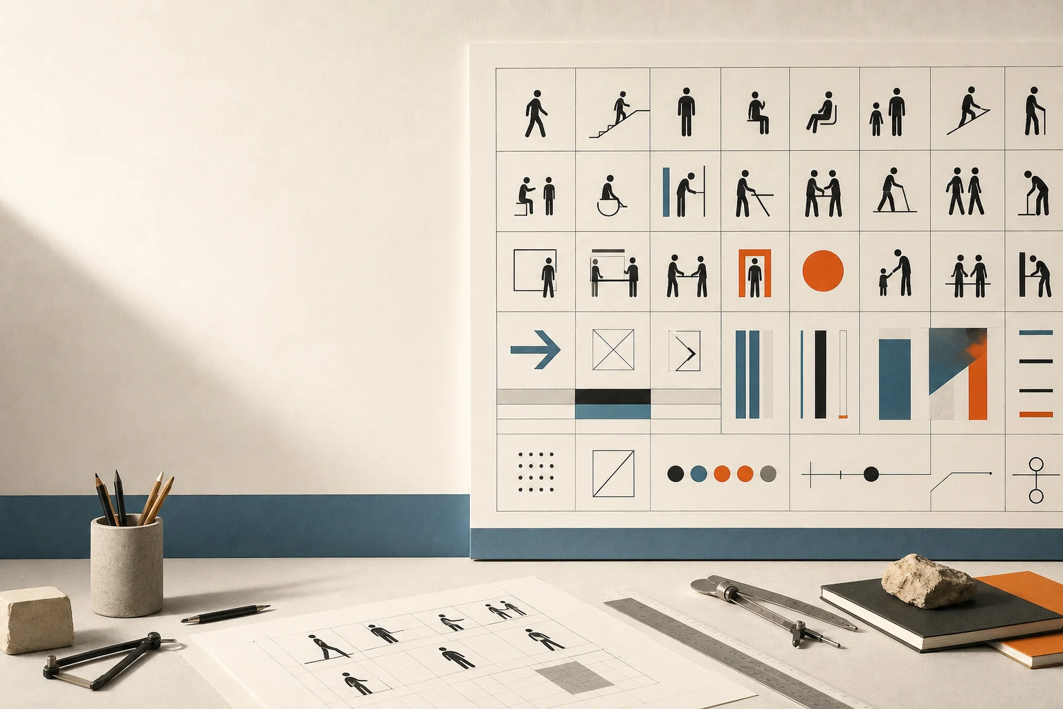
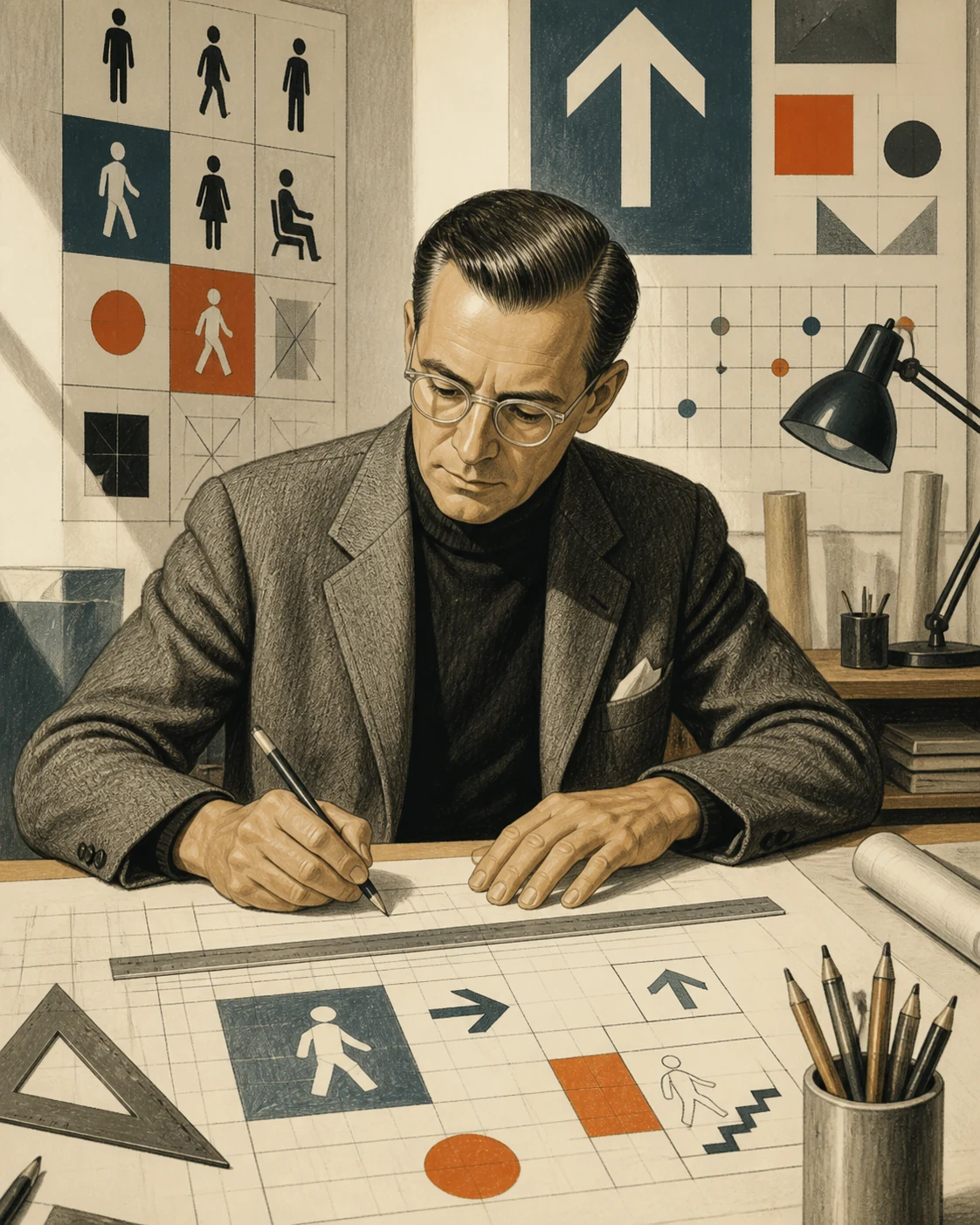
Aicher showed that graphic design can operate not as decoration around a message but as infrastructure: linking a school, transport system, city, corporation and international event through rules, colour, typography and signs.
Editorial thesis
Otl Aicher matters not because he authored a set of recognisable pictograms. His central contribution was to treat design as a system of public relationships. At HfG Ulm and in projects for Lufthansa, München 1972, ERCO, Isny and bulthaup, he repeatedly designed not a single mark but the conditions under which many elements could remain clear and work together. [source]
Reader question
How can a sports pictogram, an airport sign or a corporate colour palette become a political and cultural statement even when it contains neither a slogan nor an image of the state?
Short answer
Otl Aicher (1922–1991) was a German graphic designer, theorist and co-founder of HfG Ulm. He helped shape the Ulm Model, worked on visual systems for Braun and Lufthansa, directed the visual programme of the München 1972 Olympics, developed pictogram and corporate-design systems, created Isny’s civic identity, collaborated with ERCO and bulthaup, and designed the Rotis type family. [source]
1. Ulm, 1922: a designer’s biography begins inside political history
Otto “Otl” Aicher was born in Ulm on 13 May 1922. His generation came of age inside a violently political environment: National Socialist dictatorship, war and the destruction of Germany made questions of form inseparable from institutions, responsibility and public life. 18
His mature rationalism is therefore difficult to read as taste alone. Aicher’s pursuit of explicit rules was connected to a distrust of decorative rhetoric, mass mobilisation and the heroic image of the author. For VANSMITHLAB, that is the key: system does not begin as a love of order for its own sake, but as an attempt to make communication accountable and publicly responsible.
2. 1946: Volkshochschule Ulm and a democratic restart through education
From 1946, Inge Scholl and Otl Aicher helped build the Ulm adult-education centre, the Volkshochschule, as a place for intellectual and democratic renewal. Stiftung HfG Ulm explicitly connects this initiative to the experience of dictatorship and to the attempt to build a different public culture after the war. 6
Design already reaches beyond the poster here. A lecture notice, programme, typography and the organisation of knowledge form one educational interface. HfG-Archiv later assembled around 700 posters made by Aicher for vh Ulm between 1948 and 1968: a long series showing how a visual language can emerge through disciplined repetition rather than a single “masterpiece”.
3. Inge Aicher-Scholl, the memory of the White Rose and an ethics of public responsibility
Inge Aicher-Scholl was the sister of Hans and Sophie Scholl, members of the White Rose resistance who were executed by the Nazi regime. That family history should not be romanticised as biographical atmosphere; it helps explain why education, civic responsibility and resistance to authoritarian culture were practical rather than abstract ideas in Aicher’s circle. 18
In this context, Aicher’s “objectivity” is not a promise of political neutrality. It is better understood as an effort to reduce formal arbitrariness and make public communication open to scrutiny. Design does not abolish ideology; it has to recognise which relations of power are normalised through habit, symbol and interface.
4. 1953: HfG Ulm — a school that wanted to design society
In 1953 Aicher co-founded Hochschule für Gestaltung Ulm with Inge Aicher-Scholl and Max Bill. The school’s own history stresses that its purpose was not the production of “beautiful things” but the integration of artistic-design, scientific-technical knowledge and socio-political responsibility. 18
Practical design remained central, but a project became a form of research: who uses the system, which constraints operate, how information moves, and what happens when the solution is reproduced. To a contemporary product or interface designer, the logic is familiar: prototype, data, use scenario and production are considered together with form rather than after it.
5. From the Bauhaus legacy to the Ulm Model: the designer stops being an autonomous artist
During the mid-1950s, HfG debated the more artist-centred legacy represented by Max Bill against a stronger connection between design, science and technology. In 1957–58 Aicher served in a collegiate rectorate with Hans Gugelot, Tomás Maldonado and Friedrich Vordemberge-Gildewart. 18
The “Ulm Model” that emerged treated the designer not as a superior artist imposing personal style on industry but as an equal participant in decision-making. Visual culture did not disappear; it became an outcome of argument. Function, technology, economy, sign and user had to be coordinated as one set of relationships.
6. Visual Communication: information before self-expression
Aicher headed Visual Communication and taught at HfG. In his logic, the task begins less with “what should this look like?” than with “what must a person understand or do?”. Reversing that order turns graphics from styling into the design of information behaviour. 18
Hence his sustained interest in typography, photography, signs, maps and series. A single element matters only insofar as it belongs to a grammar that can preserve hierarchy, distinction and rhythm across a new format, scale or medium. This is where Aicher is closer to the contemporary design system than to a fixed visual “style”.
7. E5: collective practice instead of the lone-master myth
Within HfG development group E5, Aicher worked with colleagues on applied commissions including Braun and Deutsche Lufthansa. The archive separately documents the participation of Tomás Gonda and other collaborators, correcting the habit of reducing complex system projects to a single author. 18
Collective authorship is particularly logical for corporate design: marks, advertising, packaging, printed documentation and environments require different skills and long-term maintenance. A strong system should survive one layout and even one designer. Authorship lies in building rules and criteria, not in personally executing every detail.
8. Braun: product, advertising and visual system meet inside one school
HfG-Archiv lists Braun among the corporate programmes developed through E5, while the school’s history shows how closely Ulm connected industrial product and communication. New Braun equipment was not presented independently of graphics: product, display, photography and visual order became parts of one modern design culture. 3
This moves beyond “graphic design for an object” toward a system in which the object itself embodies related values: clarity, economy and repeatability. Aicher should not be treated as the lone author of Braun’s language. The more accurate picture is a network involving HfG, Hans Gugelot, Dieter Rams, E5 and the industrial client.
9. Lufthansa, 1962: an airline becomes an integrated visual environment
HfG’s official history dates E5’s work on the Lufthansa corporate design to 1962. Lufthansa now describes the programme as an integrated corporate design that consistently extended to colour, typography, signage, colour concepts and even aircraft interiors. 7
Corporate identity therefore stops being an emblem on an aircraft tail. A passenger encounters the same logic in a ticket, sign, printed item, airport touchpoint and cabin interior. This continuity made Lufthansa a key example of design coordinating a large service organism rather than merely decorating it.
10. Corporate design: identity as coordination, not logo decoration
Aicher’s work for Lufthansa, Bayerische Rück, ERCO, Frankfurt Airport, FSB and other organisations repeats one principle: corporate design is the visual part of how a system behaves. HfG-Archiv lists these projects together because what connects them is not one “Aicher look” but a method for managing many touchpoints. 18
A strong mark may be memorable, but it cannot rescue a contradictory environment. The difficult work starts after the logo: type, colour, spacing, formats, photography, wayfinding and scaling rules have to be coordinated. In this sense Aicher anticipates the contemporary design system, where value lies not in a component library alone but in consistent decisions.
11. The pictogram: reducing language without reducing meaning
A pictogram has to communicate an action or category quickly, with little text and ideally across language boundaries. Aicher did not “invent” this principle. His work continued earlier experiments in visual language and international wayfinding, including Isotype and the sign programme for Tokyo 1964. 18
His contribution lies in the discipline of the system: figures share a limited set of geometric decisions, a coherent logic of motion and the capacity to expand without visual collapse. Reducing detail does not reduce the difficulty of the task. The fewer elements remain, the more precisely each action must remain distinguishable from the next.
12. München 1972: for a few weeks the city becomes an information machine
For the München 1972 Olympics, Aicher’s team did not create a set of souvenir graphics but a temporary information environment for an international city. The programme extended across pictograms, maps, signage, tickets, uniforms, publications, posters and operational materials. 18
The project makes systems thinking visible at full scale: a visitor does not have to know who designed a particular sign. They have to find a sector, sport, transport connection or exit at the right moment. Success is measured less by the spectacle of one page than by the way different elements support one model of orientation.
13. Colour: constructing an image of an open Germany after Berlin 1936
The organisers of München 1972 wanted to distinguish the new Games from Berlin 1936. Cooper Hewitt notes that Aicher built the palette around vivid greens and blues and deliberately avoided the dominance of red and black associated with the visual memory of the Nazi period. 18
Colour therefore performs a political function without a literal political symbol. It constructs a mood of openness, youth and civic modernity. The lesson is important: visual identity can participate in redefining a nation’s historical image, but it cannot by itself erase history or social conflict.
14. Sports pictograms: geometry that has to move without animation
The sports pictograms for München 1972 reduce the body to lines, angles and directions while preserving the distinct character of each sport. Anatomical accuracy is secondary to the instantaneous recognition of action: running, jumping, striking, rowing or throwing must read at small size and inside a moving crowd. 11
The figure therefore behaves less like a miniature illustration than an element in a coordinate system. Body angle, limb length, equipment axis and negative space belong to one grammar. The sign looks simple only after a complex bodily gesture has been analysed into a minimal set of differences.
15. Grid and body: turning a figure into a reproducible rule
The grid behind the pictogram system functions as a production tool. It stabilises angles, proportions and directions so that additional signs can be created without breaking the family resemblance. The system is not an album of finished pictures but a method for generating compatible solutions. 18
That separates a design system from a collection of good examples. If a rule cannot be continued, it does not scale. If it is too rigid, different actions start to look the same. Aicher’s achievement sits in that balance: enough constraint for coherence, enough variation for precise meaning.
16. Olympic posters: photography, colour and energy instead of a national symbol
In the München 1972 posters, photographs of athletes are transformed through intense colour treatment. MoMA holds multiple lithographs from the series, while Cooper Hewitt connects their imagery to an effort to foreground motion and human accomplishment rather than conventional national rhetoric. 8
The posters matter because they do not literally repeat the pictogram language. A system can support different levels of emotion: a wayfinding sign needs greater neutrality, a poster can carry more energy. Unity comes from the palette, rhythm, photographic treatment and the larger idea of the event, not from making every medium look identical.
17. Tickets, signs, maps and uniforms: one language at different scales
The Olympic identity was a test of transmedia performance: from a small ticket to a large navigation panel, the rules had to remain recognisable. Cooper Hewitt specifically notes the extension of the language to signage, tickets, souvenirs and uniforms. 8
For a contemporary designer this reads almost like a responsive system before the digital interface. A layout cannot simply be enlarged. Viewing distance, contact time, information density and physical material change at each scale. The system succeeds when kinship survives while hierarchy adapts to the real situation of use.
18. A universal language — and the limits of universality
Pictograms promise communication beyond language, but universality is never absolute. People read figures through cultural habits, knowledge of sport, technologies and environments. Even a radically reduced sign depends on learned conventions: the arrow, the schematic body, reading direction or a familiar object. 18
It is therefore more precise to speak of lowering a language barrier than of creating a fully universal language. Aicher’s system works because it tests visual distinctions and reduces a message to action. But new audiences still require testing; a designer’s geometry should never be mistaken for the natural language of the world.
19. 1966, 1967 or 1968? Why archives date the start of the Olympic role differently
Sources use different dates for the beginning of Aicher’s Olympic role. Cooper Hewitt says he was appointed Design Commissioner in 1966; Stiftung HfG Ulm gives 1967 for becoming official design commissioner; HfG-Archiv uses 1968 for the point at which he “became responsible” for the Games’ design. 8
The discrepancy should not be artificially erased. Large commissions often pass through invitation, preparation, formal appointment and expansion of responsibility. VANSMITHLAB therefore treats the dates as stages in an organisational process rather than selecting one neat date and turning a complex project into a myth of instant authorship.
20. The political limit of visual optimism: München 1972 after the terrorist attack
The open and international image of München 1972 remains inseparable from the tragedy of the Games: a terrorist attack led to the deaths of members of the Israeli Olympic team and a West German police officer. Cooper Hewitt rightly notes that the political conflict which the visual programme sought symbolically to soften did not disappear through the strength of that programme. 8
This is not a “failure of design”; design simply does not possess that kind of power. The boundary matters. A system can improve orientation, propose a civic image and change the tone of public space, but it cannot substitute for political institutions or security. Respecting design also means refusing to grant it magical agency.
21. Frankfurt Airport: wayfinding as everyday infrastructure
HfG-Archiv includes Frankfurt Airport among Aicher’s major projects. An airport is almost an ideal laboratory for his method: multiple languages, stress, limited time, complex flows, repeated decisions and the need to distinguish directions at a distance. 3
In that environment graphic design becomes part of the architecture of movement. A sign does not exist independently from corridor, light, distance and route. This is why Aicher belongs in the same conversation as Massimo Vignelli and contemporary service systems: good wayfinding is not a collection of attractive arrows but a model of spatial behaviour.
22. ERCO: the pictograms acquire a long life beyond the Olympics
ERCO collaborated with Aicher on its corporate design and, after his death, assumed distribution, licensing and further development of the pictogram system. The company emphasises that the signs continued to be adapted for new applications while retaining the original concept. 18
This is a rare example of a project becoming a living standard. The archival original matters, but a system retains value only if it can accept new functions. The difference between style and infrastructure becomes clear: style can be quoted; infrastructure has to be maintained, documented and extended.
23. Isny, 1977–1985: 136 signs for a small town
For Isny im Allgäu, Aicher developed 136 black-and-white, almost square Bildzeichen between 1977 and 1985, addressing the town, nature, sport and everyday regional culture. They deliberately opposed conventional tourism advertising built around a ready-made image of the “beautiful destination”. 18
Aicher observed landscape, animals, craft and everyday life and translated them into a limited repertoire of lines, dots and forms. The result is less a slogan than a visual construction kit for identity. Decades later Isny continues to work with this archive, making the project an example of long civic memory rather than a historical curiosity.
24. Pictogram versus Bildzeichen: why Isny deliberately leaves room for ambiguity
Isny now makes an important distinction: only some signs derived from the ERCO repertoire are pictograms in the strict sense. Most Isny motifs are Bildzeichen — pictorial signs that invite association and secondary meanings. 18
That complicates the stereotype of Aicher as a designer of “cold universality”. In an airport, a sign should reduce ambiguity; in civic identity, a fox, tree or fountain can open memory and imagination. The same designer uses opposite modes of communication because the problem matters more than a pre-selected aesthetic dogma.
25. Bulthaup, 1980–1982: the kitchen begins with research into how people cook and eat
In 1980 Gerd Bulthaup brought Aicher into collaboration with the company. Before shaping a new kitchen culture, the pair made more than fifty trips to study how people lived, cooked and ate; in 1982 Aicher formulated the approach in The Kitchen for Cooking. 18
Systems thinking moves here from graphics into object and interior. Function is not an abstract “form follows function” but a sequence of real acts: storing, cutting, cooking, talking and gathering around food. Everyday observation becomes design material — the same principle as wayfinding, except that the route being studied is a body moving through a kitchen.
26. Rotis, 1988: an attempt to build a system between serif and sans serif
In 1988 Aicher issued Rotis, a type system named after the place where he lived and worked. It combined four related families ranging from grotesk to antiqua and was conceived as an attempt to bridge the hard division between serif and sans serif. 18
The project is useful not only because of its success but because it remained controversial. Type designers criticised aspects of Rotis, a reminder that systems thinking does not guarantee a perfect result. Aicher again proposes a strong hypothesis — one family across typographic poles — and professional history tests how well that hypothesis performs in actual reading.
27. Rotis as a place: work, architecture and everyday life become one design environment
After München 1972, Aicher moved with his family to Rotis in the Allgäu and gradually transformed a former mill complex into a place for living and work. In 1984 he designed studio buildings and founded the Institute for Analog Studies there. The site itself became a physical extension of his interest in structure, distance and everyday function. 18
Rotis matters less as the romantic refuge of a “master” than as an experiment with the boundary between office, home, printing, food, garden and architecture. A designer known for corporate visual systems applied a related discipline to his own environment, expanding design practice into a way of organising life.
28. The World as Design: design as a cultural and ethical argument
Aicher’s writing is not an appendix to the “real” visual work. The World as Design and related essays address modernism, symbols, technology, architecture, typography, Eames, HfG Ulm and the idea of the world itself as a field of design responsibility. 18
The literary work helps explain why his projects often read like arguments. Colour, grid and sign are not neutral techniques but decisions about how people should relate to information and environment. A designer need not agree with Aicher to recognise the scale of the claim: form inevitably participates in culture.
29. Critiquing the system: when clarity risks becoming control
Systems design is easy to romanticise: the grid promises order, the pictogram promises understanding, the standard promises efficiency. Yet every standard excludes alternatives and stabilises someone’s model of the “normal” user. Even München 1972, in pursuing a universal human image, centred the athletic male body in most of its sports posters. 18
Aicher’s legacy is therefore more useful as a discipline of problem framing than as a book of eternal rules. Today, clarity must be joined by accessibility, cultural testing, multilingual research and permission for exceptions. Good design is not the system in which everything obeys the grid, but the one in which the rule can be explained, tested and changed.
30. The main legacy: design as public infrastructure and responsibility
The connection between vh Ulm, HfG, Lufthansa, München 1972, Frankfurt Airport, ERCO, Isny, bulthaup and Rotis becomes clear once we stop searching for a single visual style. Aicher repeatedly worked on things larger than one object: a school, service, event, city, company or model of everyday life. 18
His legacy is not the angle of a stick figure or one specific blue palette. It is the professional habit of turning complexity into a system of relationships: define the problem, build rules, test them at scale and remember that design operates inside society. That is why Aicher remains a crucial link between graphic design, product, architecture, public information and the contemporary logic of design systems.