graphic designer profile
Massimo Vignelli
System, order and design as one
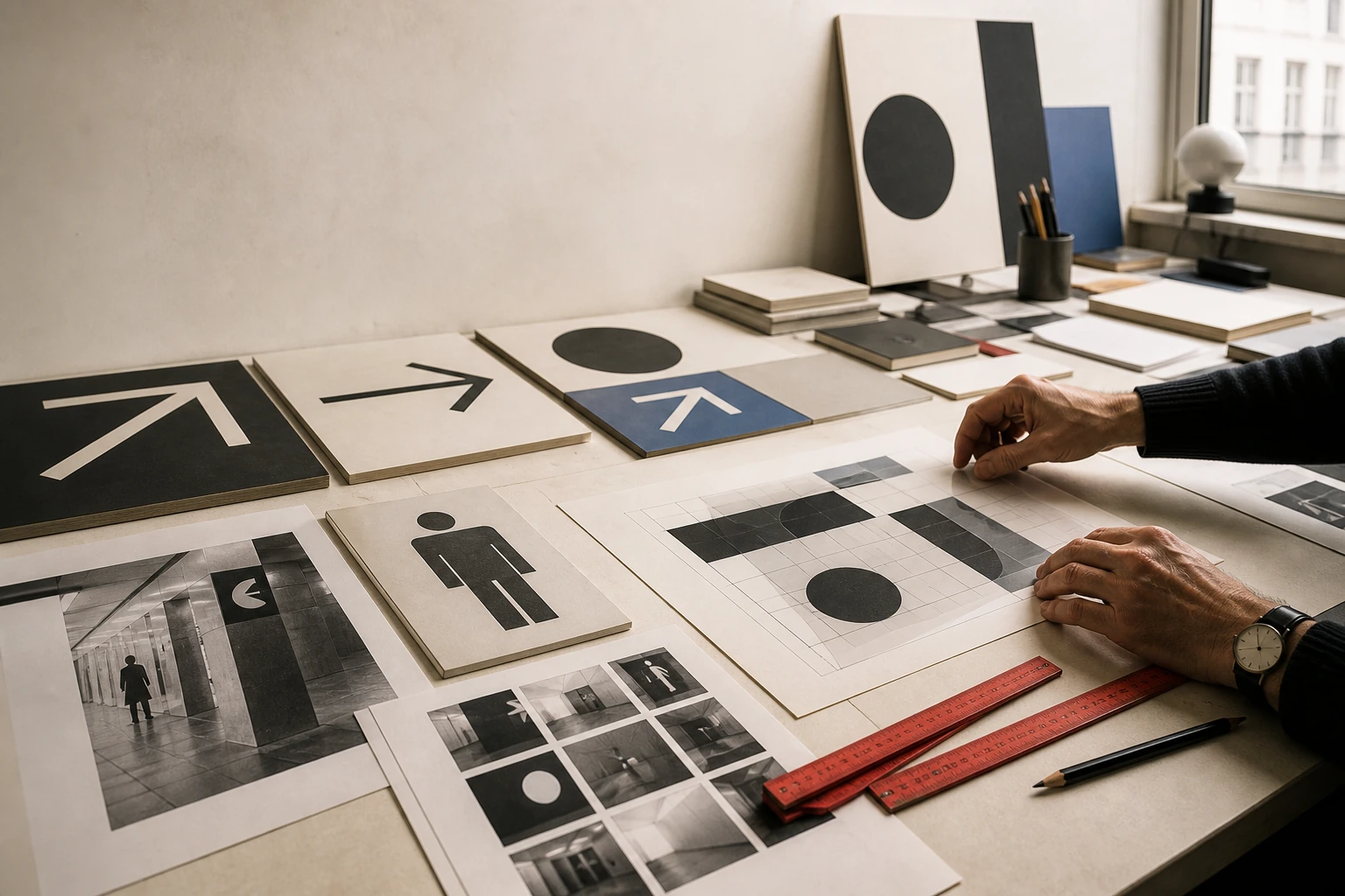

Vignelli made system itself a subject of design: identity, grid, signage, map, packaging, publication, product and interior are connected not by one look but by a shared discipline of relationships.
Editorial thesis
Massimo Vignelli matters not as the maker of a few supposedly timeless logos or one famous subway map. His central contribution is the design system as a way to reduce arbitrariness and coordinate many media, people and scales. A contemporary reading must also restore Lella Vignelli and other collaborators to the story, otherwise system thinking collapses into the myth of a single master. [source]
Reader question
How could the same designer work on an airline, a subway, government brochures, a shopping bag, a chair and an interior — and still consider all of it one profession?
Short answer
Because for Vignelli design begins not with the object but with relationships: hierarchy, scale, proportion, material, information and use. Once those relationships are understood, the principle can move from page to space and from logo to public infrastructure. [source]
1. Milan, 1931: design begins with architecture
Massimo Vignelli was born in Milan in 1931. RIT and MoMA describe a designer whose practice would later range across corporate identity, transportation, publications, furniture, products and interiors, but whose professional foundation was architectural. 1
That beginning is crucial to the history of graphic design. Vignelli does not approach the logo as an autonomous sign. He is trained to think about scale, proportion, route, material and the relationship of parts within a whole. His later corporate manuals therefore behave more like architectural projects than collections of decorative variations.
2. Milan and Venice, 1950–1953: space before graphics
Between 1950 and 1953 Vignelli studied architecture in Milan and Venice. RIT records this period as the basis of his education before his practice expanded into broader design. 1
Architectural training teaches the system before the isolated object. Wall depends on plan, type on hierarchy, signage on route, catalogue on sequence. Vignelli would later apply this logic at radically different scales, from a letter on stationery to the movement of millions of subway passengers.
3. Swiss influence and Max Huber: order becomes a visual language
RIT connects Vignelli's development to postwar Milan and strong Swiss influence, naming Max Huber as particularly important. 1
What he takes from Swiss-derived rationalism is not simply Helvetica and asymmetry but the conviction that form needs an intelligible structure. That distinction separates a modernist method from its later styling: a 'clean page' only works when a precise system of relationships sits behind it.
4. Lella Vignelli: the partnership without which the story is incomplete
Massimo married Lella Valle in 1957, and their professional histories remained tightly intertwined for more than fifty years. The Vignelli Center stresses that Lella was an architect, led Interiors at Unimark, became executive vice president and later CEO of Vignelli Associates, and then president of Vignelli Designs. 1
A contemporary account therefore cannot automatically assign everything to 'Massimo Vignelli'. MoMA credits many key works to both designers. The larger the project — identity, interior, furniture, product — the more important that distributed authorship becomes.
5. 1960: Vignelli Office of Design and Architecture
In 1960 Massimo and Lella established the Vignelli Office of Design and Architecture in Milan. RIT presents the office as the beginning of their joint practice before the American period. 1
The name already states the later philosophy: design and architecture are not divided into high and applied culture. The same intelligence can organise poster, dinnerware, exhibition and space. The later phrase Design is One grows directly from this experience.
6. 1965: Unimark International and the scale of the corporate system
In 1965 Massimo became co-founder and design director of Unimark International. The company was conceived as an international network able to manage large corporate systems rather than isolated advertisements. 1
Unimark marks an organisational turn in the profession. A designer must not only produce a good mark but explain how it lives on aircraft, tickets, signage, uniforms, vehicles, maps and offices. Corporate scale demands standards; the standards manual becomes as important as the symbol itself.
7. Knoll, 1966–1980: the catalogue as long-term identity
Knoll International became an early long-term program. MoMA holds a sequence of twenty brochures from 1966–1980 credited to Massimo and Lella Vignelli. 16
The program is powerful because it repeats without becoming monotonous. Format, typography, photography, paper and grid create a recognisable frame while furniture, designers and collections change. Identity becomes a grammar capable of speaking about many products rather than a single advertising image.
8. American Airlines, 1967: two letters and the question of the corporate symbol
In 1967 Unimark developed a new identity for American Airlines. Cooper Hewitt adds an important detail: Vignelli's original logic used two Helvetica As, one red and one blue; the airline insisted on retaining an eagle, which was eventually added by another design office. 14
The episode is useful against the myth of the autonomous designer-author. Corporate identity is negotiated with management, brand history, employees and institutional memory. Purity of concept meets organisational attachment, and final form can be a compromise.
9. Corporate identity: the logo is only one point in a system
The Vignelli Center defines corporate identity as the coordination of all visual aspects of a company: products, packaging, printed communication, point of sale and the broader culture of the organisation. 3
The lesson is simple: a logo is an entry point, not the whole system. If the mark is elegant but signage, packaging, instructions and digital interfaces behave independently, identity collapses. Vignelli's real subject is coordinated organisational behaviour.
10. Typographic economy: why restrict the type palette
Vignelli is famous for a restricted typographic palette and for preferring a small set of deeply understood typefaces to endless choice. The Vignelli Canon and RIT material document that attitude toward type and hierarchy. 1
Today the useful principle is not a ban on new fonts. It is decision economy: every additional typeface needs a function. Restriction frees attention for scale, spacing, hierarchy and content; dogmatic repetition of Helvetica merely turns method into costume.
11. The grid: infrastructure for decisions rather than a cage
For Vignelli the grid is not a decorative mesh that the viewer is meant to notice. It is invisible infrastructure for coordinating sizes, margins, images, headlines and production. 1
A grid becomes especially valuable in large systems because it reduces arbitrary decisions and speeds collaborative work. Yet it does not replace judgement. Two pages can use the same grid and have radically different quality because rhythm comes from scale and pause, not columns alone.
12. New York Subway, 1967–1970: signage before the map
In 1967 the New York City Transit Authority invited Unimark International to create a system-wide graphic identity for the subway. MoMA notes that the 1970 Graphics Standards Manual standardised signage, sans-serif typography and colour logic before the map became the cultural icon of the project. 4
This is the essential point: passengers interact daily not with a museum object but with hundreds of micro-decisions. Station name, direction, transfer and exit have to appear where they are needed. Wayfinding is the design of behaviour in space.
13. Bob Noorda, Joan Charysyn and the collective authorship of a transit system
The subway system was collaborative. MoMA credits the celebrated map to Massimo Vignelli, Joan Charysyn, Bob Noorda and Unimark International, while RIT separately emphasises Vignelli and Noorda's work on signage and maps. 10
That corrects the popular legend that 'Vignelli designed the subway'. Large-scale information design requires researchers, designers, engineers, printers, transit staff and institutional approval. The authorial idea is real, but it functions inside an organisation.
14. Subway Map, 1970–1972: geography gives way to diagram
The 1970–1972 map abandoned geographic fidelity for diagram: lines were regularised at forty-five and ninety degrees, stations reduced to dots and topography radically simplified. MoMA describes it as an attempt to make a huge network more legible. 10
The key distinction is map versus diagram. Geography asks where something sits in the city; a transit diagram asks how lines connect. Vignelli deliberately privileges network relationship over the physical shape of Manhattan.
15. Why the map was replaced in 1979 — and why it was later admired
New Yorkers criticised the diagram for its distance from real geography, and it was replaced in 1979 by a more topographic solution. MoMA notes that the design was later widely admired and entered the museum canon. 11
This failure-success exposes the limit of universal clarity. What seems logical as a network abstraction can conflict with a user's mental map. Good design needs not only internal order but evidence about the problem people are actually trying to solve.
16. 2012: the diagram returns in digital service information
In 2012 Massimo Vignelli, Beatriz Cifuentes and Yoshiki Waterhouse created a new subway diagram for Weekender/service-change information; MoMA holds the print and lists MTA New York City Transit as publisher. 2
Digital context made the diagram useful again: temporary network changes require topological understanding more than street-level geography. An idea imperfect for one task in the 1970s became strong for a different use case decades later.
17. 1971: Vignelli Associates and the Design is One model
In 1971 Massimo and Lella founded Vignelli Associates. Vignelli Designs later expanded work in product and furniture. RIT describes a field spanning graphic identity, publication, interior, furniture and consumer products. 1
This is the basis of Design is One: not the claim that all objects should look identical, but the belief that scale, proportion, material, hierarchy and clarity can travel between disciplines.
18. Bloomingdale’s, 1973: a paper bag becomes urban advertising
In 1973 Massimo Vignelli created Bloomingdale's Big Brown Bag; Cooper Hewitt records how its success led to Little and Medium Brown Bags. 15
It is almost a perfect branding object. Cheap kraft paper becomes moving advertising without illustration or elaborate symbolism. Product size itself becomes the message. Packaging protects, identifies and travels through the city with the customer.
19. National Park Service, 1977: Unigrid as public infrastructure
In 1977 the National Park Service brought Vignelli in to reform its inconsistent visitor brochures. NPS describes Unigrid as a comprehensive system standardising format and production while allowing writers and designers to focus on content. 12
It is a powerful design-system case before the digital interface era. The grid solves an administrative problem: thousands of publications must be recognisable, economical to print and flexible enough for radically different parks.
20. Information at the point of decision: transit as a test of clarity
The Vignelli Center summarises a practical principle of transportation design: information should be delivered at the point of decision — never too early, never too late. 4
The idea survives any particular typeface. A navigation system, airport app or website faces the same question: what information does the user need now? Clarity is not showing everything; it is showing the right thing at the right moment.
21. St. Peter’s Church, 1977: graphics, interior and architecture as one field
RIT lists the 1977 design of St. Peter's Church in New York among Vignelli's landmark projects. Across the office's work, interiors, environmental graphics, furniture and signage repeatedly overlap. 1
The church matters to Design is One because identity cannot end on stationery. A visitor enters material, proportion, light and graphics as one character. Environment becomes an architectural form of identity.
22. Design is One: why disciplines should speak to one another
The phrase Design is One crystallised the holistic position of Massimo and Lella Vignelli. RIT continues to use it as a central part of the Vignelli ethos and as a framework for educational projects. 1
It is easy to misread the phrase as a universal visual style. The stronger reading is relational: designers need to understand how disciplines affect one another. Graphic design isolated from product, space and production leaves a system as disconnected fragments.
23. Publication design: rhythm, white space and the materiality of the book
The Vignelli Center describes publication design through pacing, white space, image scale, typeface, paper, ink, binding and materials. 5
A book is not a neutral container. It controls reading time: a large image accelerates, an empty spread pauses, paper changes weight, binding changes movement. Print design becomes choreography of attention and physical action.
24. The Vignelli Canon, 2010: rules that need critical reading
The Vignelli Canon appeared in 2010 as a concentrated statement of design philosophy. RIT connects it to semantics, syntax, pragmatics, discipline, timelessness and related criteria. 1
The Canon is most useful as a clear position rather than sacred law. Its modernist faith in order can collide with accessibility, cultural plurality, responsive interfaces and other twenty-first-century problems. Continuing Vignelli means testing principles under new conditions rather than reproducing the surface style.
25. Stacking Dinnerware, 1964: the system becomes an object
MoMA holds the 1964 Stacking Dinnerware by Massimo and Lella Vignelli: melamine resin, compact storage and colourful modularity. 17
The object makes clear that 'system' is not merely a metaphor. Cup, plate and bowl must physically coordinate in storage, production and use. Geometry becomes functional infrastructure — the same role that the grid plays in graphics.
26. Handkerchief Chair, 1985: function, plastic and lightness of form
MoMA credits the 1985 Handkerchief Chair to Massimo Vignelli, Lella Vignelli and David Law. Its fiberglass-reinforced shell appears almost weightless, like fabric caught in the air, while remaining a stackable office chair. 18
The design reveals why minimalism is not emotional austerity. The form is reduced but not neutral. One continuous gesture answers manufacture, ergonomics and character simultaneously.
27. Interior as an identity one can enter
The Vignelli Center describes interiors as memorable experiences built through scale, light, simple materials and controlled space rather than expensive finish alone. 9
For the graphic designer this expands identity into human scale. Margins become distance, contrast becomes light and shadow, hierarchy becomes route, typography becomes signage. Principles migrate from the page into space.
28. Lella, the team and the problem of the single-master myth
The myth of one Massimo long obscured the work of Lella and other collaborators. MoMA and the Vignelli Center increasingly restore joint attribution across Knoll, products, furniture and the office practice. 1
That does not diminish Massimo. It makes his role more precise: part of his talent was building an intellectual framework and public language through which a large collaborative practice could operate. Design history should distinguish public persona from actual production.
29. The Vignelli Center and A Language of Clarity, 2026: the archive keeps arguing
In 2010 the Vignelli archive received a permanent home at the Vignelli Center for Design Studies at RIT. In 2026 Triennale Milano is presenting Lella and Massimo Vignelli: A Language of Clarity, the first major retrospective of their international contribution, on view through 6 September 2026. 2
The new exhibition deliberately restores both names to the title. The archive becomes less a mausoleum of timeless style and more material for argument: which forms of rational clarity still work, and which need revision?
30. The main legacy: system matters more than a signature visual gesture
Massimo Vignelli's main legacy is not Helvetica, a red line, a brown bag or a geometric map. Those surface signs can be copied in an hour. 1
Harder to borrow is the method: define the problem, reduce arbitrary decisions, build grid and hierarchy, coordinate physical production, recognise collective authorship, and make a system strict enough to be identifiable yet flexible enough for real life. Vignelli remains relevant as a designer of systems rather than the supplier of one modernist look.