graphic designer profile
Wim Crouwel
Grid, technology and design as a system
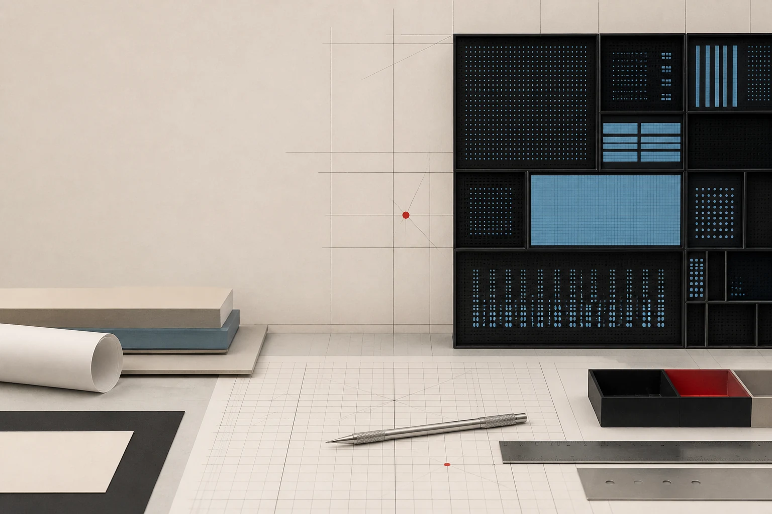
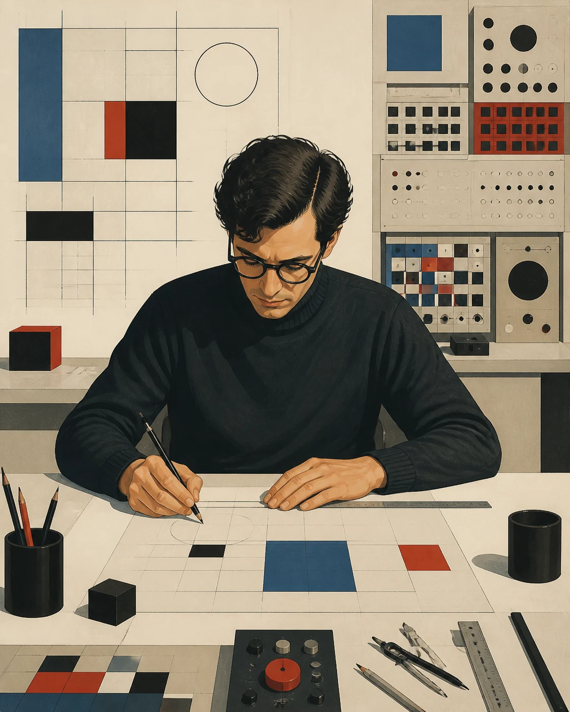
Crouwel turned the grid from a compositional device into infrastructure: museum, catalogue, corporate identity, postage stamp and experimental alphabet become different interfaces of one idea — order should help complex information work.
Editorial thesis
Wim Crouwel matters not because he made the grid into a recognisable visual style. His contribution was to turn graphic design into a manageable system of relationships among content, production, technology, institution and user. His legacy should therefore be read both as a model of systematic practice and as a reason to question modernism's claim to neutrality. [source]
Reader question
When does a grid make information clearer, and when does it begin imposing its own ideology on content? And why can an experimental alphabet from 1967 now feel closer to interface design than to classical typography?
Short answer
Wim Crouwel (1928–2019) was a Dutch graphic designer, typographer, educator and museum director, co-founder of Total Design and long-term designer for the Stedelijk Museum Amsterdam. His central themes include the modular grid, institutional identity, New Alphabet, mass information systems and the professionalisation of graphic design.
1. Groningen, 1928: an artist before the systems designer
Wim Crouwel was born in Groningen in 1928. His early path did not begin with corporate identity or typographic grids, but with fine art. From 1946 to 1949 he studied at Academie Minerva, developing a sense of composition, space and rhythm before typography became his central professional tool. 15
This matters when reading the mature Crouwel. His rationalism was not the opposite of visual culture; it grew from it. Even his strictest posters retain a sense of scale, movement and tension that rules alone cannot explain.
2. Academie Minerva, 1946–1949: composition before typography
Training in Groningen gave Crouwel an artist's foundation, but not a ready-made profession as a graphic designer. He later studied typography in Amsterdam at the Instituut voor Kunstnijverheidsonderwijs, now the Gerrit Rietveld Academie. The shift from image-making to the organisation of text became decisive. 16
Instead of a story in which a gifted poster designer simply 'finds a style', another story appears: a designer learns to translate compositional thinking into a repeatable system suited to institutions, editions and production.
3. Amsterdam: typography becomes construction
In postwar Amsterdam Crouwel entered a culture in which modernism was not only an aesthetic but a project for organising a new public environment. Sans serif type, asymmetry, standardisation and modularity signalled modernity, yet Crouwel's decisive question became not 'what does modernism look like?' but 'how does order work?' 15
Typography therefore becomes constructive. Letters, intervals, format and margins form a system of relationships. The visual result may change, but the logic of decision-making should remain legible.
4. 1955: the studio with Kho Liang Ie and the exhibition as a first system
In 1955 Crouwel opened an office with designer Kho Liang Ie. Their work crossed exhibition, graphic and product design — fields that would later seem natural parts of one design system but were often treated separately at the time. 16
Exhibition design became an ideal school for systems thinking: a message has to be distributed not across one page but through space, route and time. This prepared Crouwel for museums and large institutions, where visual identity operates at many scales at once.
5. Van Abbemuseum: museum commissions teach serial thinking
Before the Stedelijk Museum, the Van Abbemuseum in Eindhoven was an important laboratory. Crouwel designed catalogues, invitations and posters for it; MoMA holds, for example, his 1959 Bazaine poster. A museum commission required both institutional recognition and respect for constantly changing art. 6
One of the central themes of his career forms here: a designer should not have to start from zero every time. A system provides a stable frame inside which each exhibition can gain its own voice.
6. 1963: Stedelijk Museum and the legacy of Willem Sandberg
In 1963 Crouwel began his long relationship with the Stedelijk Museum Amsterdam, following the graphic culture associated with Willem Sandberg. According to the Type Directors Club, he designed almost all of the museum's main posters and catalogues until 1985. 13
Sandberg's legacy was difficult: the museum already possessed a strong visual culture and authorial character. Crouwel did not imitate him. He turned toward modularity, standardised formats and a repeatable grid, transforming museum graphics into systemic infrastructure.
7. The grid: invisible architecture rather than a ready-made style
For Crouwel the grid is not a visible ornament made of columns. It is hidden architecture for coordinating text, image, caption, date and format. This is why the system can be applied to different exhibitions without turning them into identical posters. 15
The paradox is that the grid both limits and frees. It reduces arbitrary decisions while leaving room for scale, colour, rotation, repetition and unusual typographic composition.
8. Catalogue, poster, invitation: the museum as a long information system
The Stedelijk was not a set of isolated jobs but a long series. A poster had to work in the street, a catalogue in the hand and the archive, an invitation as a short signal, and schedules as a regular service. Crouwel connected these media through a shared grammar rather than a logo alone. 13
The museum therefore becomes an early example of what would now be called a design system: common rules produce different interfaces without losing identity. In this sense Crouwel's museum graphics are closer to a contemporary product system than to a portfolio of 'beautiful posters'.
9. Univers and typographic economy: a voice without unnecessary theatre
Crouwel favoured functional sans serif typefaces, including Univers. He was interested not in neutrality as the absence of character but in a typeface's capacity to support hierarchy, repetition and large amounts of information. 15
This economy made typography almost infrastructural. Yet it also produced criticism: when systematic consistency became too complete, readers could experience it as cold or institutionally authoritative.
10. Total Design, 1963: design becomes collective infrastructure
Also in 1963 Crouwel, Benno Wissing, Friso Kramer, Paul Schwarz and Dick Schwarz founded Associatie voor Total Design NV. Design Museum Den Bosch describes it as one of the Netherlands' first large modern multidisciplinary design practices. 4
Total Design operated not as the workshop of one author but as an organisation capable of producing identity, graphic, product and spatial systems for large clients. Systems design became not merely a personal method, but a team-based production model.
11. Corporate identity: not a logo, but rules that outlive a single medium
For Total Design, corporate identity meant much more than a mark. Logo, colour, typographic hierarchy, stationery, signage and application standards had to form one manageable system. 16
Crouwel matters here as a representative of a profession that begins to design the behaviour of a visual organisation. A strong identity exists not because every application is independently beautiful, but because hundreds of applications clearly belong to one structure.
12. Collective authorship: why not every Total Design project is 'a Crouwel'
Popular design history often compresses Total Design into Crouwel's name. It is convenient, but historically inaccurate. Benno Wissing, Ben Bos, Friso Kramer and many other designers worked at the office; different programmes had different lead authors. Stedelijk archive records also identify joint works by Crouwel with Jolijn van de Wouw and Arlette Brouwers. 14
For VANSMITHLAB this is an important rule: systems design is especially vulnerable to the myth of the single master, even though its very nature depends on teams, production and institutions.
13. Henri Michaux, 1964: order does not exclude visual tension
The 1964 Henri Michaux poster for the Stedelijk Museum demonstrates why Crouwel cannot be reduced to a dry grid. MoMA holds the lithograph as an independent work of graphic design: the structure remains disciplined, yet scale, contrast and distribution create strong visual tension. 8
The grid is not seen as a cage. It is felt as confidence in placement. That is the key to Crouwel's best work: the system disappears into the result and leaves the viewer with clarity and rhythm.
14. Vorm Gevers, 1968: the typographic poster as a machine of scale
In the 1968 Vorm Gevers poster for the Stedelijk Museum, Crouwel builds the image almost entirely through typography. MoMA records the work as an offset lithograph; the scale and placement of letters turn the exhibition title into a spatial event. 10
This contradicts the stereotype of modernist typography as small type in the top-left corner. Crouwel could be loud, but his loudness remained structured.
15. Visuele Communicatie Nederland, 1969: the profession displays its own language
The 1969 Visuele Communicatie Nederland poster is especially revealing: graphic design becomes the subject of graphic design. Crouwel designs communication about visual communication itself, showing a profession that already understands itself as an independent discipline with methods and responsibilities. 11
For Crouwel, professionalisation was not a question of status alone. He taught, lectured, organised and argued that designers should be able to explain their method rather than merely present a result.
16. New Alphabet, 1967: the letter submits to the machine's constraint
New Alphabet of 1967 emerged as an experiment with the limits of early electronic displays. MoMA describes an alphabet built from straight elements because CRT technology struggled to reproduce conventional curved letterforms. 15
The important point is not its futuristic appearance. Crouwel asks a design question: if technology changes the conditions of display, should we imitate the old form or construct a new form from the machine's possibilities?
17. An 'impractical' experiment: technology as a critique of typographic tradition
Crouwel later described New Alphabet as over-the-top and not really intended for ordinary use. It is therefore better understood not as a replacement alphabet but as a critical prototype. 15
The experiment pushes functionalism to the point where functionality begins to conflict with reading. That makes New Alphabet valuable: it exposes the limits of Crouwel's own ideology and turns a technical constraint into an intellectual provocation.
18. From CRT to pixel: why New Alphabet arrived before its time
In 1967, typography designed around screen logic looked radical. Decades later interface designers would routinely confront related issues: pixel grids, responsive rendering, hinting, variable typography and multiple devices. 9
New Alphabet does not literally predict contemporary UI. But it states an early principle: media is not a neutral container. Technical systems shape the form of a message, and the designer must treat machine constraints as part of visual language.
19. Gridnik: experimental alphabets as a laboratory, not a signature style
The nickname Mr. Gridnik and the name Gridnik fixed Crouwel in public memory as the man of the grid. Yet experimental lettering was a laboratory for him, not a recipe to apply to everything. 15
If Gridnik is used only as a decorative techno-font, the important part disappears: Crouwel investigated relationships among module, production and legibility. His legacy is a question addressed to systems, not a set of recognisable forms.
20. PTT and telephone directories: modernism faces mass-use conditions
When systemic modernism leaves the museum and enters public service, it can be tested by actual reading. Work around the PTT and telephone directories became such a test. Research published by the Wim Crouwel Institute also recalls criticism of a telephone book set in small Univers without capitals. 15
This is a crucial boundary: visual consistency does not guarantee usability. A mass information system must survive search speed, audience age, printing quality and established reading habits.
21. Cijferpostzegels, 1974–1976: small format and mathematical character
In 1974 the PTT invited Crouwel, Gerrit Noordzij and Willem Sandberg to develop new numeral stamps. Crouwel's system was selected and the stamps were issued in 1976. He sought to distinguish denominations through typography and colour and to give the numerals a simple mathematical character. 15
A postage stamp only a few centimetres wide becomes a miniature information interface. Here Crouwel translates a modernist system into a mass-produced, regulated object with extreme space constraints.
22. EXPO ’70: Dutch modernism enters the international stage
The Type Directors Club notes Crouwel's contribution to the Dutch pavilion for Expo ’70 in Osaka. For the Total Design generation, a world exposition was a place where national modernity could be staged through architecture, exhibition design, graphics and technology at once. 16
This reinforces the cross-field nature of his practice: graphic design in Crouwel's work continually touches space, industrial production and architecture.
23. Crouwel and Jan van Toorn: neutrality, authorship and social position
During the 1970s Crouwel's rational position increasingly met resistance. The Wim Crouwel Institute describes how younger and politically engaged designers, including Jan van Toorn, challenged the dogmatism of modernist practice and demanded a more explicit authorial and social position. 15
The conflict should not be reduced to 'grid versus chaos'. The deeper question is whether a designer should organise a message while minimising their visible presence, or acknowledge that every form already contains interpretation and power.
24. Teaching at Delft: the system becomes an educational method
Crouwel taught throughout much of his career. The Type Directors Club records his work at the Technische Hogeschool Delft, his appointment as associate professor in 1972 and later leadership in the faculty. 17
In education, the grid becomes not the teacher's style but a way to discipline an argument: define the problem, constraints, format and sequence. Crouwel's history also shows the risk: a method can become dogma when it is no longer tested against new conditions.
25. The designer as organiser: a profession needs institutions, not only authors
Crouwel was more than a practitioner. He participated in professional organisations, taught, directed, wrote and publicly defended graphic design as an independent discipline. The Wim Crouwel Institute emphasises his role as an organiser who continuously worked on the infrastructure of the profession. 16
For VANSMITHLAB this layer is essential: design history is not made only of objects. Schools, studios, museums, professional associations and archives determine which methods are preserved, scaled and normalised.
26. Museum Boijmans Van Beuningen: from designing museums to directing one
In the mid-1980s Crouwel became director of Museum Boijmans Van Beuningen in Rotterdam and remained in the post until his retirement in 1993. The transition is symbolic: a designer who had spent decades building visual systems for museums now became responsible for a museum as an institution. 4
This expands the idea of design leadership. Collections, exhibition policy, organisation and the public role of a museum are also systems problems, only no longer at the scale of a typographic grid.
27. The 1980s–1990s: modernism is criticised and Gridnik returns
By the late twentieth century, Crouwel's modernist confidence was no longer the profession's only vision of the future. New Wave, postmodern graphic design and more authorial practices challenged the idea of universal neutrality. Yet at the same time younger designers began rediscovering his experimental alphabets. 16
Crouwel's return shows the cyclical nature of visual culture: what one generation experiences as dogma can become historical material for another generation's experiment.
28. Peter Saville and Substance, 1988: an experimental alphabet enters pop culture
MoMA notes that Peter Saville Associates used a stylised version of New Alphabet on Joy Division's Substance compilation in 1988. In 1997, Freda Sack and David Quay of The Foundry digitised the alphabet for contemporary use. 9
A typographic experiment from 1967 thus moved from a debate about computers into music culture and digital font production. This was more than revival: a new medium gave the old project a use it had not originally possessed.
29. 2019: TDC Medal and Mr. Gridnik — the archive becomes a living argument
In 2019 Crouwel became the thirty-second recipient of the TDC Medal for his contribution to typography. The same year the Stedelijk Museum prepared Wim Crouwel: Mr. Gridnik, while the Wim Crouwel Institute recorded a renewed wave of attention to his legacy. 13
The recognition is interesting not as a final canonisation but because Crouwel was now being read simultaneously as a model of systematic practice, a source for digital type experimentation and a figure through whom the limits of modernist objectivity could be debated.
30. The main legacy: a system should serve content, not replace it
Crouwel's central lesson is not 'use a grid'. His strongest projects show that systems help coordinate complex information across time, people and media. Grid, typography and standards are useful when they make content clearer and production more resilient. 15
His career also demonstrates the limit: when a method is declared universally correct, it can suppress context. Crouwel's contemporary legacy is therefore discipline plus criticism of one's own discipline — not the visual costume of modernism, but the habit of designing relationships and repeatedly asking whom they serve.