graphic designer profile
David Carson
Intuition, illegibility and editorial design as experience
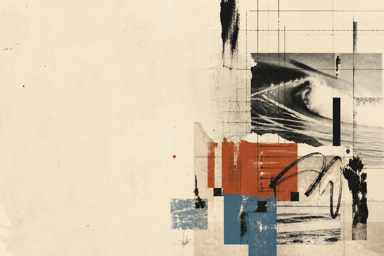
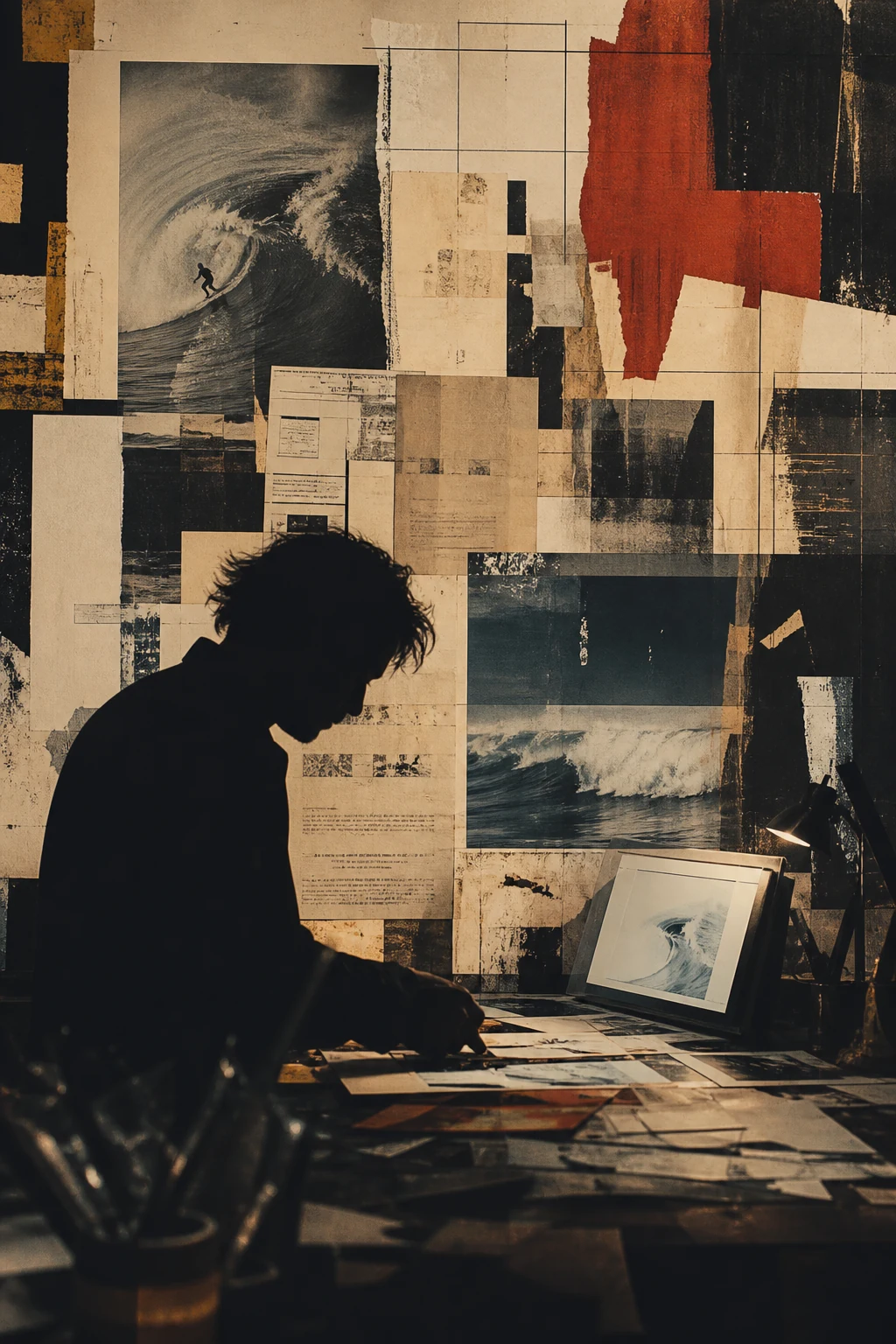
Carson turned the magazine page from a neutral surface into an emotional interface: typography, photography, noise, pause and even difficulty can carry meaning - but only when disruption belongs to the audience and the subject.
Editorial thesis
David Carson matters not as 'the designer who made text unreadable'. His real contribution was to make editorial design a contextual language in which form can carry cultural tone as strongly as words carry facts. He showed that legibility, grid and polish are not absolute values but variables that must be judged against content. [source]
Reader question
Why can Carson's work still feel alive when most of its visible techniques are now available in ordinary software - and why does simply copying a 'grunge style' usually look dated?
Short answer
Because his strongest work is built from judgement rather than effects. Carson adjusts noise, legibility, scale and chance to a specific subject. The surface can be copied; the relationship among content, audience and visual decision is much harder to reproduce.
1. Corpus Christi and the ocean: visual culture before the profession
Carson was born in Corpus Christi, Texas, but the more useful biographical fact is his long relationship with the ocean and surf culture. His own sites and later interviews repeatedly return to water, boards, travel and found visual signals as environments in which his eye developed. 15This is an important starting point: his design did not emerge from a museum or corporate tradition but beside cultures where speed, risk, weather, music and local language change faster than textbooks do.
2. Sociology: reading people before reading layouts
Before working professionally in design, Carson studied sociology. TED still introduces him as a sociologist and surfer turned designer, a detail more useful than the romantic myth of the untrained genius. 15Sociology did not give him a grid or a typographic canon, but it reinforced a habit of reading audiences as social groups. Later Carson would insist that the same visual language cannot work equally well for a surf magazine, a music title, a bank or a technology company.
3. A late entry into design: the outsider as a working position
Carson entered graphic design later than many peers and did not follow a long academic design path. AIGA Eye on Design describes him as self-taught and resolutely grid-free, while Carson himself repeatedly turns his unconventional route into a method: look first, then ask why a rule exists at all. 15The outsider position does not mean a lack of professionalism. It means weaker attachment to professional rituals - useful when a designer needs to notice what trained eyes have stopped seeing because it has become normal.
4. Switzerland: encountering a discipline worth arguing with
Wired noted a productive paradox in 1993: the designer associated with breaking the grid had spent time studying in Switzerland, symbolic home of modernist discipline. 4That tension matters. Carson is not simply unaware of order; he encounters the idea of order and tests when it helps communication and when it becomes a universal template. His anti-grid work is more convincing when seen as an argument with a system rather than ignorance of one.
5. Transworld Skateboarding: action, speed and subcultural rhythm
Work for Transworld Skateboarding became an early environment in which Carson could combine action, photography, subcultural noise and unstable typography. AIGA later cited Transworld alongside Ray Gun when discussing projects that shaped his reputation. 15Skateboarding demands a different page rhythm from a corporate annual report: images carry motion, risk and physicality. Here the later Carson logic becomes clear - a layout does not have to be a neutral frame when the subject itself is not neutral.
6. Surfer: photography and the wave as editorial structure
Wired listed Surfer among the magazines through which Carson was already recognisable by the early 1990s. 4 In surf publishing, a photograph does more than confirm the text: it carries timing, trajectory, weather and scale.Carson uses those properties as editorial structure. A crop can be more aggressive, space longer, a caption almost lost, if that preserves the sensation of movement. The same logic later enters music publishing, where photography and typography behave like two tracks in one composition.
7. Beach Culture: a short-lived magazine as a laboratory of freedom
Beach Culture was short-lived, but for Carson it became a space where a commercial magazine could behave like an authorial laboratory. His own archive emphasises the publication's role in surf culture and connects it to the visual language that followed in Ray Gun. 14Its importance is not that every later Carson device is already present. More important is the proof that continuity between issues can come from shared sensitivity to photography, subject, material and audience rather than a rigid template.
8. The page as an experience, not an information container
The modernist page is often imagined as a clear surface where information is organised for efficient reading. Carson proposes another model: the page can be an event the reader moves through, not a transparent container designed to disappear.Wired captured the effect by describing his magazines as objects that readers tilt, inspect and physically decode. 4 In such a system, friction is not automatically an interface failure; under specific conditions, it can become part of meaning.
9. Ray Gun, 1992: a music magazine becomes a sensory object
Ray Gun launched in 1992 and gave Carson a platform where music, photography and typography could openly conflict. Vogue's 2019 retrospective through the magazine anthology emphasised its difficult visual language and its influence on a generation of art directors. 15For alternative music in the early 1990s, a clean corporate layout could feel culturally false. Carson built pages as if each spread were listening to a particular band: sometimes noisy, sometimes sparse, sometimes barely readable.
10. Content before style: design has to belong to its subject
One of Carson's most useful ideas is that an external style should not be transferred automatically from one job to another. In a 2019 interview he stressed a responsibility to represent the audience and the subject matter rather than repeat a signature look. 15This undercuts the caricature of Carson as the author of one grunge style. His deeper principle is the opposite: if a golf magazine looks like Ray Gun, the designer has probably replaced the problem with a personal signature.
11. Distorted typography: legibility becomes a variable
In Carson's layouts text can stretch, fragment, leave the page, change scale or lose the conventional line of reading. This produced his reputation as the designer who cancelled legibility.A more precise reading is that he made legibility a variable to be managed. 15 A headline can behave like sound, a short phrase like an image, and long text may still require calm reading. The problem is not the broken rule but the absence of a reason for breaking it.
12. Bryan Ferry and Zapf Dingbats: joke, myth and editorial judgement
The most famous Ray Gun anecdote is the Bryan Ferry interview set in Zapf Dingbats. Carson later explained that he found the interview dull; AIGA Eye on Design and Vogue both return to the episode. 15It should not become a universal recipe. The Dingbats page is an editorial gesture, funny and questionable at the same time. It exposes the power of the art director: design can comment on writing, but it can also deny the writer and reader ordinary access to it.
13. Photography as material rather than illustration
Carson often makes his own photographs and treats photography not as a finished rectangle but as material: cropped, blurred, enlarged into grain and collided with type. His archive documents both design and photography for Nine Inch Nails and other music projects. 15The boundary between art direction and image-making begins to dissolve. Photography is not added after a text has been designed; it participates in creating pace, emotional pressure and the physical character of the page.
14. Macintosh and Photoshop: digital tools produce physical-looking noise
Wired noticed the technological paradox early: Macintosh computers, scanners and Photoshop enabled Carson to make work that looked dirty, physical and almost anti-digital. 4This matters in the history of desktop publishing. A computer does not necessarily lead toward perfect geometry. Carson used distortion, scanning artefacts and layered type as new materials. Later he would criticise dependence on software presets: a tool liberates only until designers begin thinking in its menus.
15. Against the grid - but not against structure
Carson is usually described as anti-grid, but his strongest pages are not random chaos. They contain local structure: a dominant image, a direction of movement, scale tension, repetition and visual pauses.That is why his work cannot be reproduced convincingly through a set of effects. The absence of a modular grid is not the absence of decisions. It is a shift from a system fixed in advance to one assembled from the specific material of the page. 15
16. 'Grunge typography': a useful label and a poor explanation
The term 'grunge typography' is useful shorthand: it links Carson quickly to rough textures, distressed type and 1990s culture. But it is too narrow as an explanation of method.AIGA frames his impact more broadly as an expansion of what typography and editorial layout could do. 15 Reduce Carson to dirty fonts and photography, pacing, audience, humour, empty space and the ability to change visual voice all disappear.
17. Emigre 27, 1993: Carson becomes an object of design discourse
In 1993 Emigre devoted an issue to Carson; Emigre 27 is now held in MoMA's collection. 6 The moment matters because a working magazine art director became not only a practitioner but an object of professional discourse.Rebellion entered design history quickly. A visual language that looked local to surf and alternative music culture began to be taught, debated, collected and converted into a new norm.
18. Criticism: when expression begins to overpower content
The central criticism of Carson is legitimate: expression can begin to compete with information. If readers cannot access the text, 'but is it beautiful?' is not enough.His practice is valuable precisely because it makes that conflict visible. 15 It forces a distinction between deliberate friction that intensifies a subject and decorative complexity that merely advertises the presence of the designer.
19. The imitation problem: effect without reason
After Ray Gun, Carson's visual signals became easy to imitate: distressed type, rotations, overlaps, blurred photography and constructed chaos. But when form is copied without editorial reason, a radical language becomes a cliché.Eye on Design notes the breadth of Carson's influence on designers working with zines, music and less strict aesthetics. 15 His legacy is therefore more useful as a question than a style kit: what in this specific content requires this specific disruption?
20. The End of Print, 1995: a book turns practice into a historical argument
The End of Print: The Graphic Design of David Carson appeared in 1995, written by Lewis Blackwell with Carson and introduced by David Byrne; Yale's catalogue records the first edition that year. 7The title sounded like a provocation in the desktop-publishing era, but the book did not literally announce the death of paper. It captured a moment when print no longer had to be the sole carrier of order and could absorb the logic of screens, scanners, music video and digital montage.
21. David Carson Design: from magazine pages to commercial systems
After the magazine period Carson expanded into branding, advertising, music, packaging and digital work. His official client archive lists Nike, Microsoft, MTV, Armani, Levi's, Sony, AT&T and many other organisations. 2This is an important test. An experimental reputation has to function beyond an independent magazine. Carson's better commercial work keeps an emotional voice while adjusting noise, density and legibility to the context.
22. Nine Inch Nails: design and photography merge
For Nine Inch Nails, Carson worked across design and photography. His archive documents design and photography for The Fragile and visual/navigation work around All That Could Have Been. 15This is a useful transition from page to music object and screen menu. The same principle - image and type as one atmosphere - begins operating across packaging, disc, video and interface.
23. Web and interface: experiment meets navigation
One of Carson's early web projects involved MGM; his archive describes a graphic and typographic redesign of the site intended to improve both appeal and functionality. 15The web reveals the limits of editorial freedom. A print spread can make a reader pause; navigation that hides the primary action can simply break a service. Carson's digital work is useful as a boundary case between expressive communication and usability.
24. The Book of Probes: McLuhan and nonlinear reading
The Book of Probes, built around the ideas of Marshall McLuhan, appeared in 2003. Carson's archive describes him as art director and designer of a project in which quotations, photographs and typography form a nonlinear path through the material. 18The connection is logical: McLuhan examined how the medium changes the message, while Carson makes that relationship physical on the page. Readers receive not only an aphorism but its visual resistance, pause, scale and adjacency to images.
25. TED2003: discovery, intuition and found signs
At TED2003 Carson presented Design and discovery. TED frames the talk as a sociologist and surfer turned designer moving through his work, found images and humour. 9His method of attention is especially visible here. An idea can come not from a trend report or moodboard but from a sign, a printing error, torn paper or absurd street typography. Discovery is not a pre-design phase for Carson; it is the continuous practice of looking.
26. AIGA Medal, 2014: rebellion enters the professional canon
In 2014 Carson received an AIGA Medal, one of the major professional honours in American graphic design. TED's announcement of the Centennial Medalists included him among that year's recipients. 11Institutional recognition does not cancel the earlier conflict with rules. It shows how quickly experimental margins can become canon. The useful task is not to turn the canon into hero worship, but to preserve the conditions, arguments and contradictions that made the work matter.
27. Collage, 2019: a return to paper and found fragments
In 2019 Carson published nucollage.001, a substantial collection of recent collage work. AIGA Eye on Design noted his return to found fragments, paper and physical assembly after decades of digital practice. 15This is not nostalgia for pre-digital design. Collage confirms Carson's continuing interest in accidental collisions between materials; only the site of the collision changes - the table, Photoshop or the layout itself.
28. Surfing as method: attention, timing and uncertainty
Surfing is often turned into an attractive biographical metaphor for Carson, but it is more useful as a working discipline. A wave never repeats exactly; decisions are made inside a moving situation.AIGA's film on Carson deliberately connects his design practice with a life organised around surf. 15 The lesson is not romanticism but method: watch longer, react precisely and do not assume every part of the material can be controlled in advance.
29. The digital and AI era: what can be inherited and what cannot be copied
In an era of templates, generative systems and AI, Carson is easy to imitate at the surface level: distressed type, collage, skew and noise. That is exactly why copying him now is especially pointless.What can be inherited is contextual judgement, willingness to interrupt defaults, attention to found material and the ability to separate a live disruption from an automatic effect. 15 AI can generate a Carson-like texture quickly; it cannot decide why this audience needs this particular friction.
30. The central legacy: communication can carry feeling as well as information
David Carson's central legacy is not permission to make text unreadable. He expanded the idea that graphic design can communicate not only information but timbre, tension, speed, irony and cultural belonging.His strongest lesson is paradoxical: to break rules convincingly, designers must pay more attention to content, not less. 10 Design becomes language when form is not applied from above but grows from what the audience needs to feel and understand.