analysis
The Screen That Answers Back
How the cursor, touch, design systems and AI turned the image into action
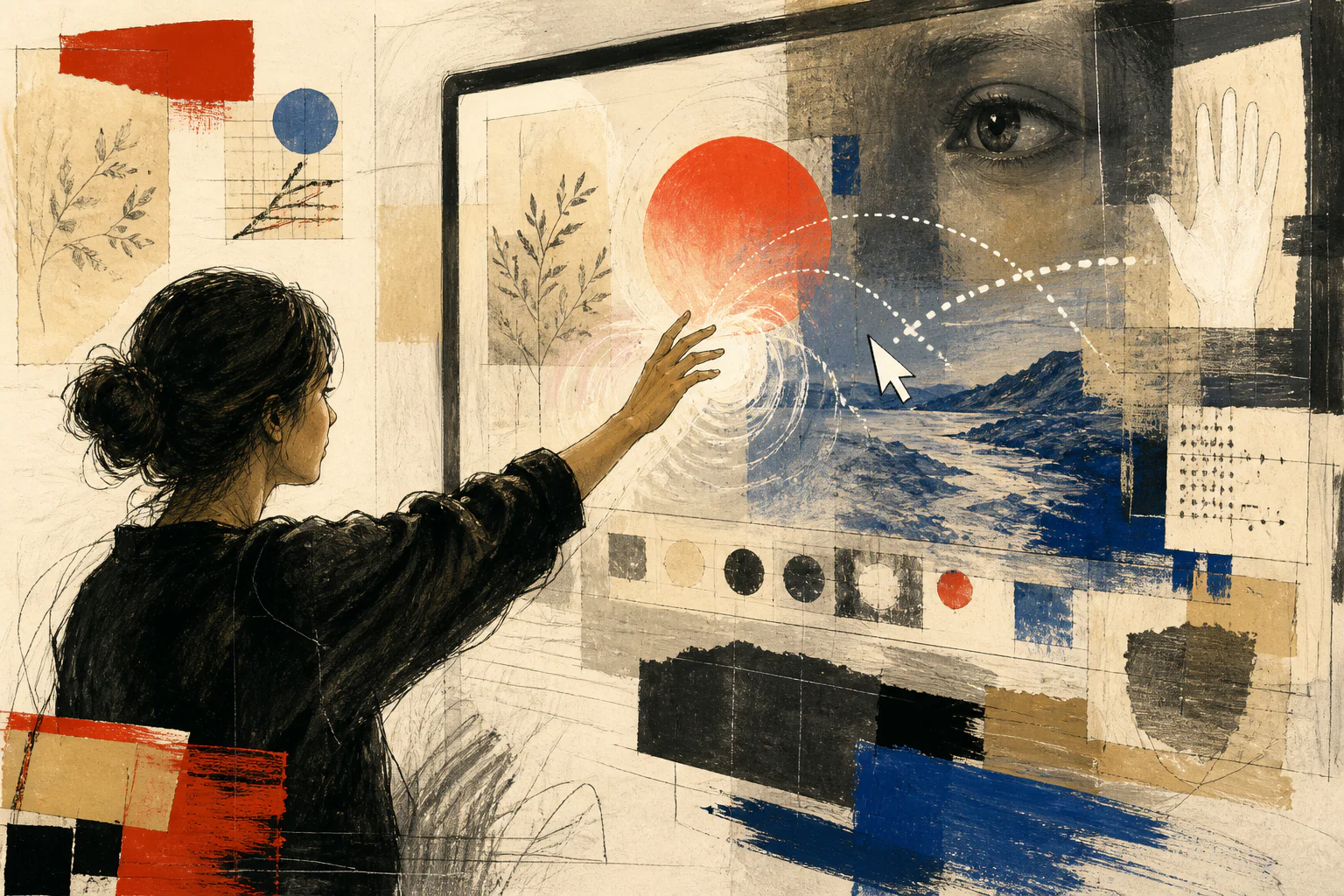
A poster waits for a gaze. An interface waits for a decision — and has to show that it heard the user.
Editorial question
When did the image stop waiting for our gaze and begin to answer it — and why did that change the designer’s job?
Short answer
The answer begins with a simple gesture. In 1968 Doug Engelbart demonstrated a screen where the cursor, windows, hypertext and collaborative work made the image a working environment; Xerox Alto turned graphical space into an everyday model of computing; the Web turned the link into a way of moving through knowledge; iPhone connected the screen directly to the fingers; design systems turned behaviour into a scalable platform language. 2 4 6 8
Since then, a good interface is recognised less by how impressive it looks in a static mock-up than by how clearly it explains action, state, error and the next step. It is an image that answers — and for that reason it is simultaneously graphics, tool, script and ethical contract.
Thesis
Interface changed visual culture not because it added buttons and menus to graphic design. Its radical shift is that the image stopped being only a composition and became a sequence of states, actions and responses. A user no longer only sees form; they test it through behaviour.
An interface therefore cannot be judged like a poster. The same screen exists while loading, failing, focusing, selecting, confirming, cancelling, sitting empty and recovering. Design becomes not an image of a result but a system of promises: what happens if I click, swipe, type, look, ask or change my mind.
A poster waits for a gaze. An interface waits for a decision — and has to show that it heard the user.
Evidence and cases
The button is pressed and the screen stays silent
Imagine the most beautiful app screen: perfect grid, precise typography, correct colour, impeccable icons. Now press the primary button — and nothing happens. In that instant the beauty becomes irrelevant. The user cannot tell whether the click was accepted, the system is loading, an error occurred or the action is impossible.
That small failure reveals the essential difference between an interface and static graphics. A poster may remain silent. An interface has to answer. Its form is tested not only by the eye but across time: before an action, during it and after it.
Screen design therefore begins not with the button as an object but with a promise of behaviour. If form invites action, it must explain that the system heard the user and what happens next. This is where the image becomes a relationship.
Interface turns an image into a contract of behaviour
An interface has no single final frame. It has states: default, active, disabled, selected, loading, error, empty and confirmed. What could once be one composition in graphic design becomes a network of variants.
This changes the designer’s role. They design not only text placement and surface colour but causality: what triggers change, how long it lasts, whether an action can be undone, what happens on error, how the system behaves on another screen and what a person experiences without a mouse or without colour perception.
Interface is therefore closer to directing than it first appears. It manages a sequence of attention and action. The difference is that the user acts inside the scene, while the system must answer predictably.
Engelbart: the cursor makes the screen addressable
Doug Engelbart’s 1968 demonstration is often reduced to the story of the computer mouse. Its scope was broader: mouse, cursor, windows, hypertext, collaborative editing and video communication appeared as parts of one working environment. The screen ceased to be only an output surface and became a space in which one could point, move, change and collaborate. 2
The cursor is crucial here. It joins eye, hand and computation. Before the cursor the screen could be read; with the cursor it could be addressed. A point on the screen became a place of action.
This is one of the fundamental visual shifts of the twentieth century: the image gains a coordinate, and the coordinate gains a command. From that moment composition must account not only for what can be seen but for what can be selected.
Xerox Alto: the desktop becomes a visual model
Xerox Alto in the 1970s made the graphical working environment a laboratory reality: windows, documents, pointer, text work and network functions coexisted on one screen. The Computer History Museum presents Alto as a formative platform for personal graphical computing rather than a mass-market consumer product. 4
The central idea is not the icons themselves. Folder, window, document and desktop translate invisible computational structure into spatial relationships. The user understands the system through metaphor: things can be opened, moved, closed, stored and recovered.
Interface thus becomes a translator. Its job is not to show the computer literally but to propose a visual model in which complexity becomes manageable.
The Web: the key image is the path between images
The World Wide Web added another form of behaviour to the screen: transition. CERN links the birth of the Web to a system of documents and hyperlinks, while the early WorldWideWeb browser functioned as both reader and editor. 6
This is a major cultural shift. A page no longer has to be a final composition. Part of its meaning lies in where it leads: link, address, history, tab, return, external source. The user does not only read the page; they construct a route.
In a printed magazine the designer controls page sequence. On the Web sequence becomes partly user-authored. A good interface has to offer freedom of movement without losing orientation.
iPhone: the screen becomes bodily
In 2007 Apple introduced iPhone around a multi-touch interface in which interaction happened directly through the screen. Touch, scrolling, pinch-to-zoom and the software keyboard made the surface not only a display but a site of physical gesture. 8
After that, visual form became even more dependent on the body. Target size, spacing, scrolling inertia, accidental taps, thumb position and feedback stopped being technical details and entered the composition.
The screen became a strange object: flat yet behaving like space, lacking physical buttons yet needing to convince the fingers that action is possible. Interface became a tactile illusion sustained by very precise visual and behavioural discipline.
Design systems: behaviour has to scale
Material Design, Fluent and Human Interface Guidelines mark the next stage: an interface becomes too large to design every screen as an isolated picture. A platform needs repeatable components, states, motion rules, hierarchies and patterns that work across thousands of situations and many teams. [source] [source] 9
In this sense a design system is closer to grammar than to a library of ready-made buttons. It defines not only how an element looks, but the conditions of its behaviour: when it is active, how it reports error, how it responds to focus, how it behaves under text scaling and how it preserves meaning in another environment.
The larger the system, the less a designer can rely on the intuition of one beautiful screen. They must design rules that survive beyond their own mock-up.
Accessibility: an interface is tested by the ability to act
WCAG 2.2 formalises what visual culture could once treat as secondary: contrast, keyboard focus, structure, understandable errors, labels and multiple ways to interact are part of digital content quality, not an optional extra. 15
This changes the criterion for good design. If an element is beautiful but cannot be perceived, reached by keyboard, understood through text or recovered after an error, it is unfinished as an interface.
Interpretation
Interface makes the power of design unusually visible: it can reveal an action or hide it, explain an error or blame the user, offer a real choice or visually push toward the system’s preferred outcome. Accessibility and the rejection of manipulative patterns are therefore not external morality placed on design; they test how honestly the visual contract itself is constructed.
Spatial and AI interfaces: the button stops being the centre
In visionOS the interface is no longer confined to a flat rectangle: depth, distance, gaze, gesture and spatial placement become meaningful. Research on gaze-and-pinch interaction likewise shows that combining looking and gesture raises new questions of selection, precision and feedback. [source] 19
AI interfaces shift the centre again. A user may not search for a command in a menu but describe an intention in natural language. Free-form input does not remove interface; it raises its responsibility. The system must show what it understood, what information it used, where it is uncertain, what can be changed and how the result can be checked. [source]
In both cases the disappearance of the familiar button does not mean the disappearance of design. On the contrary: as control becomes less visible, guidance, state, feedback and the ability to regain control become more important.
The screen that answers back
Over half a century the screen has moved from an output surface to an environment that continually changes state in response to a person. The cursor made the image addressable. The graphical desktop gave computing a spatial model. The Web turned the screen into a route. Multi-touch made it bodily. Design systems turned behaviour into infrastructure. Spatial and AI interfaces again blur the familiar form of control.
But the central question remains the same as with the silent button at the beginning: does the person understand what happens between their intention and the system’s response?
A good interface does not perform the power of technology. It makes that power legible. It shows state, leaves a route back, does not hide consequences and does not force the user to guess the rules. The screen has become an image that answers. Design now answers with it. 14
Visual analysis
The article's visual logic can be tested through «The button is pressed and the screen stays silent», «Interface turns an image into a contract of behaviour», «Engelbart: the cursor makes the screen addressable», «Xerox Alto: the desktop becomes a visual model», «The Web: the key image is the path between images», «iPhone: the screen becomes bodily». Compare these signs within one object or sequence rather than judging them as an isolated style.
Practical implication
Practical use begins by testing the thesis against a specific object, frame, or production decision. For this subject, the working criterion is: How the cursor, touch, design systems and AI turned the image into action
Limitations
“The Screen That Answers Back” is limited to its stated subject: how the cursor, touch, design systems and ai turned the image into action. The analysis does not replace examination of a specific original, project, or production context.
Sources
The open sources for “The Screen That Answers Back” are listed in the page panel and define the boundary of its verifiable facts.