analysis
Why design does not translate: how different schools teach different ways of thinking
American, Soviet, Bauhaus, Swiss, Polish, Japanese, Italian, Scandinavian and Dutch design differ not only in form. They answer the basic question of design in different ways: why should design exist at all?
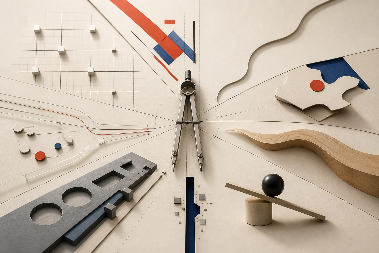
Design cannot be translated from one school to another by copying surface features. A grid, color, typeface, composition or object can be imitated. What is harder to transfer is the deeper operating system: the first question, the professional conscience and the attitude toward user, market, state, material, emptiness, function and authorship.
Editorial question
Why does a designer trained in one visual culture often struggle to produce convincing design in another — for example American design, when their own reflexes are closer to Soviet, European, Japanese or Swiss thinking?
Short answer
Because design is not only a style. It is a way of framing a problem. The American school often thinks through the user, market, clarity and the promise of a better working life. The Soviet-Constructivist line thinks through mobilized attention, social idea and visual energy. Bauhaus thinks through material, craft and industry. Swiss design thinks through informational clarity. The Polish poster school thinks through metaphor. Japanese design thinks through pause, emptiness and the trace of time. Italian design thinks through the character of the object. Scandinavian design thinks through calm usefulness. Dutch design thinks through conceptual reversal.
Thesis
Design cannot be translated from one school to another by copying surface features. A grid, color, typeface, composition or object can be imitated. What is harder to transfer is the deeper operating system: the first question, the professional conscience and the attitude toward user, market, state, material, emptiness, function and authorship.
Evidence and cases
Why this essay matters to VANSMITHLAB
This essay functions as a connective analytical node for VANSMITHLAB: between design history, photography, fashion, architecture, objects, graphic design and technology. It explains not a single style, but a deeper mechanism: design schools form different ways of thinking.
When we say American design, Japanese design, Swiss design or Soviet Constructivism, we often see only the surface: grids, posters, furniture, packaging, colors and typography. Behind that surface lies a question: what does each school believe design is supposed to do?
One school designs clarity. Another designs desire. A third designs social energy. A fourth designs silence. A fifth designs metaphor. A sixth designs character. A seventh designs everyday dignity. That is why design does not translate directly.
Interpretation
This typology is a VANSMITHLAB editorial model, not a claim about national essence; it compares historically formed professional questions.
The problem: why style can be copied but thinking cannot
It seems that any style can be repeated. Open the references, copy the palette, typeface, grid, composition, proportions and amount of air — and the result will look similar. Sometimes it works on the surface. One can make something look like a Swiss poster, Japanese packaging, an American landing page, Soviet avant-garde or an Italian interior.
But the copy often remains dead. It resembles a style but not a way of thinking. It repeats signs without understanding causes. It borrows form without borrowing the inner question.
A designer may use a large headline, a clean photograph and generous white space, but the result will not feel American if there is no clear promise to the user. A modular grid and Helvetica-like type do not make Swiss design if the message has not become more honest and legible.
Not “national character” but professional optics
It is important to avoid a crude simplification. This essay is not about a Russian mind, American mind or Japanese mind as a biological or national essence. That would be inaccurate and reductive.
The subject is different: how design optics are shaped by school, market, state, industry, museum, production model, visual environment, education, client and professional myth.
A designer from one culture can work powerfully in another. But this requires more than changing visual techniques. It requires changing the first question that appears when the brief arrives.
Bauhaus: design as an educational system for a new life
Bauhaus is often reduced to visual markers: white walls, simple geometry, tubular steel, strict typography and functionality. But Bauhaus matters less as a style than as an educational machine that tried to recombine art, craft, architecture, material and industry.
MoMA describes Bauhaus as a school of art and design founded by Walter Gropius in Germany in 1919 and shut down by the Nazis in 1933. In its exhibition framing, MoMA emphasizes Bauhaus as a conversation among artists, architects and designers about the nature of art in the age of technology, with output ranging across industrial design, furniture, architecture, graphics, photography, textiles, ceramics and theater.
The key Bauhaus question is: how can art, craft, material and industry become a new grammar of life? It was not a school of decoration. It retrained the eye and the hand through material, construction, form, surface, function and production. 1 2 3
The Soviet-Russian line: design as organized energy
The Soviet-Russian design line is especially powerful when form must become action rather than decoration. It runs through the avant-garde, Constructivism, VKhUTEMAS, posters, books, photomontage, production art, agitational graphics, theater and architectural experiment.
MoMA defines Constructivism as a movement developed by the Russian avant-garde around the October Revolution of 1917; artists led by Aleksandr Rodchenko aimed to strip works of subjective emotional character and eventually rejected painting as an individualist bourgeois form. MoMA also notes Rodchenko’s teaching at VKhUTEMAS, where construction, metalwork, spatial constructions and photography helped move art toward industrial production and public education.
The central question of this line is: how does form organize attention, action and social energy? This is not the design of a friendly surface. It is the design of command, signal, construction and mobilization. 4 5
The American school: design as the promise of a working life
American design is strongly connected with market, mass production, advertising, packaging, appliances, automobiles, interfaces, corporate identity and the consumer scenario. This does not make it shallow. It means that it learned early to think through scale and the user.
Smithsonian writes that streamlined objects of 1930s American design used horizontal lines and rounded forms to suggest speed and efficiency, projecting images of progress and affluence. After the Second World War, manufacturers again turned to industrial designers to shape mass-produced goods for the American consumer.
The central American question is: how will people understand, desire, buy and use this? American design knows how to turn an object into a promise: a car promises freedom, a refrigerator a modern home, packaging trust, an interface effortless control, a brand belonging, advertising a better life. 6 7
The Swiss school: design as the honesty of information
Swiss design is often associated with grids, Helvetica, asymmetry, black text, white space and strict posters. But if we keep only that appearance, we lose the core: Swiss design is an ethics of information.
Cooper Hewitt describes Swiss Style, or International Typographic Style, as a movement that originated in Switzerland in the 1940s and 1950s, with typography — especially sans-serif typefaces — as an essential design element. Cooper Union frames Swiss Style as a simple visual language for international trade and communication.
The central Swiss question is: what should be removed so that the information becomes clearer? The grid is not an ornament. It prevents the designer’s ego from damaging the message. 8 9
The Polish poster school: design as metaphor under pressure
The Polish poster school shows that design can be public, authorial, artistic and psychologically sharp at once. Its strength lies not in beautiful illustration alone but in metaphor that replaces long explanation.
Staatliche Museen zu Berlin describes the Polish School of Poster Art 1950–1970 as a phenomenon of extraordinary creative power and conceptual variety. The Poster Museum at Wilanów presents the Polish poster as social and cultural history, with the Polish School of Posters as an artistic phenomenon.
The central Polish question is: what image will remain in memory after a single glance? The Polish poster often does not retell a film, play or exhibition. It creates an image that acts like a psychological splinter. 10 11
The Japanese school: design as pause, emptiness and the trace of time
Japanese design is often described as minimalism, but the word is too poor. The Japanese school does not merely remove excess. It makes emptiness an active part of form.
ADI Design Museum links Japanese simplicity with ku, emptiness; ma, space or silence; wabi, modesty or poverty; sabi, consumption linked to use over time; and also with asymmetry, non-definition and imperfection. The Issey Miyake Foundation frames the same project through emptiness, space, wabi and sabi as cultural foundations of Japanese design.
The central Japanese question is: what can remain unsaid so that the object becomes deeper? In Japanese design, empty space is not absence. It holds the breath of the form. 12 13
The Italian school: design as the character of the object
The Italian school rarely accepts that an object should merely function. It wants character. Even a functional object often receives gesture, temperament, irony, theatricality or intellectual provocation.
Design Museum describes Ettore Sottsass as a key figure in late 20th-century Italian design. Vitra Design Museum writes that Memphis emerged in 1980/81 around Sottsass as a group of young designers seeking to break from the dogmas of functionalism and industrial design. Alessi shows how everyday objects can be uniquely reinterpreted by creative minds.
The central Italian question is: where does function become character? Italian design can turn a kettle, lamp, cabinet, typewriter, chair or showroom into a character. 14 15 16
The Scandinavian school: design as calm social usefulness
Scandinavian design is often marketed through light wood, white walls, lamps, textiles and warmth. But behind that softness lies a more serious system: everyday life, durability, function, craft, democratic usefulness and calm humanity.
Designmuseum Denmark describes itself as a working archive and gateway to Danish design culture. Denmark.dk emphasizes that Danish design became known through furniture, lamps, silver, glass and textiles, and that architects often designed not only buildings but also furniture, textiles and cutlery inside them.
The central Scandinavian question is: how can everyday life become calmer, simpler and more dignified? The object should not defeat the person. It should live beside them for a long time. 17 18
The Dutch school: design as conceptual experiment
The Dutch line runs from De Stijl to later forms of Dutch Design, where abstraction, concept, irony, structure, experiment and the willingness to question the task itself become important.
MoMA defines De Stijl as an abstraction pioneered by the Dutch journal De Stijl, founded in 1917 by Theo van Doesburg. In its description of Gerrit Rietveld’s Red Blue Chair, MoMA notes that the red, yellow, blue and black color scheme closely associated with De Stijl was applied around 1923.
The central Dutch question is: what if the brief itself is wrong? Dutch design often does not smooth over the problem. It shows the problem. It is design thinking out loud. 19 20
Why a designer from one school does not automatically produce another
A designer can copy signs, but they do not instantly change their professional reflex. A designer trained in Constructivist energy may consider American simplicity too commercial. A designer trained in Swiss clarity may see Polish metaphor as too subjective. A designer trained in Japanese pause may experience American directness as noise.
Each school considers obvious what another school may find strange. The American school says: explain quickly. The Swiss school says: clean the message. The Polish school says: leave an image in memory. The Japanese school says: do not say everything. The Constructivist line says: organize the energy of action. The Italian school says: give the thing character. The Scandinavian school says: make everyday life dignified. The Dutch school says: question the brief.
Switching between schools is therefore not a change of decoration. It is a change of the first question.
Comparative table: what question each school asks
The table below is not a ranking of schools and not an attempt to reduce culture to national style. It is a working map of professional questions. It helps designers understand what logic they are using and why another design tradition may seem too simple, too cold, too noisy or too strange.
How this appears in photography, fashion, interiors and identity
These schools matter beyond graphic design. They help us read photography, fashion, interiors, objects and visual campaigns. In photography, the American logic makes the frame clear and desirable; the viewer quickly understands the promised life. The Japanese logic leaves space and pause. The Polish logic seeks metaphorical impact. The Swiss logic organizes the frame as information. The Soviet-Constructivist logic uses diagonal movement, montage and compositional force.
In fashion, the American school turns clothing into lifestyle. The Italian school turns it into character, stage and gesture. The Japanese school turns it into pause, asymmetry, emptiness and material. The Scandinavian school turns it into calm everyday durability. The Constructivist line can make silhouette feel like discipline or motion.
In identity, American logic promises, Swiss logic explains, Polish logic becomes memorable, Japanese logic leaves things unsaid, Italian logic plays, Dutch logic argues and Constructivist logic mobilizes.
Main conclusion: strong designers know what mind they are using
Design does not translate directly because behind every style stands not a set of visual techniques but an ethics of the task.
The American school teaches designers to promise, simplify, scale and guide the user. The Soviet-Constructivist line teaches them to gather attention, energy and social gesture. Bauhaus teaches them to begin with material, craft, function and production. The Swiss school teaches informational clarity. The Polish school turns a message into an image-memory. The Japanese school hears emptiness, time and implication. The Italian school gives function character. The Scandinavian school makes everyday life more humane. The Dutch school doubts the framing of the task itself.
A strong designer today is not simply someone who can do everything. A strong designer knows what mind they are using. A school is not a prison; it is a professional setting. The best contemporary designer switches not between styles but between questions.
Visual analysis
The article's visual logic can be tested through «Why this essay matters to VANSMITHLAB», «The problem: why style can be copied but thinking cannot», «Not “national character” but professional optics», «Bauhaus: design as an educational system for a new life», «The Soviet-Russian line: design as organized energy», «The American school: design as the promise of a working life». Compare these signs within one object or sequence rather than judging them as an isolated style.
Practical implication
Practical use begins by testing the thesis against a specific object, frame, or production decision. For this subject, the working criterion is: American, Soviet, Bauhaus, Swiss, Polish, Japanese, Italian, Scandinavian and Dutch design differ not only in form. They answer the basic question of design in different ways: why should design exist at all?
Limitations
“Why design does not translate: how different schools teach different ways of thinking” is limited to its stated subject: american, soviet, bauhaus, swiss, polish, japanese, italian, scandinavian and dutch design differ not only in form. they answer the basic question of design in different ways: why should design exist at all. The analysis does not replace examination of a specific original, project, or production context.
Sources
The open sources for “Why design does not translate: how different schools teach different ways of thinking” are listed in the page panel and define the boundary of its verifiable facts.