analysis
Why Games Taught Us to Read the Screen Faster Than Cinema
HUDs, maps, inventory and feedback as a new kind of visual literacy
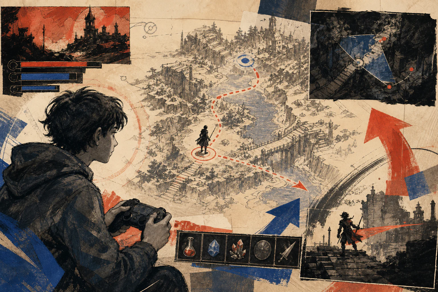
Cinema taught us to follow the frame. Games required us to see the world, read data and make a decision at the same time—sometimes before we can even name what we noticed.
Editorial question
Why can a player track space, health, ammunition, map, prompt and objective at the same time—and how did that habit change what we consider a normal screen?
Short answer
Because a game turns the image into a feedback system. In DOOM, the status bar makes health, armour, ammunition and keys a separate channel of perception; in Pong, the rule is almost entirely readable from the geometry of the screen; in Dead Space, part of the interface moves into the game world itself. The player learns not to inspect these elements one by one, but to assemble them into one state: where am I, what is happening to me, what changed and what should I do next? 6
This literacy is built through repetition. Colour, position, icon, sound and short animation acquire stable meanings. Over time, the player stops translating the sign into words and begins to react to it as part of the action.
Thesis
Video games changed visual culture not because they added health bars, maps and crosshairs to images. Their deeper effect was to train viewers to read several visual layers at once and immediately turn what they read into action. World, status, objective, resource, danger and system response occupy the same field of attention.
For that reason, “faster than cinema” is not a laboratory claim about human visual processing speed. It is an editorial formula for a mode of perception: a film can continue even if a detail is missed; a game often requires a signal to be understood in time because the next second already depends on the player’s decision.
Cinema taught us to follow the frame. Games required us to see the world, read data and make a decision at the same time—sometimes before we can even name what we noticed.
Evidence and cases
DOOM: the eye stays in the corridor while reading a second screen
In 1993’s DOOM, the main scene occupies the centre, but the status bar below continuously carries health, armour, ammunition, keys and the character face, turning the player’s invisible state into graphics. The world demands forward vision while the interface simultaneously demands survival monitoring. 5
The interesting part is not the quantity of numbers but the distribution of attention. The player does not have to stop and read “health 23” every time. A dangerous state can be registered peripherally, linked to a red flash, sound, facial reaction or ammunition shortage, and immediately change behaviour. The screen works as two images at once: a field of action and an instrument panel of state.
This is where a key gaming habit emerges: important visual meaning does not have to sit in the centre of the frame. Cinema also uses peripheral detail, montage and visual clues, but games add a cost to the missed signal—an error, lost resource or defeat.
Players do not simply read more—they read under pressure to act
A game screen is not a poster with extra information. It lives in a loop: intention → action → system response → new decision. Button, cursor, crosshair, meter, hit flash, vibration and sound form one short chain. 9
Good game graphics therefore value not only beauty and not only legibility, but time to understanding. A signal must appear where and when it is needed: a warning before the mistake, confirmation after the action, a goal before direction is lost. The interface becomes a form of editing that occurs not between shots, but between states of the system.
This is the difference from passive viewing, but not a claim that games are superior to cinema. Games simply added an obligation to respond to visual perception. The viewer becomes the operator of their own attention.
Spacewar! and Pong: the rule becomes visible
Early games show especially clearly that interface does not begin with menus. In Spacewar!, ship trajectory, distance, collision and the screen space itself are both image and model of action. The Computer History Museum preserves the PDP-1 and Spacewar! as a major episode in early interactive computing culture. 2
Pong pushes the idea toward abstraction: two paddles, a ball, boundaries and score. The Strong and ACMI document Pong as a key early commercial game object. Its visual power lies in the fact that the rule can be understood with almost no text: form shows what can be done. [source]
For design, this is a fundamental lesson. The less time a person has for interpretation, the more important it is for form and action to coincide. A strong interface does not explain every rule separately—it makes the rule visible in the behaviour of elements.
The HUD turns an invisible body into data
The player often cannot see their own body, especially in a first-person shooter. The HUD compensates for that loss: health becomes a number or bar, armour a resource, ammunition a constraint, direction an arrow and objective a marker. The interface literally constructs a body from data. 5
But data works only when it becomes sensation. Critical health may be accompanied by colour, pulsing, sound, screen shake or a change in tempo. Graphic design meets sound design and animation here: information must not only be correct, it must be felt.
The game therefore teaches us to read state not as a spreadsheet but as an atmosphere of risk. A number becomes a bodily signal—which is why an experienced player can register the problem before naming it in words.
Map and inventory teach us to switch scale
A map does something strange: it asks the player to believe in the world and see it as a diagram at the same time. The player moves through a room, street or landscape, but can at any moment compress space into route, marker, elevation, objective or risk area. This is more than navigation; it is practice in moving between image and model. 9
Inventory does the same to objects. A weapon, key, medkit or resource stops being only an object in the world and becomes a system of choice: what to take, what to leave, what to upgrade, what to use now. The player continually switches between the visual scene and its abstract economy.
That is why a game screen can comfortably hold several scales at once. The world may be cinematic, the map schematic, the inventory almost tabular and the prompt typographic. For the player, these are not four separate media but four reading modes of one situation.
Dead Space: when the interface stops being a frame
Dead Space became a well-known example of diegetic interface: important indicators and messages move from the external frame of the screen onto the suit, weapons, holographic panels and objects inside the space. Game Developer and GDC materials discuss this approach as part of immersive interface design. 17
The interface does not disappear—it changes address. Health still has to be read, but now it belongs to the character’s body. Menus still exist, but appear as objects of the world. The player continues to receive data while the presentation supports the illusion of space.
This is an important counterargument to the idea that a good interface should be invisible. It should be appropriate. Sometimes a clear external panel is more honest and faster; sometimes in-world graphics strengthen the world. Quality depends not on the amount of decorative effect, but on the fit between information, context and action.
More information does not mean better reading
Game interfaces live with a permanent conflict: the more data shown, the greater the control, but the easier it is to turn the screen into an instrument panel that competes with the world itself. Minimap, quest log, markers, prompts, chat, score and notifications can help and destroy attention at the same time.
A minimal HUD is therefore not an automatic virtue. If the interface is hidden, the world must do its job through light, architecture, sound, enemy behaviour and direction of movement. Conversely, a dense interface can be excellent when the game genuinely requires the comparison of resources and states.
Interpretation
Games did not teach us to love more information. They taught us to trust information that appears in the right place at the right time. Visual speed comes not from a crowded screen but from a stable grammar: the same signal should mean the same kind of action.
Accessibility: speed of reading must not become a barrier
If an interface assumes perfect vision, hearing, motor precision or reading speed, its “speed” becomes a form of exclusion. Xbox guidelines address text size and legibility, UI navigation and accessibility feature labelling; Game Accessibility Guidelines likewise connect subtitles, contrast, controls and information clarity to the practical ability to play. 14
This matters especially in games because information often appears during motion and danger. A subtitle may compete with a map, a warning with a crosshair, a menu with a timer. An accessible interface does more than enlarge type: it manages priority, duration, repetition and alternative channels of signalling.
Accessibility therefore becomes not a separate “minority setting,” but a strong model of screen design in general. When a state can be understood through text, colour, form, sound and sequence, the system becomes more robust for everyone.
Game literacy leaves the game
Across decades, games normalized a screen in which a world and data about that world coexist. Users became accustomed to looking at the centre while reading the periphery, switching between map and space, distinguishing active from unavailable, treating a notification as a change of state rather than a decorative label.
This does not mean that modern apps, broadcasts or films simply “copy games.” Similar visual logic developed in aviation, instrument panels, television and software interfaces. But games made it mass, emotional and everyday: millions of people spent hours linking signs to actions and checking consequences almost immediately.
This is where the phrase “games taught us to read the screen faster than cinema” becomes useful. It describes not a contest between media, but a new expectation of the viewer: a screen can simultaneously be image, map, instrument, menu, message and control system.
A screen that must be understood in time, not merely watched
Cinema formed an enormous culture of framing, montage and visual narrative. Games added another dimension: the need to read the state of an image within the time of one’s own action. In a strong game interface, vision becomes part of control.
The legacy of the HUD is therefore not the health bar or the minimap. It is the habit of seeing a screen as a system of related signals. We learn to notice the periphery, distinguish priorities, change scale, trust repeated codes and demand feedback.
A game begins where an image stops being only something to look at. It becomes something that must be understood in time—because the next second already depends on how we read it. 18
Visual analysis
The article's visual logic can be tested through «DOOM: the eye stays in the corridor while reading a second screen», «Players do not simply read more—they read under pressure to act», «Spacewar! and Pong: the rule becomes visible», «The HUD turns an invisible body into data», «Map and inventory teach us to switch scale», «Dead Space: when the interface stops being a frame». Compare these signs within one object or sequence rather than judging them as an isolated style.
Practical implication
Practical use begins by testing the thesis against a specific object, frame, or production decision. For this subject, the working criterion is: HUDs, maps, inventory and feedback as a new kind of visual literacy
Limitations
“Why Games Taught Us to Read the Screen Faster Than Cinema” is limited to its stated subject: huds, maps, inventory and feedback as a new kind of visual literacy. The analysis does not replace examination of a specific original, project, or production context.
Sources
The open sources for “Why Games Taught Us to Read the Screen Faster Than Cinema” are listed in the page panel and define the boundary of its verifiable facts.