analysis
Why Opening Titles Can Matter More Than the First Scene
Saul Bass, Kyle Cooper and Skip Intro — how the opening sequence teaches the viewer to watch
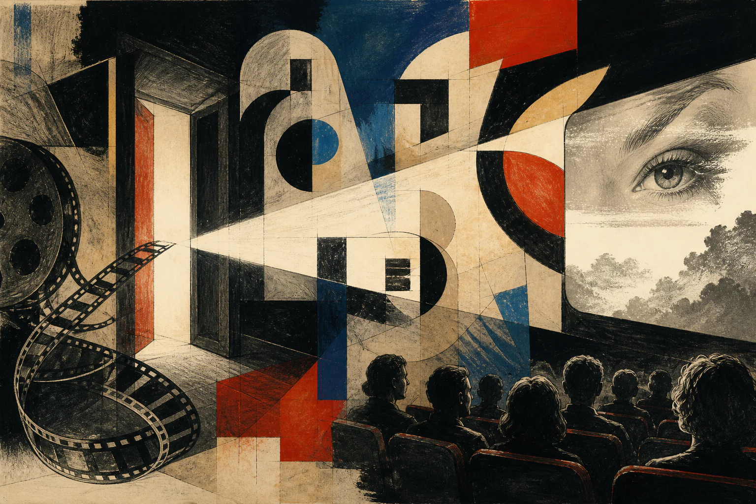
The plot has not started yet, but the film has already tuned our attention through rhythm, letters, sound and expectation.
Editorial question
Why can the part of a film that can be skipped with one click sometimes shape our perception more strongly than the first narrative scene?
Short answer
Because titles operate in a rare zone: the film has begun, but plot has not yet occupied all attention. In that interval graphic design can control expectation directly through motion, typography, music, pause, abstraction and repetition.
Bass showed that a symbol can become dramaturgy; Ferro that a letter can have a voice; Binder that an opening can become a franchise ritual; Cooper that titles can introduce a character’s mind before the face. Streaming added a new conflict: the viewer can now decide whether this threshold still belongs to the work. 16
Thesis
Strong titles do not announce that a film is beginning. They teach the viewer in advance how the film should be watched: at what tempo to read the image, what to fear, where to look for irony, what rhythm to accept as normal and what visual code to remember.
That is why title design becomes especially interesting now, when the interface can turn it into an optional part of viewing. The conflict between an authored threshold and the Skip Intro button shows that the beginning of a film is now designed not only by director and designer, but also by platform and viewer.
The plot has not started yet, but the film has already tuned our attention through rhythm, letters, sound and expectation.
Evidence and cases
The essential event can happen before the plot
In Psycho, the first act of violence happens before the film shows a knife. Long bars cut across a black screen, break the names apart, reassemble the letters and disappear. Saul Bass does not tell us what will happen to Marion Crane. He does something more useful: he makes the viewer feel fracture, nervous rhythm and the violation of a whole before the narrative begins. 2
This is why titles cannot be treated as a neutral frame around a film. In a strong sequence, an actor’s name, a line, a sound and a pause already function as dramaturgy. We still know nothing about the motel, the mother, the money or the murder, but a way of watching has already been established.
That leads to the central question of this analysis: why can the part of the image that a streaming interface now lets us skip with one click sometimes shape our understanding of a film more powerfully than its first narrative scene?
Titles teach us how to watch
Ordinary opening credits solve a practical problem: they name the makers of a film and register authorship. But once graphic design enters time, service text becomes an attention system. Criterion describes opening and closing credits as an obligatory part of film whose aesthetic potential Saul Bass pushed into an independent field of visual work. 3
Such a system has several levers. Typography establishes character: severe, nervous, luxurious, childish or documentary. Editing sets the speed of reading. Music determines whether a name arrives like a hit, a whisper, an expectation or a threat. The space around the letters tells the viewer where they are: in front of a screen, inside architecture, inside a character’s mind or inside an abstract graphic field.
Good titles therefore do not announce that a film is beginning. They teach the viewer in advance how the film should be watched. That is their hidden power: they organise a state of attention before the narrative begins asking us to understand it.
When a name stopped being a label
The history of titles can easily become a long chronology, but for analysis one turn matters more. Before the mid-twentieth century screen credits could already be expressive, yet in the mainstream studio system they often remained primarily a list of names. Bass helped radically expand that function: campaign symbol, poster, typography and motion began to operate as one concept. The BFI links this turn to his work of the 1950s and 1960s, while the Academy preserves original artwork, storyboards and production material in the Saul Bass Collection. 4
The point is not that one designer “invented” film titles. The point is that Bass demonstrated that the minutes before a narrative can be designed with the same precision as a poster or a brand identity, except that time becomes the primary material.
Graphic design stopped hanging in front of the movie like a signboard. It entered editing and began to do the work of a prologue: not retelling the story, but creating the climate in which the story would be read.
Bass: the symbol acquires time
In Vertigo, Bass builds the entrance to the film around an eye, a face and a spiral. The BFI notes his collaboration with pioneering computer animator John Whitney; the Academy separately records Whitney’s use of a mechanical computing system to make Bass’s graphics move. 5 This is the crucial shift: a sign is no longer only a form, it acquires duration.
Consider the difference between a poster and a title sequence. A poster can show a spiral all at once. Film makes us wait as it appears, turns, multiplies and pulls the gaze inward. Meaning is produced not only by form but by tempo and repetition. Psycho uses another mechanism: not a vortex but a cut. Bars disrupt the letters and bring them back together. The same designer uses different mechanics because the mechanics serve the film, not a personal style. [source]
That is why Bass matters to designers now not as a set of mid-century motifs. His method says: find the internal structure of the work first, then invent a graphic action that gives that structure time.
Ferro: the letter acquires a voice
Pablo Ferro made almost the opposite move. Where Bass often pursued a clear system, Dr. Strangelove receives handwriting that feels too human, too uneven and too alive for the military machine behind it. AIGA describes Ferro as known for hand lettering, rapid cutting and multi-screen techniques, and identifies his work for Kubrick’s film as an early declaration of that language. 7
The strength of the sequence is not decorative “vintage” style. The letters behave like a voice that does not quite agree with the official seriousness of the image. Military hardware promises control while the handwriting feels nervous, comic and almost improper. Typography starts commenting on the picture.
This is an important shift: a title can be not the packaging of a film but its first authored attitude toward itself. It can establish irony, doubt or distance before a character has spoken a line.
Binder: the opening becomes a ritual
Maurice Binder had a different problem: not only to introduce one film, but to build a repeatable entrance into a franchise. The official James Bond site connects his Dr. No sequence with the white dots, the gun-barrel motif, abstract animation and tempo that became durable elements of 007. The site explicitly describes these devices as setting the tone and tempo for the franchise. 8
Here titles work as a ritual of recognition. The viewer does not yet know the new villain, location or plot, but the Bond machine is already legible through a few signals: circle, barrel, silhouette, music, movement and colour. This is not repetition for its own sake. The ritual lowers the threshold into a new film while promising that a familiar system will be transformed again.
Later 007 designers continue to converse with that inheritance. On the official franchise site, Daniel Kleinman describes the return of Dr. No-style dots as a deliberate link back to Binder. [source] In this case title design behaves more like a brand system than a one-off intro.
Se7en: the viewer meets the killer before his face
In 1995 Kyle Cooper demonstrated how far the idea of titles as a first scene could go. Imaginary Forces describes Se7en’s main title as if it were made by the hands of John Doe: notebooks, photographs, blades, scratches and physical interventions into film. Harris Savides shot it, Angus Wall edited it and Cooper directed it. 10
This is not merely an atmospheric collage. The film withholds the killer’s face for a long time, yet the title sequence gives us access to his procedure: collecting, cutting, writing, erasing and fixing. We meet not the character’s appearance but his method. The opening therefore does what a scene normally does: it introduces an active consciousness.
WIRED later described Cooper scratching the letters into film stock with a needle frame by frame and connected the method to the serial killer’s disturbed mind. [source] The technique is inseparable from the meaning. Replace the scratch with a clean digital glitch and the effect may survive, but the sense of physical obsession becomes weaker.
Television: the opening becomes memory
A feature-film entrance usually happens once. A series opening returns episode after episode, and repetition changes the function of titles. The sequence becomes not only a threshold but a memory device: a short route back into the same world. The viewer recognises rhythm before plot and receives a few seconds in which attention can switch modes.
Title design’s status as an independent professional discipline is visible institutionally as well. The Television Academy now has a Motion & Title Design peer group, while the 2026 Outstanding Title Design category credits creative directors, art directors, designers, animators, cinematographers and editors. 14
For VANSMITHLAB the important point is not the award itself but the structure of the profession. Titles are collective design in time: typography, motion, sound, editing, illustration, 3D and cinematography must behave as one compact system. Series make that system especially visible because viewers encounter it repeatedly.
Skip Intro: interface versus authorial ritual
The streaming platform added another author to this story: the interface. Netflix says it began testing Skip Intro in 2017; by 2022 the company reported 136 million presses of the button on a typical day, saving members 195 years of cumulative time each day. These are the platform’s own figures, but their scale makes the behavioural shift clear. 15
The paradox is sharp. The industry recognises title design as a distinct discipline, designers and directors spend months tuning two minutes, and the product interface simultaneously tells the viewer that this section can be removed as friction between them and the plot. The authorial threshold collides with user optimisation.
Interpretation
Skip Intro does not prove that titles have become unnecessary. It makes their task harder. If a sequence must survive the possibility of instant skipping, it cannot rely on obligation; it has to give the viewer a reason to stay — ritual, mystery, music, a visual idea, or a piece of storytelling whose absence can be felt.
This is where title design becomes a useful test for screen culture itself. What do we consider content, and what do we consider delay before content? The answer is no longer determined by the director alone. It is co-authored by designer, platform and the viewer’s finger.
The first image after darkness
Titles matter not because they are always “better” than the first scene, but because they can perform work the first scene cannot repeat. They give a film an abstract form before form becomes story. They allow a symbol to move, a letter to speak, a franchise to repeat a ritual and an unseen character to leave a trace.
Bass turned ideas into motion. Ferro gave typography a voice. Binder built a ritual of recognition. Cooper made the opening a psychological space. Streaming added a button capable of switching all of that off. That is precisely why titles are more interesting now: if a viewer cannot be forced to stay, the beginning has to earn attention.
A great title sequence does not open the name of a film. It opens a way of seeing. When that work is exact, the first narrative scene begins with a viewer who has already been prepared — whose attention, tempo and expectation were designed in advance.
Visual analysis
The article's visual logic can be tested through «The essential event can happen before the plot», «Titles teach us how to watch», «When a name stopped being a label», «Bass: the symbol acquires time», «Ferro: the letter acquires a voice», «Binder: the opening becomes a ritual». Compare these signs within one object or sequence rather than judging them as an isolated style.
Practical implication
Practical use begins by testing the thesis against a specific object, frame, or production decision. For this subject, the working criterion is: Saul Bass, Kyle Cooper and Skip Intro — how the opening sequence teaches the viewer to watch
Limitations
“Why Opening Titles Can Matter More Than the First Scene” is limited to its stated subject: saul bass, kyle cooper and skip intro — how the opening sequence teaches the viewer to watch. The analysis does not replace examination of a specific original, project, or production context.
Sources
The open sources for “Why Opening Titles Can Matter More Than the First Scene” are listed in the page panel and define the boundary of its verifiable facts.