research
Braun: how product design became a system
Braun showed that an aesthetic becomes a system when it turns into a repeatable grammar of functions, proportions, and interfaces.
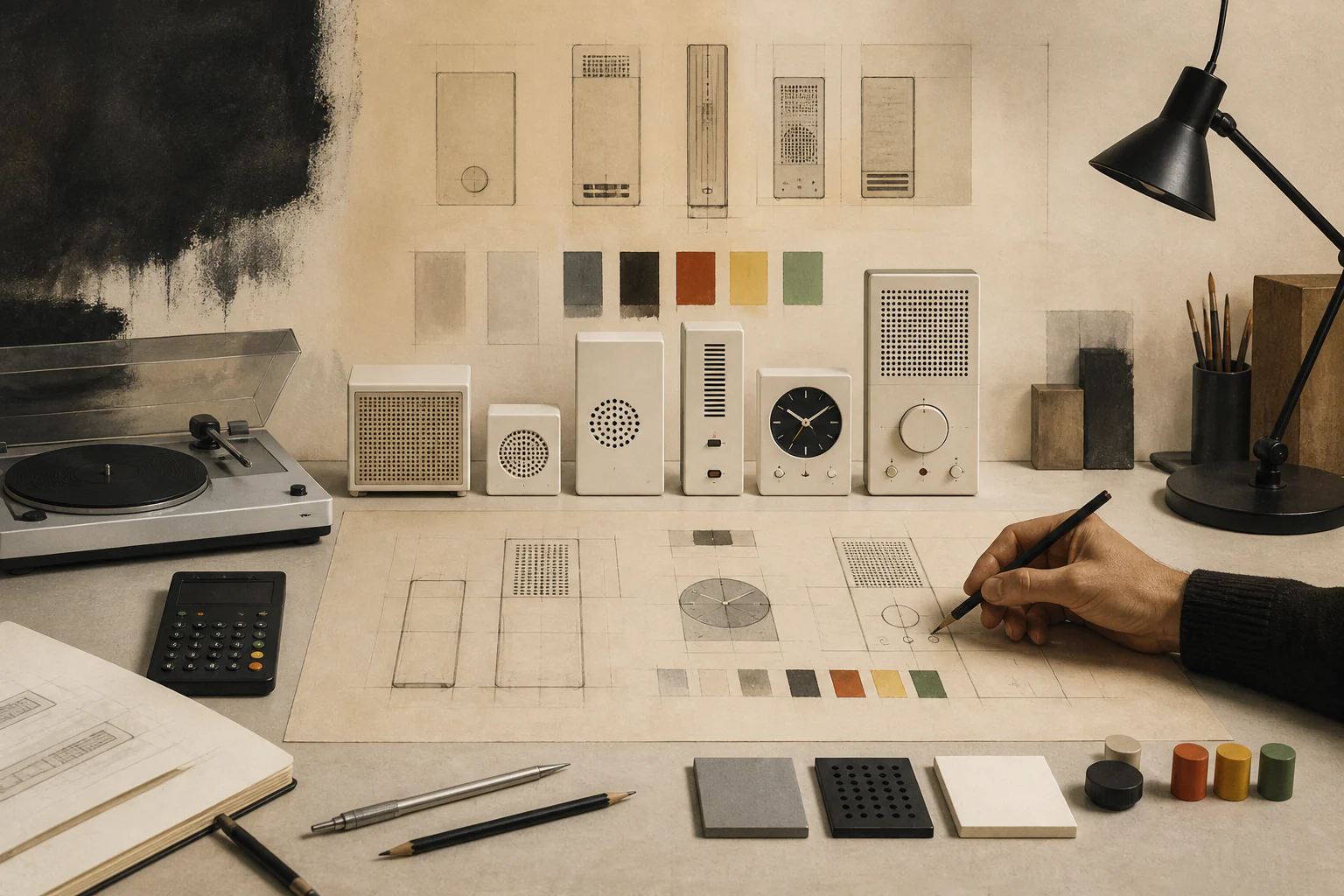
Braun shows that industrial design becomes a system when an aesthetic turns into a repeatable grammar of functions, proportions, interfaces, and trust.
1. Research thesis
Braun is interesting not for a single appliance but because it produced a transferable grammar: how to place controls, how much blank surface to leave, which colour marks an action. That grammar outlived the individual products.
2. Why this is more than a brand profile
The story is usually reduced to the name of a chief designer. It is more accurate to treat it as a case of institutionalisation: decisions were written down, taught, and applied by people who had not invented them. That is what turns a set of devices into a system.
3. Historical setup
The turn came in the second half of the 1950s, when domestic appliances stopped being luxuries and entered mass housing. A device had to fit a small flat and not argue with it — and that became the brief.
4. The company as a system
Design was removed from subordination to marketing and given the right to participate in defining the product. The organisational decision mattered more than the aesthetic one: it determined at what stage form is decided.
5. The object layer: radio and audio as a grammar of trust
A combined record player with a transparent lid, developed in the later 1950s, stated a new position: the mechanism is not hidden behind a furniture facade but presented. Transparency here was a claim about the honesty of the device.
6. Refusing furniture disguise
Until then a radio pretended to be furniture: veneer, turned legs, cloth. Abandoning the disguise meant acknowledging that appliances are a separate category of object with their own language.
7. The interface layer: calculator and appliance
A desk calculator with a grid of identical keys and colour-coded functions became a textbook case: key shape, colour, and position communicate an action before any label is read. This is graphic design executed in plastic.
8. Colour as function
The palette was deliberately restricted: white and grey as ground, black as frame, one bright colour as an indication of action. The restriction turned colour from decoration into an instrument of navigation.
9. The graphic layer
The typeface on a panel, the scale, and the pictogram were designed together with the housing. A device reads like a typeset page, which explains why product and graphic design are inseparable here.
10. The Ulm link: method meets production
A substantial part of the approach came from the Ulm school, where a systematic method was taught and industrial form was studied. The collaboration between school and manufacturer is a rare case of a teaching method receiving a production test.
11. The rules were written down
The approach was later formulated as a short set of principles of good design. What matters is less each formulation than the fact of writing: unstated taste is not transmitted, stated taste is discussed and contested.
12. Material and production
An even matt plastic surface demands precise tooling and strict control: moulding marks, warping, and batch colour variation all show on it. A calm appearance is paid for by production discipline.
13. The economy of form
A shared grammar reduced development cost: a new device inherited settled questions and had to answer only new ones. The system saved not material but design time.
14. Canon and museum
The products entered museum collections early and became a benchmark in teaching. This produced a durable reputation and simultaneously turned the approach into a stylistic model to be copied without its method.
15. Archive and reproducibility
Drawings, manuals, and advertising material survive, so claims about the method can be checked. The existence of documentation is why the case is fit for research rather than only for admiration.
16. Where the myth begins
The myth begins with the idea of infallibility. In reality ordinary products were also made, and some decisions did not survive a change of technology; the canon is built on a selected top layer of the range.
17. Where the myth blocks analysis
The cult of restraint leads to copying appearances: a white housing and small type without the corresponding production discipline. The result is a quotation of form in the absence of a system.
18. First key example
The record player with a transparent lid is worth analysing as a statement about the status of appliances in the home: the device stopped imitating furniture and began imitating an instrument.
19. Second key example
The calculator is worth analysing as a navigation problem: a finite set of functions, a limited area, the need for instant differentiation. This is precisely the problem that screen interfaces later inherited.
20. Comparison with adjacent systems
Unlike an approach based on a circle of authors, consistency here rested on a body of rules. Such a system is more robust to changes of personnel but produces fewer exceptions and responds worse to a change of genre.
21. Link to fashion
The clothing analogue is a core line built on proportion and execution rather than on seasonal print. Both strategies last longer and both require more expensive manufacture.
22. Link to the image
Product photography extended the method: even light, neutral ground, frontal view. Such photography presents an appliance as a document rather than as a temptation.
23. Link to architecture and space
The appliances were calculated for the small dwellings of postwar Europe: they do not claim to be the centre of a room. That is a spatial decision taken at the level of dimension and colour.
24. Link to technology
The method reached its limit with the move to the screen. When functions moved into menus, the grammar of physical controls lost part of its subject — and had to be reinvented.
25. Link to materials
Plastic, anodised aluminium, and matt coating are three surfaces with different wear behaviour. Reconciling them within one device is most of the invisible work.
26. Market and logistics
Serial production required component compatibility across generations and a service network. A system in manufacturing is first of all shared fixings and a shared stock of parts.
27. Critique and limits
The critique is fair on two points: the approach works poorly where emotional attachment is required, and it degenerates into a style when copied without its organisational half. Restraint without method is merely dullness.
28. What has changed today
The grammar of physical devices largely migrated into screen systems: grid, restricted palette, priority of legibility. The inheritance happened by principle of organisation rather than by appearance.
29. What to connect next
The material links to the entries on Ulm, on shelving systems, on minimalism, and on design systems. An analysis of the move from physical control to screen control would also be useful.
30. Editorial conclusion
Product design became a system here because decisions were written down, taught, and backed by an organisational right to influence the product. The aesthetic was a consequence, not a cause.
31. How to read this case today
When assessing successors, check not the whiteness of a housing but the existence of a rule set, its owner, and its changelog. Without those you are looking at a quotation, not a system.