research
Helvetica: how a typeface became infrastructure
The typeface’s power lies not in expression but in its ability to disappear inside navigation, identity, and interface.
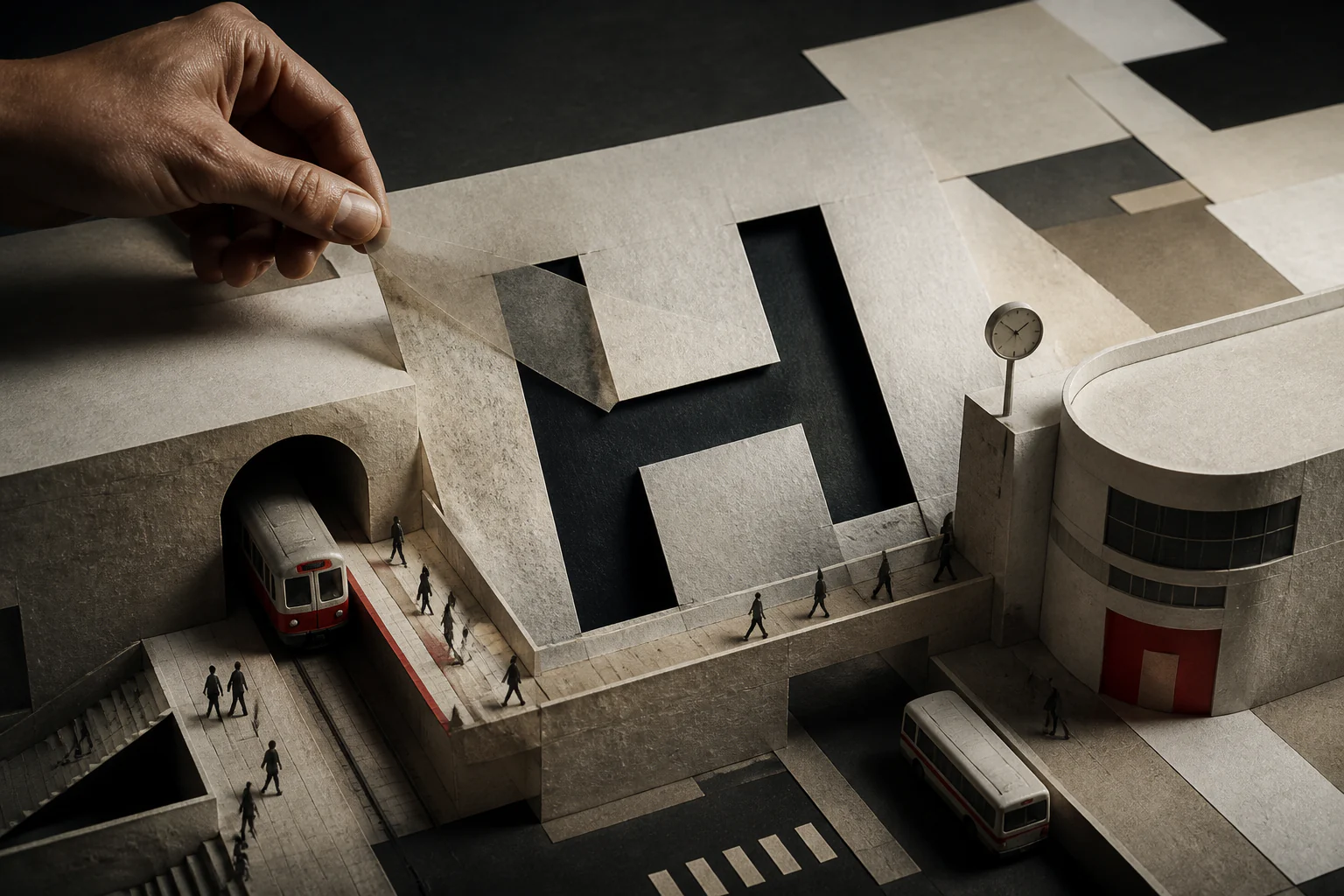
Helvetica became infrastructure because its power lies not in expression but in disappearing inside navigation, branding, interface, and urban space.
1. Research thesis
The typeface is interesting not for the drawing of its letterforms but for its position: it became the default setting for an enormous range of tasks. What makes it infrastructure is not quality but ubiquity and the invisibility that follows from it.
2. Why this is more than a typeface history
The history of drawing the letterforms occupies a few years; the history of distribution occupies decades and several technological platforms. The second explains the typeface’s position; the first does not.
3. Historical setup
The typeface was developed in Switzerland in the later 1950s as a response to demand for a neutral grotesque and was initially released under a different name. Its renaming for the international market was a commercial decision.
4. Inheriting a tradition
The drawing continued a line of nineteenth-century German and Swiss grotesques. The novelty lay not in inventing a form but in systematising it: aligning proportions and unifying weights within the family.
5. Neutrality as an active position
Neutrality here is not an absence of character but an engineered property. The letterforms are deliberately stripped of distracting detail so that text reads as information rather than as a statement about itself.
6. The cost of neutrality
The price is legibility in difficult conditions: similar letterforms merge at small sizes and in motion. The typeface is optimised for calm reading rather than for extreme cases.
7. The Swiss school as context
Its spread coincided with the influence of Swiss typography, with its grid and its priority of objective presentation. Typeface and method reinforced one another: the grid needed a neutral face.
8. Corporate identity
The wave of corporate identities in the 1960s and 1970s required a face that would not compete with a logotype and would work across every carrier. The typeface was locked into the identity manuals of hundreds of companies.
9. Urban navigation
In wayfinding systems the typeface received a task for which its neutrality is ideally suited: to communicate direction without drawing attention to itself. Here invisibility is a direct functional requirement.
10. The move to a digital platform
Inclusion in the base sets of typesetting systems and then of operating systems made the typeface available without a choice. A default setting is the strongest distribution mechanism there is.
11. Reworking the family
A later reworking regularised the weights and introduced a numeric naming system. This was work not on improving the drawing but on turning a set of fonts into a manageable system.
12. The screen era and retreat
On high-density screens, faces engineered for different reading conditions were needed. Major platforms developed their own system typefaces, and the default monopoly weakened.
13. Museum and status
The inclusion of digital typefaces in a museum collection in the early 2010s recognised type as a design object on a par with products. This changed the conversation about what can be collected at all.
14. Archive and reproducibility
Original specimens, foundry catalogues, and subsequent digital versions all exist. The differences between them are significant, so "the same typeface" across decades means different objects.
15. Where the myth begins
The myth begins with attributing perfection to the typeface. It was a successful commercial product at the right moment; its spread is explained by licensing and inclusion in standard sets as much as by its drawing.
16. A second layer of myth
A second simplification treats it as a symbol of soulless corporate culture. That is an evaluative position formed in reaction to ubiquity rather than a property of the drawing.
17. Where the myth blocks analysis
Both myths obscure the mechanism: the typeface won where a decision is taken once and for a long time — in a manual, in a sign system, in a default set. This is a question of infrastructure, not of taste.
18. First key example
The identity manual is worth analysing as a mechanism of entrenchment: a typeface choice written into a document outlives everyone who made it and changes far less often than a logotype.
19. Second key example
A wayfinding system is worth analysing as a case where neutrality is functionally justified. Here the typeface’s invisibility is not poverty but precise performance of the task.
20. Comparison with adjacent systems
A comparison with humanist grotesques shows a difference of task: there the priority is legibility in difficult conditions, here the evenness of the text field. Neither choice is universally correct.
21. Link to fashion
Fashion houses moved en masse to neutral grotesques in the late 2010s, and the difference between brands nearly vanished. This showed plainly that neutrality stops distinguishing when everyone chooses it.
22. Link to the image
In magazine layout the typeface works as a ground for photography without claiming attention. That makes it convenient where the image carries the statement.
23. Link to architecture and space
On a facade or a sign the typeface becomes part of the city and is subject to distance, angle, and lighting. Here typography is designed as an element of the environment.
24. Link to technology
The typeface’s history is a history of changing carriers: metal, phototypesetting, digital file, variable format. At each transition the drawing changed slightly while the default position persisted.
25. Link to materials
Metal setting imposed physical limits on size and spacing that do not exist digitally. The freedom of digital setting changed the typeface’s behaviour more than any redrawing did.
26. Market and logistics
Licensing is the key to distribution. Inclusion in a standard software bundle gave the typeface an audience unattainable through individual licence sales.
27. Critique and limits
The critique is fair on technical grounds: the typeface performs poorly at small sizes, at low contrast, and in motion, and choosing it is often an avoidance of a decision rather than a decision.
28. What has changed today
Variable fonts and platform-specific system typefaces have reduced the weight of any single choice. The infrastructural position is eroding, though the habit persists.
29. What to connect next
The material links to the entries on the Swiss style, on design systems, on wayfinding, and on graphic designers who worked with the grid.
30. Editorial conclusion
The typeface became infrastructure not because it is the best but because it entered the places where a decision is taken once and for a long time. Infrastructure is always a question of position, not of quality.
31. How to read this case today
When choosing a neutral grotesque, ask whether it is a decision or the absence of one. Neutrality is justified where text must disappear and unjustified where distinction is the task.