art director profile
Peter Saville
Music, code and identity as a cultural system
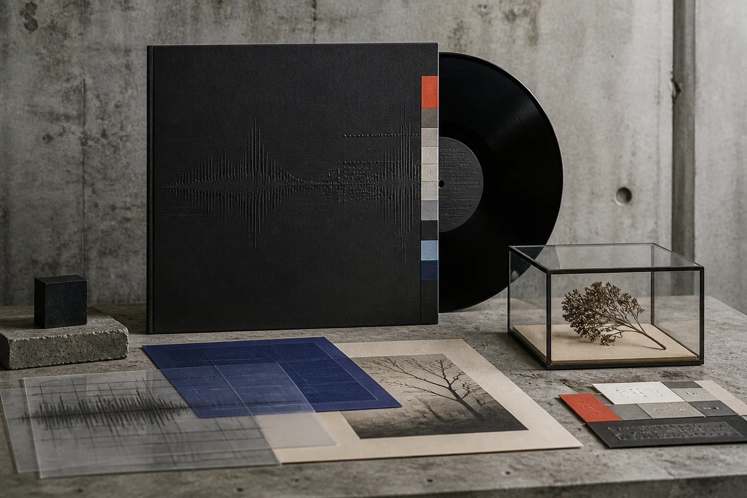
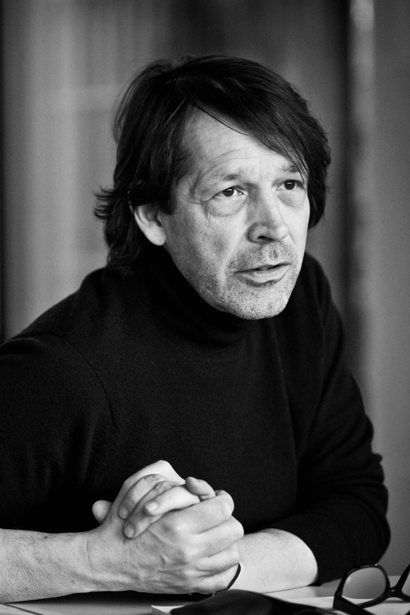
Saville made graphic design part of cultural experience: a found scientific diagram, museum painting, code, packaging and civic identity become systems that do not explain content but construct a parallel world around it.
Editorial thesis
Peter Saville's significance lies beyond one recognisable Factory Records aesthetic. He demonstrated that the graphic designer can work as a cultural editor: selecting existing imagery, changing context, building identity without a compulsory logo, and linking music, fashion, museum, product and city through a sequence of decisions. [source]
Reader question
Why can a sleeve without a band name, a scientific diagram, a code or an old painting create a stronger identity than a conventional logo and direct product description?
Short answer
Because Saville builds recognition not by repeating one picture but by repeating a principle: precise source selection, trust in the audience, high material culture and distance between a product and its visual explanation. Identity becomes system behaviour. [source]
1. Manchester, 1955: design begins inside an industrial city
Peter Saville was born in Manchester in 1955 and grew up in Hale. The Design Museum, Science Museum Group and National Portrait Gallery all connect his professional identity to the city whose industrial history and later music culture repeatedly return in his work. 1
Manchester matters here not as decorative background but as evidence that visual culture is entangled with economy and infrastructure: factories, transport, clubs, independent labels, print production and youth culture form one system.
2. School, architecture and the modern movement
At school Saville studied not only art but architectural history; he later recalled that the principles of design became legible to him through the modern movement. The Design Museum also records the role of teacher Peter Hancock, who introduced Saville and Malcolm Garrett to graphic design. 1
This helps explain his early attraction to systems rather than expressive drawing: proportion, sign, emptiness and serial order. Modernism was not a historical style to him but a way to organise contemporary cultural production.
3. Manchester Polytechnic, 1975–1978: order instead of punk graphics
From 1975 to 1978 Saville studied graphic design at Manchester Polytechnic. The Science Museum Group confirms the dates, while the Design Museum emphasises his fascination with Jan Tschichold, Herbert Bayer and early modernist typography. 3
At a moment when punk frequently spoke through rupture, collage and visual noise, Saville chose cool order. The contrast made his work distinct: the music could be new and anxious while the sleeve resembled an unknown European institution, technical document or cultural archive.
4. Kraftwerk and the found sign: an image does not have to be drawn
Kraftwerk and the Autobahn sleeve provided one early revelation: a found road sign showed Saville that a designer did not necessarily have to draw a new symbol but could recognise an existing cultural object and relocate it. The Design Museum connects that principle directly to his first Factory poster. 3
A central method emerges: selection can be authorship. Contemporary scholarship, however, must distinguish source-image authorship, art direction, photography, typography and production.
5. The Factory, 1978: the poster as a first cultural object
In 1978 Tony Wilson commissioned Saville to design a poster for The Factory club night at the Russell Club in Hulme. The University of Manchester preserves and displays the poster within the British Pop Archive context, and the Design Museum calls it his first significant commercial project. 13
Instead of expected punk aggression, the poster behaved like a strict industrial sign. Design did not illustrate the music; it produced a parallel register, cooler and more official than the club itself.
6. Factory Records: the label as a catalogue system rather than a logo
Factory Records took shape across 1978–1979; institutional sources use both dates as points of origin. Saville entered the project as co-founder/art director and received an unusual degree of freedom. 6
The FAC catalogue system is especially important: numbers were assigned not only to records but to posters, events and objects. Identity did not depend on one logo. It emerged through organisational behaviour — a very contemporary model of branding.
7. Unknown Pleasures, 1979: one sign instead of an explanation of music
Joy Division's Unknown Pleasures appeared in 1979. MoMA and the Science Museum Group attribute the cover design to Peter Saville; a white diagram of successive radio pulses sits on a black field. 2
The radical act is refusal. There is no band portrait, conventional typography or genre explanation. The sleeve asks for trust: mystery itself becomes part of listening.
8. CP1919: from scientific diagram to cultural icon
The Unknown Pleasures diagram was not invented by Saville. The Science Museum Group and University of Manchester trace it to Harold D. Craft Jr's work on pulsar CP1919/PSR B1919+21; Bernard Sumner encountered the image in an astronomy encyclopaedia and suggested it for the cover. 3
The precise formulation is therefore not 'Saville created the pulsar image' but that Saville and the Factory team transformed a scientific diagram through a new cultural context. It is both a lesson in art direction and in attribution.
9. Closer, 1980: an image whose meaning was changed by history
For Closer in 1980, Saville used a Bernard Pierre Wolff photograph from Staglieno Cemetery in Genoa. MoMA credits Saville, Martyn Atkins and Wolff in the cover's authorship. 2
After Ian Curtis's death the image acquired an almost prophetic reading, although the design preceded the tragedy. Meaning is not fixed at production; events can permanently alter how a completed visual form is understood.
10. DinDisc, Trevor Key and Brett Wickens: authorship becomes collaborative
After moving to London, Saville worked as art director at DinDisc and met photographer Trevor Key; Brett Wickens joined the studio and later became a business partner. The Design Museum emphasises how those relationships expanded work in photography, production and typography. 3
The myth of the solitary designer is especially misleading here. Many celebrated sleeves were collective productions involving band, label, photographer, printer, studio assistant and art director. Authorship remains real but layered.
11. New Order: a new band receives a new visual grammar
The visual system for New Order could not simply continue Joy Division's mourning aesthetic. Saville introduced classical art, coding, technological objects and an even stronger refusal of conventional branding. 1
It is a powerful example of identity without a compulsory constant. New Order remains recognisable not because every album repeats a mark, but because each solution preserves an intellectual contract with the audience.
12. Power, Corruption & Lies, 1983: museum painting enters post-punk
Power, Corruption & Lies from 1983 uses Henri Fantin-Latour's A Basket of Roses from the National Gallery. Both the National Gallery and Design Museum connect the painting with the New Order sleeve. 8
Saville's move is to collide Victorian flower painting and electronic music without visually synthesising them. The historical image does not illustrate sound; it creates friction between incompatible periods.
13. The colour code: information becomes a game with the reader
Power, Corruption & Lies also carries a colour code through which textual information can be decoded. 1
The code turns reading into participation. The viewer first encounters an elegant system and only later discovers that the system contains a message. In digital design the idea remains useful, but critical information cannot be hidden as freely as it can on a record sleeve.
14. Blue Monday, 1983: packaging as an enlarged floppy disk
Blue Monday in 1983 was packaged like an enlarged 5.25-inch floppy disk. The Science Museum Group describes the die-cut sleeve, silver inner and colour-based code carrying track and catalogue information. 4
Physical carrier and graphic concept become one. The sleeve does not depict technology; it simulates a technological object. Graphic design approaches product design.
15. When design conflicts with business
The complexity of Blue Monday made the package unusually expensive; Factory histories and the Design Museum repeat the famous account that the early sleeve cost so much that the economics of the single became absurd. 1
The useful lesson is not a romantic victory of art over business but a conflict. Design freedom has material cost: die-cutting, non-standard print, assembly and volume. Creative direction must understand symbolic value and unit economics simultaneously.
16. Peter Saville Associates: the studio beyond Factory
In 1983 Saville formed Peter Saville Associates with Brett Wickens, expanding the practice beyond Factory. The Design Museum connects the studio to music, cultural institutions and fashion clients. 1
A studio changes the scale of authorship. The task is no longer one object but a process in which an idea must survive dozens of deliverables while the contributions of collaborators remain distinct.
17. Whitechapel: the cultural institution instead of the music carrier
In the mid-1980s Saville developed an identity for Whitechapel Art Gallery. The Design Museum and National Portrait Gallery both note the project as a key transition toward cultural institutions. 1
Institutional identity requires a different discipline from record packaging. A gallery must remain recognisable for years without competing with its exhibitions. Authorial mystery becomes quieter; the system must hold many other artistic voices.
18. Yohji Yamamoto, Marc Ascoli and Nick Knight: fashion as an authorial laboratory
In 1986 Saville worked with art director Marc Ascoli and photographer Nick Knight on catalogues for Yohji Yamamoto. The Design Museum describes the collaboration as a transfer of experimental music-production freedom into fashion. 1
Fashion proved a natural extension of his method. Clothing could be placed inside a larger cultural object in which typography, image sourcing, paper and sequence mattered as much as straightforward documentation.
19. Fashion without the mandatory product: image before demonstration
Some fashion projects deliberately weakened direct product display. Found imagery, stock photography and cultural quotation could occupy more space than the garment. 1
The move is risky. When a brand is already strong, absence can increase desire; when identity is weak, the same gesture reads as missing information. Saville demonstrates that minimalism works only with high contextual precision.
20. Magiciens de la Terre: graphic design enters the museum system
In the late 1980s Saville produced graphics for Magiciens de la Terre at the Centre Pompidou. The Design Museum includes the project in his transition from music culture toward art institutions. 1
The designer should not be confused with the curator. Art direction frames an encounter with art but does not become the author of the works on display. The larger the institution, the more important the distinction between design system and curatorial authorship.
21. Technique, 1989: Yves Klein, emptiness and the artificially perfect surface
For New Order's Technique in 1989, Saville and Trevor Key explored emptiness and artificially perfected surfaces with reference to Yves Klein. The Design Museum presents this period as a conscious move away from the visual overload of the late 1980s. 1
Emptiness is not neutral. It becomes emotional material: the surface looks too perfect, almost without signs of production, and therefore strange.
22. Pentagram, crisis and fatigue with visual noise
By the early 1990s Peter Saville Associates was under financial pressure and Saville briefly joined Pentagram; Factory also collapsed. The Design Museum and Science Museum Group describe the period as a major transition. 1
The story counters the mythology of unconstrained creative culture. Symbolic capital does not guarantee a sustainable business. Studios require pricing, production control, deadlines and management structure as much as powerful ideas.
23. Republic, 1993: Photoshop and a new kind of found image
New Order's Republic in 1993 belongs to a new digital phase: collage and post-production enabled found urban and media imagery to be recombined more directly. 1
Digital tools did not replace Saville's older method; they accelerated it. Selection, recontextualisation and montage remained central while software joined darkroom and print experiment.
24. Suede and Pulp: one's own legacy becomes a commission from a new generation
In the 1990s Suede and Pulp sought Saville precisely because they had grown up with his Factory work. The Design Museum describes how Brett Anderson and Jarvis Cocker regarded his designs as part of their own visual education. 1
This is a rare point at which authorial reputation becomes part of a new brief. The client is not merely buying problem-solving but deliberately activating the designer's history, creating the risk of self-pastiche.
25. Nick Knight, Dior and the digital fashion image
Saville's relationship with Nick Knight continued through fashion and digital projects, including Dior and later work around SHOWstudio. SHOWstudio's twenty-five-year archive still includes Saville among the creative figures in its network. 1
Digital fashion expands art direction beyond the printed spread. Image now lives as screen, moving image, interface, project page and interactive object; typography becomes navigation and behaviour.
26. Raf Simons, 2003: reverse appropriation of Factory
In 2003 Raf Simons used archival Factory graphics in a menswear collection. The Design Museum treats the episode as a reversal in which Saville's own appropriative visual language became source material for a younger generation. 1
It forms an almost perfect cultural loop: scientific diagram and museum painting entered pop music; music packaging then entered fashion. Authorship becomes a chain of transformations rather than an isolated object.
27. The Peter Saville Show: the designer becomes a museum subject
In 2003 the Design Museum opened The Peter Saville Show, his first museum retrospective; the National Portrait Gallery also records the retrospective as an institutional milestone. 1
When commercial design enters a museum, its mode of reading changes. A sleeve is no longer held beside a record player; it becomes historical evidence. Exhibition design therefore has to preserve original function as well as visual beauty.
28. Manchester as client: Original Modern and Factory International
In 2004 Saville became Creative Director of the City of Manchester. The Government Art Collection and Factory International confirm the role; he has also worked with Manchester International Festival as Artistic Advisor and participated in the evolution of the organisation's identity into Factory International. 13
The idea of Original Modern described the city through its capacity to produce new forms of industry and culture rather than through a tourist logo. It is the broadest extension of the early Factory principle: identity is behaviour and self-description, not necessarily a mark.
29. Burberry and Ferragamo: the historic house as a redesign problem
In 2018 Riccardo Tisci and Peter Saville developed the TB monogram for Burberry; Burberry's official material explicitly describes it as a collaboration. In 2024 Ferragamo also noted that Saville had recently redesigned the house logo. 18
These projects differ from Factory because the historic luxury house already possesses an immense archive. Redesign is less about inventing culture from nothing than deciding which historical element becomes active in the present.
30. The main legacy: the designer as cultural editor
Peter Saville's main legacy is not the black sleeve, modernist type, missing title or colour code. Those devices have long become easy-to-copy surfaces. 1
Harder to borrow is the method: treat the designer as a cultural editor. Find the exact image, understand its origin, change its context without erasing authorship, trust the audience, control physical production and construct identity as a sequence of decisions. That is why Saville's language survived vinyl: it was a system of thought rather than the style of one medium.