art director profile
Fabien Baron
Minimalism, provocation and the luxury image system
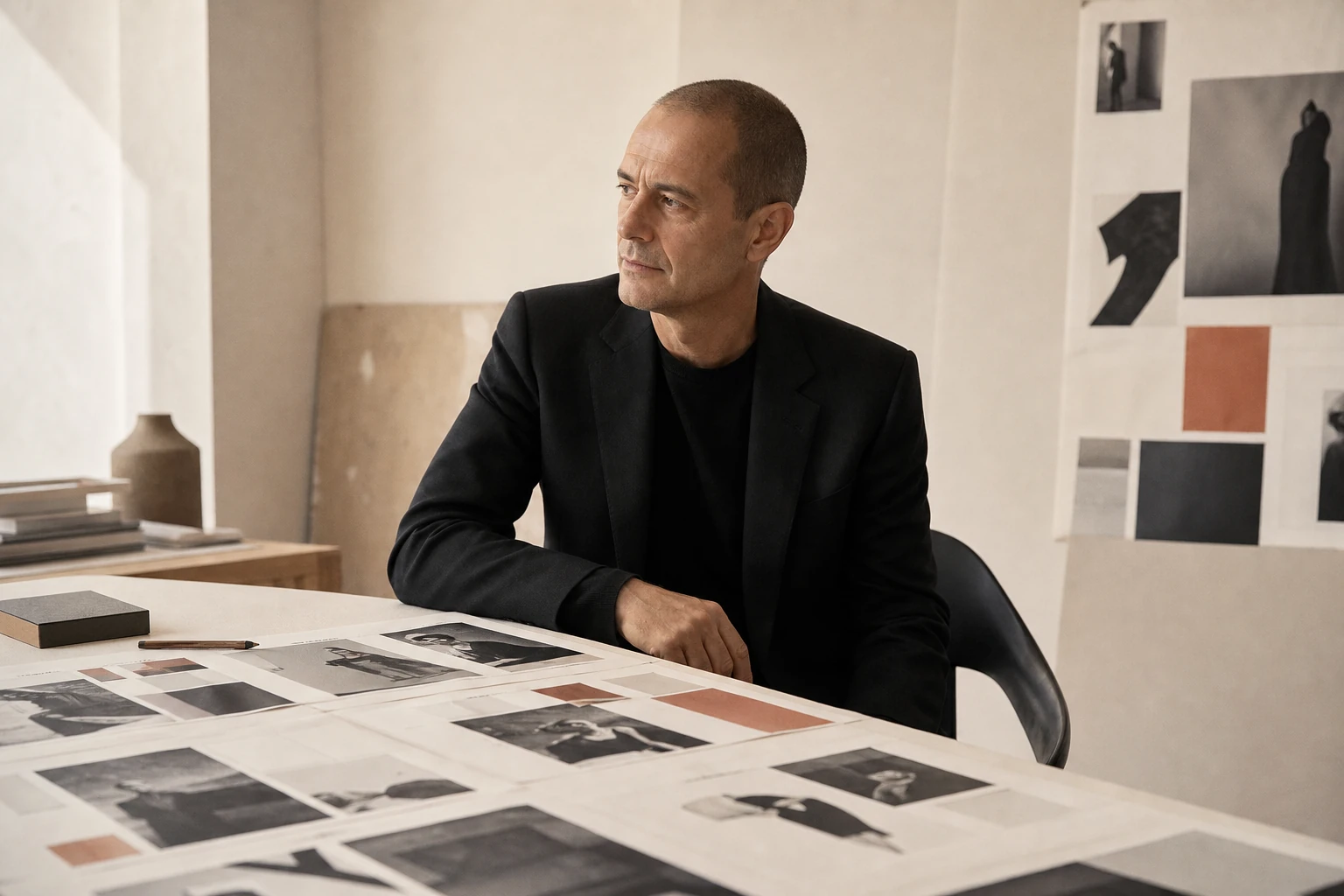
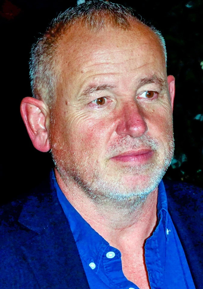
Baron expanded art direction from the magazine page into a complete brand system: typography, photography, campaign, perfume bottle, film, furniture and space obey one logic without needing to look identical.
Editorial thesis
Fabien Baron's significance is not a collection of 'luxury' visual devices. He helped define the contemporary creative director as the author of a system managing relationships among editorial, photography, typography, brand, packaging, film and space. His minimalism always sits beside commercial power and provocation, which means it requires critical reading as well as admiration. [source]
Reader question
How can one creative director make Harper's Bazaar, Calvin Klein, Madonna: Sex, fragrance packaging, furniture and hotel identity recognisable without turning every project into the same style?
Short answer
Through a repeatable system of decisions rather than a repeatable picture: radical selection, clear hierarchy, precise scale, strong photography commissioning, controlled white space and the ability to translate an idea across media. The preset changes; the discipline of relationships remains. [source]
1. Antony: design as a familiar profession rather than abstract art
Fabien Baron was born in 1959 in Antony, France. In his Eye interview he recalled that his father was an art director who worked with newspapers and magazines, which meant visual communication appeared from childhood as a real profession rather than a mysterious artistic destiny. [source]
That starting point matters. Baron rarely builds a romantic mythology of sudden inspiration. His language grows from professional infrastructure: type, print, photography, mechanical production, deadline, client and circulation. Later luxury minimalism may look almost weightless, but heavy production systems remain underneath it.
2. Arts Appliqués and L’Équipe: craft before the authorial gesture
From 1975 to 1976 Baron studied at the École des Arts Appliqués in Paris and then worked in the art department of the sports newspaper L’Équipe. The U.S. Department of State and Eye record this short period of education and early professional work. [source]
L’Équipe is particularly useful as a school of speed. A newspaper does not allow endless refinement of one layout. Large flows of images must be sorted, hierarchy decided quickly, and the element that truly holds attention identified. Baron later turns that discipline into radical reduction: one strong image, one large headline and a great deal of air.
3. New York, 1982: Self, GQ and entry into the American magazine system
Baron moved to New York in 1982 and worked at Self and GQ. Eye presents the move as a deliberate search for an environment in which typography and magazine design offered more possibilities than the French commercial scene he had left. [source]
The American system gave him scale: Condé Nast, advertising budgets, fashion clients and an industry in which an art director could influence more than the finished page. In New York, the designer gradually becomes someone involved in commissioning, casting, photographer selection and the overall construction of a brand.
4. Barneys New York: the store as a visual character
During the 1980s Baron worked with Barneys New York and helped shape its visual character. Biographies from The One Club and the U.S. Department of State connect his early American career to creative direction for the store. [source]
For the history of art direction this is an important move from magazine to retail. A store is not one plane: logo, advertising, windows, paper, bags, interior and urban behaviour need to feel like one system. The future Baron & Baron model begins to form here: identity must operate across several physical and media touchpoints.
5. New York Woman, 1987: building a magazine from the ground up
In 1987 Baron designed the prototype for New York Woman and served as art director for its first year. The Department of State and Eye use the project as an early example of him constructing an editorial identity largely from the ground up. [source]
A prototype demands more fundamental decisions than a redesign. Rhythm, type family, relationship between text and photography, cover aggression and long-term recognisability all need to be invented. The job is already less about a beautiful page than about a repeatable system of rules.
6. Vogue Italia, 1988: Franca Sozzani and freedom of the image
In 1988 Baron became creative director of Vogue Italia under Franca Sozzani. The One Club and Eye identify the project as a period in which his typographic discipline met a more adventurous approach to fashion photography. [source]
Sozzani allowed the magazine to function as more than a seasonal catalogue. For Baron, that meant layout could remain extremely controlled while photography became provocative, strange or cinematic. The contrast between page discipline and image unpredictability would remain central to his work.
7. Interview, 1990: the face becomes page architecture
Baron redesigned Interview in 1990. Phaidon treats the project as one of the defining magazine interventions of his career. [source]
Interview already carried the powerful legacy of Andy Warhol, so the task was not to erase history. Baron intensified a simple idea: celebrity and face could become the primary graphic material. Monumental portrait, restricted colour, direct typography and repeated rhythm turn the celebrity from an illustration into the architecture of the page.
8. Baron & Baron: the agency as an expanded creative system
Baron founded Baron & Baron in 1990. Today the agency describes its practice through art direction, branding, visual identity, campaigns, film, packaging, product, environmental design, digital and production management. [source]
This is an organisational shift as much as a creative one. A contemporary creative director cannot maintain luxury identity through a single layout. A team must translate an idea across campaign, film, bottle, website, environment and post-production. The agency becomes a machine for preserving visual logic across media.
9. Harper’s Bazaar, 1992: relaunch rather than cosmetic redesign
In 1992 Liz Tilberis arrived at Harper’s Bazaar and brought Baron in as creative director. Bazaar itself describes their relaunch as an attempt to recover the electricity of the Carmel Snow and Alexey Brodovitch era without resorting to retro imitation. [source]
The September 1992 issue was not a cosmetic refresh. Cover, typography, image scale, caption length, page tempo and the concept of modern elegance all changed. Baron did not copy Brodovitch, but restored a comparable degree of influence to the art director over the images a magazine chooses to produce.
10. Didot: typography as voice rather than decoration
Didot became one of the dominant typographic voices of 1990s Bazaar. In Eye, Baron explained that he chose it not as a historical quotation of Brodovitch but because the high-contrast face suited the magazine’s idea of femininity and new elegance. [source]
Didot should not be treated as a magical luxury formula. A typeface alone does not make a page expensive. Baron worked with extreme scale, tracking, thin weights and white space, producing a sense of control. Luxury is coded by the precision of the whole system rather than by the name of the font.
11. White space, crop and scale: how to let a page breathe
In 1993 The New Yorker described Baron’s central ability as letting oxygen into the page. His Bazaar used large photographs, aggressive cropping and fields of emptiness so that a spread could feel calm and tense at once. [source]
White space is not an absence of information. It controls reading speed, increases the cost of every mistake and forces each remaining element to work harder. Cropping does the same: a face or body can become almost abstract. Minimalism here means concentrated decisions, not reduced labour.
12. Liz Tilberis and the collective authorship of a magazine
Baron repeatedly stressed that Bazaar was built through teamwork. In Eye he linked the magazine’s quality to Liz Tilberis’s leadership, under which an idea could come from anyone on the team. [source]
This corrects the myth of the omnipotent art director. Baron shaped typography, photography and overall rhythm, but editors, fashion directors, photographers, models, production and Tilberis herself produced the magazine image. Creative direction becomes stronger when one author creates a clear enough system for collaboration rather than consuming everybody else’s authorship.
13. Calvin Klein: art direction becomes part of brand strategy
Calvin Klein hired Baron as creative director in September 1992. The One Club records the appointment as the beginning of one of his longest and most influential commercial relationships. [source]
Here art direction fully exits the magazine and becomes part of brand strategy. Campaign, casting, packaging, fragrance launch and film need to describe not merely the same look but the same kind of person. At Calvin Klein that person becomes youthful, sexually ambiguous and minimally decorated — an emblematic 1990s figure.
14. Kate Moss and Mario Sorrenti: intimacy as an advertising language
Baron played an important role in translating Mario Sorrenti and Kate Moss’s private image world into Calvin Klein advertising. In a Phaidon interview he described seeing Sorrenti’s journal of intimate photographs, hiring him for Bazaar and then proposing that the reality of the couple’s relationship should become the basis of the Obsession campaign. [source]
It is a radical art-direction decision: instead of fabricating romance on set, create conditions in which an existing intimacy can become an image. It also raises an ethical question about the point at which a private relationship becomes commercial material and who controls its public meaning.
15. CK One, 1994: bottle, packaging and an image of a generation
CK One launched in 1994. Phaidon and Monocle connect Baron to the bottle and packaging design, while the broader campaign established unisex fragrance as a cultural proposition rather than merely a scent category. [source]
The bottle resembles an almost neutral pharmaceutical container: flattened transparent form, metal cap and few decorative signals of gender or status. Its force comes from packaging and advertising speaking the same language. Recognition is carried by proportion, material and attitude as much as by a logo.
16. Sexuality and provocation: where boldness ends and power begins
Calvin Klein in the 1990s made sexuality a primary attention mechanism, and Baron was one of the key authors of that visual system. Campaigns featuring Kate Moss, Mark Wahlberg and others blurred intimacy, youth culture and the commercial display of the body. [source]
The work expanded the permissible language of advertising, but it cannot be read only as a story of creative freedom. Model age, brand power, body standards and the commercialisation of personal sexuality require critical context. Provocation does not remove the question of who benefits and who bears the consequences of an image.
17. Madonna: Sex — book-object, media event and controlled chaos
In 1992 Baron art-directed Madonna’s Sex book; WorldCat lists him as art director, Steven Meisel as photographer and Glenn O’Brien as editor. Vanity Fair described Madonna as actively controlling the selection and direction of the project. [source]
Sex matters as a model of cross-media authorship. Metal covers, spiral binding, wrapping, photography, text, publicity and moving image function as one event. Baron described the task as finding the right degree of tabloid elegance: radical enough to disturb convention, precise enough not to collapse into accidental cheapness.
18. Steven Meisel: photographer and art director build one visual world
Steven Meisel is one of the central photographers in Baron’s editorial and commercial orbit. Their work intersects through Vogue Italia, Madonna: Sex and the wider fashion culture of the early 1990s. [source]
A strong photographer-art director partnership does not mean one author gives the other a style. Meisel constructs scene, character, light and photographic drama; Baron determines how an image lives in book, magazine, campaign and brand system. Authorship is distributed across different levels of the same visual object.
19. Issey Miyake and L’Eau d’Issey: fragrance authorship must remain distributed
Eye in 1995 listed L’Eau d’Issey among fragrance launches overseen by Baron. Yet Issey Miyake’s current official fragrance site describes the original bottle concept as Miyake’s own idea, inspired by a drop and the moon above the Eiffel Tower. [source]
This is a useful lesson in describing authorship accurately. A luxury product may involve a conceptual designer, art director, packaging team, engineer and advertising agency. The history should not be simplified into 'Baron designed everything'; his contribution is better understood as part of a larger brand architecture.
20. Giorgio Armani and Acqua di Giò: minimalism changes temperature
Phaidon connects Baron and Giorgio Armani through the 1996 launch of Acqua di Giò Pour Homme, describing his work across bottle design, advertising and television. [source]
The visual temperature differs markedly from Calvin Klein. Minimalism remains, but becomes more adult and Mediterranean: water, skin, light and glass. A strong creative director does not apply the same preset to every client. The system must recognise a brand’s character and change its own tone accordingly.
21. Vogue Paris, 2003: a new version of French fashion authority
In 2003 Baron became creative director of Vogue Paris under Carine Roitfeld. The One Club includes the appointment in its professional biography. [source]
Vogue Paris required a different form of authority from American Bazaar. The distance between editorial sophistication and sexual provocation was smaller. Baron carried his familiar precision of scale and typography into a harder fashion culture where photography itself could become confrontational and physically close.
22. Arena Homme Plus: the men’s magazine as a site of visual risk
From 2000 to 2002 Baron served as editor-in-chief and design director of Arena Homme Plus. The One Club records this unusual combination of responsibilities. [source]
For an art director this is a decisive expansion: responsibility now includes the editorial machine itself, not simply its form. A men’s fashion title can tolerate more visual risk than a mass monthly, and Arena becomes a space where sequence, photography and cultural commentary work as one statement.
23. Returning to Interview: an editorial system after the digital turn
In 2009 Baron returned to Interview as editorial director, continuing his interest in monumental portraiture and hard-edged celebrity architecture. [source]
The media environment, however, had changed. A magazine now existed beside websites, video, social platforms and digital covers. Art direction could no longer conclude with the print file. Interview’s continuing lesson is the preservation of a recognisable voice while distribution formats multiply.
24. Liquid Light: independent photography without a client logo
Baron maintains an independent photographic practice. Liquid Light 1983–2003 gathers long-term observations of light on water and demonstrates that his interest in emptiness, horizon and surface was never confined to commercial graphics. [source]
The photographs are particularly useful for understanding his minimalism. Once the client logo disappears, the same structure of attention remains: a large field, one material disturbance, almost architectural quiet. Commercial and private practice become different modes of the same eye.
25. Monuments, 2014: ice, scale and an almost architectural landscape
In 2014 Baron created Monuments, a study of Greenland’s frozen coast commissioned by Moncler and shown in the context of Frieze London. Baron & Baron describes the project as a monumental photographic exploration later published in book form. [source]
Ice becomes almost sculpture or architecture: scale is difficult to establish and surfaces move between weight and transparency. A contemporary viewer inevitably adds a climate context, even if the project is not a straightforward environmental illustration. Material beauty and anxiety about disappearance coexist.
26. Furniture and product design: proportion leaves the page
Baron extended his practice into furniture and industrial design. The One Club records a residential collection with Cappellini in 2001 and a contract collection with Bernhardt in 2002; Bernhardt Design continues to list him among its international design roster. [source]
Object design tests whether visual logic truly exists outside the page. In furniture there is no crop or printing effect to hide behind. Proportion, material, joint and literal empty space become physical. Minimalism becomes a constructive rather than merely graphic discipline.
27. Hospitality and space: identity becomes environment
Baron & Baron also describes a practice in hospitality and environmental design, including long relationships with Ian Schrager. [source]
In space, brand identity becomes bodily. The user does not simply see a layout; they enter light, materials, signage and furniture. Art direction expands into experience design: the task is not to place a logo in a hotel but to make all components support one mode of behaviour.
28. Works 1983–2019: a career organised through visual rhymes
Phaidon published Fabien Baron: Works 1983–2019 as the first large retrospective of his career. Baron rejected simple chronology and organised the book through recurring visual themes and collisions across decades. [source]
That montage reveals authorship more effectively than a CV. A commercial campaign may sit beside water photography, typography, furniture and an ice landscape. What repeats is not a particular font or colour but a set of relationships: control and chaos, purity and provocation, flat image and physical object. Style becomes a system of rhymes.
29. Baron & Baron in 2026: the luxury image as a network of media and production
In 2026 Baron & Baron remains an active agency with offices in New York and Paris. Its official site lists current or recent work and relationships with Dior, Fendi, Louis Vuitton, Zara, Boss, Moncler, Armani, Dolce & Gabbana, Gucci, Alaïa, Ferragamo, Pandora and other clients. [source]
The capabilities list demonstrates how much the profession has changed: branding, copy, film, digital, environmental design, production and post-production sit inside one structure. The luxury image is now a network of interconnected productions rather than a single picture.
30. The main legacy: the creative director as author of a system of relationships
Fabien Baron’s main legacy is not Didot, white space, provocative photography or one iconic perfume bottle. Those signs are easy to copy and quickly become a costume for the 1990s. [source]
Harder to borrow is the actual method: the creative director as author of relationships. The role demands understanding magazine and product, photographer and client, sexuality and commerce, typography and film, and knowing when to remove an element or intensify a conflict. Contemporary creative direction must also recognise distributed authorship. A strong system does not erase collaborators; it makes their contributions coherent and visible.