graphic designer profile
Josef Müller-Brockmann
Grid, rhythm and objective communication
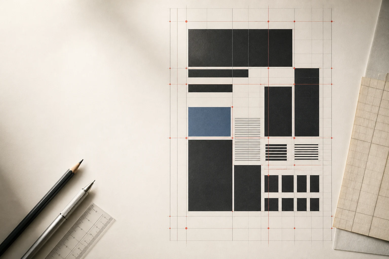
Müller-Brockmann turned the grid from hidden technical scaffolding into an intellectual method: poster, magazine, textbook and wayfinding system are built as relationships among information, scale, interval and user.
Editorial thesis
Josef Müller-Brockmann matters not because he 'invented the grid'. He made systems thinking a central professional value of graphic design: the solution begins with the problem, order must be reproducible, and visual clarity has to survive real use. His method matters precisely because it can generate variety without abandoning discipline. [source]
Reader question
Why does a strict grid not make every poster look the same — and why can Müller-Brockmann still feel contemporary even when there is no Helvetica, red square or visibly modular layout?
Short answer
Because the grid is not a style but a way of distributing decisions. It reduces randomness while leaving freedom to scale, rhythm, imagery and contrast. What stays constant is the thinking process: define the problem, build relationships and test how quickly the user understands the message. [source]
1. Rapperswil, 1914: order begins in a lived environment, not abstraction
Josef Müller-Brockmann was born on 9 May 1914 in Rapperswil, Switzerland. SFMOMA and European authority records identify the small town on Lake Zurich as the starting point of the career of one of twentieth-century design's most influential system thinkers. 1
His mature work often appears almost placeless: grid, grotesque type, geometry and white space. Yet that universality grew inside a specifically Swiss environment of industry, transport, public posters, multilingual communication and professional design schools.
2. The Zurich school: Ernst Keller and design that begins with the problem
In the early 1930s Müller-Brockmann studied and attended classes at the Kunstgewerbeschule Zürich, where Ernst Keller was the crucial teaching figure. Later histories of Swiss Style repeatedly return to Keller's principle that a solution should grow from the problem rather than from a preselected aesthetic. 4
That principle became foundational for Müller-Brockmann. The grid appears not because a designer likes rectangles but because information needs a functional order.
3. Before 1950: illustration, stage and exhibition as prologue
Müller-Brockmann's early career included illustration, stage and exhibition design and commercial graphics. Lars Müller Publishers explicitly notes that the radical move toward an uncompromising rational language came only around 1950. 4
This matters against the myth of an innate Swiss Style. System was a position he arrived at, not a natural manner. Earlier methods existed and were consciously left behind.
4. The turn to constructive graphics: rejecting personal gesture as a method
Around 1950 Müller-Brockmann turned sharply from illustrative work toward constructive graphics. Personal expression receded while modules, proportion, typographic hierarchy and economy of means became central. 19
Rejecting gesture did not remove authorship; it relocated it. Authorship now sat in decisions about hierarchy, repetition, interval, scale and the amount of contrast a message required.
5. The grid: not a cage but a decision-making machine
For Müller-Brockmann the grid was not a decorative framework the viewer had to notice. It was a machine for making decisions, connecting format, columns, typography, images, intervals and sequence. 4
A good grid is paradoxical: the better it works, the less the reader thinks about it. The reader simply understands the order faster. That is why contemporary digital design systems recognise such a clear ancestor in his work.
6. The poster as a public interface for the city
The poster was an ideal medium for Müller-Brockmann: public, fast, large and forced to compete with the city. Museum für Gestaltung Zürich stresses that his posters obey strict functional criteria while remaining visually varied and dynamic. 10
A poster tests a system more harshly than a magazine spread. There is no time to study the logic; the logic has to be felt in a second.
7. Tonhalle Zürich: a long commission that allowed a language to emerge
From the early 1950s Müller-Brockmann worked repeatedly for Tonhalle Zürich. MoMA holds several concert posters from 1953, while Museum für Gestaltung names Tonhalle among his long-term clients. 10
A long commission matters because it allows a language to develop. A one-off poster may be striking; a series has to generate variation inside rules. Here strict systems reveal that they need not produce identical results.
8. Musica viva: turning music into geometry
The Musica viva series became the clearest demonstration that abstract composition could communicate music without literal illustration. MoMA holds versions from 1957 and 1958 made through different printing processes. 9
Circle, line, repetition, scale and interval behave like tempo, pause and accent. The poster does not depict an orchestra; it translates structural qualities of music into visual rhythm.
9. Beethoven, Stravinsky, Berg, Fortner: rhythm without depicting the instrument
Posters for Beethoven, Stravinsky, Berg, Fortner and other mid-1950s programmes are now included in museum editions devoted to Müller-Brockmann. 19
Their strength lies in refusing the compulsory symbol of the composer. Instead of portrait, notation or instrument, the viewer receives a tense system of forms. The information remains concrete while the image avoids illustrative cliché.
10. Asymmetry: stability without a central axis
Asymmetry allowed Müller-Brockmann to abandon conventional centred composition without sacrificing stability. An element can be displaced while weight, distance and scale hold the surface together. 4
For contemporary designers this matters more than a superficial Swiss look. Asymmetry only works when relationships are calculated; random displacement does not become a system because the text happens to sit on the left.
11. Grotesque type and typographic discipline: a voice without theatrical decoration
Müller-Brockmann is closely associated with sans-serif typography and disciplined setting, yet the method is not reducible to one favourite typeface. It neutralises unnecessary theatricality and builds hierarchy through scale, placement, spacing and repetition. 19
That is why recreating his language with Helvetica or Akzidenz-Grotesk alone usually produces costume rather than method. Type works only inside the larger system.
12. Photography: evidence that still has to be constructed
A substantial part of his poster practice is photographic rather than purely geometric. Museum für Gestaltung distinguishes a group of Photo Posters addressing road safety, noise, children and cyclists. 10
Photography may look like evidence, but its objectivity is also constructed. Crop, scale, contrast and the relationship to text guide interpretation as forcefully as drawn form.
13. The Automobile Club of Switzerland: safety as a problem of visual clarity
Müller-Brockmann designed road-safety campaigns for the Automobile Club of Switzerland. Museum für Gestaltung names the club among his long-standing clients and emphasises the combination of strict functionality with dynamic composition. 10
This is design with real consequences: the message is supposed to change behaviour, not simply produce admiration. Formal clarity becomes a public function.
14. Überholen…? Im Zweifel nie!: fear, speed and one instant of decision
The 1957 poster Überholen…? Im Zweifel nie! centres on the instant of doubt before overtaking. MoMA and museum reissues preserve it among Müller-Brockmann's key safety works. 10
Strong design compresses a complex rule into one psychological moment. The viewer feels the danger before fully analysing the compositional mechanics.
15. Weniger Lärm, 1960: a social problem becomes a poster
Weniger Lärm from 1960 translates urban noise into a concise visual situation and is held by MoMA. 12
The work shows that Swiss objectivity is not the same as emotional coldness. A social problem can feel sharp and physical without decorative rhetoric.
16. Kunstgewerbeschule Zürich, 1957–1960: teaching as systemic reform
From 1957 to 1960 Müller-Brockmann taught at the Kunstgewerbeschule Zürich. Museum für Gestaltung notes that he substantially reformed the programme of his predecessor Ernst Keller, using constructive principles as a foundation for training. 10
Teaching exposes a system in pure form: the method has to work for somebody other than its author. If a student can apply the rules to a different problem and reach a different result, the framework is genuinely transferable.
17. Objectivity: an ethics of communication or well-organised subjectivity?
Müller-Brockmann pursued a universal, formally reduced language of communication, commonly described through the Swiss Style ideal of objectivity. 4
Absolute neutrality is impossible. Someone chooses scale, photograph, typeface and criteria of clarity. It is more useful today to read his objectivity as an ethics: reduce visual noise and personal display without pretending that the author disappears.
18. Neue Grafik, 1958: the magazine becomes a manifesto without declaring itself one
In 1958 Müller-Brockmann initiated Neue Grafik / New Graphic Design / Graphisme Actuel. Lars Müller Publishers calls it a programmatic platform for Swiss graphic design and an international organ of constructive thinking. 14
The magazine turns practice into discourse. Designers do not simply show work; they argue for order, function and modern visual communication as professional values.
19. LMNV: collective authorship of an international Swiss Style
Neue Grafik appeared in eighteen issues from 1958 to 1965 and was produced by the editorial collective Müller-Brockmann, Richard Paul Lohse, Hans Neuburg and Carlo Vivarelli — LMNV. 4
This matters for any history of influence. International Typographic Style did not spread through one hero; it emerged through a network of authors, schools, clients, journals and conferences.
20. The Graphic Artist and His Design Problems, 1961: practice becomes a textbook
The Graphic Artist and His Design Problems appeared in 1961. Niggli describes it as a systematic guide to form, function, typography, advertising, exhibitions, visual communication and the education of the designer. 15
The book marks a professional shift from workshop intuition toward an explainable process. A designer should be able not only to produce a solution but to argue why it works.
21. Tokyo, 1960: the World Design Conference and meeting Shizuko Yoshikawa
At the 1960 World Design Conference in Tokyo Müller-Brockmann met Shizuko Yoshikawa, who was working as an interpreter. Nakanoshima Museum of Art connects the encounter to their later professional and personal partnership. 19
The episode widens the usual European story of Swiss Style: ideas travel through conferences, translation, education and relationships as well as through printed posters.
22. Japan and Ulm: the system moves beyond the Swiss scene
From the 1960s through the 1980s Müller-Brockmann repeatedly travelled and taught in Japan; Lars Müller Publishers also records teaching in Zurich, Ulm and Japan. 3
When a method crosses cultural borders, universality has to be tested rather than assumed. A grid may travel, but writing systems, urban contexts and pedagogical cultures alter how it should be used.
23. Shizuko Yoshikawa: a partnership that cannot be reduced to a biographical footnote
Shizuko Yoshikawa later worked in Müller-Brockmann's Zurich office, and their collaboration developed into a lifelong partnership. The 2024–2025 exhibition Space In-Between in Osaka was the first large institutional retrospective to place their practices together. 19
That is a useful correction to the canon. Yoshikawa should not appear merely as the wife of a famous designer; she had an independent artistic practice, and their shared history is better understood as an exchange between two authors.
24. Consulting and corporate design: the grid becomes organisational logic
Across the 1960s–1980s Müller-Brockmann worked as consultant and designer for industrial and corporate clients, translating poster logic into longer systems of identity and information. 19
Corporate work tests the endurance of a grid. It must operate across documents, media and different hands for years, preserving order without the constant presence of the original designer.
25. SBB, 1980: an information system for a multilingual country
In 1980 Müller-Brockmann created the basis of a unified Visual Information System at Train Stations and Stops for the Swiss Federal Railways. Lars Müller Publishers and Museum für Gestaltung stress that the system responded to Swiss multilingualism and relied heavily on pictograms. 4
Graphic design becomes infrastructure. The passenger does not admire the sign; they need to find the platform and direction quickly. Success is measured by reduced uncertainty.
26. Passenger Information System, 1992: wayfinding as long-term infrastructure
In 1992 the SBB system was substantially expanded and renamed Passenger Information System. Its modern reissue presents the project as a model of complex system design built on rationality, consistency and a long life cycle. 17
This is an important counterpoint to the iconic poster. Müller-Brockmann's legacy survives not only on museum walls but in almost invisible everyday navigation.
27. Grid Systems in Graphic Design, 1981: constraint becomes a working tool
Grid Systems in Graphic Design was published in 1981. Niggli describes it as a practical handbook covering systems from 8 to 32 grid fields and applications from business cards to exhibition stands. 16
The point is not that everything must be divided into columns. A grid reduces random decisions, freeing attention for content, hierarchy and relationships.
28. The critique of universality: what Swiss objectivity cannot solve by itself
The universal language of Swiss Style has limits. What appears neutral inside a European modernist tradition may not be neutral to another script, audience or cultural context. 4
Contemporary designers can inherit Müller-Brockmann's systems thinking without inheriting the claim that one visual language is universally correct. A system is useful when it serves people, not when people are forced to fit the system.
29. Archive, foundation and Osaka 2024–2025: reading the legacy through relationships
Müller-Brockmann's estate is held by Museum für Gestaltung Zürich and supported by the Shizuko Yoshikawa and Josef Müller-Brockmann Foundation. The 2024–2025 Space In-Between exhibition at Nakanoshima Museum of Art reconnected his design practice with Yoshikawa's independent work. 19
Archives alter the canon. Alongside iconic posters appear teaching materials, correspondence, collaboration and transnational history. The isolated hero becomes a participant in a network again.
30. The main legacy: the grid as a way of thinking, not a visual costume
Josef Müller-Brockmann's main legacy is not the red square, Helvetica or a visible grid. Those signs are easy to copy and just as easy to turn into retro costume. 19
Harder to inherit is the discipline: define the problem first; organise information, format, typography, image and user as relationships; build rules that can outlive the author; and leave enough freedom inside the system that different problems do not produce identical designs.