graphic designer profile
Herb Lubalin
Words as image, expressive typography and editorial risk
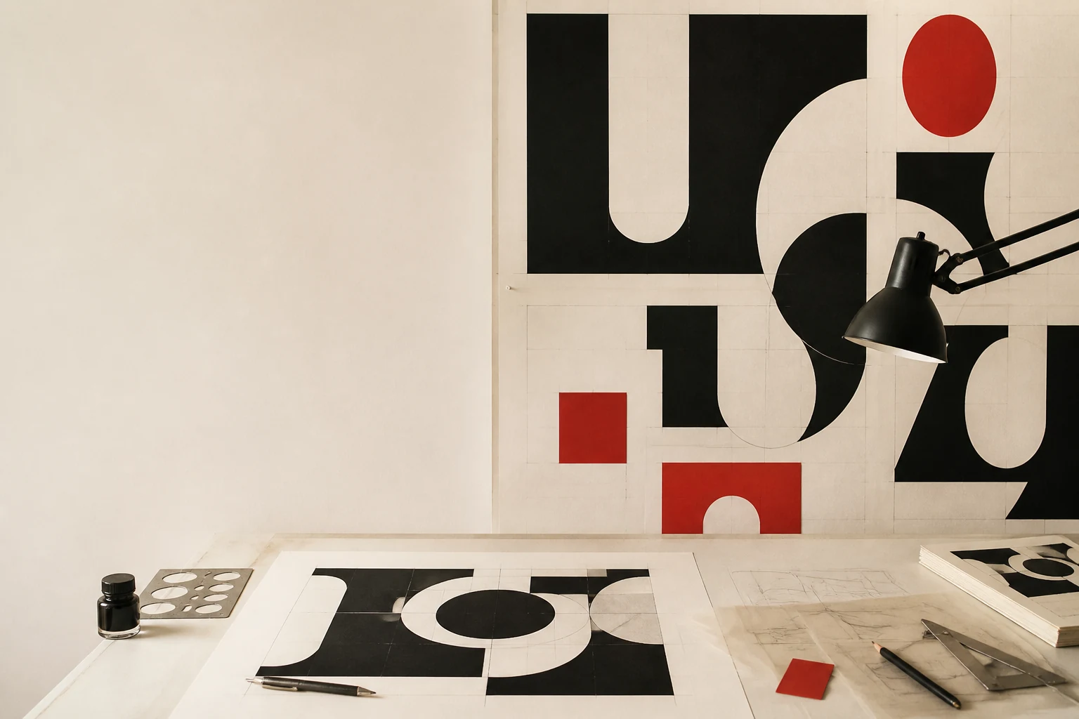
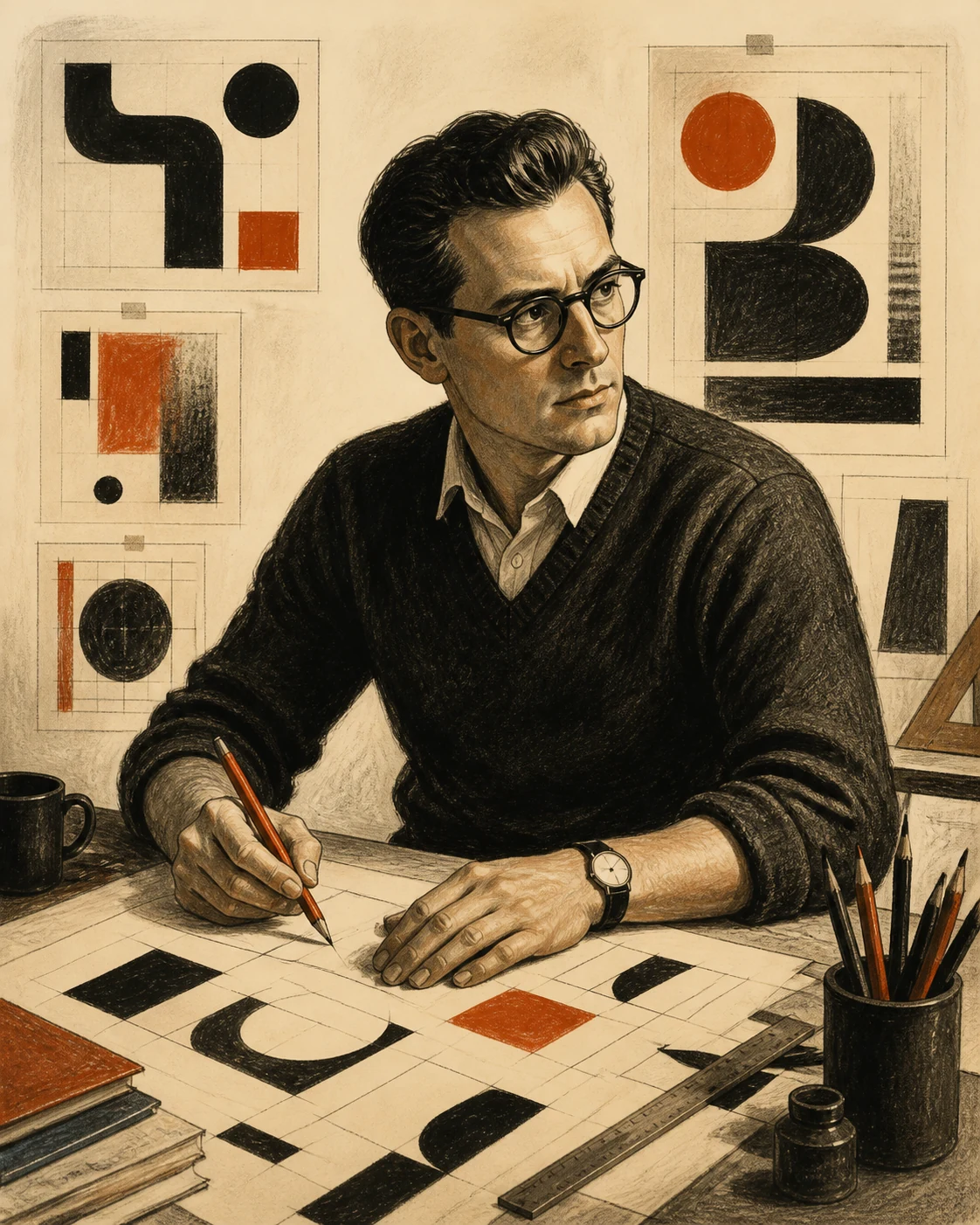
Lubalin turned the letter from a neutral carrier of text into an active character: a word can embrace, argue, move and sell an idea, while a typographic system can connect a magazine, a typeface, publishing culture and business.
Editorial thesis
Herb Lubalin matters not as the creator of a collection of attractive retro effects. His contribution is the proof that typography can read, picture and interpret content at the same time. From Ralph Ginzburg's magazines to ITC and U&lc, he built systems in which letters became editorial voice and phototypesetting became the condition for a new professional culture. [source]
Reader question
What changes when a designer stops treating letters as neutral symbols and begins using spacing, counters, ligatures and rhythm as image-making material? And why is copying Lubalin’s visual manner almost always weaker than understanding his method?
Short answer
Herb Lubalin (1918–1981) was an American graphic designer, art director, typographer and type designer. He worked in advertising, founded his own studio, art-directed Eros, Fact and Avant Garde, co-founded International Typeface Corporation, and from 1973 designed U&lc. His archive is preserved at the Herb Lubalin Study Center at Cooper Union. [source]
1. New York, 1918: a quiet child in a city of loud messages
Herbert Frederick Lubalin was born in New York City on 17 March 1918 and grew up in a creative household where music and art were part of everyday life. Lubalin100's researched biography describes a quiet child who was not an outstanding conventional student but changed markedly after entering Cooper Union. Colour blindness did not define his career; attention to form, rhythm and silhouette mattered far more. 4
This is an important starting point for the designer he became. Lubalin did not build a professional identity around academic perfection. His mature work repeatedly shows that expression does not require decorative excess; it requires hearing the character of a word and turning that character into a visual gesture.
2. Cooper Union, 1936–1939: craft becomes ambition
At Cooper Union Lubalin began without the profile of an obvious star, yet graduated from the School of Art in 1939 with the Student's Medal for General Excellence. He also met Sylvia Kushner and Lou Dorfsman there, both important to his personal and professional life. The archival biography stresses how his attitude to work became disciplined and ambitious during these years. 2
Cooper Union matters for another reason: the story eventually returns to the institution. Lubalin later taught there, and after his death the school established the Herb Lubalin Study Center. Education is therefore not a biographical footnote but a line connecting training, practice, teaching and archive.
3. 1939: the World's Fair and the first professional test
Lubalin's first job after graduation involved lettering for a sign company at the 1939 New York World's Fair. Lubalin100 preserves the almost comic detail that he was dismissed after asking for a two-dollar increase to his weekly wage. A sequence of small agencies, publications and advertising jobs followed, providing the ordinary commercial apprenticeship of the period. 4
This phase did not yet produce the celebrated Lubalin language, but it produced endurance. Before the letter could become an image, it had to function in the real world of deadlines, budgets, production limitations and advertising hierarchy.
4. Sudler & Hennessey, 1945–1964: advertising as a strict school of clarity
Lubalin joined Sudler & Hennessey in 1945 as an art director specialising in pharmaceutical advertising and promotion. By 1955 he was vice-president and creative director as the studio expanded into a broader advertising agency. Nearly two decades in that environment trained him to make images explain, persuade and perform quickly. 9
The later Lubalin is often presented as the opposite of corporate restraint, yet his expressiveness rests on advertising discipline. He understood that strong form does not remove function. A letter can be visually radical only when the designer knows exactly what it has to communicate.
5. 1964: 'fed up with advertising' and the independent studio
In 1964 Lubalin left a secure position and opened Herb Lubalin, Inc. He later described the move as a response to frustration with advertising and continual client compromise. The studio's name changed over time to reflect partnerships with Ernie Smith, Tom Carnase, Tony DiSpigna, Alan Peckolick and others. 4
This is not simply the story of a lone author finally becoming free. Lubalin built a laboratory in which he could choose problems and assemble strong specialists around them. Freedom meant selecting the constraints that actually helped an idea rather than eliminating constraint altogether.
6. Graphic Expressionism: typography stops pretending to be neutral
Lubalin described his approach as Graphic Expressionism: using typography and letterforms not merely as a mechanical means of setting words but as a way to express an idea and provoke an emotional response. For him, a word did not have to behave as a quiet container for meaning; its form could participate in content as actively as photography or illustration. 4
This marks the central break with an ideal of visual neutrality. Lubalin did not reject clarity, but he rejected the belief that clarity must always be invisible. When a word speaks about intimacy, conflict, sex, family or politics, spacing and internal form can become part of the argument.
7. Tight spacing: why the word matters more than the isolated character
Lubalin repeatedly reduced space between letters and lines, arguing that readers perceive words as structures rather than one character at a time. His extreme kerning became possible in the era of phototypesetting, when the physical body of metal type no longer imposed the same limits and designers could force letterforms into new relationships. 4
This is not permission to compress everything. In Lubalin's best work, density creates semantic cohesion: letters become one construction and negative space becomes active drawing. Without that logic, 'Lubalinesque' typography quickly becomes a mannerism in which tightness substitutes for an idea.
8. The word as image: Marriage and a visual grammar of relationships
One of Lubalin's defining methods was to make a word look like what it means. In logos and typograms he used rotation, overlap, mirroring and filled counters so that relationships among letters became relationships among concepts. His Marriage, with two R forms meeting one another, became an almost textbook example. 4
The important point is that an illustration is not added beside the word. The image happens inside language itself. The designer finds symbolic potential in existing letterforms and turns the act of reading into a small visual event.
9. Mother & Child, 1965: meaning placed inside a letter
The Mother & Child mark shows Lubalin's method at its most precise. The large O in MOTHER contains the smaller CHILD and ampersand, producing an image of protection and physical closeness. The Lubalin archive clarifies collective authorship: the design is credited to Herb Lubalin and Alan Peckolick, with Tom Carnase drawing the finished form. 5
The mark became famous because its metaphor needs almost no explanation. Yet the apparent simplicity is deceptive: scale, position, counterform and ampersand must align with near-mathematical sensitivity. A small shift would collapse the emotional construction.
10. The studio as a network of authors: Carnase, Peckolick, DiSpigna and others
Lubalin100 repeatedly names the people who worked with Lubalin: Tom Carnase, Alan Peckolick, Tony DiSpigna, Annegret Beier, Ernie Smith and many others. Lubalin could formulate an idea and recognise the right solution, but the making of numerous famous marks and typefaces was collaborative. 4
For VANSMITHLAB this matters. The single-genius myth is convenient but explains design badly. Lubalin's authorship becomes more interesting when we see how he created conditions in which lettering artists, designers, illustrators and type specialists could develop an idea beyond what one person could execute alone.
11. Eros, 1962: the magazine as an object rather than a container
Lubalin's collaboration with publisher Ralph Ginzburg began with Eros, an expensive hard-cover quarterly about love, sexuality and culture. Lubalin received unusual freedom to decide format, typography, imagery and pacing. The result was a magazine that behaved as a designed object rather than a neutral vehicle for articles. 9
For Lubalin, Eros was a chance to prove that editorial design could shape how material is encountered instead of decorating it after the fact. Cover, endpapers, white space, photographic scale and paper quality became arguments in their own right.
12. Eros and censorship: design inside a public conflict
Eros appeared when American norms around publication, sexuality and obscenity were rapidly changing and were simultaneously subject to legal pressure. Ginzburg's publishing activity faced federal prosecution, and the controversy affected not only the publisher but the possibility of radical editorial experimentation itself. 8
Design cannot be separated from distribution here. Lubalin created a refined, tightly controlled visual form for material authorities considered dangerous or unacceptable. The contrast between elegance and public scandal makes Eros a powerful case of design participating in a dispute over what may be published.
13. Fact, 1964–1967: restrained form for provocative text
After Eros, Ginzburg and Lubalin created Fact. Unlike the luxurious materiality of the previous project, Fact worked with a more economical, text-driven structure. The Lubalin Center uses Fact spreads to show how differently Lubalin could handle editorial tone without forcing every publication into one signature visual gesture. 8
This is a useful correction to the caricature of Lubalin as a designer of ligatures alone. When material requires tension, irony or intellectual distance, expression can come through controlled structure. The system should match the publication's voice, not the art director's personal manner.
14. Lubalin + Ginzburg: trust between editor and art director
Cooper Union describes the Lubalin–Ginzburg relationship as one of the major creative partnerships of the 1960s. Together they made Eros, Fact and Avant Garde while navigating censorship, accusations, legal pressure and financial risk. Ginzburg supplied editorial provocation; Lubalin was given substantial freedom to frame it visually. 6
That trust explains the work better than style does. Strong art direction emerges when editorial thinking and visual structure develop together, rather than when a designer is asked to package a finished text product.
15. Avant Garde, 1968: a magazine about the future receives an impossible name
Avant Garde was intended as a voice for art, politics and cultural conflict at the end of the 1960s. The name itself struck Lubalin as almost impossible: any solution declared 'avant-garde' risked becoming obsolete the moment it appeared. Identity development became an extended debate with Ginzburg and a sequence of deliberately unsuitable proposals. 9
The disagreement became productive. Rather than adding a fashionable futuristic effect, Lubalin began investigating the structure of the letters themselves. The final mark looked geometrically controlled yet intimately interlocked, turning the name into a system rather than a decorative label.
16. Avant Garde ligatures: when connection becomes content
The final Avant Garde logotype relied on capital ligatures such as AV, VA, AN and GA. In an article for the first issue of U&lc, Lubalin recalled moving through numerous stylistic proposals before arriving at this system of linked capitals. 9
Here the ligature stops being a conventional typographic convenience and becomes the engine of composition. Letters do not merely sit next to one another; they form architecture. It is a rare example of a logo generating a visual language capable of living beyond the original title.
17. 1970: a logotype becomes ITC Avant Garde Gothic
The popularity of the Avant Garde identity led to a commercial typeface expansion. Avant Garde Gothic was released in 1970; Lubalin100 emphasises the contribution of Tom Carnase, who drew the logotype and the eventual typeface, with later additions by other designers. 11
This was a shift from bespoke lettering to a reusable system. It also created a paradox: a solution that worked perfectly for one publication became a universal product and often lost its original discipline. Lubalin later criticised careless uses of the typeface bearing his reputation.
18. Tom Carnase and the problem of the 'Herb Lubalin typeface'
Avant Garde Gothic is often casually described as 'Herb Lubalin's font', while the archive gives a more precise account of collaboration: Lubalin established the visual idea and ligature logic, and Carnase was central to drawing and systematising the forms. 11
This is why attribution matters in design history. Conceptual authorship and drawing authorship can be distributed across different people, while popular culture prefers to compress a complex process into one recognisable name.
19. International Typeface Corporation, 1970: type becomes a licensing system
In 1970 Aaron Burns, Herb Lubalin and Edward Rondthaler founded International Typeface Corporation. The Type Directors Club describes ITC as one of the earliest type foundries without a conventional foundation in metal-type manufacturing: it was built around the new economics of phototypesetting and licensing designs to independent equipment and type suppliers. 4
For Lubalin this was a logical extension of editorial practice. If technology had freed the letter from metal, a new cultural and business infrastructure was needed so type designers could be paid and type systems could circulate across machines and markets.
20. U&lc, 1973: a type catalogue becomes a cultural magazine
In 1973 Lubalin began designing U&lc, ITC's in-house publication, whose name stood for Upper and lower case. Instead of producing a conventional specimen catalogue, he made a large tabloid in which new typefaces appeared through editorial features, illustration, essays, play and historical references. 4
It is an early and unusually sophisticated form of content marketing. U&lc sold type not through blunt promotion but by constructing a culture around it: the reader was invited to belong to a world in which typography was an intellectual and visual adventure.
21. Becoming your own client: U&lc as maximum creative freedom
Lubalin said that he had worked for decades toward the ideal of becoming his own client. U&lc came close to that condition: as editor and designer he could shape content, contributors, pacing and type presentation without the usual chain of client approvals. 4
Freedom did not make the publication chaotic. U&lc reveals how demanding Lubalin remained about selection and editing. Autonomy only worked because it was supported by decades of production discipline.
22. U&lc as a laboratory: illustration, essays, lettering and other voices
Lubalin regularly used U&lc to publish illustrators, designers and writers, turning the paper into an open platform rather than a personal portfolio. Recollections repeatedly mention his willingness to give contributors room instead of editing them into a single house style. 4
This is art direction based on selection rather than total stylistic control. A system can remain recognisable without forcing every contribution to look the same, a principle that remains relevant to magazines, brands and digital platforms.
23. Ronda, Serif Gothic and Lubalin Graph: letters as families, not one-off tricks
Beyond Avant Garde Gothic, Lubalin participated in Ronda with Tom Carnase and in Serif Gothic and Lubalin Graph with Tony DiSpigna. Lubalin100 records these collaborations as part of a broader effort to turn expressive display ideas into reproducible type systems. 11
Lubalin Graph is particularly revealing: a geometric sans logic is extended into a slab-serif voice. The point is not a single spectacular letterform but the possibility of related typographic personalities for different communication problems.
24. PBS: typography moves into time
After 1971 Lubalin's studio worked on animated titles for PBS. Writing in U&lc, he described the approach as Metaphorical typography: words and signs changed through time so that typographic form became a sequence rather than a static composition. Production involved the Lawrence K Grossman Agency and Edstan Studios. 2
This is an important bridge to contemporary motion design. Lubalin did not merely make letters move; he transferred into time the same principle used on paper: the form of a word should reveal meaning. The logic now feels native to title design, interface motion and kinetic identity.
25. Teaching: Cornell and a return to Cooper Union
Lubalin began teaching at Cornell University in 1972 and taught at Cooper Union from 1976 until 1981. Biographical sources stress that he entered education as a highly experienced practitioner, bringing to the classroom production knowledge and critical judgement rather than a closed rulebook. 2
His frequently remembered advice that real education begins on the first day of the job captures the temperament. Typography was not an abstract exercise in classification for Lubalin; it was a way of solving concrete communication problems under real conditions.
26. Against cold neutrality: human expression instead of one universal canon
Research around the Lubalin Center and Unit Editions often positions Lubalin against strict Swiss-modernist orthodoxy. It is more useful, however, to see a dispute with the idea that universality demands emotional neutrality. Lubalin could use systems while allowing those systems to speak in different voices. 2
This makes his work especially valuable after studying Swiss Style. Grid, hierarchy and typography remain professional tools, but the designer may make a letter comic, anxious, erotic, tender or political when content requires it.
27. Political conscience: design does not have to be neutral
Lubalin100 materials repeatedly point to Lubalin's political sensitivity and his willingness to work with subjects many commercial designers avoided. His relationship with Ginzburg, response to censorship and choice of editorial projects show that professional freedom had a public dimension for him. 8
That does not turn every Lubalin work into an activist poster. It means that a designer never exists outside publishing conditions. Choosing a client, platform, subject and degree of risk already carries a position, even when the resulting visual form remains elegant.
28. Collective authorship: generosity as part of a professional system
Accounts of Lubalin repeatedly mention his willingness to acknowledge collaborators. Unit Editions and Lubalin100 note that he often displayed the names of designers and lettering artists rather than concealing how studio work was made. This matters especially for pieces later attributed to him alone. 9
Such a model does not weaken the role of a strong creative director. It clarifies it: recognising people, combining their skills and holding an idea together. In contemporary production that resembles visual direction more than the romantic image of a master personally drawing every element.
29. The danger of 'Lubalinesque': when expression becomes decoration
Lubalin's influence generated decades of imitation: tight kerning, ligatures, oversized ampersands, rounded geometry and words turned into pictures. He himself watched Avant Garde Gothic used without judgement and publicly criticised many of those applications. 11
The lesson is paradoxical: to work 'like Lubalin', copy Lubalin less. His strongest solutions came from the meaning of a specific word and a specific problem. Take only the surface symptoms and the part that made the work convincing disappears.
30. The central legacy: a word can be an image, but the idea matters more than the effect
Lubalin died in New York on 24 May 1981. In 1985 Cooper Union and friends of the designer founded the Herb Lubalin Study Center of Design and Typography around his archive. In 2018 the Center launched Lubalin100 for his centenary, revealing additional layers of process, attribution and collaboration. 2
Lubalin's central lesson is not tight kerning or one famous typeface. He demonstrated that typography can be language, image, editorial voice and business infrastructure at the same time. Expression works only when form answers a specific meaning. His legacy is therefore not a style to copy but permission to think through letters as living relationships.