graphic designer profile
Paul Rand
Modernism, wit and corporate identity
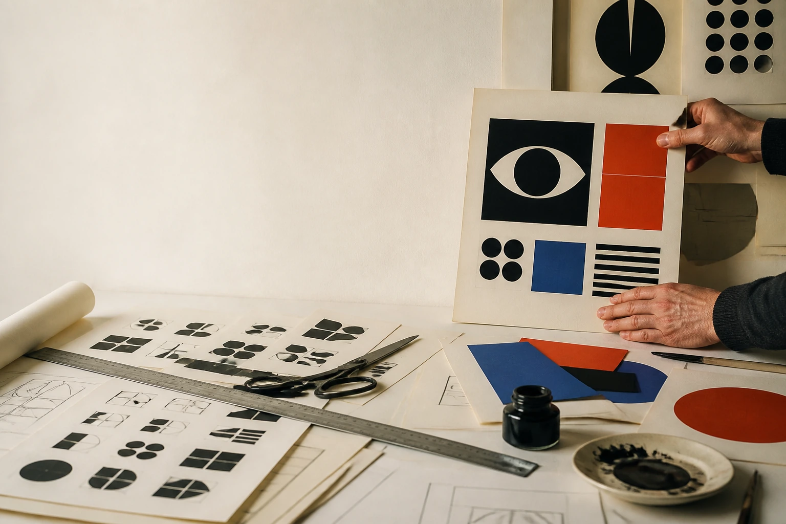

Rand turned graphic design from the styling of a commercial message into a system of thought: visual metaphor, play, typography, logo, packaging and corporate standards work together, connecting artistic ambition to a real business problem.
Editorial thesis
Paul Rand matters not because he created several supposedly timeless logos. He changed the profession by showing that a designer could think simultaneously as artist, editor and business strategist: reducing complexity to a strong sign, building a system of application and defending an idea through argument. [source]
Reader question
Why do the IBM, ABC or UPS logos look almost obvious in their simplicity - and why are solutions like these so difficult to reproduce?
Short answer
Because simplicity is the end of a long chain for Rand: research, selection, metaphor, typography, production testing and an understanding of how the mark will live inside an organisation. He reduces form only after expanding the understanding of the problem. [source]
1. Brooklyn, 1914: design before the profession existed
Paul Rand was born on 15 August 1914 in Brooklyn and grew up in a poor Orthodox Jewish family. Yale University Library records the dates 1914-1996, while later biographical material places his childhood in Brownsville and around his parents' store. 1
Poverty or religious upbringing should not be turned into a ready explanation for his visual language. The more useful point is that the profession of graphic designer did not yet have a settled status. Rand entered it through signs, advertising pictures, magazines and close observation of how images worked in everyday life.
2. Peretz Rosenbaum becomes Paul Rand: the name as a first identity
He was born Peretz Rosenbaum and adopted the professional name Paul Rand early in his career. Archival biographical accounts connect the change with antisemitic pressure in the American job market; only later did the compact pair of four-letter words acquire the elegance of a personal mark. 1
The episode should not be romanticised as a clever branding exercise because it began in social pressure. It does, however, introduce a theme that runs through his career: name, mark and reputation are read inside systems of power and recognition.
3. Self-education: the library, Gebrauchsgrafik and European modernism
Rand often described himself as largely self-taught in modernism. He studied European magazines such as Gebrauchsgrafik and Commercial Art, through which he encountered Cassandre, the Bauhaus, Constructivism, De Stijl, Cubism and new typography. 19
He did not simply copy Europe. His strength was translation: rigorous structure met American advertising speed, humour, photography, hand lettering and mass printing. Modernism became less an imported look than a practical language for American commercial culture.
4. Pratt, Parsons and the Art Students League: school without a ready-made system
Rand attended Pratt Institute, Parsons School of Design and the Art Students League, where he studied with George Grosz. He later criticised formal schools for paying too little attention to contemporary European culture. 2
The contradiction is useful. Formal education supplied craft and drawing discipline, but the intellectual system was assembled independently. The lesson is not that school is unnecessary; education becomes stronger when a student builds a map of sources beyond the compulsory curriculum.
5. Apparel Arts, 1936: the cover becomes a laboratory
In 1936 Rand was hired to work on an anniversary issue of Apparel Arts, the men's fashion trade magazine connected to Esquire. His collage-based covers quickly stood apart from more literal magazine graphics. 1
The cover became a laboratory of reduction. Instead of many cover lines, one visual conflict; instead of illustrating content, a metaphor. The future corporate Rand is already visible: complex material is reduced to a few forms without becoming banal.
6. Esquire: art director at twenty-three
By the age of twenty-three Rand was working as an art director within the Esquire/Coronet environment. That meant responsibility not only for images but for editorial flow, promotion and the mechanics of print production. 1
The early success matters less as a genius myth than as evidence of how quickly he learned to connect taste and business constraint. A magazine cannot wait indefinitely: a decision must be strong, reproducible and ready on deadline.
7. Direction, 1938-1941: a small budget and large freedom
From 1938 to 1941 Rand designed covers for Direction, a small cultural magazine with an antifascist position. A tiny budget was exchanged for a high degree of creative freedom. 14
The limitation strengthened the work. A map, barbed wire, a cross, cut paper or simple type could carry political tension without elaborate illustration. Rand demonstrates that editorial design can become an intellectual statement rather than decoration around text.
8. Collage, asymmetry and visual metaphor
Asymmetry, collage, photography, cut paper, hand drawing and bold type became central to Rand's visual vocabulary. Cooper Hewitt connects the language to Constructivism, De Stijl, Cubism and the Bauhaus, while the compositions themselves remain strikingly playful. 7
The deeper principle is visual metaphor. Two familiar things collide and produce a third meaning. That principle survives any particular style and remains useful in posters, social images and interfaces when imagery changes understanding rather than merely ornamenting a message.
9. William Weintraub, 1941: design enters advertising
In 1941 Rand became art director of the William H. Weintraub Advertising Agency and remained there until 1954. This phase carried his modernist discipline from editorial design into mass advertising. 14
American advertising was often organised around copy, with layout serving the words. Rand insisted that composition itself belonged to the idea. The professional hierarchy changes: the art director is no longer simply the person who makes an already-finished message attractive.
10. Bill Bernbach: image and copy become one idea
At Weintraub Rand worked with the young copywriter Bill Bernbach. Later accounts describe the partnership as an early model for the art-and-copy creative team that would become central to modern advertising. 14
The point is not to assign the entire Creative Revolution to one individual. The important principle is that words and images should emerge together. If the headline already explains everything, the image becomes illustration; if the visual ignores the copy, the advertisement splits into two unrelated halves.
11. El Producto: the commodity becomes a character
The El Producto campaign of the 1950s demonstrates Rand's characteristic wit. Cooper Hewitt describes a series in which the cigar receives hats, accessories and different personalities. 8
The commodity never disappears: the cigar remains literal and central. Character is built around it. The campaign remains a useful lesson in product advertising because metaphor can humanise a brand without sacrificing product legibility.
12. Thoughts on Design, 1947: the designer defines the profession
Thoughts on Design appeared in 1947 and became one of the key texts of American graphic design. Cooper Hewitt describes it as an influential manifesto of modernist theory and practice. 19
Rand writes from practice rather than academic distance. The book connects form, function, symbol, audience and aesthetics. The designer is not a stylist choosing a beautiful surface but a person who analyses a problem, removes excess, finds analogy and constructs a clear visual argument.
13. The play instinct: a serious problem needs play
Rand returned repeatedly to the idea of a play instinct in essays and teaching. Play was not the opposite of discipline but a method for finding unexpected relationships among forms. 20
This helps explain why his modernism rarely feels sterile. A strict structure can coexist with a childlike drawing, rebus, accidental object or absurd association. A strong system does not prohibit play; it provides boundaries clear enough for play not to collapse into noise.
14. 1954: independent practice and the turn toward corporate identity
In 1954 Rand left agency life and concentrated on independent practice, teaching and long-term corporate consulting. The transition coincided with the rise of corporate identity as a distinct American design discipline. 14
The scale of the problem changes. Advertising lives by campaign; identity must survive years, thousands of applications and multiple departments. The designer now needs not only a powerful idea but a system that does not disintegrate through repeated use.
15. IBM, 1956: the logo as an entry point into a larger system
In 1956 Eliot Noyes brought Rand into IBM's Design Program. IBM now describes the moment as the beginning of a modern chapter in its visual language; Rand's initial logotype had to announce a new era while preserving continuity. 12
The mark was only the entry point. The work extended through publications, packaging, stationery, exhibitions and other touchpoints. Corporate identity becomes a form of quality management and the graphic designer becomes part of organisational infrastructure.
16. IBM 8-bar, 1972: changing a mark without destroying memory
In 1972 Rand created the eight-bar version of the IBM logo, which remains the company's primary mark in 2026. IBM stresses that its basic construction has remained unchanged for more than fifty years. 13
Its durability is not mystical timelessness. Rand changed the mark gradually: solid letters, stripes, then the refined eight-bar structure. Identity preserves memory when change happens inside a recognisable framework rather than restarting the brand with every redesign.
17. Eye-Bee-M, 1981: the corporation permits itself a joke
The 1981 Eye-Bee-M rebus replaces I with an eye, B with a bee and retains the striped M. IBM still uses it as part of its heritage, while MoMA holds related work in its collection. 12
What matters is that the joke occurs inside a serious technology corporation. The rebus humanises the system without destroying authority. Brand consistency does not mean permanent solemnity; a strong identity can sustain a controlled exception.
18. Westinghouse, 1960: the mark has to live in motion and infrastructure
Rand's 1960 Westinghouse mark represents another form of corporate system. The Paul Rand archive preserves not only the symbol but graphics identification manuals, vehicle programs, signage and advertising. 17
That breadth is the point. A successful mark is tested not at the centre of a presentation slide but on a service truck, sign, box, screen and tiny nameplate. Corporate design becomes engineering for application.
19. UPS, 1961: the parcel on the shield and the test of application
Rand's 1961 UPS shield with a tied parcel remained in use until the 2003 redesign. Archival materials preserve sketches and applications, while later accounts emphasise that Rand checked the symbol on delivery vehicles. 16
The method is intensely practical. A mark has to survive dirt, speed, scale changes and daily use. A beautiful vector symbol that collapses on a real carrier is not a finished design.
20. ABC, 1962: a media brand without visual noise
The ABC logo of 1962 approaches extreme reduction: three lowercase letters organised inside a circular structure. The Rand archive records the date and authorship, and the mark became one of the most persistent identities in American television. 16
Simplicity is particularly demanding for a media brand. The symbol must coexist with faces, titles, live graphics and huge volumes of content. It should provide a stable point of identification without constantly competing for attention.
21. Corporate identity is not a logo: packaging, signage, paper and behaviour
Cooper Hewitt notes that coordinated corporate identity was conceived as far more than a logo - it covered signage, letterheads, packaging, publications and environment. IBM became one of the clearest demonstrations of the approach. 8
The distinction remains essential to contemporary branding. A logo file is not a design system. Identity also determines how an organisation speaks, organises information, uses material, behaves in space and applies its own standards.
22. A logo cannot create reputation by itself
Rand wrote about good design and good will, but also warned that a beautiful object that fails to work reflects on a company's integrity. 19
This places an important limit on branding. Design can organise a reputational signal but cannot replace product quality, governance or ethics. When corporate behaviour contradicts the visual promise, identity stops building trust and can begin to intensify the perception of hypocrisy.
23. Yale, 1956-1985: teaching as a test of argument
From 1956 to 1985 Rand taught graphic design at Yale. Cooper Hewitt records the period, and Yale School of Art still maintains the Paul Rand Lecture Series. 2
His teaching demanded that students explain decisions. A visually appealing form was not enough; the author had to say why it existed. Critique therefore became training for future client presentations: an idea had to withstand questions rather than simply please its maker.
24. Critique, severity and the problem of the authoritarian mentor
Many recollections describe Rand as an exceptionally severe teacher whose criticism could be harsh and humiliating. 3
Contemporary pedagogy should separate valuable rigour from authoritarian manner. A strong mentor can force an argument to become more precise without using intimidation as a method. The productive legacy is rigour of reasoning, not imitation of Rand's abrasiveness.
25. Children's books: simplicity without simplification
Rand illustrated children's books including I Know a Lot of Things, made with Ann Rand. MoMA holds an illustration from the 1956 edition. 4
Children's graphics reveal his method with unusual clarity: simple form is not impoverished form. A child immediately detects rhythm, colour, scale shifts and visual jokes. The work releases Rand from corporate seriousness while preserving the discipline of the clear sign.
26. Abacus and textiles: graphics enter domestic space
His Abacus photogram became both the cover of Thoughts on Design and the basis for a textile pattern. Cooper Hewitt treats the work as a movement of one idea between book design and furnishing fabric. 7
Graphic form does not have to remain flat. Pattern enters the interior, repeats across a large surface and becomes part of domestic space. The system is now tested by physical scale rather than by the page alone.
27. NeXT, 1986: one concept instead of a menu of options
In 1986 Steve Jobs hired Rand to create the NeXT identity. The project archive preserves a presentation book in which the designer does not offer a menu of logos but builds a step-by-step argument for one concept: a tilted cube, the split Ne/XT and a specific typographic logic. 18
The presentation became a design legend. Its strength is responsibility: the author proposes a solution instead of outsourcing the decision to the client. But the method only works when supported by research and trust; one option without an argument is dogma, not confidence.
28. Enron, 1996: the limits of visual identity
Rand designed the Enron logo in 1996, one of the final marks listed in his archive. After the corporation's collapse, the symbol acquired a radically different historical context. 16
The case almost literally confirms Rand's own warning: strong identity cannot make an organisation honest. Graphic design can create coherence and recognition, but it cannot control financial reporting, management incentives or law. Enron is a useful defence against the idea that branding can repair a broken business.
29. Archives and institutional memory: Yale, MoMA, Cooper Hewitt
The Paul Rand papers are now held by Yale University Library; MoMA and Cooper Hewitt maintain significant collections of his work. Yale continues a lecture series in his name. 1
Archives matter because they reveal more than finished logos. Sketches, presentation books, printed objects and correspondence expose process, client constraints and production reality. Graphic design history becomes more accurate when the canonical mark is studied alongside the path that produced it.
30. The main legacy: the designer as author of an idea and a business tool
Paul Rand's main legacy is not a set of IBM-blue logos and not a command to make everything as simple as possible. 19
His deeper contribution is the designer as author of a visual idea who understands business, production, writing, image, symbol and audience as one problem. He demonstrated that commercial effectiveness and artistic ambition can coexist - but only when the designer takes responsibility for meaning, structure and quality rather than decoration alone.