graphic designer profile
Saul Bass
Symbol, motion and film as a visual system
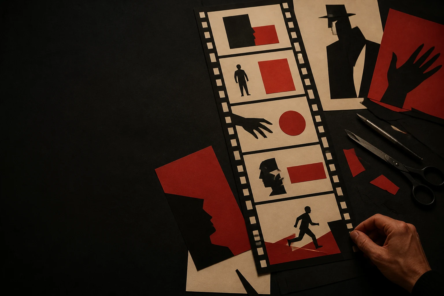

Bass showed that a film begins before its first scene: symbol, poster, titles, music and campaign can be organised around one idea, and the same discipline can scale into corporate identity at national level.
Editorial thesis
Saul Bass matters not because he made several famous posters and title sequences. His deeper contribution was the move from styling to conceptual system: one visual principle could connect a film symbol, motion, typography, music, advertising and, later, corporate identity. Bass did not explain content literally; he found a compact symbolic mechanism that made the viewer feel the structure of a story before narrative action began. [source]
Reader question
Why can four white lines, a single jagged arm or a few horizontal bars prepare an audience for a film more strongly than a detailed illustration filled with actors and scenes? And what changes when a designer thinks in terms of the whole experience rather than one isolated medium?
Short answer
Saul Bass (1920–1996) was an American graphic designer and filmmaker working across advertising, cinema and corporate identity. He collaborated with Otto Preminger, Alfred Hitchcock, Stanley Kubrick and Martin Scorsese; the Academy Film Archive holds roughly 2,700 items in his collection. Alongside titles and posters, Bass developed corporate systems, short films and his sole feature film, Phase IV. [source]
1. The Bronx, 1920: a visual language begins in the urban environment
Saul Bass was born on 8 May 1920 in the Bronx. His early story is useful not as a myth of innate genius but as professional formation inside a dense visual city: shop windows, signs, advertising, movie theatres and printed graphics formed part of everyday life. RIT records his early interest in drawing and illustration, followed by study at the Art Students League and Brooklyn College. 1
Bass’s mature work would become radically reduced, but that economy did not mean limited observation. It depended on seeing one form inside a crowded visual field that could hold attention. That ability later became the basis of the film poster, the corporate mark and the title sequence alike.
2. The Art Students League: craft before theory
Before Bass developed a recognisable method, he had to learn the craft of the profession. At the Art Students League he studied with Howard Trafton; professional biographical sources stress that Bass retained respect for process, material and execution even after he became a symbol of concept-driven design. 2
This matters when reading his apparent simplicity. A rough paper figure may look spontaneous, but it is not arbitrary. Reduction only works when a designer knows exactly what can be removed without losing meaning. In this sense Bass behaves more like an editor than a decorator: every element earns its place through its role in the sequence.
3. Brooklyn College and Gyorgy Kepes: the image as a system of relationships
At Brooklyn College Bass came under the influence of Gyorgy Kepes, the artist, theorist and educator associated with the New Bauhaus and with the idea of visual language as a system of relationships. RIT explicitly links Bass’s study with Kepes to Russian Constructivist typography and Bauhaus theory; the Smithsonian archive situates Kepes more broadly across Moholy-Nagy, light, photography, technology and visual communication. 2
For Bass this meant moving from the image as decoration to the image as organised effect. Form, scale, emptiness, contrast and motion became tools for directing perception rather than stylistic embellishments. The same principle would later work in both film titles and identity systems.
4. Los Angeles, 1946: advertising meets the film industry
Bass moved to Los Angeles in 1946. RIT identifies the move as the point after which his career found its main momentum: in the city of cinema, a graphic designer worked in immediate proximity to advertising agencies, studios, print promotion and the films themselves. 4
Before Bass, film advertising and on-screen titles were commonly treated as different production tasks. His practice gradually broke that boundary. He saw a film as something that could be designed before, during and after viewing: the poster builds expectation, the titles establish an emotional entrance, and the symbol keeps the film alive in memory.
5. An independent studio: the idea has to arrive before styling
By the early 1950s Bass had established an independent Los Angeles practice. At the centre of the model was not a fixed visual toolkit but the search for a concept capable of organising the project. That is why his strongest works vary so widely in technique: cut paper, photography, lines, live action, split screen or almost neutral typography can all serve the same discipline. 5
For VANSMITHLAB the methodological lesson is clear: style arrives after the problem. If a designer first chooses a 'Saul Bass aesthetic' and then forces content into it, the result becomes imitation. Bass worked in the opposite direction—finding the nerve of the project first, then choosing the minimum language that made that nerve visible.
6. Carmen Jones, 1954: one symbol gathers an advertising campaign
The turning point in film came through Otto Preminger. For Carmen Jones (1954), Bass developed an advertising concept in which a burning rose compressed passion and danger into one memorable image. Biographical accounts connect this campaign to his move from promotion into titles: Preminger recognised that the visual motif could live not only on the poster but inside the film. 6
The shift is fundamental. The symbol is no longer a logo applied after the fact; it becomes the semantic core of the campaign. One of Bass’s central strategies emerges here—not to show everything contained in a film, but to find an image that lets the viewer mentally complete the rest.
7. Otto Preminger: a director accepts the designer as co-author of the film threshold
Preminger proved unusually willing to give a designer broad responsibility. Their collaboration demonstrated that titles could be an independent directorial problem rather than a compulsory list of names. The Academy and MoMA preserve a substantial record of this line of work, from posters and album covers to title design. 19
Bass did not replace the director. He designed the transition between the viewer’s external world and the film’s internal world. This intermediate zone—the seconds before the first scene—became a medium in itself. In contemporary terms it resembles experience design: the audience does not yet have plot information, but its attention and emotional temperature have already been calibrated.
8. The Man with the Golden Arm, 1955: a jagged arm instead of plot illustration
For The Man with the Golden Arm Bass created one of the most recognisable marks of twentieth-century film design: a jagged black arm. MoMA connects the image to addiction and notes how a single symbol linked poster, soundtrack album and title sequence. 5
The radical step is the refusal of star portraiture and direct scene illustration. A Frank Sinatra film is sold not by his face but by an abstracted form. The form is simple enough to survive on the street, on a record sleeve and in motion, yet tense enough to transmit a psychological condition. Bass turns the marketing mark into a dramaturgical tool.
9. Titles as threshold: the film begins before the first scene
After The Man with the Golden Arm it became difficult to treat opening titles as neutral housekeeping. The Academy describes Bass as a figure who revolutionised the feature-film title sequence, while Criterion emphasises his transformation of obligatory credits into a space for concept, rhythm and expectation. 7
For Bass the point was not to decorate names but to prepare the mind. A sequence could create a climate in which the first scene would already be perceived differently. Titles become comparable to an architectural vestibule: not the main room, but a designed transition that changes the state of the person entering.
10. Rhythm and music: design that works to a count
MoMA preserves a revealing account of The Man with the Golden Arm: Bass and composer Elmer Bernstein worked in parallel, and the motion of the graphics was developed in relation to musical counts. 19
Graphic design is no longer static. A line has duration, a pause carries weight, and the appearance of a name becomes an editing event. Bass imports musical logic into screen graphics—repetition, accent, delay and break. This is why his titles cannot be judged adequately from still frames alone; meaning is produced through time.
11. Poster, album, trailer and titles: a film acquires one visual system
One of Bass’s strongest innovations was to think about a film campaign as a connected system of media. MoMA shows how the mark for The Man with the Golden Arm moved between poster and soundtrack sleeve; a comparable logic appears in Anatomy of a Murder, where the fragmented body works both as advertising image and as moving title material. 9
This is close to a brand system, but built for a single film. Media do not need to look identical; they need to derive from one idea. For contemporary art direction this remains more useful than a single key visual: the system can change format while retaining semantic DNA.
12. Vertigo, 1958: eye, spiral and anxiety without literal synopsis
In Vertigo Bass works with a mental state rather than plot: an eye, magnification, red light and endlessly forming spirals create an experience of pull and instability. BFI treats the sequence as a central example of Bass discovering the film’s underlying secret and translating it into an abstract mechanism. 12
The spiral does not explain the characters or retell events. It creates the physical sensation of recurrence, vortex and inability to escape movement. It is visual metaphor operating before rational interpretation—and therefore stronger than literal illustration.
13. John Whitney: a graphic idea meets computational motion
The spiral graphics for Vertigo were realised with John Whitney, a pioneer of mechanical and computational animation. BFI notes the technological systems used by Whitney to generate geometric motion. 19
The work complicates the myth of the solitary master. Bass formulates the concept and visual logic, but the final effect depends on a specialist in motion and technology. In that sense Vertigo anticipates the contemporary relationship between an art director and motion designer, creative coder or generative system: authorship remains strong while production is distributed.
14. North by Northwest, 1959: the grid becomes facade, movement and city
North by Northwest begins with a strict diagonal grid through which names enter the frame; the abstraction then dissolves into the reflective facade of a real building. BFI notes the transition from graphic construction to the surface of the city. 19
This is not the grid as typographic doctrine in the Swiss Style sense. It becomes a cinematic device: first coordinate system, then architecture, then human flow. Bass demonstrates how one structure can move between graphic design, architecture and live action without abandoning its organising principle.
15. Anatomy of a Murder, 1959: the body becomes a modular sign
For Anatomy of a Murder Bass cuts the human body into separate parts. MoMA and Criterion document the design as one of the central works in his film practice. 9
The body is simultaneously evidence, diagram and almost typographic composition. Crucially, the pieces can be rearranged: the mark becomes modular and adaptable to poster, titles and related graphics. Bass again finds not one image for a film but a rule capable of generating many images.
16. Psycho, 1960: typography fractures with the psychology of the film
In Psycho figures disappear and bars invade the screen, splitting and reassembling typography. BFI relates this formal fragmentation to the nervous structure of the film and Bernard Herrmann’s score. 16
The material is almost austere: black, white, grey, lines and typeset names. Motion makes these neutral elements threatening. It demonstrates that emotional intensity does not require illustrative abundance. When rhythm, direction and rupture are precise, minimal material can be more aggressive than a complex image.
17. The Psycho shower scene: storyboard, Bass’s contribution and the authorship dispute
Bass’s role on Psycho extended beyond title design. Pat Kirkham’s research in West 86th documents his position as pictorial consultant and his storyboarding of the shower scene. The stronger claim that Bass effectively directed the scene remains disputed, so it is more accurate to distinguish the well-supported contribution to visualisation and storyboarding from claims of full directorial authorship. 19
For design history the dispute is revealing. It shows how far a visual consultant could enter the production of cinema. The storyboard is not merely a service drawing made after a director’s solution; it can participate in designing space, editing logic and point of view.
18. Spartacus, 1960: object, sculpture and historical memory instead of poster language
Criterion credits Bass with the main title of Spartacus. Instead of familiar paper signs, the sequence uses sculptural fragments, surfaces and objects that read as material traces of Rome and power. 11
The example matters because it resists the reduction of Bass to rough cut-paper silhouettes. He did not defend one signature style. For a specific film he could move toward object and photographic image if these produced the necessary historical weight more effectively. The method stays stable while the visual form changes.
19. West Side Story, 1961: credits enter the surface of the city
In West Side Story, Bass’s graphic work connects to New York itself: letters, signs, wall textures and urban visual noise become part of the credits. The work is also tied to Elaine Bass and to photographic research into the city environment. 19
It is another way of erasing the boundary between design and film. If North by Northwest turned a grid into a facade, here the city is no longer background for typography—it becomes the medium. Contemporary location-based identity and environmental graphics rely on the same principle: space itself can carry communication.
20. Elaine Bass: a partnership that cannot remain a footnote
RIT explicitly records Saul Bass’s collaboration with Elaine Bass, while Criterion’s discussion of later title work stresses that many projects should be read as the product of Saul and Elaine together. 11
Elaine is especially important to the later period, where photography, live action, time-lapse and more sensuous imagery expand the studio language. Editorially, it is important not to reproduce the old model of a great man surrounded by unnamed assistance. Bass’s history becomes more accurate when Saul’s individual method is distinguished from the collaborative production in which Elaine was an independent creative partner.
21. Walk on the Wild Side, 1962: a live animal becomes a graphic character
In Walk on the Wild Side Bass abandons flat graphic material and builds the title sequence around a black cat. Criterion points to the sequence as an example of his ability to transform an ordinary subject into an extraordinary visual sign. 11
The cat remains real, yet framing, light, editing and typography turn it into an almost abstract form. The sequence demonstrates a key Bass quality: he did not need one technique to preserve an authorial logic. Graphic force could be created inside photography and live action without drawn stylisation.
22. Grand Prix, 1966: speed becomes an editing structure
In Grand Prix, speed is handled through split screen, machine fragments, timing and editorial juxtaposition. Criterion includes the sequence among Bass’s works that use the language of cinema far beyond static graphics. 11
He designs not an image of a car but an experience of a system: preparation, mechanics, waiting, repetition and acceleration. For motion design the lesson is durable—a dynamic object does not need to be shown whole; it can be understood more powerfully through temporal and spatial fragments.
23. Why Man Creates, 1968: the designer becomes a filmmaker and wins an Oscar
Bass had been moving beyond title design for years, but Why Man Creates made the shift institutionally visible. The Academy records the film as the 1969 winner for Documentary (Short Subject), with Saul Bass as producer. 19
The film combines animation, documentary material, graphic devices and essayistic structure around the question of creativity. There is no need to choose between designer and filmmaker: the capacity to organise ideas through a sequence of images makes the transition natural. Graphic design becomes a way of thinking in time.
24. Corporate identity: a parallel laboratory for the same method
Alongside cinema, Bass spent decades developing corporate identity. AIGA and RIT list organisations for which his studio created marks and systems, from Bell and AT&T to Continental and United. 7
A logo and a title sequence may look like opposite tasks: one is expected to remain stable, the other exists in time. Yet the method is the same—find a compact idea, remove the unnecessary and test whether the idea survives changes of scale and medium. In film it must survive motion; in identity it must survive years of use.
25. Continental and United: a mark must live on an aircraft, ticket and in memory
Northwestern University Transportation Library documents Continental Airlines’ 1968 rebranding and the United Airlines tulip of 1974, connecting both projects to Bass. 16
An airline is a severe test for identity: the mark has to function on a giant aircraft tail, timetable, ticket, advertisement and airport environment. Bass designs not a decorative emblem but a form with a strong silhouette and high reproducibility. It is the same thinking found in his film symbols—the idea must be read instantly as context changes.
26. Bell System and AT&T: identity as infrastructure at national scale
AT&T’s brand history shows the transition from the Bell symbol of the late 1960s to the striped globe of the early 1980s. The Academy also preserves A New Look for the Bell System, Bass’s 1969 film presenting a new identity programme. 14
Here design becomes infrastructure: vehicles, buildings, telephone booths, forms and communications require common rules. The mark matters, but the standards of use matter as much. Bass demonstrates that corporate identity is a managed system for the behaviour of form, not a collection of attractive mock-ups.
27. Phase IV, 1974: the sole feature film and its recovered ending
Phase IV is the only feature film directed by Bass. The Academy Film Archive notes that in 2012 it rediscovered his original extended abstract ending, allowing the project’s directorial ambition to be seen differently. 12
The film is important precisely where it does not match expectations of 'Saul Bass design'. Its visual discipline is built through macro imagery, rhythm, repetition and the behaviour of systems. Bass’s interest in form remains tied to a larger question: how can an audience understand complexity through a sequence of observations?
28. The return with Scorsese: GoodFellas, Cape Fear, The Age of Innocence, Casino
After a period of reduced activity in mainstream title design, Saul and Elaine Bass returned to major films through Martin Scorsese. The Academy and Criterion associate the late period with GoodFellas, Cape Fear, The Age of Innocence and Casino. 7
The Age of Innocence is especially revealing: mid-century cut paper gives way to saturated photographic and botanical imagery, lace layers and slow unfolding. This directly contradicts the idea that Bass repeated one aesthetic for life. His continuity was conceptual rather than decorative.
29. Why the “Saul Bass style” is easy to copy and difficult to understand
A parody version of 'Bass style' is instantly recognisable today: rough cut paper, limited colour, hand-drawn grotesque type and diagonals. That is why it is endlessly imitated. Criterion’s discussion of his influence points to the difficulty of reproducing the quality that made the originals convincing. 9
The reason is simple: for Bass, form followed a thesis. The jagged arm exists because of addiction; the broken body because of Anatomy of a Murder; the bars of Psycho because of fracture. Remove the causal logic and keep only the texture, and modernism becomes retro decoration.
30. The central legacy: a strong idea should survive the format
Bass’s central lesson is not merely to 'make it simpler', but to find a form capable of surviving changing conditions. A strong visual thesis can become poster, motion, album cover, advertisement, logo or environmental system without collapsing into mechanical repetition. 10
For the contemporary designer, photographer or art director this is especially relevant in a landscape of many screens and formats. Do not begin with a list of adaptations. Begin with an idea that has an internal structure. Then the system scales through meaning rather than decorative uniformity.