illustrator profile
René Gruau
Line, Glamour and Fashion Illustration as a System of Visual Reduction
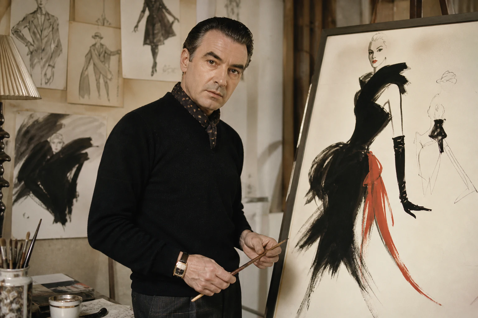
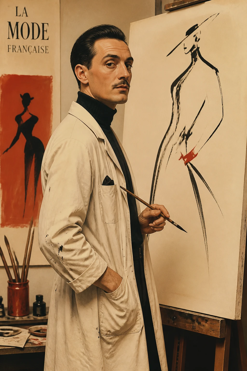
Gruau showed that fashion can be communicated not through the quantity of detail but through precision of selection: a contour, a block of colour and an empty field.
Editorial thesis
René Gruau matters not as a nostalgic master from an “era before photography.” His central contribution was to prove that the fashion image can become stronger through reduction: knowledge of clothes, line, colour, negative space and advertising metaphor compress complex cultural information into an instantly legible sign.
Reader question
Why can a few black lines, an empty field and one red accent by Gruau still feel more convincing than a complex luxury campaign?
Short answer
Because Gruau reduced noise rather than content. He understood garment construction, the body, brand character and the advertising task so well that he could leave only the elements carrying the whole image.
1. Rimini, 1909: between Italian origins and a French name
René Gruau was born in Rimini on 4 February 1909 as Renato Zavagli Ricciardelli. Italian and museum sources connect him to an aristocratic Italian family through his father and a French line through his mother; professionally he adopted his mother’s surname, Gruau. 2
This dual background matters less as decorative biography than as early experience of multiple visual cultures. His mature work would combine theatrical gesture with the discipline of Paris fashion, not as a literal national mixture but as the practice of someone formed between different environments.
2. 1924: a career begins before formal professional schooling
Palais Galliera dates the beginning of Gruau’s career as a fashion illustrator to 1924. He was still a teenager and did not follow the long academic route commonly associated with the fine artist. 2
That does not mean a lack of discipline. His later career reveals almost craft-like training of the eye: figure, cloth, posture, reduction and the ability to decide with one movement which detail matters and which can disappear.
3. Lidel, 1926: the magazine as a first professional school
From 1926 Gruau collaborated with the Italian magazine Lidel. At a time when fashion illustration remained a principal way to communicate new clothes, the magazine demanded both accuracy and character. 2
A drawing had to communicate silhouette, length, proportion, fabric and mood faster than description. One of Gruau’s defining methods appears here: the image does not copy the garment; it compresses it into the few signals the viewer remembers.
4. Paris, 1931: fashion becomes an urban media system
Palais Galliera identifies 1931 as the moment Gruau established himself in Paris. He entered an environment where couture, magazines, advertising, theatre and social culture operated within the same city network. 2
For a fashion illustrator, the runway and the page were inseparable. The task was not merely to look at a dress, but to understand how it would be discussed, printed, advertised and converted into a cultural sign.
5. Fémina, Marie Claire, L’Officiel, Silhouettes: the illustrator as editorial translator
During the 1930s and 1940s Gruau worked for Fémina, Marie Claire, L’Officiel de la Mode et de La Couture, Silhouettes and other titles. Palais Galliera specifically records his important role at Silhouettes. 2
Editorial drawing is not an autonomous picture inserted into a magazine. It translates a collection into page language: choosing viewpoint, amplifying gesture, controlling blank space and deciding what the reader sees first.
6. Line as selection, not decoration
The main technical myth about Gruau is that his drawings are “simple.” Their simplicity arrives only after severe selection. A contour may omit eyes, a hand or half a garment and still retain the exact shoulder movement that explains the whole figure. 2
Strong graphic reduction works this way: fewer lines do not mean less knowledge. The fewer elements remain, the more exact each must become. In this respect Gruau is closer to logo and poster logic than to a casual sketch.
7. Black, white and red: three colours as an architecture of attention
Palais Galliera describes a characteristic Gruau system: white paper, black ink and a vivid colour accent. Red repeatedly operates not as background but as semantic impact — lips, glove, fabric or sign. 2
The palette works because the white field is not empty. Black constructs form, red creates emotional force and untouched paper leaves room for imagination.
8. Negative space: luxury is built from what is absent
Many Gruau images feel luxurious because of the absence of detail rather than its accumulation. A figure may occupy only part of the sheet; the setting disappears; an object seems to exist in air. 2
This is a lasting lesson for luxury communication. Luxury can be produced through the confidence not to over-explain. Blank space becomes the visual equivalent of a pause.
9. Japanese prints and Toulouse-Lautrec: influence without imitation
Studies and contemporary surveys of Gruau regularly note affinities with Japanese prints and Toulouse-Lautrec: flat colour, emphatic contour, asymmetric cropping and instantaneous gesture. 2
It is more useful to describe this as method than quotation. Gruau learns from print and poster traditions how to remove perspectival depth without losing movement. The page is flat, yet the figure remains psychologically active.
10. Knowing clothes: stylisation works only after construction is understood
Fashion illustration can easily become fantasy in which clothes stop being legible. Gruau avoids this through deep knowledge of couture: waistline, distribution of volume, drape and the behaviour of fabric on the body remain readable even under strong stylisation. 2
His images therefore idealise and inform at the same time. They are not technical flats, but the viewer understands why the garment is new.
11. Balmain, 1946: drawing documents new French fashion before Dior
The Metropolitan Museum of Art holds A New French Style: Eight Models from Pierre Balmain, a 1946 publication illustrated with Gruau lithographs. It establishes his stature before the rise of the House of Dior. 2
Gruau already operates as an author capable of building a visual atmosphere around a collection. Post-war French fashion had not yet been labelled the New Look, but the language of renewed elegance was already being assembled.
12. Christian Dior: friendship before the house becomes a world symbol
The Met and Somerset House emphasise the friendship between Christian Dior and René Gruau. This matters because Gruau was not an anonymous contractor hired after the house became successful. He understood Dior’s taste and the cultural environment from which it emerged. 2
A rare form of collaboration follows: the designer creates clothes, while the illustrator does more than advertise the result — he builds a parallel visual language for the brand.
13. 1947: the New Look and image-making as part of a new era
In 1947 Dior presented his first collection and Gruau began a long collaboration with the house. Society of Illustrators and Somerset House connect his graphic work to the wider perception of Dior’s new femininity. 2
It would be inaccurate to claim Gruau “created the New Look.” The silhouette came from Dior’s couture ateliers. But the visual culture of the New Look was produced across clothes, press, photography, drawing and advertising, and Gruau gave it one of its most recognisable graphic voices.
14. Miss Dior, 1947: how to draw a scent that cannot be seen
Palais Galliera dates one of Gruau’s early Dior advertising drawings to 1947 for Miss Dior. Perfume gives the illustrator a problem more difficult than a dress: the subject itself is invisible. 2
Gruau answers with metaphor and gesture. Leopard paw, glove, hand, flower, ribbon or silhouette do not “show” the scent. They create a character — predatory, light, intimate or nocturnal. Advertising becomes a scene of desire rather than product description.
15. The “Gruau” dress, 1949–1950: a designer names couture after the illustrator
The Met holds the House of Dior dress “Gruau” from fall/winter 1949–50 and explicitly states that Dior named it after his friend René Gruau, who provided early advertising illustrations for the house. 2
The gesture reverses the normal hierarchy. Usually the illustrator visualises the designer; here the illustrator’s name becomes the name of a couture object. Mutual influence enters the formal archive.
16. Rouge Baiser, 1949: an iconic image that is not Dior
One of Gruau’s best-known works is the Rouge Baiser lipstick advertisement: a face with a blindfold, black graphic shapes and a sharp red accent. Palais Galliera dates the first poster to 1949. 2
Historical accuracy matters: Rouge Baiser was a separate brand, not Dior. Yet the image reveals Gruau’s pure mechanism. The product nearly disappears while its promise — kiss, confidence, provocation — becomes a memorable sign.
17. Advertising as an autonomous genre, not a commercial downgrade
From 1947 Gruau increasingly worked in advertising across couture, accessories, lingerie, perfume and cosmetics. Advertising was not a fall in status after editorial illustration. 2
It intensified his strongest qualities: immediacy, reduction, dramatic composition and the ability to give a brand character through a single figure. Commercial pressure made the image more exact.
18. Perfume advertising: from object to atmosphere
With Dior, Gruau produced imagery for a broad fragrance world. Somerset House built Dior Illustrated around the way his drawings translated perfume into visual characters and situations. 2
In this genre he anticipates the contemporary brand world: the product can nearly disappear if the viewer recognises the psychology of the brand through gesture, colour and scene.
19. Eau Sauvage: the male figure enters fashion illustration as a character
In Eau Sauvage advertising Gruau shifted attention from the conventional female couture body toward a male image. Dior Illustrated included Eau Sauvage as a major example of his work for the house. 2
His men can be relaxed, sensual, humorous and almost caricatural. This removes some of the heavy official tone from luxury advertising and shows that elegance can coexist with wit.
20. The United States and Flair: illustration enters competition with a new editorial culture
In the late 1940s Gruau worked in the United States for Harper’s Bazaar and Vogue, while Fleur Cowles brought him into Flair. Society of Illustrators and Vanity Fair note his special position within that short-lived but visually ambitious magazine. 2
Flair matters as an experimental print environment in which illustration could sit beside photography, typography, die-cuts and material interventions. Gruau’s drawing was no longer the only way to show fashion; it became one strong media voice among several.
21. Vogue, 1954: drawing and photography meet inside one image
Vogue preserves a 1954 example in which Gruau’s drawing of a Givenchy dress is superimposed on a photographic portrait of Veronica von Hagen by Erwin Blumenfeld. 2
This breaks the convenient myth that illustration simply ended when photography arrived. The media overlapped. Drawing could contribute abstraction, designer line and compression; photography contributed physical presence.
22. Photography displaces illustration — without cancelling its function
The digital Silhouettes archive shows photography gradually expanding within the fashion magazine of the 1940s: first small images beside drawings, then full-page and double-page photographs. 2
Gruau survives the shift by refusing to compete with photography in realism. He emphasises what the camera is not required to do: graphic metaphor, instant sign, omission and impossible lightness.
23. Lido: cabaret becomes a poster
From the mid-1950s Gruau produced numerous posters for the Lido. Musée des Arts Décoratifs and Christie’s document a long line of cabaret work. 2
Fashion illustration now intersects with urban advertising and spectacle. Feathers, legs, gloves, smiles and body movement do not document a show; they promise a night. The poster must work at distance and in seconds, so silhouette becomes even more powerful.
24. Theatre, ballet and costume: line leaves the page
Gruau also worked for stage culture through posters, costume and theatrical projects. Musée des Arts Décoratifs records, among other projects, La Belle de Paris in 1961 and his wider involvement with performance imagery. 2
The extension is logical. If a drawing is already built around gesture and motion, theatre becomes a space in which that gesture receives an actual body and duration.
25. A brand without a logo: when authorial language becomes identity
In Gruau’s strongest work, the client name can almost be removed and the discipline of the brand remains legible. This is especially true of Dior: black, white, red, line, glove, profile, animal metaphor, empty field. 2
Here the illustrator begins to act like an art director. He did not create a corporate identity system in the current sense, but he formed a repeatable visual world capable of linking different products without repeating one layout.
26. The star-signature: authorial visibility inside a commercial image
Gruau frequently signed works with his recognisable name and star. In advertising this creates a rare double identity: the client brand and the illustrator’s authorial mark coexist. 2
That visibility matters. The artist does not disappear inside the campaign; his style itself becomes part of what the commission is buying.
27. Economy of line requires an excess of observation
Later accounts often praise the “effortless” quality of Gruau’s drawing. But the ease rests on a large reserve of observation: body, anatomy, material, light, fashion history, graphic design and theatre. 2
This is his most useful lesson for the contemporary illustrator and AI image-maker. An image can be reduced only after one understands what is being removed. Otherwise minimalism becomes emptiness rather than precision.
28. 1989–1999: the museum turns commercial graphics into cultural history
By the end of the twentieth century institutions increasingly canonised Gruau, including exhibitions at the Musée du Costume / Palais Galliera and the Musée de la Publicité. Musée des Arts Décoratifs links him to the opening of the new advertising museum space in 1999. 2
The transition is revealing: work created for magazines, lipstick, fragrance or cabaret shifts from disposable commercial material to a document of visual culture.
29. Dior after Gruau: the house begins to quote its own illustrator
Gruau continued to influence Dior after his death. Vogue has noted John Galliano’s direct engagement with his graphic language; the 2010–2011 Dior Illustrated exhibition returned the Gruau–Dior relationship to public view. In 2025 official Dior again included Gruau illustrations in Christian Dior: Jardins Rêvés. 2
This is a rare feedback loop: the illustrator once translated the house into images; later his own visual language becomes source material for new fashion and exhibitions.
30. The main legacy: illustration was not a rough draft for photography
René Gruau matters not as the last great master of an era “before photography.” That description turns his medium into a historical dead end. His drawing does things photography is not obliged to do: compress reality into a graphic argument, turn scent into metaphor, clothing into gesture and a brand into a handful of instantly recognisable relationships. 2
That is why his work is newly relevant in an age of image excess. Gruau demonstrates the opposite strategy: do not add detail; decide which single contour, shape or pause will remain in memory after the image has left the screen.