analysis
Color: Directing Attention, Depth and Mood
How to stop making images “pretty” with sliders and start understanding colour as a system of relationships.
The most dangerous control in colour grading is the one that instantly makes the image more impressive. Saturation rises, skin turns golden, the sky deepens — and five minutes later the whole series is shouting in the same voice. Colour is stronger when it distributes meaning instead of decorating the frame.
Editorial question
Why can two photographs with the same palette feel completely different?
Short answer
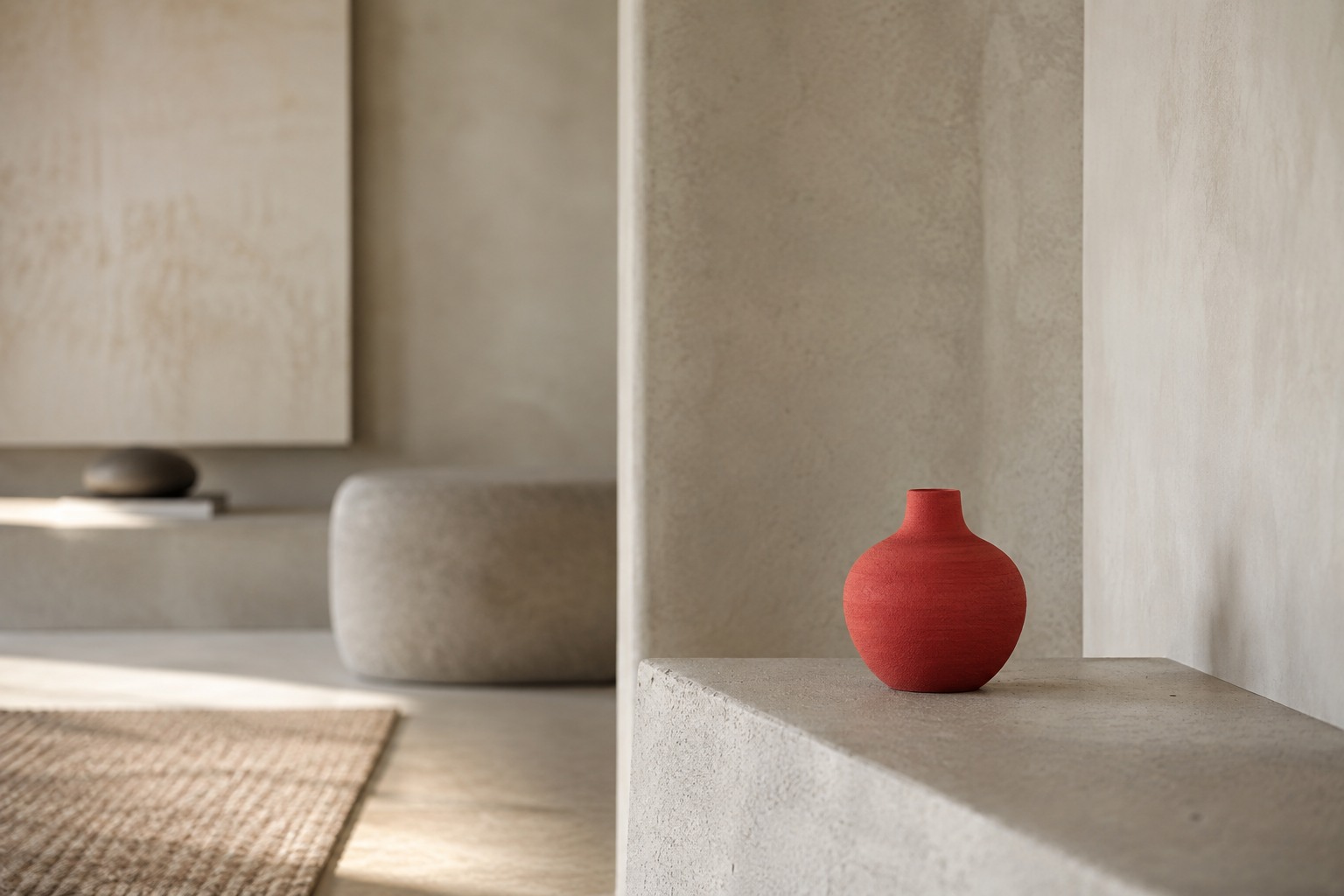
Because colour depends on brightness, area, adjacency, material, illumination and context. A small red accent in a grey frame behaves differently from a red wall; warm skin in a cool room reads differently from skin inside an entirely warm scene.
Thesis
Colour in photography works at once as a physical signal, a cultural association and a tool of hierarchy. To control it is to control relationships between colours, not to improve each colour separately.
The most dangerous control in colour grading is the one that instantly makes the image more impressive. Saturation rises, skin turns golden, the sky deepens — and five minutes later the whole series is shouting in the same voice. Colour is stronger when it distributes meaning instead of decorating the frame.
Evidence and cases
Colour begins before Lightroom
Colour does not start in the HSL panel. It begins with light, materials, wardrobe, paint and the way a camera interprets the scene. If a green wall reflects green light onto skin, no neutral white-balance setting can restore the face without changing relationships in the image.
Colour decisions are therefore strongest before the shoot: materials, background, clothing and light character first; grading continues the system rather than inventing it from scratch.
Colour is a relationship, not a number
The same RGB value looks different beside different neighbours. Photographers benefit from thinking relationally: warm against cool, saturated against neutral, light against dark.
An accent only exists because the field around it is calmer. If everything is saturated, there is no accent — only noise.
Light temperature is not the same as mood
Warm light is often called cosy and cool light distant. That vocabulary is convenient but simplistic. A blue dawn can be tender; a yellow lamp can be anxious. Mood depends on story, contrast and culture, not a single Kelvin number.
Practically, mixed sources matter because neutralising one can push another warmer or cooler. That can be corrected or used as narrative.
RGB and CMYK are different lives of colour
A screen creates colour with light; print creates it with inks on paper. Some luminous screen colours therefore cannot be reproduced in print. Adobe explains that devices use different colour spaces and gamuts. [source]
For a campaign that must live on both phones and paper, colour should be designed as a translation system rather than one ideal file.
An ICC profile is a passport, not magic
ICC profiles describe how a device or colour space reproduces colour. Adobe and the International Color Consortium use profiles to make colour more predictable across devices. [source]
A profile does not fix bad colour. It defines conditions. Think of it as an accurate map: it will not choose your route, but it prevents arguments with the compass.
Skin is not a separate colour project
Trying to make skin “perfect” outside context often kills the image. Faces reflect their environment — foliage, concrete, red walls, warm timber. Skin that has been completely neutralised can look plastic because it no longer belongs to the space.
The task is to retain recognisability and vitality while preserving a believable relation to the scene.
Saturation is volume, not quality
Increasing saturation gives instant impact because the picture gets louder. Loudness becomes tiring quickly. Mature colour work often depends on limitation: several quiet hues and one controlled accent.
Try reducing everything and restoring only the range that matters. Hierarchy often improves immediately.
The colour of a series matters more than one frame
In a campaign or portfolio, viewers read transitions between images. One frame may be deliberately cooler so the next warm image feels stronger. Uniform grading can become a preset; uncontrolled variation can destroy the world.
Check colour on a contact sheet as well as full screen. The frame that shouts without a reason becomes obvious.
Print gives colour a material body again
On screen, black can approach absolute darkness; on paper it depends on ink, paper and viewing light. ICC maintains profiles for defined output conditions, while Adobe describes rendering intents for translating out-of-gamut colour. [source]
A proof is not just a technical check. It is an encounter between image and material, and it may force a rethink of the colour concept itself.
Conclusion: colour needs a reason
Strong colour is rarely a random collection of pleasing hues. It answers: what matters, where is depth, what is the temperature of the world, what breaks the system and why?
If removing the grade does not change the logic of attention, the effect may have been cosmetic. If the structure collapses with the colour, then colour was truly building the image.
Visual analysis
The article's visual logic can be tested through «Colour begins before Lightroom», «Colour is a relationship, not a number», «Light temperature is not the same as mood», «RGB and CMYK are different lives of colour», «An ICC profile is a passport, not magic», «Skin is not a separate colour project». Compare these signs within one object or sequence rather than judging them as an isolated style.
Practical implication
Practical use begins by testing the thesis against a specific object, frame, or production decision. For this subject, the working criterion is: How to stop making images “pretty” with sliders and start understanding colour as a system of relationships.
Limitations
“Color: Directing Attention, Depth and Mood” is limited to its stated subject: how to stop making images “pretty” with sliders and start understanding colour as a system of relationships. The analysis does not replace examination of a specific original, project, or production context.
Sources
The open sources for “Color: Directing Attention, Depth and Mood” are listed in the page panel and define the boundary of its verifiable facts.