analysis
Composition Without Myths: How a Frame Actually Works
Why the rule of thirds is useful as an exercise and harmful as a religion — and what viewers actually read inside a frame.
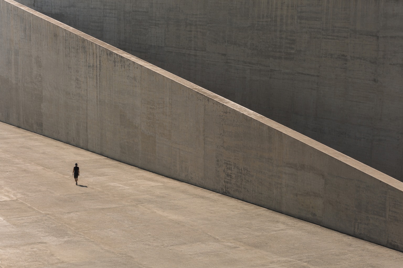
Composition becomes interesting the moment you stop looking for the correct grid position. A frame is not a mathematical puzzle with one right answer; it is a system of forces: gaze, weight, emptiness, movement, scale and everything left outside the picture.
Editorial question
If millions know the rule of thirds, why do millions of correctly composed photographs remain boring?
Short answer
Because a grid does not create relationships. Composition emerges from tension between objects, frame edges, lines of sight, light, scale and negative space. Rules can help us notice those relationships, but they cannot make the decision for us.
Thesis
Composition works not because elements obey a universal rule, but because the photographer organises relationships between them and controls the sequence of attention.
Composition becomes interesting the moment you stop looking for the correct grid position. A frame is not a mathematical puzzle with one right answer; it is a system of forces: gaze, weight, emptiness, movement, scale and everything left outside the picture.
Evidence and cases
The frame begins with exclusion
Every photograph is an act of selection. Even documentary photography never “shows everything”: the photographer chooses position, timing and what is left outside the edge. MoMA notes that composition, framing, cropping and editing inevitably introduce a point of view. [source]
So the first compositional question is not “where do I place the person?” but “what am I deliberately refusing to show?” Sometimes the image becomes powerful precisely because context is missing and the viewer must complete the space.
The rule of thirds is a useful crutch
The thirds grid is useful as early discipline: it breaks automatic centring and makes you notice empty space. But it has no magical power. A person can sit perfectly on an intersection and the image will still fail if background, gesture, light and scale do nothing.
The danger starts when a rule becomes an excuse. Composition must answer “why here?” rather than “because the grid said so.”
The centre is not a mistake
Centring can be extremely strong. Symmetry, frontal gaze and architectural axes can create control, pressure, officialness or calm. The point is not to avoid the centre but to understand its effect.
In MoMA’s discussion of Harry Callahan’s New York, the rigid grid of windows becomes a framework for deviations — curtains, cracks and signs of life. The departures from order make the structure alive. [source]
The frame edge is active
The edge cuts the world. It can accidentally amputate a hand or intentionally make a figure feel compressed. It can leave breathing room in front of a gaze or deny it.
Strong photographers feel all four edges, not only the subject. Street photography makes this obvious because decisions happen quickly, yet the result still depends on how figures negotiate those borders.
Lines only lead when there is somewhere to go
“Leading lines” easily become a cliché. A road, railing or shadow does not improve an image by itself. It becomes a compositional force when it points to something meaningful or collides with another direction.
Rodchenko and the avant-garde used high and low viewpoints, diagonals and unusual perspective to break habitual seeing; MoMA connects these strategies to the pursuit of fresh perception. [source]
Visual weight is not measured in kilograms
A tiny bright face can weigh more than a large grey wall. A black mark in a pale frame can pull the eye. A single gaze can create more tension than all the architecture around it.
Weight comes from contrast, recognisability, colour, sharpness and cultural significance. Balance is not equal area; it is the sense that forces inside the frame are intentionally related.
Negative space is not forgotten space
Empty space can make a subject feel fragile, isolated, free or monumental. In advertising it may hold copy, but in an authored image it can be content itself.
Try covering the empty area with your hand. If the picture merely becomes more informative, the space may have been accidental. If tension disappears, it was doing work.
A sequence changes the composition of one frame
A photograph in a book, campaign or carousel never exists entirely alone. A frame that feels “too empty” may be the perfect pause between two dense images. Magnum describes contact sheets as a way to trace how framing, light and moment evolve toward the selected image. [source]
Composition therefore operates on two scales: inside the frame and across the sequence.
Analyse instead of reciting rules
Take a photograph that grips you and forbid the phrase “nice composition.” Describe specifics: where is the highest contrast, where does the person look, what line cuts the frame, what happens in the corners?
This is how mechanism becomes visible. MoMA learning resources similarly ask viewers to examine viewpoint, perspective, composition and light as decisions that shape interpretation. [source]
Conclusion: composition manages expectation
Rules are comforting because they promise a checklist. Strong composition usually contains risk — too much emptiness, an awkward edge, a central figure, broken symmetry.
Do not ask whether a frame is correct. Ask where it sends the eye, where it creates tension and why the viewer wants to stay inside it for one more second.
Visual analysis
The article's visual logic can be tested through «The frame begins with exclusion», «The rule of thirds is a useful crutch», «The centre is not a mistake», «The frame edge is active», «Lines only lead when there is somewhere to go», «Visual weight is not measured in kilograms». Compare these signs within one object or sequence rather than judging them as an isolated style.
Practical implication
Practical use begins by testing the thesis against a specific object, frame, or production decision. For this subject, the working criterion is: Why the rule of thirds is useful as an exercise and harmful as a religion — and what viewers actually read inside a frame.
Limitations
“Composition Without Myths: How a Frame Actually Works” is limited to its stated subject: why the rule of thirds is useful as an exercise and harmful as a religion — and what viewers actually read inside a frame. The analysis does not replace examination of a specific original, project, or production context.
Sources
The open sources for “Composition Without Myths: How a Frame Actually Works” are listed in the page panel and define the boundary of its verifiable facts.