research
Bottega Veneta: weaving instead of a logotype
A house that made a production technique its identifying mark and therefore needs no visible branding.
Editorial thesis
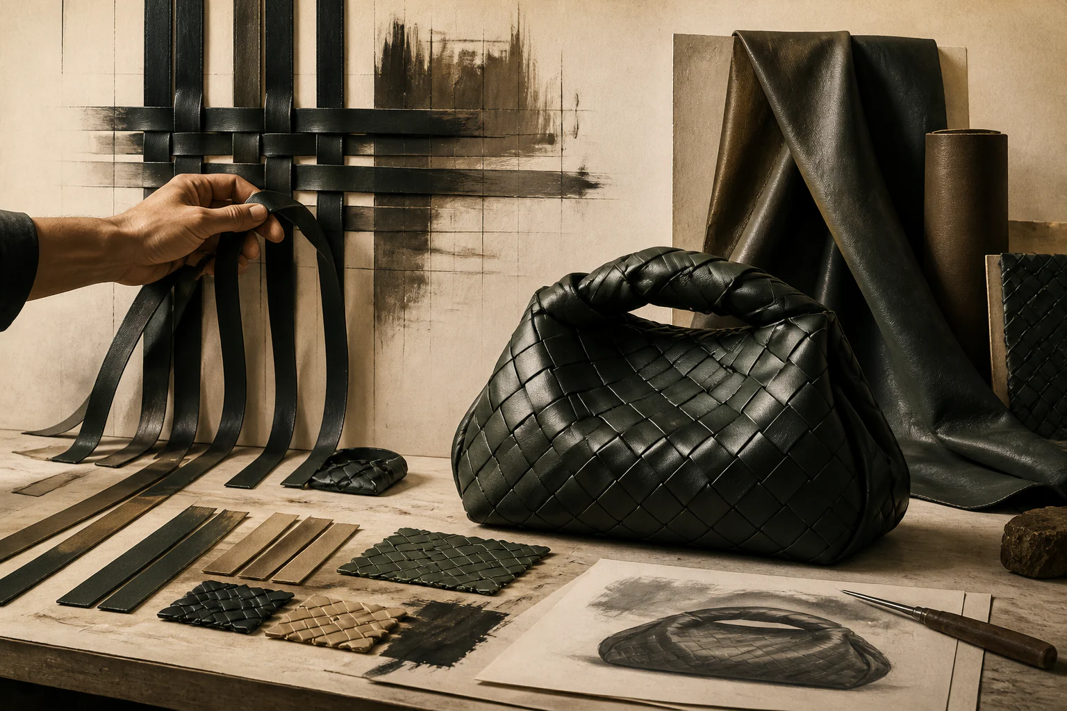
Bottega Veneta matters as a rare case where recognition is delivered by a manufacturing technique rather than an applied mark: weaving cannot be stamped onto a finished object; it must be built into the cut.
Reader question
Can a brand stay recognisable while consistently refusing a logotype?
Short answer
It can, if the mark is technological and therefore expensive to counterfeit. Founded 1966 by Renzo Zengiaro and Michele Taddei; context Vicenza and the Veneto.
1. Origin: a regional leather tradition
The brand emerged in the Veneto — a region with a dense concentration of leather and footwear manufacture. Its origin explains the essential point: access to makers was an initial condition rather than an acquired asset.
2. Weaving as the solution to a technical problem
The signature technique of interwoven leather strips arose from a constraint: available sewing machines could not handle thick leather. Strips were cut thinner and interwoven, achieving strength without a heavy seam.
3. Why this detail matters
That the device originated in a constraint rather than in aesthetic search is the key to the whole case. The house’s recognisable mark is a by-product of a production problem, and is therefore genuinely technological.
4. Refusing the visible mark
The brand formulated its position through an advertising line about one’s own initials being enough. Refusing a logotype was not modesty but address: the object is identified by whoever knows the technique.
5. The economics of an invisible mark
The strategy works only at the upper price level. It requires a buyer who does not need to display status to strangers, and therefore narrows the market deliberately.
6. The unstructured bag
One of the anchor models is built without rigid structure: form is given by the weave and by contents. This follows directly from soft finishing and interlacing — construction and mark coincide.
7. Entering a group
The brand joined a major conglomerate in the early 2000s. This supplied capital and distribution but raised the question of whether craft volumes are compatible with growth expectations.
8. A long period of restraint
For nearly two decades the house pursued a line of quiet luxury without sharp gestures. The strategy delivered stability and simultaneously made the brand nearly invisible to a younger audience.
9. The sharp turn of the late 2010s
A change of creative leadership at the end of the 2010s brought large scale, saturated colour, and new silhouettes. The weave remained but was enlarged to a size legible on a phone screen.
10. Adapting the mark to the channel
Enlarging the weave is a precise example of a distribution channel changing form. A fine technique does not read in a feed, so the mark was reworked for viewing distance rather than for the owner’s hand.
11. Leaving social media
In the early 2020s the house closed its own social media accounts, handing image distribution to third-party publications and to its audience. It is a consistent extension of the absent-mark strategy.
12. Scarcity as instrument
Restricting channel and production volume works like a limited edition: it restores the scarcity that industrial manufacture does not supply on its own.
13. The 2025 change of leadership
From January 2025 the post of creative director is held by Louise Trotter. The house is again in a position of testing: whether technique remains a sufficient basis for identity through another change of authorial hand.
14. What is transferable here
The technique transfers: it exists in makers’ hands and in production documentation rather than in a designer’s head. That is why the house survives leadership changes more easily than brands built on a signature.
15. Critical questions
The critique is justified: quiet luxury is a position available only to a very expensive segment, and its moral advantage over the logotype is doubtful. Enlarging the weave for the screen has also weakened the original argument about a mark for those who know.
16. How to read this house today
Look at the density and evenness of the weave at close range. The technique is tested at thirty centimetres, and that is where it becomes visible whether an object differs from an imitation reproducing only the pattern.