i-D matters not only as a fashion magazine, but as a system of looking that taught readers to read style through face, gesture, street and youth culture.
i-D matters not only as a fashion magazine, but as a system of looking that taught readers to read style through face, gesture, street and youth culture.
How did a small hand-made magazine from 1980 turn the street, the wink and young scenes into one of fashion media culture’s most recognisable languages?
i-D made fashion not only a question of clothing, but a question of identity. Its language is built on the straight-up, the wink, early talent discovery and the ability to translate subculture into an editorial image before it becomes a mass trend.
i-D was born in London in 1980 not as a calm fashion supplement, but as a way of observing the street. Its early energy belongs to punk-era London, clubs, hand-made print culture and the sense that style no longer came only from above — from fashion houses, gloss and campaigns. It came from below: from people, movement, subcultures and the way clothing became a way to say “I am here.” This is why i-D matters to VANSMITHLAB as a magazine that turned the street into an editorial source.
Terry Jones came to i-D after working in art direction at British Vogue. That move is important: he did not simply leave classic gloss behind; he carried professional discipline into a rawer, faster and more open environment. i-D did not reject fashion. It changed the entry point into it. Instead of waiting for the official seasonal image, the magazine learned to recognise style where it was already alive — on the street, in clubs, among young makers, photographers, stylists and musicians.
The history of i-D cannot be reduced to a single founder. Terry and Tricia Jones built an almost workshop-like production culture around the magazine: a small team, trust in young people, flexible editorial tone and attention to the energy of the moment. This explains why the magazine was long perceived not as a corporation, but as an environment. It acted as a home for emerging talent, where what mattered was not only portfolio or status, but eye, character and the ability to see the new before others did.
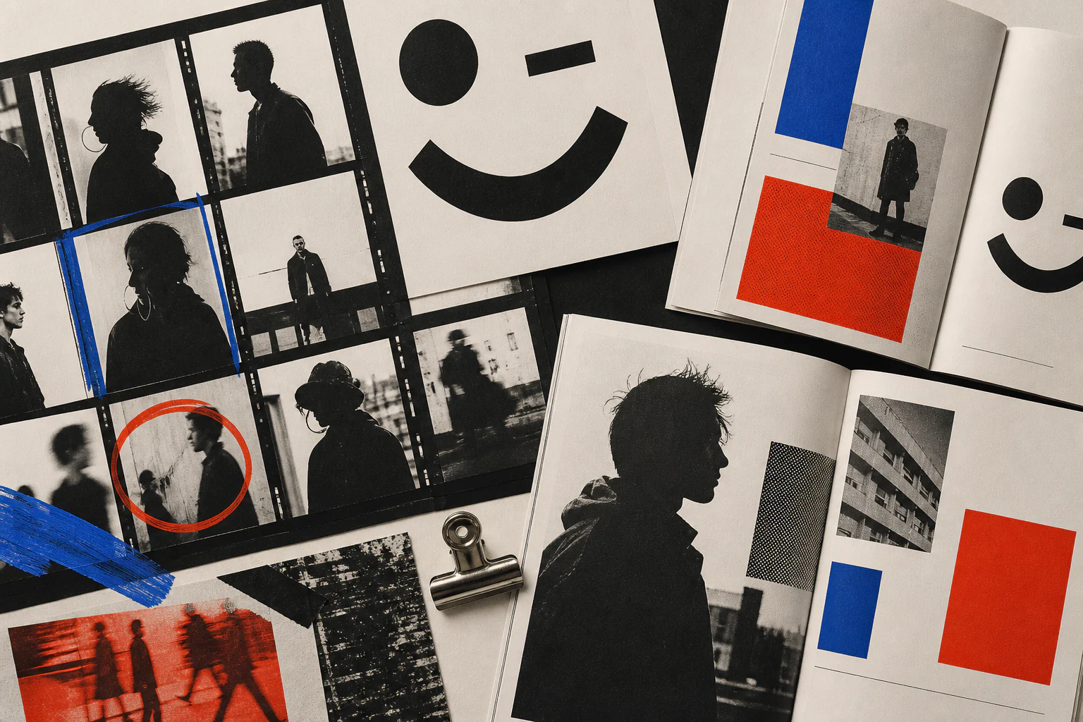
Turned sideways, i-D reads as a face: one eye closed, the mouth smiling. This simple sign became not only a logo, but a behaviour for the magazine. The wink signals complicity: the magazine seems to tell the reader that style does not have to be official, correct or fully explained. The smile adds a human tone. As a result, the i-D mark works as an early form of visual emotion: not just a name on a cover, but a small gesture between magazine, subject and reader.
One of i-D’s key contributions is the straight-up: a frontal full-length portrait in which clothing, posture, shoes, gesture and facial expression read as one document. For fashion photography this was a shift: the subject did not have to be a model, and style did not have to pass through the studio. The camera registered not an idealised image, but a social signal — how a person assembled themselves from clothing, music, city and mood.
Early i-D was tied to the logic of the hand-made publication. Staples, page density, graphic roughness and directness were not flaws, but methods. This format allowed the magazine to react quickly, publish what had not yet become official, and keep the feeling of a living record. Later the magazine became more professional, but its core energy remained: to look not like a finished showcase, but like a window into culture while it is still changing.
The phrase “originate — don’t imitate” became for i-D not a decorative slogan, but a working ethic. It means: do not copy the surface of a subculture; look for the source from which a new style is born. For the magazine this required constant contact with young scenes, photographers, stylists and musicians before they became safe for the mass market. i-D’s strength lies in recognising unstable energy and turning it into an image.
The i-D cover became recognisable through a repeated gesture: one eye often closed, hidden or visually played with. This is not simply a brand pose. By repeating the wink, the magazine creates a portrait series in which each subject enters the brand’s language while keeping their own character. Unlike the classical magazine cover, which often creates distance between celebrity and reader, i-D makes the cover almost a sign: “we understand the same code.”
i-D became a platform where many photographers, stylists, editors and models gained early visibility. What matters is not only the list of names, but the mechanism: the magazine looked for people before they became part of institutional consensus. That is why the i-D archive is valuable as a map of the future seen early. It shows how young energy, a local scene or an unfamiliar face can become part of global visual language a few years later.
Before digital platforms, the magazine did work that social media partly performs today: noticing micro-scenes, collecting visual signals and turning them into cultural stories. But i-D differed because it was not an endless feed, but an edited gaze. The editorial team did not only record “what people wear”; it asked why it mattered. In that sense i-D can be read as a pre-digital cultural search system.
The graphic language of i-D did not aim for absolute neutrality. Its pages could be dense, sharp, conversational and asymmetrical, but behind that freedom was an editorial logic: layout had to convey the rhythm of culture, not simply arrange material conveniently. In this i-D connects to the broader British magazine tradition of the 1980s, but is distinct in its mix of street directness, fashion sensitivity and almost friendly tone.
For i-D, fashion was never an isolated industry. The image emerged where music, nightlife, dance, graphics, youth politics and the street intersected. This is essential to understanding the magazine: it showed not only clothes, but the environment that made clothes meaningful. That is why i-D can be understood as a magazine not about things, but about scenes — about places, people and rhythms where style becomes a language of belonging.
i-D made the visibility of different bodies, races, ages, gender expressions and subcultures part of its language early on. This does not remove difficult questions of representation, but it marks an important shift: the magazine widened the idea of who could carry a fashion image. Its pages often centred people who might have remained peripheral in more conservative gloss. For i-D, the periphery became the centre of attention.
Edward Enninful’s career shows how i-D functioned as a school for future industry leaders. His early connection to the magazine, work with stylists and later role in fashion editing demonstrate that i-D not only published images, but grew professional ways of thinking. The magazine became a place where a stylist could be not a technical assistant, but the author of a cultural position.
The i-D archive is linked to names including David Sims, Juergen Teller, Wolfgang Tillmans, Tyler Mitchell, Harley Weir and others. What matters is that the magazine did not demand only polished luxury from photography. It accepted sharpness, intimacy, accident, direct gaze, street light and imperfection. That photography brought fashion closer to life and at the same time created a new form of iconicity — less glossy, but often more memorable.
The i-D wink became a small choreography. A model, musician, actor or unknown subject on the cover does not simply pose, but enters a shared ritual. One eye may be closed by a hand, hair, an accessory, cropping or facial expression. In this way the magazine connects graphic sign and human body: the logo stops being only typography and becomes behaviour.
i-D grew out of British urban culture, but its language quickly became international. It is an example of how a local scene can create a global visual code if it is precise enough and honest to its environment. The magazine did not imitate universality; it was recognisably British, London, youth-centred — and precisely for that reason it became interesting beyond its own country.
With the digital turn, i-D changed how it circulated. The magazine began to work not only as a printed object, but also as a website, video channel, social platform and media environment around fashion and culture. This created a new tension: how to keep editorial character when the image now competes with an endless feed? i-D’s answer depends on archive, recognisable sign, young subjects and the ability to shape the chaos of the present into edited stories.
In 2012 i-D moved under Vice Media. This stage matters not only as a corporate transaction, but as a sign of the period: independent magazine brands were looking for new digital infrastructures, video formats and global audiences. The move gave i-D access to a wider media machine, but also raised the question of how to keep its own tone when a small cultural environment becomes part of a large platform.
In the digital era i-D did not simply move articles online. It produced video, short formats, interviews, lists, shoots and campaigns that continued the magazine principle: show people, style and cultural signals before they are fully obvious. The main risk is losing depth of selection and becoming an ordinary flow. i-D’s strength depends on whether it preserves an editorial filter.
Wink and Smile: The First Forty Years matters as an attempt to gather i-D’s history not only through famous covers, but through pages, texts, shoots and cultural eras. This archive shows that i-D is not a set of separate successful images, but a long method of observation. It records how style changes across decades and how a magazine can stay alive if it constantly renews its circle of subjects.
After the crisis of Vice Media, the magazine moved to Bedford Media, associated with Karlie Kloss. This stage raised questions about the future of an independent cultural voice: can a historically rebellious magazine keep its nerve under a new owner, a different financial logic and a changed media environment? For VANSMITHLAB the point is not to judge this transition in advance, but to record it as a new layer in the magazine’s biography.
In 2024-2025 i-D went through a relaunch period. It tested again the relation between website, social platforms and print. This is typical for many cult magazines: they can no longer be simply monthly print machines, but they also do not want to dissolve into digital noise. i-D’s relaunch shows that the archive becomes a resource for the future: early DIY logic reads again as contemporary media logic.
The appointment of Thom Bettridge marked a new chapter for i-D. His task is not only to manage legacy, but to find language for a moment in which fashion, the internet, celebrity culture, independent scenes and commercial platforms constantly mix. At this point i-D must prove again its central ability: not to chase trend, but to turn unstable cultural energy into image, text and editorial gesture.
The i-D relaunch through The Unknown Issue is especially revealing. Choosing an unknown or not-yet-canonised face returns the magazine to its early logic: look not only for the person who already has an audience, but for someone who may become a sign of the future. In an era when covers are often governed by ready-made popularity, that gesture recalls an older function of the magazine — not to confirm status, but to discover a new subject.
The return of i-D to newsstands in 2025 shows an important shift: the printed magazine rarely exists now as a mass monthly habit, but it can work as a collectible object, archival gesture and material proof of editorial choice. For younger readers, print may be not an obsolete technology, but a rare thing to keep. In that sense i-D returns to its early materiality.
i-D is often compared with The Face, but their roles are not identical. The Face built a broad map of British youth culture, music, fashion and graphics; i-D focused more sharply on identity, street style, face, gesture and personal code. Both magazines matter as radars of the 1980s and 1990s, but i-D is especially important because it turned the pose of a person into editorial material.
i-D’s main contribution is the shift of fashion from product to identity. Clothing on its pages rarely exists by itself; it is linked to face, body, street, music, age, the desire to belong or the desire to differ. That is why the magazine is useful to designers, photographers and art directors: it shows that a strong image does not come from clothing alone, but from the system of relations around it.
i-D also has an internal risk: what once was living observation can easily become a stylish template. The wink can become an obligation, streetness a decoration, youth a marketing category. Each new stage of the magazine is therefore tested by one question: does it see real culture, or repeat its own legend? A strong i-D must rediscover the street each time, not only quote the archive.
The legacy of i-D is that it made the magazine a tool for recognising identity. It showed that style can be read through gesture, face, street, pose, young scenes and a small graphic sign. For VANSMITHLAB, i-D is a key node between fashion, photography, graphic design, club culture and digital media. Its main lesson is simple: a good magazine does not only show fashion; it teaches how to look.