research
M/M (Paris)
Signs, collaboration and the expanded field of graphic design
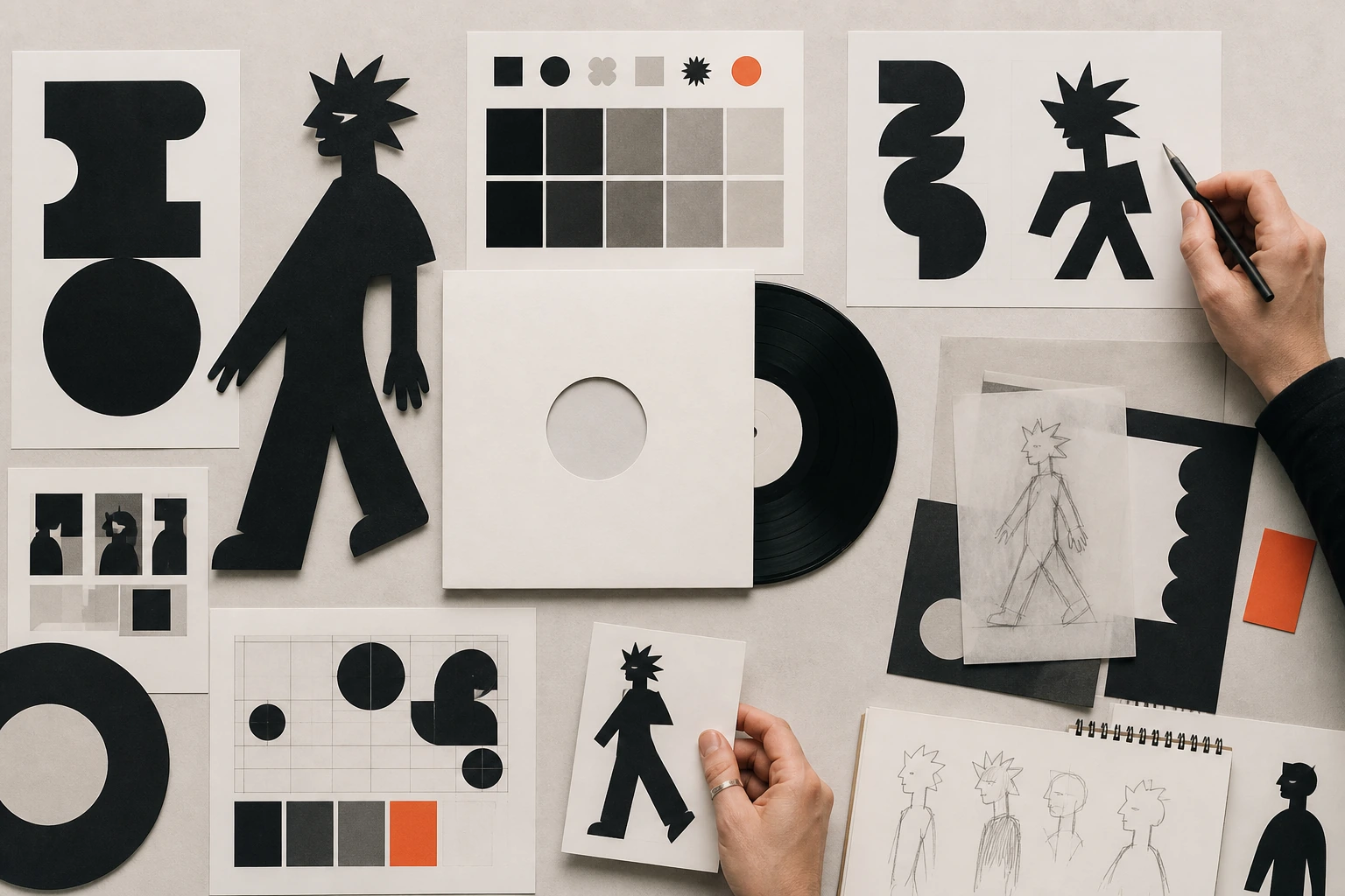
M/M (Paris) turns graphic design into a system of relationships: a letter can become furniture, a poster can become artwork, an album can become an interface, and a fashion identity can become an evolving world built with photographers, musicians, artists and institutions.
Editorial thesis
M/M (Paris) matters not because of one recognisable visual effect but because the duo expanded the profession itself. Their work shows that graphic design can simultaneously be commissioning, conversation, typography, image editing, publication, object, interface and exhibition space when those forms are held together by one system of signs and relationships. [source]
Reader question
How can a studio work for decades with Björk, Yohji Yamamoto, museums, contemporary artists and luxury brands without becoming either a service agency with no authorship or artists who ignore the client’s problem?
Short answer
Through dialogue and self-developed sign systems. M/M do not try to make every project look alike, but repeatedly organise relationships among content, collaborator, letterform, image, object and audience. Their authorship is therefore recognisable through world-building rather than one preset. [source]
1. 1992: two authors instead of one signature style
M/M (Paris) was founded in Paris in 1992 by Michaël Amzalag and Mathias Augustyniak. Both the studio’s official site and Centre Pompidou record that year as the beginning of the shared practice. 1
The duo format itself is fundamental. Graphic-design history often favours one recognisable signature and one author, whereas M/M build practice through conversation between two people and then widen that conversation to client, photographer, musician, artist or institution. Authorship begins as a relationship rather than a solitary signature.
2. Mathias Augustyniak and Michaël Amzalag: different schools, one practice
Augustyniak, born in 1967, studied at the Royal College of Art in London; Amzalag, born in 1968, studied at the École Nationale Supérieure des Arts Décoratifs in Paris. Centre Pompidou and Air de Paris document those different educational paths. 3
The difference should not be turned into a simplistic division of labour. Their mature practice is not one half drawing and one half strategy. It is better understood as an internal editorial mechanism: an idea has to survive at least two strong perspectives before it reaches the outside client.
3. The music industry as a first testing ground
Centre Pompidou noted in 2000 that M/M began by working for the music industry and quickly expanded into fashion and contemporary art. 4
Music is an ideal first testing ground because sound is invisible. Design therefore has to construct a field of expectations around it — cover, typography, characters, photography, packaging, sometimes video and stage. The later M/M logic is already present: one project must be capable of living across several media.
4. Why M/M describe themselves as more than graphic designers
Air de Paris describes M/M as image thinkers and practitioners, while the official site presents an agency developing communication, branding, image, design and spatial strategies. 14
This defines the profession more accurately. Graphic design remains the point of departure but not the final border. A sign may become a poster, letterform, piece of furniture, exhibition module, book object or interface. Expanding the medium does not abandon graphic thinking; it transfers it into space and behaviour.
5. Yohji Yamamoto, 1996–2000: freedom without constant approval
The V&A records that M/M art-directed Yohji Yamamoto catalogues from 1996 to 2000. In the museum’s account, the duo recalls an unusual degree of freedom: projects were developed independently and presented to the designer only at the end. 11
That trust is essential to creative direction. The client remains present but does not supervise every pixel. A catalogue becomes an interpretation of a collection rather than a service appendix to it. This is one reason M/M could build complete visual worlds with fashion designers instead of merely seasonal advertising.
6. The fashion image: design does not serve photography but enters into dialogue with it
For decades M/M have worked alongside major fashion photographers; Air de Paris lists Craig McDean, Inez & Vinoodh, Juergen Teller, Paolo Roversi, Steven Meisel, Viviane Sassen and others. 14
In their system, photography does not enter layout as a completely closed object. Type, drawing, framing, cropping and characters can intervene in the image and alter its reading. Yet strong work depends on accurate attribution: the designer does not “make” the photograph but constructs another layer of meaning around independent photographic authorship.
7. Balenciaga, Prada, Louis Vuitton and Loewe: the brand as a system of relationships
Thames & Hudson lists Alexander McQueen, Balenciaga, Louis Vuitton, Miuccia Prada, Jonathan Anderson, Nicolas Ghesquière and Yohji Yamamoto among M/M’s fashion collaborations; Air de Paris adds Loewe, Givenchy, Jil Sander and other houses. 16
The range explains why M/M cannot be reduced to a fixed style preset. Each brand carries a different history and degree of visual authority. The studio’s task is to build relationships between an existing code and a new sign rather than apply one effect to every client.
8. Björk: long-term collaboration rather than a one-off cover
Björk is one of M/M’s longest musical dialogues. The studio archive includes Björk as a Book, Hidden Place, Biophilia and related projects, while MoMA calls M/M her longtime design collaborators. 1
This differs from producing a single album cover. The artist’s image, typography, digital interface, printed object and stage environment can develop across years. The designer works not only on a release but on an evolving mythology.
9. Biophilia, 2011: the album becomes an interface
Biophilia in 2011 combined album, interactive application, games, visualisations and musical participation. MoMA credits Mathias Augustyniak and Michaël Amzalag among the project’s makers and notes that the “mother app” — the galaxy linking the songs — was conceived by Björk with M/M. 8
For graphic design this is an important historical transition. Identity can no longer be described only by cover and typeface. It becomes interface, user route and a logic of transitions among parts of the work.
10. Grammy 2013: packaging recognised as authorship
At the 55th Grammy Awards in 2013, Michael Amzalag and Mathias Augustyniak received Best Recording Package for Biophilia. The official Grammy archive lists them by name. 10
The award matters less as proof of “best design” than as recognition that packaging and visual systems are independent levels of authorship in music. Biophilia is especially revealing because the physical package existed beside app, sound and performance rather than replacing them.
11. Art Posters, since 1999: the commission becomes an autonomous series
The Art Posters series began in 1999 and continued for decades; Air de Paris stated in 2023 that it had grown to more than eighty posters. 14
Each poster is tied to an artist, exhibition, film or cultural object, but the series introduces repeatable rules — industrial silkscreen, urban advertising format, recurring typographic and character systems. A commission becomes communication and part of M/M’s autonomous artistic archive at the same time.
12. No Ghost Just a Shell: design inside a collective artwork
Walker Art Center holds an M/M poster as part of No Ghost Just a Shell, Pierre Huyghe and Philippe Parreno’s project around the character Annlee. 18
The case makes the expanded field of design unusually clear. The poster does not advertise the artwork from outside; it exists within the artwork and helps construct the identity of a character whose authorship is intentionally collective and transferable.
13. Philippe Parreno, Pierre Huyghe and Sarah Morris: graphic design enters contemporary art
Air de Paris and Centre Pompidou connect M/M with Philippe Parreno, Pierre Huyghe, Sarah Morris, Rirkrit Tiravanija, Carsten Höller and other contemporary artists. 14
The designer is no longer the final service layer after the “real art”. Design can participate in the structure of the project itself: sign, book system, poster series, credits, fictional character or exhibition device. The boundary between artwork and communication becomes part of the work rather than an administrative separation.
14. Théâtre de Lorient, 1996–2015: the poster as a reading of the play
The Musée des Arts Décoratifs holds a substantial body of posters made by M/M for Théâtre de Lorient from 1996 to 2015. The museum describes the method: careful reading of the play, conversation with Éric Vigner, a colour photograph and a strongly contrasted black-and-white title. 13
The poster is not a literal illustration of a scene. It translates dramaturgical structure into visual form. This is a strong example of research-based art direction: the image follows analysis of content rather than preceding it.
15. Photography + title: tension between document and sign
In the theatre posters, an everyday-looking photograph meets an unusually active title. MAD stresses that the documentary-looking scene was selected after reading the play and speaking with the director. 13
The collision between photograph and letter creates productive ambiguity. The viewer sees a fragment of reality and at the same time recognises that the fragment has been converted into a sign. M/M do not resolve the contradiction; it is what keeps attention active.
16. The poster as image, object and urban infrastructure
Cooper Hewitt included M/M in How Posters Work and analysed their exhibition posters as art. The museum shows how a poster can communicate an event, contest an institution’s existing design and become a collectible object at the same time. 17
Those three roles rarely coexist without friction. If a poster becomes too autonomous it risks losing information; if it becomes too service-oriented it loses authorial energy. M/M repeatedly hold that tension on the boundary of design and art.
17. Palais de Tokyo and cultural identity as an open system
In the early 2000s M/M worked with Palais de Tokyo and developed a visual-identity toolkit that their own archive dates to 2000–2006. 1
A cultural identity in this context cannot freeze an institution inside one logo. Museums and art centres change exhibitions and authors constantly, so the system must be recognisable while allowing new participants to disturb it. For M/M, identity is strongest when it produces variation rather than mere uniformity.
18. Icons, indexes and symbols: why the sign matters more than decoration
Air de Paris describes M/M’s practice through icons, indexes and symbols — the semiotic triad associated with Charles S. Peirce. 14
This helps explain their visual density. A sign may resemble an object, point to it indirectly or operate through convention. M/M therefore favour images in which letter, portrait, character and decorative motif simultaneously communicate and complicate. Design becomes a machine for layered reading rather than decoration around a message.
19. The alphabet as a thinking tool
The alphabet in M/M is not a neutral set of characters. Across projects they have made custom letterforms, fonts and graphic characters that can migrate from print to object or space. 1
The letter becomes a minimal unit of world-building. Where a logo concentrates identity into one mark, an alphabet distributes identity across a complete sign system from which new messages can be assembled without losing character.
20. Letters from M/M, 2022: thirty years of type as one archive
Letters from M/M (Paris), published in December 2022, gathered letters and typefaces created since 1992; Air de Paris devoted the 2023 exhibition En toutes lettres to that archive. 16
The project reveals a rare way of reading a studio’s history through tools rather than clients. Instead of a list of campaigns, it becomes an archaeology of letters: forms made for specific dialogues and the ways they continued to live in later contexts.
21. The Agent: a character who is author and spectator at once
The Agent is a recurring M/M character dating from around 2000. MAD describes the mute figure as both a decoy substitute for the authors and a representation of the spectator. 13
The character solves the problem of authorial presence. Rather than direct self-branding, M/M introduce an intermediary sign that can watch the project from inside. The studio becomes part of its own visual world without turning every commission into a literal self-portrait.
22. Wallpaper Posters: repetition turns graphics into environment
Since 1998 M/M have produced Wallpaper Posters, large silkscreened wallpapers used in many exhibitions. The official archive describes the continuing series in a 120 × 176 cm poster format. 1
Repetition changes the status of graphics. A single poster is read frontally; repeated elements produce an interior and begin to influence the spectator’s body. Graphic design becomes spatial rhythm.
23. Vision Tenace, 2008: the poster enters the space of Centre Pompidou
In 2008 Centre Pompidou presented Vision Tenace, where new versions of the Art Posters were placed within an environment designed by M/M. The institution describes the space as an artwork in which signs, clues and symbols form a new language. 5
A flat archive becomes exhibition architecture. The poster can no longer be viewed only from the correct frontal distance; the spectator moves through the system and the sequence of encounters becomes part of the design.
24. M to M, 2012: a monograph organised by its own alphabet rather than chronology
In 2012 the first major monograph M to M of M/M (Paris) appeared. Centre Pompidou presented it as a 528-page book gathering twenty years of projects and organised through a particular alphabetical order — from M to M. 3
This is more than a clever contents device. Alphabetical structure breaks the linear career story of early-to-mature work. Fashion, music, art and self-initiated projects collide under other rules, revealing a practice that has always developed as a network of connections.
25. Volume II, 2020: the visual atlas keeps expanding
In 2020 Thames & Hudson published M to M of M/M (Paris), Volume II — 456 pages and more than 850 project images from the following decade. 16
The second volume matters methodologically because the archive does not close after the first period is canonised. It continues to grow and alters how previous work is read. For a design studio, its own history remains active material rather than a museum endpoint.
26. D’un M/Musée à l’autre, 2020–2021: the book becomes exhibition architecture
In 2020–2021 the Musée des Arts Décoratifs and Musée d’Orsay jointly presented D’un M/Musée à l’autre. Linked to Volume II, the intervention placed monograph pages, objects and M/M modules inside the permanent collections of both museums. 13
The book effectively became an exhibition script. Page scale expanded into physical space while museum architecture, furniture and historical objects entered a new montage. It is a precise example of editorial thinking organising a spatial route.
27. Borderline, Colorstools and furniture: the flat sign becomes an object
MAD displayed Borderline, M/Matching Colorstools and other M/M objects in the same project. Flat graphic elements become steel structures, stools and spatial modules. 13
The transition is useful for understanding product design: M/M do not restart as conventional industrial designers. They continue working with sign, module, colour and repetition, except those relationships now have to carry weight, scale and human touch.
28. Art, design, commerce: why disciplinary boundaries are deliberately blurred
M/M deliberately operate among art, design and commerce. Centre Pompidou already emphasised their activity across fashion, art, music, theatre, publishing and design in 2012; MAD later described the heterogeneous output as one expanding imaginary world. 3
This does not mean commissioned work and artwork become identical. They have different budgets, rights, audiences and responsibilities. Strong practice crosses the boundary without pretending that a commercial project automatically becomes art because its authors are famous.
29. M/M (Paris) in 2026: agency, gallery practice and expanded communication
In 2026 the official M/M (Paris) site still presents an active agency working in creative communication, branding, image, design and spatial strategies, while gallery representation is linked to Air de Paris. 1
The model has therefore remained productive for more than three decades. The practice has neither frozen into museum status nor dissolved into agency routine. Commercial commissions, type design, self-publishing, exhibition objects and art projects continue in parallel.
30. The main legacy: graphic design as the production of relationships and worlds
M/M (Paris)’s main legacy is not a complicated letterform, collage over photography or a supposedly “French” intellectual graphic style as a collection of surface signs. 1
The real method is the production of relationships. Two authors speak to one another; then photographer, designer, musician, artist, institution, reader and viewer enter the system. Graphic design organises these connections through signs, books, posters, objects, interfaces and spaces. Copying M/M visually is easy; working like M/M is difficult because it requires building one’s own system of dialogues rather than borrowing somebody else’s style.