encyclopedia
Art Nouveau / Jugendstil
Line, nature and the total interior
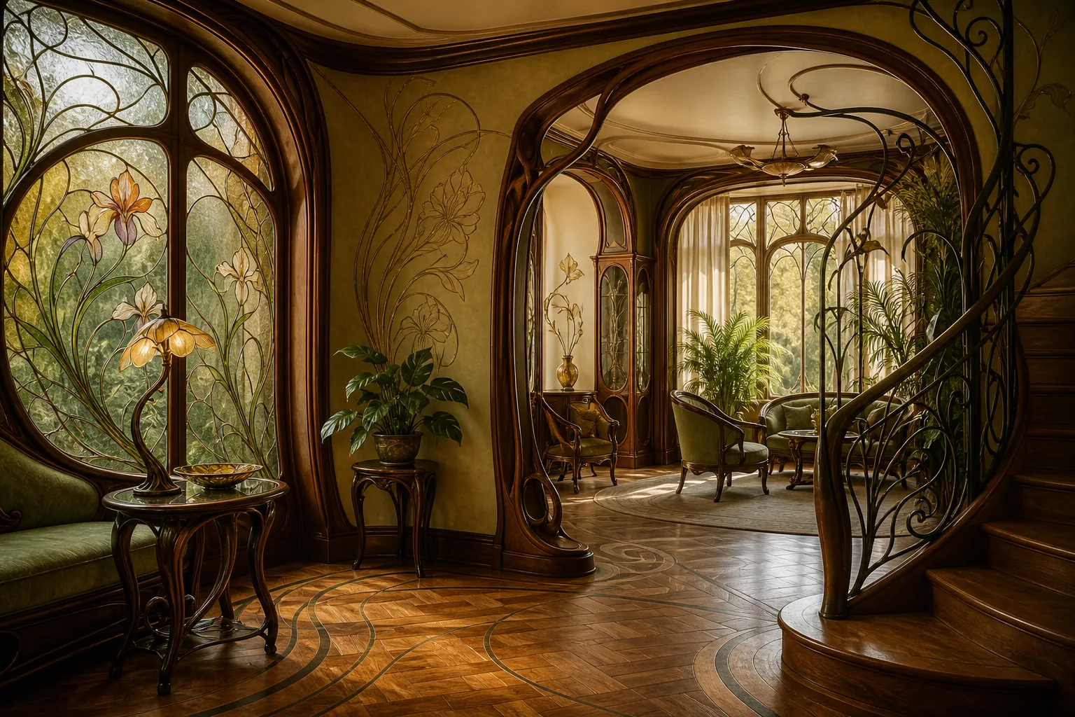
Art Nouveau makes the line feel alive: it climbs a facade, becomes a stem in glass, continues into a door handle, a typeface, a dress and a poster. It was not merely a decorative fashion around 1900, but an attempt to make architecture, objects, graphics and interiors speak one language.
Editorial thesis
Art Nouveau matters not as a collection of attractive curls but as the first truly international attempt to make the modern environment coherent. Architecture, glass, furniture, poster, typography, jewellery and interior begin to obey a shared logic of line, material and movement. The movement is therefore best read as an early design system rather than as a decorative filter. 1
Reader question
Why can the same movement look fluid in Brussels, geometric in Vienna, graphic in Mucha and almost severe in Mackintosh - and still remain recognisably part of the same cultural field?
Short answer
Because Art Nouveau was an international field of local variants. They shared a rejection of literal historicism, an interest in nature, renewed craft, modern materials and the total environment; regional traditions, technologies and degrees of ornament produced very different visual results. 1
1. Why the new style looks as if it is growing
Art Nouveau has a rare quality: an object can seem grown rather than assembled. A line may begin in a table leg, continue into a carpet pattern, climb a balustrade and dissolve into stained glass. The interior is therefore perceived not as a set of purchases but as a single organism. 1
This sense of life does not require literal botanical copying. Strong Art Nouveau extracts principles from nature: curvature, branching, stem tension, the opening of a flower, the rhythm of a wing. That is why the style is easy to recognise but difficult to repeat honestly without falling into decorative cliché.
2. The 1890s: fatigue with historical costumes
By the end of the nineteenth century, European cities were full of Neo-Gothic, Neo-Renaissance, Neo-Baroque and other historical masks. The new bourgeois world lived with electric light, iron structures, mass printing and rapidly expanding cities, while architecture often continued to speak in the language of earlier centuries. Art Nouveau emerged as an attempt to find a visual form for modern life. 1
In this sense the movement was not an escape from modernity but an attempt to design it. It accepted new materials and infrastructure, yet refused to let modernity look only like a factory. The machine had to learn beauty, and beauty had to work in the city.
3. Where the name Art Nouveau came from
The French phrase art nouveau means “new art”, but the label became especially visible through Siegfried Bing’s Paris gallery-shop Maison de l'Art Nouveau, opened in 1895. New decorative art was presented there as an environment in which furniture, glass, graphics and objects worked together. 1
The paradox is that the movement never had one universal name. In German-speaking regions it became Jugendstil, in Austria Secessionstil, in Catalonia Modernisme, and in Italy Stile Liberty. These are not separate planets but local answers to the same anxiety: how to stop copying the past and invent a contemporary language.
4. Nature as grammar, not a bouquet on the surface
The most common mistake in reading Art Nouveau is to see only flowers. Nature mattered not as illustration but as a system for constructing form. A stem explained line, a bud volume, an insect wing transparency, a leaf asymmetry and a sea wave continuity of surface. 1
When this logic works, ornament stops being a sticker. It affects construction. A chair back stretches like a plant, a grille directs the eye, stained glass redistributes light, and a poster builds its composition around hair, fabric and typography.
5. The whiplash line: a line that refuses to stay still
The term whiplash line describes one of Art Nouveau’s favourite gestures: a long curve accelerates, changes direction sharply and opens again. It creates a sensation of movement even on a still surface. 1
The same line can become a stem in Gallé, a metal member in Horta, hair in a Mucha poster or the contour of furniture. Its power is its ability to connect scales. One rhythm can operate on a jewel, a poster and a staircase.
6. Japonisme: flatness, asymmetry and a new way to frame the world
European Art Nouveau developed during an intense fascination with Japanese art. Ukiyo-e prints demonstrated that a composition could be flat, asymmetrical, cropped by the edge and still feel highly dynamic. Artists and designers saw an alternative to academic perspective. 1
The lesson was important: modernity could be built not only through a new subject but through a new frame. In posters, books and ornament, empty space began to work as actively as the filled area.
7. Victor Horta and Hôtel Tassel: the house becomes a flowing system
In Brussels, Victor Horta’s Hôtel Tassel, designed in 1892-1893, turned Art Nouveau from surface decoration into an architectural system. UNESCO describes Horta’s town houses as pioneering works of late nineteenth-century architecture and emphasises their radically new approach. 1
Staircase, metal, mosaic, columns, painting and light operate in a shared rhythm. The house does not ask the viewer to stop in front of a beautiful wall; it conducts movement through space. It is almost choreography, except that the route is doing the dancing.
8. Iron, glass and open plan: technology under the decorative skin
Horta’s paradox is that his fluid aesthetic depended on modern engineering logic. Iron allowed slender supports, larger openings and a freer plan. Glass carried daylight deeper into the house. Decorative line did not completely hide construction; it often intensified it. 1
Art Nouveau therefore cannot simply be called anti-industrial. It argued not against technology but against technology without a language. New materials were not meant to imitate the stone of the past; they were expected to acquire their own plastic role.
9. Hector Guimard and the Paris Métro: the city gets its own typeface
Hector Guimard’s entrances for the Paris Métro made Art Nouveau part of everyday infrastructure. A person did not need to enter a museum to encounter the new style; it appeared on the way to work. Metal curved into vegetal forms, signage became structural, and a transport system gained a recognisable visual voice. 1
This can be read as an early form of urban identity. A single family of shapes connects architecture, navigation and the brand of a place long before branding became a professional term.
10. École de Nancy: when glass, furniture and botany work together
In Nancy, Art Nouveau took a local form known as the École de Nancy. The museum describes it as a movement to renew the decorative arts, bringing together glass, furniture, stained glass, ceramics, leather, metalwork and architecture, with Émile Gallé as a central figure. 1
For VANSMITHLAB the crucial connection is between material and knowledge. The flower is not merely drawn; it is studied. Botanical precision becomes glass, marquetry, the form of a leg and colour. The designer becomes both an observer of nature and a technologist.
11. Émile Gallé: glass as a living material
Gallé demonstrates that material can carry the story more strongly than outline. Layered glass, etching, colour transitions and botanical imagery can make an object seem to emerge from mist, water or a garden. The surface feels deep because the image lives within the material rather than only on top of it. 1
This remains a useful lesson for contemporary image-making: texture should not be a decorative filter. When material truly participates in the image, light, thickness, transparency and imperfection become part of composition.
12. Vienna Secession: an artificial spring in the imperial city
In 1897 a group of Viennese artists around Gustav Klimt split from the conservative Künstlerhaus and formed the Vienna Secession. Founders included Kolo Moser, Carl Moll, Josef Hoffmann and Joseph Maria Olbrich. In 1898 Olbrich designed the Secession building as an architectural manifesto for the new programme. 9
Viennese Art Nouveau is often less fluid than its Brussels or Paris counterparts. Grid, plane, square, gold and discipline appear more quickly. That makes the Secession an especially useful bridge from decorative nineteenth-century culture toward twentieth-century rational design.
13. Klimt, Hoffmann and the idea of the Gesamtkunstwerk
The Vienna Secession strengthened the idea of the Gesamtkunstwerk - the “total work of art” in which architecture, painting, furniture, graphics and exhibition design obey one concept. The Beethoven Exhibition of 1902, for which Gustav Klimt created the Beethoven Frieze, makes this ambition especially clear. 9
For a designer the principle is fundamental: style exists not in a single object but in a system of relations. Wall, lamp, typography and the visitor’s route should reinforce one scenario. The same principle later appears in Wiener Werkstätte, modernist schools and contemporary brand experience.
14. Glasgow Style: Mackintosh, Macdonald and discipline between line and geometry
Charles Rennie Mackintosh and Margaret Macdonald demonstrated that Art Nouveau could be almost severe. Their Glasgow Style combines elongated verticals, grids, pale surfaces, the stylised rose and restrained symbolism. Glasgow School of Art was built in two phases, 1897-1898 and 1907-1909, and became Mackintosh’s most celebrated building. 1
The tearoom interiors designed by Mackintosh and Macdonald make the system especially clear: furniture, light, panel, ornament and social ritual form one scene. This is not room decoration but the direction of behaviour.
15. Geometric Art Nouveau: why the style is not only about curls
If Art Nouveau is recognised only by vegetal curls, half the movement disappears. In Vienna, Glasgow and several northern European versions, the line becomes straighter, ornament flatter and composition more modular. A flower can become almost a sign, while furniture turns into a geometric frame. 1
This branch matters for design history because it makes the transition toward modernism easier to see. The new art gradually learns to reduce its gesture: the long stem gives way to proportion, grid and material.
16. Catalan Modernisme: Gaudí and the city as laboratory
In Catalonia a related culture developed under the name Modernisme. Antoni Gaudí made it the most recognisable architectural version, yet UNESCO emphasises that his work was simultaneously personal, technically innovative and rooted in the cultural context of Catalonia. 1
Gaudí matters not because he built “fairy-tale houses”. He connected craft, geometry, structural experiment, ceramics, metal, stone, furniture and light. Architecture once again becomes a total discipline.
17. Casa Milà: stone wave, light and structural freedom
Casa Milà, built between 1906 and 1912, shows how an organic surface can be tied to genuine structural freedom. La Pedrera’s official account emphasises the building’s innovations in structure, spatial geometry, materials and the organisation of habitation. 1
The undulating facade is remembered first, but the internal logic matters more: light courts, more flexible apartment organisation, wrought-iron balconies and a roof turned into sculptural landscape. Decoration does not hang on the building; it grows out of its movement.
18. The total interior: when the architect designs even the door handle
Art Nouveau likes to control the environment as a whole. An architect or designer may shape not only walls but furniture, doors, stained glass, lamps, carpets, tableware and graphics. The result is the sensation of entering not a room but the inside of one large object. 1
Today the approach is familiar in luxury retail, hospitality and flagship spaces. The difference is that around 1900 this unity was often achieved through unique craft, while today it is built through material systems, lighting, digital interfaces and standardised details.
19. Furniture and object: structure should continue the line of space
In strong Art Nouveau furniture, form rarely appears independent from the room. A chair back continues the vertical of a panel, a table leg echoes the rhythm of metalwork, and marquetry ties the object to the botanical theme of an interior. 1
This differs from later product design, where an object is often conceived as an autonomous commodity. Art Nouveau thinks in ensembles. Even an object that can be removed from a room visually remembers the space for which it was made.
20. Louis Comfort Tiffany: glass, electric light and the American version
In the United States, Art Nouveau took a distinctive form in the work of Louis Comfort Tiffany. The Metropolitan Museum of Art highlights his technical experiments in glass, mosaic, colour and light. The electric lamp became an ideal modern device for decorative art: technology literally illuminated coloured glass from within. 19
Tiffany also demonstrates a brand in which material, technique and recognisable image are tightly linked. Favrile glass functions almost like a visual code - not a logo, but a character of surface.
21. Alphonse Mucha: the poster becomes visual identity
In the 1890s Alphonse Mucha turned the poster into one of Art Nouveau’s most effective machines. After the success of Gismonda for Sarah Bernhardt, his elongated format, decorative halo, botanical rhythm, ornamental hair and soft typography became so recognisable that “le style Mucha” nearly merged with the popular image of Art Nouveau itself. 1
This begins a story central to contemporary art direction: one visual language can move from theatre poster to advertising, packaging, decorative panel and publishing while remaining recognisable.
22. Typography and advertising: the letter becomes a plant too
Art Nouveau breaks down the border between image and text. A letter may curve, stretch, become a frame or merge with ornament. In a strong poster, type is not placed on top after the illustration; it participates in the same composition. 1
That makes the movement important to the history of graphic design. Identity is shown to be not a single sign but a repeated behaviour of form: line, frame, colour field, typography and image.
23. Adornment and body: jewellery, combs and organic miniatures
In Art Nouveau jewellery the body becomes a small architectural site. Insects, orchids, peacocks, snakes, female profiles and translucent materials combine nature, eroticism and technical virtuosity. Designers such as René Lalique expanded the idea of preciousness: value could lie not only in gemstones but in concept, enamel, horn, glass and unusual composition. 1
For contemporary luxury the lesson is fundamental: rarity of material and rarity of image are not the same thing.
24. Fashion: silhouette between dress reform and decorative line
Art Nouveau did not produce one uniform fashion silhouette, but its language overlapped with a period when dress, graphics and interior were increasingly imagined as parts of a designed way of life. The S-curve silhouette of the early twentieth century, flowing fabrics, embroidery, botanical motifs and decorative accessories could easily enter into dialogue with posters and interiors. 1
It is better not to turn this into a carnival of “Art Nouveau dresses”. The connection is more powerful through the line of the body, material, accessory, photographic staging and the larger visual environment.
25. Shop window, café and store: Art Nouveau as early experience design
Art Nouveau flourished not only in private houses but in spaces of public consumption: cafés, restaurants, shops, theatres and metro stations. Here style had to create atmosphere quickly and remain memorable. Shop window, signage, furniture, packaging and interior began to operate as one experience. 1
The movement can therefore be read as an early ancestor of experience design. A visitor remembers not one chair or one typeface but a sequence of impressions - entrance, light, material, movement and purchase.
26. Arts & Crafts and Art Nouveau: kinship without identity
Art Nouveau owes much to Arts & Crafts: respect for craft, the total interior, attention to material and a rejection of thoughtless historicism. But the two movements are not identical. Arts & Crafts more often stresses the morality of labour, local tradition and honest making, while Art Nouveau pursues a new formal language and a stronger urban spectacle. 1
Put simply, Arts & Crafts asks “how and by whom was this made?” Art Nouveau adds another question: “what should the new age look like?”
27. Art Nouveau and Art Deco: from stem to geometry
Art Deco arrives later and inherits Art Nouveau’s love of total interiors, precious materials, graphics and the spectacle of modernity. But the line changes: the organic stem yields to symmetry, steps, zigzags, rays and polished geometry. 1
If Art Nouveau wants the machine to learn how to grow, Art Deco wants luxury to learn how to move at machine speed. There is continuity between them, but the mood is completely different.
28. Why the style disappeared so quickly
The flowering of Art Nouveau was brief - roughly from the 1890s to the First World War. Reasons include the cost of individual craft, the complexity of total interiors, rapidly shifting taste and the rise of more rational modernist approaches. The Met describes Art Nouveau as short-lived but influential and as a precursor to modernism. 1
The movement did not vanish because it “lost”. It performed transitional work: it freed design from literal copying of the past and proved that modernity could have its own visual language.
29. How to photograph and visualise Art Nouveau today
The greatest danger in contemporary Art Nouveau visualisation is drowning in decorative noise. It is better to choose one mechanism: a flowing staircase, a metal line, stained-glass light, a graphic profile or botanical marquetry. Everything else should support that gesture rather than compete with it.
Photographically, the style benefits from oblique natural light that reveals relief, glass and metal. The frame should explain scale relationships: architecture first, then a person, then detail. If every curl is shown immediately in close-up, the essential quality disappears - the sensation of an environment.
30. The main legacy: design as a connected system
Art Nouveau’s main legacy is not the flower or the curve. It is the conviction that space, object, image and material can be designed as one language. This is why the movement is so useful for VANSMITHLAB: it links Horta’s architecture, Mucha’s graphics, Gallé and Tiffany glass, Mackintosh interiors, the Vienna Secession and Catalan Modernisme. 9
A contemporary designer can avoid every botanical motif and still think in an Art Nouveau way - if the project is conceived as a coherent system in which form, material, light and communication support one idea.