encyclopedia
Art Deco
Luxury, geometry and the machine
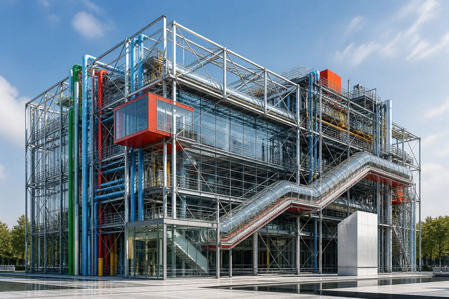
Art Deco does not simply decorate modernity. It polishes it, sets it on an axis, adds light, speed and a precious surface — as if the city, the machine and the evening silhouette spoke one language.
Editorial thesis
The force of Art Deco lies in its ability to turn modernity into spectacle. The style accepts the machine, the city, electricity, transport and advertising, but does not turn them into a dry functional system. It adds shine, rare material, symmetry, steps and the ritual of entrance.
Art Deco should therefore be read not as a set of gold frames and zigzags, but as a way of organising desire. It speaks of speed, status, night, showcase, skyscraper and a body that wants to appear modern. 1
Reader question
Why can Art Deco feel old-fashioned and futuristic at the same time, decorative and machine-like, luxurious and mass-cultural?
The answer lies in the style's own contradiction: it was born between the crafted salon and the industrial city. Its surface is expensive, but its imagination is fed by speed, repetition and new urban light. 2
Short answer
Art Deco is an international style of the 1920s and 1930s associated with decorative arts, architecture, fashion, jewellery, graphic design, interiors and product design. Its maturity appeared publicly at the Paris exhibition of 1925, while its visual language relied on geometry, symmetry, expensive materials, machine imagery and urban shine. 16
Unlike Modernism, Art Deco did not seek to remove decoration completely. It tried to make decoration modern: sharper, more geometric, faster and linked to technology. 3
1. Art Deco between craft and industry
Art Deco is easy to recognise through steps, rays, zigzags, fans, chrome and black lacquer. Yet if it is reduced to ornament, the style quickly becomes a set of decorative stickers.
Its real energy sits in the collision of two desires: to preserve an expensive crafted surface and to embrace the machine, speed, electric light, the skyscraper, the ocean liner and mass advertising. 4
2. Paris 1925: the moment that gave the style its name
The crucial public moment was the Exposition Internationale des Arts Decoratifs et Industriels Modernes held in Paris in 1925. The V&A describes it as a pivotal episode for the style, then often known as Style Moderne. 1
It is important not to write that the style was invented at the exhibition. By 1925 it had already matured across furniture, fashion, jewellery, graphics and interiors. Paris gave it a stage, scale and its later name. 5
3. After the war: a desire for new order and new shine
After the First World War, decorative culture could no longer look exactly like the Belle Epoque. The curving botanical line of Art Nouveau felt too soft for an age of electricity, aviation, the motor industry and new urban rhythms.
Art Deco answered anxious modernity not with austerity, but with controlled shine. It did not reject pleasure, but built it on harder geometry: the surface gleams, while the line disciplines it. 6
4. From Art Nouveau to geometry
Art Nouveau dreamed of an uninterrupted organic line. Art Deco cuts that line, straightens it and folds it into a fan, ray, step, diamond or zigzag.
The two styles often sit close in history, but they work differently. Art Nouveau grows like a plant; Art Deco is assembled like a facade, showcase, brooch or title card. 7
5. Cubism, the Secession and decomposed form
Cubism helped Art Deco accept fragmented form. The Vienna Secession and Wiener Werkstatte offered models of geometrisation, flat ornament and design discipline.
The style took from the avant-garde not a radical rejection of beauty, but a new grammar of form. An object could remain expensive, while its luxury was organised through planes, rhythms and sharp graphics. 8
6. Ancient Egypt, Asia and the problem of borrowing
Art Deco looked actively toward ancient Egypt, Mesoamerica, China, Japan, Persia and Africa. The V&A notes the style's global sources, including archaeological discoveries and historical imagination. 2
Today this layer requires careful language. We need to separate serious formal study from exoticising appropriation. For VANSMITHLAB, this is not a story of the world inspiring Paris, but of a European gaze moving through other cultures. 9
7. Luxury materials: lacquer, veneer, ivory, metal and glass
French Art Deco loved materials that hold light: polished lacquer, rare veneer, shagreen, mother-of-pearl, ivory, chrome, nickel, bronze, marble and glass.
Material is not a background here, but an argument. A glossy plane speaks of control; expensive veneer speaks of craft; metal speaks of the machine; mirror speaks of the night city. Luxury becomes not only price, but a way of reflecting light. 10
8. The machine as an image of speed
The automobile, locomotive, aeroplane, radio and ocean liner entered the style not as technical illustrations, but as a new psychology of motion. An object no longer had to appear still.
Even a cabinet, perfume bottle or poster could seem accelerated: diagonals move the eye, repetition creates rhythm, polished metal recalls a machine body, and rays turn ordinary light into an event. 11
9. Symmetry, steps, rays and zigzags
The most recognisable Art Deco forms are stepped silhouettes, sunbursts, zigzags, chevrons, fans, diamonds and concentric arcs. They act as a short visual code of the period.
A strong project does not copy these motifs mechanically. It understands what they do: steps create vertical ascent, rays organise a centre, zigzags produce energy, and symmetry turns an object into a sign. 12
10. Colour: black, gold, cream, jade and electric tones
Art Deco colour often works through high contrast: black lacquer and gold, cream stone and dark wood, chrome and deep enamel, jade green, coral, burgundy and silver.
Colour should not become simple retro styling. It works with surface: matte cream softens metal, black intensifies reflection, gold marks the edge, and green stone introduces a sense of preciousness. 1
11. The French line: Ruhlmann, Sue et Mare and salon culture
In the French line, the style often appears through the salon, cabinet, dressing table, screen and perfectly surfaced furniture. The Met emphasises decorative value, rare materials and French luxury culture within Art Deco. 3
Ruhlmann matters not simply because the furniture is beautiful, but because it shows the compromise of the era: new geometry was still being made through high craft, rather than mass standardisation. 2
12. Art Deco jewellery: stone as miniature architecture
In Art Deco jewellery, stone stops being only a colour accent. It becomes an architectural module: onyx draws a black line, diamond builds a light grid, emerald or sapphire turns the composition into a miniature facade.
A brooch, bracelet or necklace can read almost like a city: steps, bridges, columns, symmetry and a central axis. Jewellery transfers the scale of the skyscraper onto the body. 3
13. Art Deco fashion: silhouette, evening and the graphic woman
In fashion, Art Deco coincides with a new evening silhouette, short hair, graphic dresses, beadwork, metallic thread and a body moving more freely through the city.
The point is not only decoration. The dress begins to catch electric light: sequins, bugle beads and glass beads work like a moving facade that changes with every step. 4
14. Tamara de Lempicka: the body as a polished machine
Tamara de Lempicka became one of the most recognisable figures of Art Deco painting. Her official estate describes her as a leading Art Deco and Modern artist. 4
Her figures look like polished sculptures of the motor age: smooth skin, sharp shadow, metallic folds and a pose of power. This is not a soft portrait, but an image of the human body edited by the city and the machine. 5
15. Poster and advertising: Cassandre and the speed of looking
A. M. Cassandre made the poster one of the sharpest languages of Art Deco. MoMA records him as an important French poster designer with a substantial body of work in its collection. 5
His strength is immediate reading. A vast ship, an eye, a diagonal, a name, an empty field: everything works at the speed of perception. The poster does not explain modernity; it performs at its tempo. 6
16. Typography: the letter as facade
The Art Deco letter often looks like a small building: verticals are stretched, strokes are geometrised, and counters become architectural windows.
This typography works especially well on facades, packaging, covers, title cards and signage. It should not be merely decorative, but constructive: the letter holds the rhythm of the whole composition. 7
17. Interior: mirror, lacquer, carpet and lamp
The Art Deco interior is built like a stage: mirror extends the room, lacquer gathers highlights, carpet controls the geometry of the floor, sconces and lamps set a nocturnal rhythm.
This is not comfort in a rustic sense. It is an urban room in which the person appears as an actor: the silhouette is reflected, the material answers, and light underlines the gesture. 8
18. Furniture: form between showcase and functional object
Art Deco furniture balances between showcase object and usable thing. A table, cabinet or chair often looks like an object that already knows it will be watched.
A strong piece does not disappear into the room. It has a front, an axis, a shine and sometimes an almost jewelled quality. If function disappears completely, however, Art Deco becomes empty theatrical property. 9
19. Architecture: from pavilion to skyscraper
Art Deco architecture turned the city into a vertical spectacle. Towers gained stepped silhouettes, entrances became portals, and elevators and lobbies became part of a ritual of ascent.
The Met links Art Deco's maturity with 1925 and the continued European and 1930s success of the style. 6 In architecture this is especially clear: decoration does not merely cover a wall, but organises upward motion. 10
20. Chrysler Building: the crown of the machine
The Chrysler Building is one of the clearest examples of the machine becoming architectural image. Smarthistory identifies its Art Deco elements: stripes, geometric decoration, automotive references and the famous crown with layered crescent setbacks. 7
The building does not hide its corporate link to the automobile. It turns that link into myth: radiator grille, winged metal, speed, height and nocturnal shine become one vertical emblem. 11
21. Empire State Building: verticality as public myth
The Empire State Building works differently. Its image is less jewelled, but more collective: it is not the crown of a machine, but a public symbol of height, labour and urban ambition.
The Library of Congress notes its bold Art Deco style and its status as an icon of urban modernity. 8 Here Art Deco becomes not only a facade style, but a language of public faith in the vertical city. 12
22. Ocean liners, trains and Streamline Moderne
By the 1930s, the style became more streamlined. Streamline Moderne shifted attention from expensive ornament to the shape of speed: horizontal bands, rounded corners, smooth surfaces, aluminium, glass block and chrome.
The ocean liner, train and automobile taught objects not simply to be beautiful, but to appear aerodynamically convincing. Even when an object does not move, it looks ready to depart. 1
23. Cinema, hotel and the night city
The cinema, hotel, bar and department store became natural Art Deco stages. The style understood the night city: ticket booth, foyer, stair, luminous sign and mirrored surface gathered the spectator before the event began.
In such spaces architecture acts as prologue. The visitor buys not only a ticket or a room, but entry into a controlled feeling of modernity. 2
24. Art Deco photography: shadow, gloss and pose
Art Deco photography loves sharp light, smooth skin, Venetian-blind shadow, chrome, smoke, gloss, frontal pose and diagonal structure. Even a portrait can look like an advertising object of the age.
For a contemporary author, the task is not to imitate an old photograph, but to understand the mechanism of the frame: plane, contrast, reflection, geometry and gesture must work together. 3
25. Art Deco and luxury branding today
Today Art Deco often returns in luxury branding: monochrome palettes, gold lines, geometric marks, mirrored packaging, stepped interiors and typefaces with elongated verticals.
The danger is that the style becomes a ready-made filter for expensive. Strong contemporary work takes not only motifs, but the internal logic: discipline of form plus seduction of surface. 4
26. How Art Deco differs from Modernism
Modernism wanted to prove the honesty of function and construction. Art Deco did not oppose modern technology, but it did not treat decoration as a crime.
The difference is not that one style is modern and the other old-fashioned. Both speak about modernity, but Modernism seeks clarity of system, while Art Deco seeks effect, rhythm and the social shine of the machine. 5
27. How Art Deco differs from Art Nouveau
Art Nouveau is built on flowing line, natural growth and organic continuity. Art Deco more often chooses break, edge, plane, ray and step.
If Art Nouveau resembles a stem, Art Deco resembles an elevator, spotlight, facade or precious mechanism. They are different ways of making a surface feel alive. 6
28. Where the style becomes a dangerous cliché
The most common mistake is to reduce Art Deco to gold lines on black. The device reads quickly, but rarely survives careful looking.
Real stylisation requires scale, material and rhythm. One must decide what makes the image Art Deco: stepped composition, precious surface, mechanical speed, cinematic light or a nocturnal urban scenario.
29. How to photograph and visualise Art Deco
Photographing Art Deco requires control of highlights. Lacquer, chrome, glass and mirror do not forgive accidental reflection: the entire studio enters the frame if light is not disciplined.
The best approach is to build the frame like a facade: axis, diagonal, dark mass, precise highlight, pause of air and one dominant geometry. Art Deco dislikes visual mud; even excess must be organised.
30. How designers, photographers and art directors should read Art Deco
A designer should read Art Deco as a system of tensions: handmade and machine-made, luxury and standard, ancient motif and new technology, frontal sign and moving city.
A photographer should capture not only the object, but its shine, shadow and rhythm. An art director should avoid empty retro quotation. The stronger question is: what contemporary dream of speed, power, night or luxury can this language express today?