encyclopedia
De Stijl
Grid, Primary Colors and Universal Order
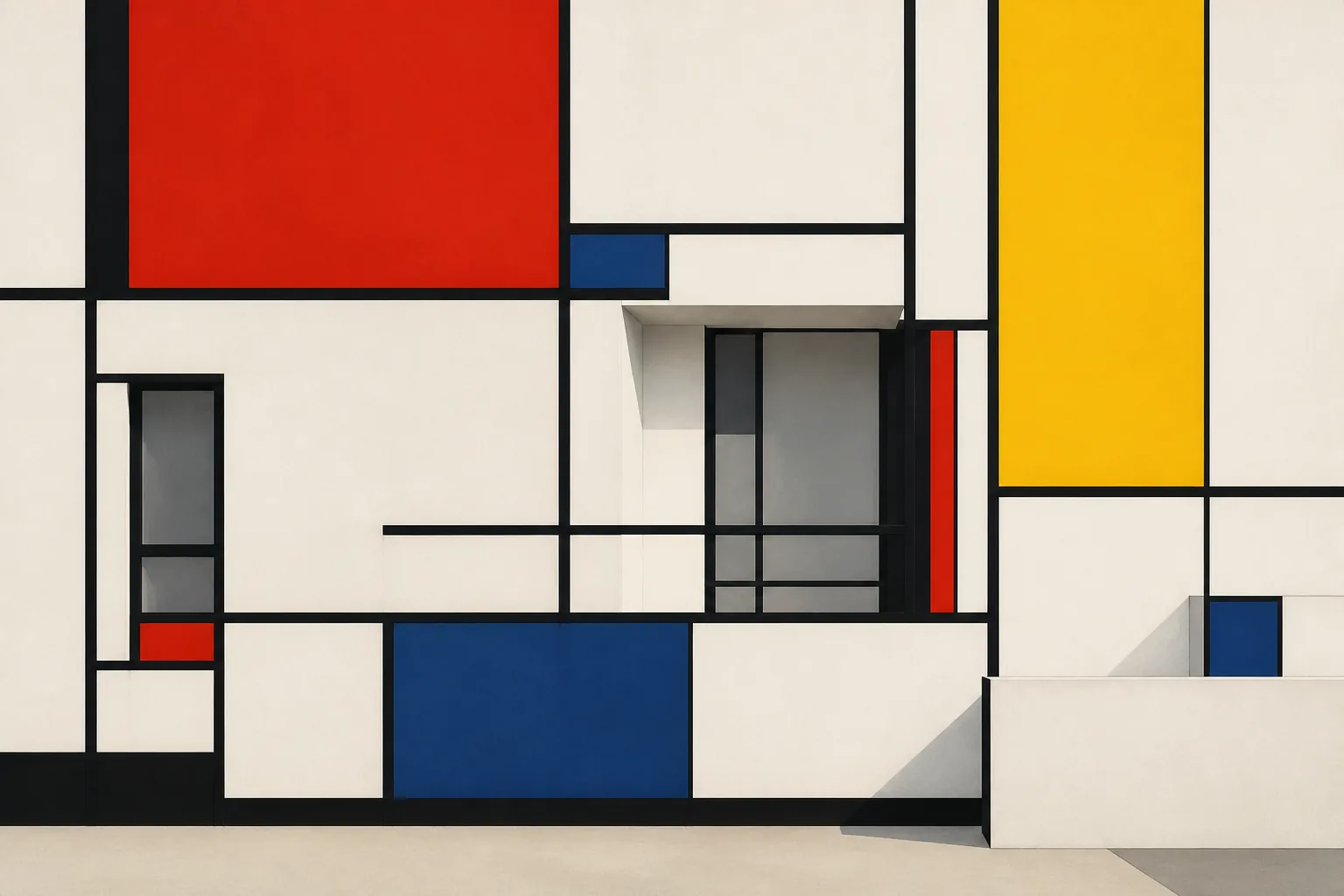
De Stijl turns design into a system of relations: vertical meets horizontal, red holds the plane, empty space becomes active, and furniture and architecture begin to behave like an abstract composition that can be entered.
Editorial thesis
De Stijl matters not because it gave design an easy recipe of black lines and primary colors. Its radicality lies elsewhere: the movement attempted to make painting, furniture, architecture, typography and interiors parts of one relational system. That is why it became one of the most influential prototypes for modern systems thinking in design. 1
Reader question
How could a few straight lines and rectangles influence architecture, furniture, graphic design and even fashion — and why does this language so easily become cliché today?
Short answer
Because De Stijl worked not only with forms but with rules. The movement sought a universal order through vertical and horizontal directions, a restricted palette, independent planes and active empty space. When those rules moved into an object or a house, they produced not ornament but a spatial system.
1. De Stijl begins as a magazine, not a package of colored squares
Look at De Stijl through a souvenir shop and the movement is easily reduced to a white ground, a black grid and three bright rectangles. Historically it began as something more complex: in 1917 Theo van Doesburg launched the journal De Stijl as a platform for art, architecture and design searching for a common language of new order. 1
De Stijl is therefore better understood not as a decorative style but as an editorial and design program. The journal assembled contributors, published theory, showed furniture and architecture, and turned parallel experiments into a recognizable system. 1
2. The Netherlands in 1917: a neutral country and a radical search for order
The Netherlands remained neutral during the First World War, yet it was not detached from the sense of European crisis. For some artists the collapse of old certainties sharpened a question: could a visual order be built without depending on historical styles, national taste or the individual gesture? 1
De Stijl answered with an almost utopian proposition. Harmony was not comfort but a precise balance of opposites: vertical and horizontal, color and emptiness, part and whole. Because the system claimed universality, it could move from painting into furniture and architecture. 1
3. Theo van Doesburg: editor, connector and engine of the movement
Theo van Doesburg was more than a painter. He wrote, edited, lectured, corresponded and built international networks, continually expanding the field of De Stijl. MoMA and Tate describe him as the founder and principal organizing force of the movement. 7
The editorial lesson is crucial: a movement exists not only through strong images but through an infrastructure of circulation. Without the journal, manifestos, lectures and correspondence, De Stijl might have remained several parallel experiments rather than an international language. 1
4. Piet Mondrian and Neo-Plasticism: painting reduced to relationships
Mondrian called his system Neo-Plasticism. He progressively removed the represented object, diagonal movement, modelling and local landscape, leaving relationships between straight lines, rectangular fields and a restricted palette. 1
This reduction was not simplicity for its own sake. Mondrian sought an equilibrium without a dominant center or narrative hero. The painting had to operate as a field of forces in which no element merely decorated another. 1
5. Vertical and horizontal: why the diagonal first looked like a violation
Early Neo-Plasticism was built around horizontal and vertical directions. For Mondrian these were more than convenient grid axes: they were clear opposites capable of producing dynamic equilibrium together. 1
That is why van Doesburg's later use of the diagonal was not a minor formal adjustment but a philosophical dispute. If a system claims universal rules, every new direction asks whether the system is evolving or ceasing to be itself. 1
6. Red, yellow, blue, black, white and grey: color as construction
Primary red, yellow and blue, combined with black, white and grey, became De Stijl's most recognizable code. Yet the palette works only when color distributes compositional weight rather than simply making a surface look “Mondrian-like.” 1
The white field is as active as the red rectangle. A black line does not outline an image; it organizes relations. Color behaves almost like a structural element, holding tension, setting scale and directing the route of the eye. 1
7. Bart van der Leck: flat color before the grid became doctrine
Bart van der Leck arrived at large flat zones of pure color before De Stijl hardened into a strict grid. His work demonstrated how color could separate from volumetric description and act as an autonomous plane. 1
This matters because the history of De Stijl should not collapse into a duet between Mondrian and van Doesburg. The movement emerged from intersections among painters, architects and designers; its shared language was produced through difference, not through instant agreement. 1
8. Vilmos Huszár and the De Stijl journal: graphic design as the entrance to the movement
Vilmos Huszár designed the cover of the first issue of De Stijl. From the start, the printed page presented the movement not as a neutral publication about art but as a visual object with its own proportions, lettering and rhythm. 1
The journal also allowed abstract aesthetics to live in reproducible form. A painting stays in one place; a page travels. Editorial design helped the ideas of De Stijl become an international language. 1
9. The 1918 manifesto: the universal against the individual
The first De Stijl manifesto, published in 1918, opposed the old and the new consciousness, the individual and the universal. Its language was idealistic and severe: art was expected to participate in constructing a new equilibrium. 1
Today that universalism deserves critical reading. Every “universal” system is produced by particular people in a specific European context. Yet the ambition remains important: design was being claimed as a way to organize not only objects but a world. 1
10. De Stijl as a network, not a school with one classroom
De Stijl had no single school building, workshop or capital. It was a network around the journal and van Doesburg, with members joining, arguing, leaving and working across disciplines. 1
That structure explains both its reach and its instability. Ideas could migrate quickly between painting, furniture and architecture, but agreement was never guaranteed. De Stijl functioned more like a protocol for debate than a curriculum. 1
11. Gerrit Rietveld: furniture becomes a spatial diagram
Gerrit Rietveld showed that De Stijl could be touched as well as seen. His furniture breaks the object into battens, planes, joints and color accents, as if the chair ceased to be a heavy body and became a drawing in space. 1
This does not mean abandoning function. Instead, function stops concealing construction. The user sees how the object is assembled, where horizontal and vertical meet, and how the seat plane separates from the frame. The object becomes a lesson in spatial thinking. 1
12. Red Blue Chair: sitting inside an abstract composition
Rietveld developed the Red Blue Chair from 1918 and later applied the characteristic De Stijl color scheme. MoMA notes that Rietveld and his colleagues connected such forms with the hope for a new harmonic human-made order after the destruction of war. 1
The chair is striking because it visually preserves air around the body. Seat and back do not close into a bulky volume; the frame continues the surrounding space. It can be read at once as furniture and as a three-dimensional abstract composition. 1
13. Hanging Lamp: the line leaves the page and becomes light
With the Hanging Lamp Rietveld makes another radical move: the familiar lamp almost disappears as a compact object. Tubes of light and suspension lines form a free spatial graphic. 1
The principle remains useful today. An object does not have to be a single enclosed thing. It can be a distributed system of elements, with the void between them working as actively as the material components. 1
14. Architecture without heavy mass: planes instead of a box
De Stijl architecture sought to dismantle the idea of the building as a single heavy box. Facade and interior become independent planes, lines, projections and color fields that continue beyond one frontal view. 1
Such space requires the viewer to move. From one angle the composition gathers; from another it breaks apart and reforms. Architecture becomes a sequence of perception rather than one perfect facade image. 1
15. Rietveld Schröder House: the house as manifesto
The Rietveld Schröder House in Utrecht, completed in 1924, is described by UNESCO as a manifesto of De Stijl ideals and an icon of the Modern Movement. It radically integrates plane, color, furniture and flexible interior space. 1
From outside it resembles an arrangement of white and grey planes crossed by black lines and small red, yellow and blue accents. More important is the continuity inside: architecture and interior are not separated into shell and decoration. 1
16. Truus Schröder: the client becomes a co-author of space
The house was commissioned by Truus Schröder-Schräder, and Centraal Museum emphasizes her active collaboration with Rietveld rather than a passive client role. Her ideas about living, freedom and transformable space shaped the project. 1
The broader design lesson is significant. A strong client can become a source of new typology rather than an obstacle to authorship. The Schröder House emerged from dialogue between a formal system and a very specific script for everyday life. 1
17. Flexible interior: walls that change the script of living
The main living floor can be changed by sliding and folding partitions. It can operate as one open volume or divide into separate rooms. UNESCO identifies this flexibility as a central quality of the house. 1
This disrupts the stereotype of De Stijl as an inflexible grid. A strict visual grammar can support changing life. Rules do not always freeze space; they can make transformation legible and controllable. 1
18. Van Doesburg and van Eesteren: Contra-Construction explodes the box
In 1923 Theo van Doesburg and architect Cornelis van Eesteren produced the Contra-Construction projects. MoMA describes these axonometric works as attempts to formulate a harmonic new order through open spatial elements. 1
The colored planes no longer behave like a conventional facade. They float, intersect and extend into depth, as if Mondrian's painting acquired X, Y and Z axes. The drawing becomes an architectural laboratory rather than an illustration of a finished building. 1
19. Axonometry and open space: drawing as a project of thought
Axonometry suited De Stijl because it is not tied to one perspectival viewpoint. Several planes can be read at once, allowing space to appear as a system of relations. 1
A contemporary 3D designer may recognize the logic of an exploded view: the object can be mentally separated into layers and nodes without losing the whole. De Stijl understood early that the way a project is represented changes the way it is conceived. 1
20. Elementarism: the diagonal enters the system and conflict begins
In the mid-1920s van Doesburg introduced Elementarism and admitted the diagonal. For him it added dynamism; for Mondrian it violated the fundamental balance of vertical and horizontal. Their paths diverged. 1
The dispute is useful because it reveals the limit of every design system. A system that is too loose dissolves into arbitrariness; one that is too rigid stops evolving. De Stijl is therefore also a history of testing how much tension rules can withstand. 1
21. Aubette: De Stijl enters nightlife
At the Aubette interiors in Strasbourg, created by van Doesburg with Jean Arp and Sophie Taeuber-Arp, abstract geometry entered restaurants, dance halls and a cinema. MoMA connects the project to van Doesburg's development of Elementarism. 1
This is almost the opposite of museum stillness. Geometry meets moving bodies, music, evening light and social life. De Stijl becomes an environment whose composition changes with the viewer. 1
22. Typography and the journal: the page as constructed space
The De Stijl page behaves like architecture at small scale: fields, bars, letters, intervals and empty space hold the composition. Van Doesburg treated typography and printed matter with the same experimental intensity he brought to painting. 1
This line leads directly toward modern editorial and interface design. A grid does not need to be an invisible technical aid; it can become the expressed rhythm of an identity. Its job, however, is to organize information rather than simply reference Mondrian. 1
23. Bauhaus and De Stijl: proximity, influence and fundamental differences
Van Doesburg maintained active contact with the Bauhaus and lectured in Weimar, although De Stijl and the Bauhaus were never the same school. Both sought a new language for art, architecture and design, while the Bauhaus tied experimentation more strongly to education, workshops and production. 1
De Stijl concentrated more intensely on a universal visual order. Their relationship is best understood as exchange rather than as a story of who invented whom. European modernism grew through travel, journals, lectures and argument. 1
24. Constructivism and De Stijl: similar geometry, different political temperature
Constructivism and De Stijl can appear related because of geometry, typography and their rejection of academic illusion. Historically, however, the political temperature is different. Russian Constructivism was more closely tied to revolutionary politics, production and agitation. 1
De Stijl spoke about a new society in a more universalist and abstract language. A Constructivist diagonal often pushes the eye like a command; De Stijl usually tries to hold equilibrium. Similar forms can serve different ideas. 1
25. Photography: how to shoot strict geometry without flattening it into pattern
Photographing De Stijl is difficult precisely because a camera readily turns a three-dimensional system into a flat poster. A strictly frontal view can make the Rietveld house look like a rectangle composition and erase its spatial complexity.
Better images reveal shifts of plane, shadow, thickness and the human body as scale. One frame can be nearly orthogonal; another can move slightly off-axis to reveal depth. Light should explain construction rather than add decorative drama.
26. Fashion: from Mondrian to Yves Saint Laurent and the problem of quotation
The most famous fashion quotation from the De Stijl legacy is Yves Saint Laurent's autumn-winter 1965-66 group of dresses honoring Mondrian. The Met notes that the color blocks were not merely printed: jersey pieces and seams preserved the geometry on a moving body. 1
This marks the difference between translation and costume. A strong adaptation carries the principle into a new material problem. A weak one simply places black lines and three colors on a surface without changing cut, proportion or behavior. 1
27. Branding, retail and interfaces: why the grid outlived the movement
The De Stijl grid survived the movement because it offers not an ornament but a method for organizing relationships. In branding it becomes a module, in retail a zoning system, in interface design a layout, and in motion a sequence of changing fields.
Directly copying the palette quickly becomes historical styling. A more contemporary approach is to borrow the discipline: limit directions, define clear modules, distribute accents and allow empty space to work as a full component.
28. The main clichés: three colors do not automatically make De Stijl
The main De Stijl cliché is the assumption that a white ground, a black grid and red-yellow-blue rectangles are sufficient. The set is recognizable, but without proportional tension it becomes a decorative meme.
A second cliché is total symmetry. De Stijl seeks order, yet its compositions are often asymmetrical. Equilibrium comes from relations of weight, size and position rather than mirroring. A third cliché is forgetting space and seeing only graphic surface.
29. How to use De Stijl in a contemporary visual project
For a contemporary project, choose one De Stijl principle and push it consistently. It might be orthogonal structure, modular furniture, one primary color as navigation, or an interior composed from independent planes.
If everything arrives at once — grid, three colors, type, furniture, diagonal and dozens of rectangles — the result becomes theme decoration. The system is stronger when its restrictions can be felt in the project logic rather than displayed as historical costume.
30. The main legacy: design as a system of relationships
De Stijl's most important legacy is the idea that design can be built as a system of relationships rather than as a collection of beautiful isolated things. Painting, chair, lamp, house, journal and dress can use different media while speaking through a shared grammar.
That idea leads directly toward contemporary design systems: a component matters not only in itself but through rules connecting it to other components. De Stijl remains current when it teaches us not to copy an appearance but to design an order.