encyclopedia
Brass
Composition, patina and warm metallic light
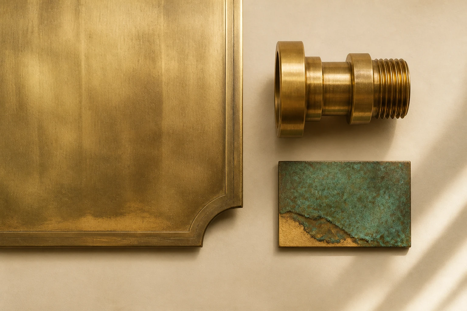
Brass looks luxurious only for the first moment. Then it begins to live: recording touch, shifting colour, darkening at edges and reflecting the room through warm light. That movement through time is what makes it a material rather than golden decoration.
Editorial thesis
Brass is often selected for its “golden” colour, yet its real character appears later. A new sheet may look bright and almost mirror-like; within weeks it begins to record touch, and with time it can turn honey-brown, deep umber or irregularly mottled. The surface does not merely reflect light — it keeps a quiet record of the room.
Its expression is never determined by colour alone. Alloy, rolling direction, polish, edge detail, protective coating and maintenance decide whether brass feels jewelled, industrial, historic or deliberately raw. A strong project does not deny change; it decides how much life the surface is allowed to show.
Reader question
Why does one brass panel remain bright and even, another become covered with fingerprints, a third age beautifully, while a fourth resembles inexpensive gold film?
The answer sits between metallurgy and surface direction. Alloy determines mechanical and corrosion behaviour; finish, protection, geometry, light, touch and maintenance determine what people actually see.
Short answer
Brass is a family of copper-zinc alloys. By adjusting zinc and adding tin, lead, aluminium, nickel or arsenic, manufacturers produce materials with different colour, formability, machinability and resistance to specific environments. Common compositions contain roughly five to forty-five per cent zinc. 12
For a project, the word “brass” is not enough. The specification should define alloy, product form, thickness, temper, grain direction, finish, acceptable variation, joining method and care. Otherwise one familiar name conceals radically different surfaces.
1. Brass is a family of alloys, not one golden colour
Brass can be reddish, honey-toned, bright yellow, green-gold or almost silvery. Composition and finishing change the hue, which is why a screen image is a poor substitute for a physical sample.
For a designer, “warm metal” is not a specification. Adjacent batches may differ slightly, while polished and matte versions of the same alloy can read as entirely different materials.
2. Copper, zinc and the changing hue
Copper contributes red warmth, conductivity and the ability to form patina. Zinc lightens the colour and changes strength and processing behaviour. As zinc increases, the visual tone generally moves from red-gold toward a paler yellow. 1
This shift becomes more powerful at architectural scale. On a small handle it may be subtle; across a wall it changes the atmosphere of the whole room.
3. Alpha and beta phases: composition controls formability
Low- and medium-zinc alpha brasses respond well to cold forming. At higher zinc levels, beta phase appears, increasing strength and hot-workability while reducing cold ductility. 2
Behind a calm decorative panel sits a metallurgical structure that decides whether the sheet can be deeply drawn, how tightly an edge can turn, and whether a complex part should be formed or cast.
4. Principal alloys: from gilding metal to naval brass
High-copper alloys such as gilding metal produce a reddish old-gold colour and form readily. C26000 cartridge brass contains about seventy per cent copper and is valued for cold working. C46400 naval brass includes tin for more demanding corrosive environments. 14
Commercial names can be historical and confusing: “architectural bronze” is often technically a brass. In drawings and procurement, alloy number and composition matter more than the romantic name.
5. Leaded, free-cutting and lead-free brass
Lead was traditionally added to improve machining: chips break cleanly, tools run consistently and small turned components receive a precise surface. Such alloys became common in fittings and hardware. 2
Requirements for potable water and responsible material use are driving lead-free and low-lead systems. The choice cannot be based on appearance alone; chemistry is linked to use, safety and production method.
6. Corrosion, tarnish and dezincification
Darkening does not automatically mean structural failure. Thin corrosion products can alter colour while preserving geometry. In certain water and chemical conditions, however, dezincification selectively removes zinc and leaves a porous copper-rich structure. 1
Dezincification-resistant alloys such as C35330 are used where the environment demands them. Decorative patina and harmful corrosion may begin with similar colour changes, so the exposure must be understood before the finish is celebrated. 1
7. Sheet, strip, rod, tube, section and casting
Sheet and strip suit panels, furniture fronts and folded parts. Rod becomes handles, fasteners and turned components; tube lightens frames; extruded sections organise joints; casting enables deeper sculptural forms.
Product form changes the visual language. Thin sheet speaks of skin, a cast fitting speaks of mass, and a machined rod suggests mechanical precision.
8. Rolling, work hardening and surface direction
Rolling leaves direction that can reappear through brushing and reflection. Cold work strengthens brass while reducing ductility; annealing restores its ability to form further.
If neighbouring sheets are rotated, light will reveal the mismatch before the eye understands the joint. Grain direction must be part of the cutting plan and factory labelling.
9. Polished, satin and brushed finishes
Polishing gathers light into a bright highlight and deepens the golden tone. Satin finishing spreads reflection into a calmer gradient. Directional brushing introduces a graphic rhythm and can disguise minor signs of use.
A finish should not be judged only at arm’s length. From across a room a fine grain may disappear, while uneven polishing becomes a broad optical wave. Full-size samples under project lighting are essential.
10. Mirror, hammered and textured surfaces
Mirror brass turns a room into a warm reflection but demands a perfectly controlled substrate and careful installation. Every ripple in the sheet becomes optical distortion.
Hammering and texture break the highlight, conceal small imperfections and return a sense of handwork. A single hammer mark is minor; thousands of marks become a field of moving light.
11. Natural patina: the material begins to keep time
Without a barrier coating, brass gradually darkens. Moisture, oxygen, salts, airborne pollution and touch create an uneven map: edges, handles and frequently contacted areas age differently from quiet planes. 19
That variability may be a defect or the central idea. Patina makes the surface feel less like applied decoration and more like material that belongs to real time.
12. Artificial patina and controlled ageing
Chemical solutions, heat, cleaning and application sequence can produce brown, grey, black and greenish effects. Copper Development Association guidance stresses test samples and disciplined surface preparation. 16
Artificial patina feels convincing when the depth of the metal remains visible. Perfectly uniform colour can resemble paint; controlled variation keeps the surface alive.
13. Lacquer, wax and oil: stopping or directing time
Clear lacquer preserves the original colour for longer and reduces fingerprints, but a scratch in the coating creates localised ageing. Wax and oil are softer systems that require periodic renewal.
Protection also changes optics. Even a clear film can make brass glossier or slightly plastic. The decision must consider maintenance and how closely hands and eyes approach the material.
14. Warm metallic light
Brass does not reflect neutrally. It adds a honey-yellow cast, especially beside warm lamps, timber, leather and dark stone. A small component can therefore influence the perceived colour of an entire interior.
Under cool white light the same surface may become greenish and hard. Lighting must be tested with the actual alloy and finish, not designed after installation.
15. Fingerprints, scratches and the trace of touch
Polished brass records a hand almost instantly. Satin surfaces reduce contrast, but incorrect cleaning can leave scratches across the grain.
In a public interior the team must decide whether touch is dirt or history. A handle continuously burnished by palms can be more convincing than a panel kept artificially new.
16. Radius, edge and thickness
A sharp edge makes brass graphic, yet it can expose the thinness of sheet and is vulnerable to impact. A folded return, chamfer, welded box or solid profile creates a completely different sense of quality.
Bend radius controls light. A tight turn produces a sharp break in the highlight; a broad radius creates a soft golden gradient. Geometry and finish should be designed together.
17. Casting, turning and milling
Casting produces dense handles, bases and decorative forms with genuine depth. Turning generates concentric tool marks; milling creates precise planes, grooves and edges.
Tool paths can be erased or retained. A visible cut often communicates process and weight more effectively than a surface polished into anonymity.
18. Soldering, brazing and welding
Soft soldering suits some thin assemblies, brazing creates stronger joints, and welding requires careful process selection because zinc affects heat behaviour and fume generation.
The joint may differ in colour from the parent metal. It can be blended through finishing or accepted as an honest construction line. An invisible seam is a technical achievement, not a default property.
19. Fasteners, joints and contact with other metals
Exposed fasteners can establish rhythm, but their alloy and colour must belong to the panel. A random silver screw can immediately break the sense of a unified object.
Contact between dissimilar metals in moisture may create galvanic corrosion. Isolation, drainage, compatible fasteners and maintenance access matter more than a seamless render. 1
20. Brass in interiors and retail design
In retail, brass quickly signals value: it gathers warm light, sharpens glass, leather and stone, and turns a thin profile into a visual frame for merchandise.
Too much, however, becomes theatrical gilding. Brass is often strongest in measured doses — a line, edge, niche or surface encountered at close range.
21. Doors, handles and the architecture of touch
A door handle is where material stops being an image. Temperature, mass, radius, mechanical resistance and the changing surface are felt before the visitor evaluates the room.
Good hardware therefore designs a gesture, not merely a silhouette. Brass is especially effective: visually warm, dense in the hand and slowly burnished by contact.
22. Kitchens, bathrooms and wet areas
Water, soap, acids, salts and cleaning products accelerate surface change. Uncoated brass in a bathroom will age actively; lacquered brass requires care to avoid breaking the barrier.
For plumbing components, a gold colour does not prove that the alloy is suitable. Water standards, dezincification resistance and the actual composition of the part remain decisive. 11
23. Lighting: the material as reflector
In a luminaire, brass performs twice: it forms the object and colours reflected light. A polished interior increases brightness and creates lively highlights; hammering softens them; a matte finish produces a quiet glow.
Heat management, ventilation and access for cleaning must belong to the construction. A beautiful reflector loses its effect quickly if it cannot be maintained without scratching.
24. Furniture and object design
A brass detail can visually lift a heavy timber volume, clarify a stone joint or form a fine support. The material is particularly articulate at small scale, where edge, screw and machining mark remain visible.
In strong furniture, brass is rarely decoration alone. It becomes hinge, handle, protective plate, connector or optical accent — ornament grows from function.
25. History: from ancient alloy to industrial material
Brass has been known since antiquity. Before metallic zinc could be isolated, it was produced by cementation, heating copper with zinc-bearing minerals. Later control of composition turned it into a major industrial alloy. 12
Its history moves constantly between imitation gold and engineering utility. Coins, instruments, scientific devices, hardware and interiors reveal an alloy capable of being both symbolic and practical.
26. Modernism and Art Deco: brass between machine and luxury
Christopher Dresser treated industrial production as a design language rather than a cheap copy of craft. In early twentieth-century Vienna, Wiener Werkstätte joined geometry, sheet metal and exact workmanship; Cooper Hewitt holds a Koloman Moser box made from silver-plated brass. 112
In American Art Deco, Chase Brass and Copper invited designers to create accessible modern objects. Brass became a mediator between machine polish, domestic scale and the image of luxury. 1
27. Tom Dixon Beat: hammered surface and soft light
The Beat collection translates traditional metalworking into a contemporary lighting system. Tom Dixon describes the pieces as hand-formed and hand-beaten, with a warm golden interior. 114
The strength of the series is not a display of expensive metal. The black exterior controls the silhouette while the brass interior remains a partly hidden source of soft light. Material is revealed through function rather than continuous shine.
28. Cleaning and maintenance
Before cleaning, establish whether the brass is bare or lacquered. Abrasive products and aggressive chemistry can remove patina, scratch directional finishes or damage a coating locally.
The correct strategy begins with a soft cloth, neutral cleaner and a test in an inconspicuous area. For large installations, regular gentle care is safer than occasional radical restoration.
29. Recycling, durability and environmental cost
Brass is highly recyclable and scrap retains economic value. Copper Development Association materials emphasise closed-loop recovery; parts of the US brass rod industry have verified very high recycled content. 1616
Yet copper and zinc extraction, melting, polishing and coatings carry environmental cost. Responsible design uses brass where durability, repairability and future recycling justify the production effort.
30. How designers, photographers and art directors should read brass
Designers should verify alloy, thickness, temper, product form, finish, direction, protection, joints, environment and care. A full-size mock-up should survive touch, cleaning and several days of real light.
Photographers must decide what the surface is saying: a clean gold highlight, dark patina, fingerprint, hammered relief or reflected room. Art directors should avoid the automatic equation “brass equals luxury”; the same metal can speak of workshop, mechanics, history, music, utility and time.