encyclopedia
Op Art
Optical illusion, rhythm and the movement of the gaze
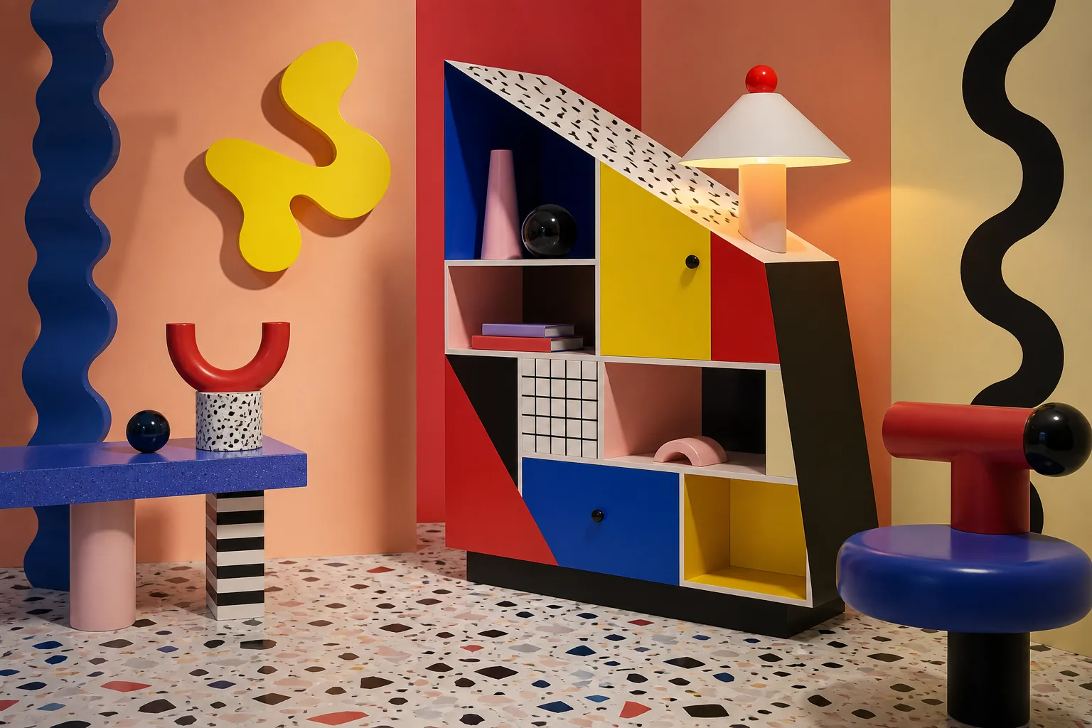
Op Art does not draw movement — it switches it on inside the viewer’s head. Stripes, grids and colour collisions turn a still plane into a small machine of perception.
Editorial thesis
Op Art does to an image what a good magician does to a coin: it shows a flat surface, and the eye suddenly sees movement, depth and vibration. It is not decoration made of stripes; it is a precise perceptual game in which contrast, repetition and rhythm make the viewer part of the work. 1 1
Reader question
Why can a still image appear to move, and why can a simple grid almost physically vibrate in front of the eye? 2
Short answer
Op Art, or optical art, uses geometry, contrast, repetition, colour interaction and the productive mistakes of human vision. In the 1960s it became especially visible through artists such as Bridget Riley and Victor Vasarely, MoMA’s The Responsive Eye exhibition, and the fast migration of optical motifs into fashion, graphics, shop windows and mass culture. 3
1. Why the eye enjoys being tricked
The eye feels like a reliable camera, but in reality it constantly negotiates with the brain: where is the edge, where is depth, what is moving and what is merely repeating. Op Art uses that negotiation. It places stripes, cells, waves and contrast fields in front of us, and the brain switches on the animation. It is almost interactive art before interactive screens. 4
2. Op Art begins with perception, not with a trick
Op Art does not need to depict an object. Its real subject is not an apple, a house or a portrait, but the act of seeing itself. The picture says: look at the way you look. That is why the movement still feels modern decades later: it works not with a passing taste for form, but with the mechanics of perception. 5
3. Black and white: the cheapest special effect in art history
In Op Art, black and white are not a lack of colour but maximum volume. When a black line and a white line sit beside each other, the eye receives a strong signal and begins to search for an edge. When there are hundreds of such edges, the image starts to pulse. The simplest means become an almost physical sensation. 6
4. Rhythm: when stripes start behaving like sound
Repetition in Op Art works like rhythm in music. One line is a note. Ten lines are a motif. A hundred lines with a slight curve become a visual drum that moves the gaze across the surface. Good Op Art is not simply “made of pattern”; it conducts the eye like a score. 7
5. The 1960s: when the painting almost became a screen
In the 1960s, Op Art met television, advertising, the space race, new fashion and bright urban display. The painting no longer wanted to be a quiet window on the wall. It began to behave like a signal: sharp, fast, reproducible and highly photogenic. 1
6. The Responsive Eye: the exhibition that made viewers dizzy
MoMA’s 1965 exhibition The Responsive Eye became one of the public turning points for Op Art. The title sounds almost like an instruction: the painting responds, but so does the eye. Viewers discovered that a museum work could produce not just contemplation but a real sensory effect. 3
7. Bridget Riley: the line that refuses to stand still
Bridget Riley showed that a line can be calm only on paper. In her work, curve, repetition and contrast turn the plane into a wave. The important point is that this is not an illustration of movement; it is the production of movement inside the viewer’s perception. Her paintings are not only read; they are experienced by the eyes. 1
8. Current: a wave that moves without a motor
Current from 1964 explains Riley’s power clearly: the surface is static, yet it behaves like a flow. MoMA connects this work to The Responsive Eye and to the definition of Op Art as a style exploiting the optical effects of patterned abstraction and contrasting colours. 3
9. Victor Vasarely: the grid, the cube and the programmable illusion
Victor Vasarely is often understood as the architect of an optical universe. His modular grids, pseudo-volumes and colour transitions look as if an image could be assembled as a system, like a facade or an interface. He is essential for understanding Op Art as a language close to design, programming and serial production. 1
10. Josef Albers: the supporting actor that steals the colour scene
Josef Albers was not an Op artist in the narrow sense, but his studies of colour interaction help explain why neighbouring hues change perception. The same colour can seem warmer, cooler, closer or further away depending on its surroundings. For Op Art this is almost a manual for directing vision. 1
11. Colour Op Art: when illusion becomes warmer, cooler and deeper
When Op Art leaves black and white, the illusion becomes more complex. Colour no longer merely decorates form; it argues with it. Red pushes forward, blue recedes, yellow begins to glow, and green may stabilise the composition or shake it further. Colour makes the optical effect emotional. 2
12. 1960s fashion: the dress as a moving poster
Fashion in the 1960s quickly understood that Op Art works perfectly on the body. A dress became not just clothing but a moving poster: a person walks, fabric changes angle, and the pattern starts to live. In fashion, Op Art does not stay on the wall; it enters the street and becomes an event. 1
13. Tights, earrings and paper dresses: Op Art walks into the street
V&A records the role of 1960s accessories in creating an ultra-modern look, and notes Mary Quant’s popularisation of patterned tights with Op Art designs. Paper dresses and graphic jewellery also turned the body into a surface for fast visual communication. 1
14. Graphic design: the poster that catches the eye before the text
In graphic design, Op Art works like a magnet. It can stop the eye before a person reads a single word. But there is a trap: if the whole page screams, the text disappears. A good Op Art poster controls the vibration: one strong visual strike, and enough air for the message to survive. 5
15. Product design: when the surface activates the object
Product design uses Op Art when an object needs active skin rather than sculptural complexity. A simple box, bottle, package or plinth can become dynamic through surface alone. This is honest magic: the form stays simple, while all the movement happens in the image. 6
16. Interior design: floor, wall and furniture as visual traps
In interiors, Op Art is strongest on planes: carpet, floor, screen, wall, curtain or panel behind an object. It can expand a room, break perspective or make a small zone unforgettable. The key is not to turn the whole interior into an eye test. Op Art needs a stage, not chaos. 7
17. Architecture and the city: optical facade instead of heavy wall
Architecture uses optical logic more carefully. A facade with repeated fins, grids or contrasting panels can change as a passer-by moves. The building appears to come alive without a screen: simply because the viewer walks, and the rhythm of the facade shifts relative to the gaze. 8
18. Retail and the shop window: how to stop a passer-by
The shop window loves Op Art because of its instant effect. A person walks past, and suddenly the floor seems to slide, the backdrop vibrates, and the product sits in the middle of a small visual tornado. It works especially well for glasses, jewellery, shoes, fragrance and anything that needs a fast stop effect. 9
19. Photography: when light draws stripes on body and fabric
Photography can translate Op Art from plane to body. Striped light, projection, grids, shadows from blinds and high-contrast fabric all create tension between skin, garment and background. In fashion photography, Op Art can give a frame energy without a complicated set. 10
20. Film and video: the motion Op Art predicted early
Film and video intensify what Op Art already knew how to do on paper. The camera moves, the pattern changes scale, lines create moire, and static graphics become a nervous pulse. Sometimes it is beautiful; sometimes it is perceptually harsh, so movement and frequency need control. 11
21. Why Op Art is dangerous in careless hands
Op Art is dangerous when the maker confuses effect with meaning. A pattern that is too dense tires the viewer, weak contrast turns into visual mush, and a random spiral quickly becomes cheap “hypnosis”. Good Op Art is precise: it knows when to stop. 12
22. How to tell Op Art from a geometric pattern
A geometric pattern repeats a form. Op Art makes the form behave strangely. If the image creates a feeling of movement, depth, flicker, unstable edge or spatial shift, it is already an optical strategy rather than a decorative motif. 1
23. Three main tools: contrast, repetition and micro-shift
The three main tools of Op Art are contrast, repetition and micro-shift. Contrast activates vision. Repetition creates rhythm. Micro-shift breaks calm and makes the brain search for a new stability. Together they produce the effect: the plane remains flat, but the eye stops believing it. 2
24. Density: how much rhythm the human eye can take
Density is the main regulator of Op Art. Too sparse, and the effect disappears. Too dense, and the viewer becomes exhausted. The strongest works stand on the edge: still readable, but already unstable; still beautiful, but slightly dangerous. That edge keeps the style alive. 3
25. Op Art and luxury: visual risk in expensive packaging
In luxury imagery, Op Art offers a rare mix of discipline and spectacle. Black-and-white rhythm can make a jewellery object colder and more expensive, colour illusion can make it more energetic, and an optical background can turn it into a near-museum scene. But the product must remain the protagonist, or the pattern steals the image. 4
26. Op Art in digital design: the screen as the natural home of illusion
On screen, Op Art feels at home. Pixels, grids, refresh rates, scroll, interactive cursors: all of these are natural conditions for optical effects. In digital design it can animate a splash page, identity or campaign site, but readability and comfort must be tested. 5
27. AI visuals: how to prompt Op Art without cheap hypnosis
For AI visuals, Op Art should be prompted structurally, not with the word psychedelic: controlled optical vibration, precise black-and-white stripe field, modular geometric depth, clean gallery lighting. That produces a visual system rather than random spiral noise. 6
28. Common mistakes: checkerboard, spiral and visual noise
The most common mistake is asking for an “op art background” and receiving a generic checkerboard. The second is an endless spiral that looks like an old television intro. The third is too many colours. Choose one principle: wave, grid, volume or vibration, and execute it cleanly.
29. Why Op Art works again today
Op Art works again today because we live among screens. The eye constantly catches notifications, scroll, grids, interfaces and flicker. Op Art turns this contemporary overload into a controlled visual experience: not just noise, but rhythm that can serve an image.
30. The main legacy: an image that switches the viewer on
The main legacy of Op Art is that it makes the viewer a co-author. Without the eye, the effect does not exist. The stripes do not move by themselves, the grid does not breathe by itself, and colour does not vibrate by itself. Everything happens in the meeting between image and person. Op Art is therefore not a surface style, but a style of perception.