encyclopedia
Postmodernism
Quotation, irony and the return of the sign
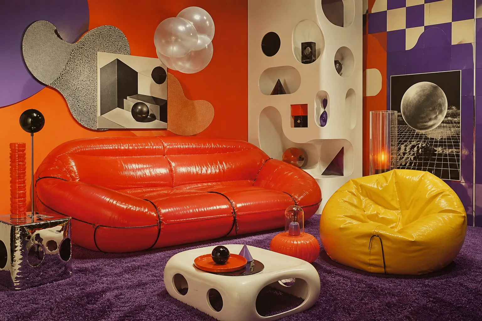
Postmodernism does not destroy history — it switches it on as lighted sign, theatrical mask, furniture silhouette and cultural montage. Where modernism searched for purity, postmodernism shows that every space already speaks in borrowed voices.
Editorial thesis
Postmodernism matters not because it permitted “anything”, but because it returned sign, quotation, historical memory, irony, decoration, mass media and pleasure in mixed codes to visual culture. It showed that form is never innocent: façade, dress, typeface, kettle or photograph already carries culture, market, power and desire.
In strong postmodernism quotation does not replace thought; it makes thought visible. A column can be structure, joke, memory and logo at once. Bright laminate can be not cheap imitation but the honest surface of an age that lives among screens, packages and signs. 1
Reader question
Why did a style so often accused of chaos, bad taste and superficial play become one of the most accurate visual languages of the late twentieth century?
Because it understood the city as an environment of signs. Postmodernism saw that people live not only among walls, chairs and clothes, but among signs, quotations, historical images, advertising, television, club culture and borrowed archives. 2
Short answer
Postmodernism is a movement and cultural position especially visible from the 1970s to the 1990s in architecture, design, art, fashion, photography and graphics. It challenged the modernist idea of pure form, universal language and functional seriousness. Instead, it used quotation, irony, historicism, mass culture, bright colour, artificial materials, façade-as-sign, staged photography and games with authorship. 123
1. Why postmodernism appears after modernism
Postmodernism begins where modernist confidence starts to sound too smooth: universal form, functional logic, the white surface and the promise of progress no longer explain the complex city of media, consumption and historical memory. It does not simply cancel modernism; it argues with its tone: seriousness, purity, directness and the idea of one correct future. 1
The shift is psychological as much as aesthetic. After the 1960s, the world is saturated with advertising, television, tourism, mass markets and political disappointment. Postmodernism answers not with a new purity but with montage: buildings, clothes, posters and objects assembled from signs that already exist.
2. Quotation instead of pure form
Modernism often wanted form to appear as if it began from zero. Postmodernism admits that there is no zero: every column, arch, colour, typeface, façade or silhouette already carries a cultural trace.
Quotation can be precise, distorted, enlarged to absurdity or nearly hidden. It may act as respect, parody or a way of showing that contemporary culture is built from borrowed fragments. 5
3. Irony as method, not decoration
Postmodern irony is not a joke added to a façade. It is the distance between a form and its former authority. A column may stop carrying a building and begin carrying meaning; a domestic kettle may speak the language of an architectural toy.
Irony makes the object double. It still performs, but it also comments on function, good taste, classicism, status and design itself. 6
4. The sign returns to the façade
One of postmodernism's key gestures is the return of the sign. The façade can once again speak through historical form, colour, lettering, symbol, mask and recognisable silhouette.
The façade no longer has to be an honest diagram of structure. It may become screen, cover, billboard or urban message. 7
5. Robert Venturi: complexity and contradiction
Robert Venturi was central to the turn against modernist purity. MoMA links Complexity and Contradiction in Architecture and Learning from Las Vegas to the overturning of International Style modernism's dominance. 4
His importance lies in a new permission: good form can be ambiguous, mixed, contradictory and even deliberately awkward.
6. Denise Scott Brown and the city of signs
Learning from Las Vegas by Robert Venturi, Denise Scott Brown and Steven Izenour proposed reading Las Vegas as a lesson in signs, speed, commercial landscape and communication. 5
Here postmodernism becomes a method for reading the city. Signs, parking lots, neon and roadside scale are not waste around architecture; they are the visual instructions of everyday life.
7. Duck and decorated shed
The pair duck and decorated shed is essential to postmodern vocabulary. The duck is a building whose form becomes the symbol; the decorated shed is an ordinary box that gains meaning through applied sign, façade or decoration.
The distinction also helps read retail, exhibitions, packaging and interfaces: some objects shout through form, others use a neutral carrier covered with meaning. 10
8. Charles Jencks and the death of modernist certainty
Charles Jencks popularised the architectural language of postmodernism and connected it to the critique of one modernist vocabulary.
Postmodernism appears on the ruins of certainty. It may not always offer a stable replacement, but it clearly shows that style, history and mass culture cannot be separated cleanly. 11
9. 1970-1990: style and subversion
The V&A describes postmodernism from about 1970 to 1990 as a movement that shattered established ideas about art and design and brought a new self-awareness about style. 12
This date range captures the visible peak: architectural theory, furniture, graphics, fashion, club culture and museum display all begin to enjoy being visibly styled.
10. Historicism without restoration
Postmodernism returns history without necessarily returning to the past. Arches, columns, pediments and ornament become signs rather than attempts to reconstruct an older world.
This is why postmodern historicism often looks artificial. It shows not tradition itself, but contemporary work with the image of tradition. 13
11. Michael Graves and the Portland Building
Michael Graves's Portland Building is often treated as a key early built example of postmodern architecture. Graves's office emphasises its bold forms, colours, ornament and legibility. 6
The building matters because it is controversial: it shows the power of recognisability and urban image, but also the risk that expressive façade does not automatically solve use, daylight or durability.
12. AT&T Building and the skyscraper with memory
In postmodern architecture the skyscraper can stop being only a glass vertical. It may receive a head, silhouette, historical quotation and almost furniture-like recognisability.
The postmodern tower speaks as logo, profile, mask and cultural hint as much as corporate technology. 1
13. Memphis: furniture after good taste
The Memphis Group, led by Ettore Sottsass in the early 1980s, became one of the most recognisable languages of postmodern product design. The Design Museum links it to bright, bold furniture and collective energy. 7
Memphis rejects the idea that furniture should be quietly correct. Laminate, colour, zigzag, diagonal and apparently cheap surfaces become a programme against disciplined good taste.
14. Carlton: the bookcase as totem
Ettore Sottsass's Carlton of 1981 became a Memphis icon. Memphis Milano describes it as a work that breaks the rules of good design, while The Met notes that it combines room divider, bookcase and chest of drawers. 89
Carlton does not hide behind function. It stands like a small architecture in the room: usable, but primarily theatrical, graphic and symbolic.
15. Colour, laminate and artificial surface
Postmodernism loves surfaces that do not pretend to be eternal. Plastic, laminate, bright paint, print and artificial stone become honest materials of mass production and visual consumption.
Value moves from rare material to the cultural precision of a surface. A cheap-looking material can become a sophisticated sign when placed accurately. 4
16. Graphic design: layer, noise and quotation
In graphic design, postmodernism breaks the neutral modernist grid or turns it into part of the game. Type can argue with image; margins become active; the poster may look like a collage of different periods.
The message is never pure: it is shaped by media, typography, context, subculture, archive and printing technology. 5
17. April Greiman and the digital surface
Early digital tools gave postmodern graphics a new material: the pixel, scan, distorted body, screen grid and hybrid of photography and typography.
A technological trace can become style. For contemporary AI and digital imagery, this remains useful: the tool mark is not always something to erase. 6
18. Photography: an image that knows it is an image
In photography, postmodernism appears through staging, appropriation and media roles. Cindy Sherman's Untitled Film Stills show the artist posing as generic female film characters; MoMA links the series to feminism, postmodernism and representation. 1011
Photography is no longer just document. It shows how identity is assembled from genres, poses, costumes and expectations.
19. Appropriation as critique
Postmodern art often works with existing images. Appropriation is not simply copying; it can reveal how power, authorship and meaning change when an image moves to another context.
For designers this is both useful and dangerous. Quotation needs knowledge, rights awareness, cultural sensitivity and a new position. 8
20. Fashion: deconstruction, mask and the body-sign
In fashion, postmodernism appears through deconstruction, historical quotation, theatrical masks, exaggerated silhouettes and games with gender, status and beauty norms.
Comme des Garçons and Rei Kawakubo matter here. The Met notes that some of her collections challenged the form of fashion and provoked both controversy and influence. 14
21. Alessi and the domestic object as character
Postmodernism can turn a domestic object into a character. Michael Graves's 9093 kettle for Alessi makes the kitchen a stage for colour, humour, animal detail and architectural silhouette. The Design Museum notes its mass success; Alessi describes it through pop and postmodern language. 1213
The object refuses to disappear into routine. It whistles, shines, smiles, irritates or stays memorable.
22. Retail and interior as a stage for consciousness
In retail, postmodernism frees the interior from being a neutral background. A shop may become stage, quotation, thematic montage or architectural comic strip.
The risk is decorative noise. Strong retail design does not merely add arches and bright colours; it decides what cultural scenario the customer enters. 11
23. Music, club culture and style as identity
Postmodernism coincides with an era in which style is assembled through music, clubs, magazines, television and subcultures.
For VANSMITHLAB this matters: a movement becomes a media atmosphere, able to be intelligent, commercial, ironic and spectacular at the same time. 12
24. Postmodernism and luxury
Postmodernism gave luxury a powerful instrument: a brand can sell cultural play as well as craft. Historical quotation, theatrical display and unexpected material turn the brand into an author of meanings.
Luxury no longer has to be quiet, inherited and restrained. It may be bright, witty, excessive and almost bad taste, if that bad taste is controlled. 13
25. How to recognise postmodernism visually
Postmodernism can be recognised through mixed codes: classical form with modern material, bright colour with historical quotation, toy-like scale with serious programme, façade-mask with ordinary box.
Other signs include irony, quotation, deliberate decoration, unusual typography, collage, theatricality, artificial surfaces and the pleasure of an object that obviously speaks. 14
26. Postmodernism and deconstructivism are not the same
Postmodernism and deconstructivism are often close, but they work differently. Postmodernism returns sign, quotation, memory and mass codes. Deconstructivism destabilises form, angle, skin and structural reading.
Both contest modernist clarity, but their tones differ: postmodernism may laugh and decorate; deconstructivism more often cuts, shifts and unsettles. 1
27. Critique: when play becomes empty
Postmodernism is criticised for superficiality, cynicism and reducing culture to signs without responsibility. This is fair when quotation appears without knowledge and irony replaces a position.
Strong postmodernism is not empty. It shows that every style is connected to power, memory, market and media. 2
28. Why postmodernism keeps returning
In the twenty-first century postmodern strategies reappear in memes, collaborations, archive relaunches, AI images, retail installations and fashion campaigns.
The movement is useful less as 1980s retro than as a way to understand today's remix culture: quotation, sign, archive and irony move faster than ever.
29. Mistakes in using postmodern language
The first mistake is treating postmodernism as effects: Memphis pattern, acid colour, column, arch, checkerboard and random antique head. Without an idea these elements become noise.
The second mistake is forgetting use. People still enter, sit, buy, read, wear and touch. Irony does not cancel proportion, light, material or comfort.
30. How designers, photographers and art directors should read postmodernism
A designer should not ask which quotation to add, but which sign already operates in the project and what happens if it is amplified, distorted or collided with another sign.
For an art director, postmodernism is a language of complex modernity: archive, media, consumption and play. Every gesture must remain legible, even if the viewer does not know the theory.