encyclopedia
Swiss Style / International Typographic Style
Grid, typography and objective information
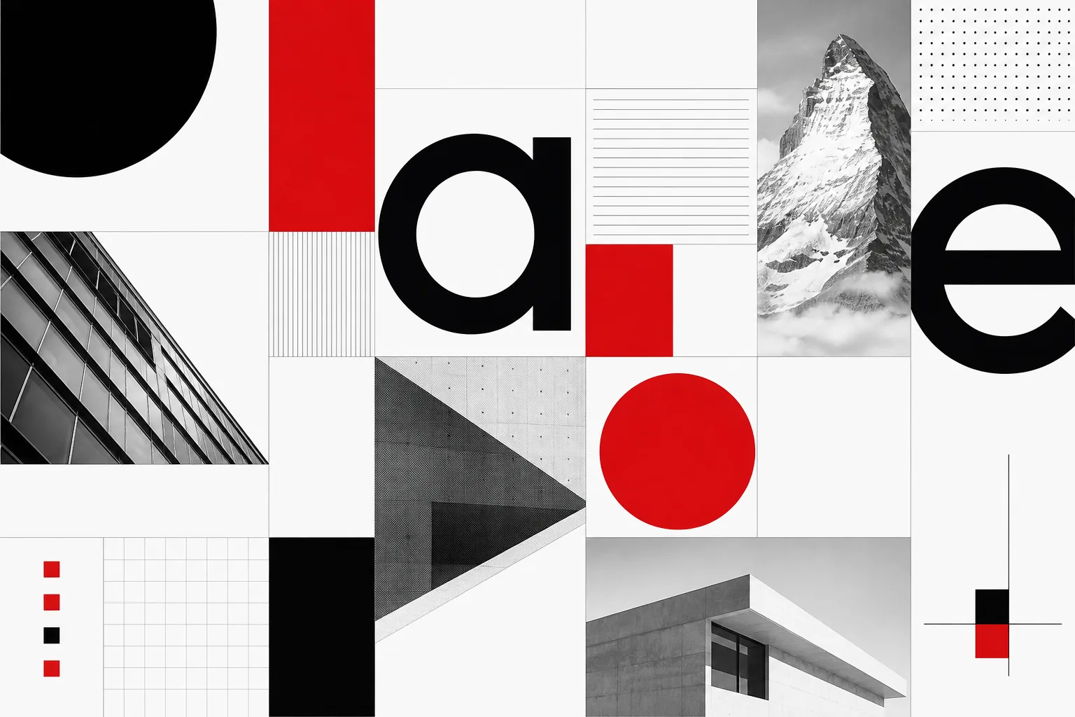
Swiss Style turns the page into a coordinate system: the grid holds order, typography builds hierarchy, white space sets rhythm, and imagery works as information. It is not severity for its own sake - it is the engineering of clarity.
Editorial thesis
Swiss Style matters not because it taught the world to set Helvetica on a grid. It made graphic design into a systemic discipline, showing how objective hierarchy, modular structure and repeatable rules can work across posters, books, wayfinding, corporate identity and, today, interfaces. 1
Reader question
Why can design created more than half a century ago still feel contemporary - and why can a simple grid sometimes create more freedom than a completely free composition?
Short answer
Because Swiss Style does not depend on a fashionable decorative effect but on fundamental relationships: scale, spacing, reading order, contrast and information structure. Those relationships remain relevant regardless of medium. 1
1. What Swiss Style is - and why it is not simply Helvetica
Swiss Style, or the International Typographic Style, is not a kit made of Helvetica, a red square and perfectly aligned text. It is a systemic approach to visual communication that developed in Switzerland in the 1940s and 1950s and became an international language of graphic design in the decades that followed. Cooper Hewitt identifies key features including grid-based design, asymmetrical layouts, sans-serif typography and photography rather than decorative illustration. 1
What matters most is not external austerity but a way of making decisions. Swiss Style asks: what is the primary message, how should hierarchy work, how much air do elements need, and how can a page become legible to someone seeing it for the first time?
2. Switzerland after the modernist avant-garde: why system became more important than gesture
Switzerland proved fertile ground for a visual language that valued clarity, standardisation and function. Yet reducing the style to a national temperament would be too easy. Its development depended on art schools, print workshops, museums, publishers and teaching environments where graphic design was becoming a discipline with its own method. 1
After the emotional avant-gardes of the early twentieth century, the task changed: designers had not only to break old rules but to build durable systems for cultural institutions, transport, business, publishing and international communication.
3. Prehistory: Constructivism, Bauhaus and the New Typography
Swiss Style did not emerge from nowhere. Constructivism demonstrated the power of diagonals, photomontage and active typography; Bauhaus linked art with production; Jan Tschichold's New Typography legitimised asymmetry, functional typesetting and the rejection of historical decoration. MoMA presents these lines side by side in the history of the modern poster. 1
Swiss designers did not simply copy these sources. They took the next step: turning avant-garde experiment into a repeatable professional system.
4. Ernst Keller: the school before the style had a name
Ernst Keller taught at the Kunstgewerbeschule Zürich long before the term Swiss Style became an international label. His influence is tied less to a single formula than to a pedagogical principle: a visual solution should grow from the specific problem rather than from a preselected effect. 1
This is an important anti-cliché lesson. The roots of Swiss Style are not in one favourite typeface but in the discipline of defining the problem. Content and context first, form second.
5. Zurich and Basel: two laboratories of one visual language
Zurich and Basel gave the style different temperaments. The Zurich line is often associated with rational systems, constructive geometry and Josef Müller-Brockmann. The Basel school, linked to Armin Hofmann and Emil Ruder, placed particular emphasis on contrast, rhythm, sign, typographic sensitivity and experiment within strict structure. 1
The distinction is useful because Swiss Style was never a single programme. Different voices existed inside a shared discipline.
6. Max Bill: rational composition and the Bauhaus legacy
Max Bill studied at the Bauhaus and worked simultaneously as an artist, architect, designer, typographer and theorist. In his posters and printed work, rational organisation of colour and type becomes a visual event in its own right. MoMA notes that his posters often depended primarily on typography and colour rather than illustrative subject matter. 1
Bill matters to Swiss Style as a bridge from the interwar avant-garde to a postwar culture of systemic design.
7. Objectivity as an ethics of communication
The word “objectivity” in Swiss graphic design does not mean the absence of an author. The designer still chooses scale, cropping, order, contrast and rhythm. The aim is instead to avoid turning the message into a performance of personal gesture. Museum für Gestaltung describes Josef Müller-Brockmann through his pursuit of a universal, formally reduced visual language. 1
It is an ethical position: form should intensify information rather than demand attention before the content does.
8. Asymmetry: order without a central axis
Asymmetry made it possible to abandon conventional centred composition without abandoning order. A headline can sit left, a photograph low on the page, an empty field occupy half the surface, and the composition can still feel stable. 1
The secret lies in relationships. In Swiss Style, balance is built through weight, distance, size and direction rather than mirror symmetry. That is why a good asymmetric page feels calm even when almost nothing is centred.
9. The grid: the invisible architecture of the page
The grid is the central invisible tool of Swiss Style. It divides a surface into columns, modules and intervals, allowing headlines, text, captions, images and page numbers to operate as one system. With Müller-Brockmann, the grid became not a decorative device but a method of design. 1
A good grid does not need to be visible. It behaves like an architectural frame: the reader does not see the calculations but feels the order of the space.
10. White space: an active pause, not emptiness
White space works actively in Swiss typography. It separates levels of information, creates reading tempo and allows an element to be noticed without borders, shadows or decorative emphasis. 1
Emptiness becomes part of the composition. The principle is equally relevant on the web: if every pixel is filled with useful content, the user can no longer tell what actually matters.
11. Grotesk type: why sans serif became the main voice of the system
Sans-serif type became an effective voice for a system seeking clarity and modernity. But Swiss Style neither invented grotesk type nor reduces to a single face. It inherited an existing sans-serif tradition and made it central to visual hierarchy. 1
What matters is not the “neutrality” of a letterform by itself but how a type family behaves across sizes, weights and line lengths within the larger grid.
12. Akzidenz-Grotesk: the working tool before Helvetica
Before Helvetica, Akzidenz-Grotesk was one of the key working typefaces of modernist typography. Its direct, understated forms suited posters, wayfinding and informational design, and Armin Hofmann worked within this broader grotesk tradition. 1
This history breaks a persistent myth: Swiss Style did not begin in 1957 with Helvetica. Helvetica became a famous tool for a method that already existed.
13. Univers: a type family as a system, not a set of styles
Adrian Frutiger designed Univers as a coordinated family in which widths and weights could be understood as coordinates within a single system. Monotype notes that the idea of the “super family” is closely associated with Univers as a comprehensive tool for commercial designers. 17
It is almost an ideal Swiss Style project: not simply a beautiful typeface, but a controlled system of variations. The typographer gains freedom inside a clear logic.
14. Helvetica: neutrality that became globally recognisable
Helvetica appeared in 1957 as Neue Haas Grotesk and later took the name under which it became one of the most recognisable typefaces of the twentieth century. Its rise coincided with the international spread of Swiss Style, and the two quickly became almost inseparable in popular imagination. 1
Yet Helvetica does not make a design Swiss by itself. Without hierarchy, grid, rhythm and a relationship to content, it remains only a typeface.
15. Josef Müller-Brockmann: the grid as a method of thought
Josef Müller-Brockmann turned the grid into a professional discipline that could operate from a concert poster to a corporate system. Museum für Gestaltung emphasises the functional criteria of his work and the way a formally strict language still produced varied and dynamic compositions. 1
His importance is not that he “forbade chaos”. He showed that limitation can generate more options when the designer understands structure.
16. Musica viva: when a concert poster begins to sound through geometry
The Musica viva posters for the Tonhalle Zürich became some of the most recognisable examples of Swiss Style. Geometric forms, grids and scale relationships translate musical rhythm into visual rhythm without literally depicting instruments or performers. 1
The poster works almost like a score. Circle, line, interval and repetition become equivalents of tempo, pause and accent.
17. Armin Hofmann: contrast, sign and the pedagogy of form
Armin Hofmann made contrast a primary tool: large and small, black and white, static and dynamic, plane and sign. Cooper Hewitt connects him to Swiss Style and identifies the grid, asymmetry, sans-serif type and photography among the movement's defining characteristics. 1
Yet Hofmann's strict system never feels dead. His posters are often built around one powerful visual tension that holds the eye almost physically.
18. Emil Ruder: typography as reading, rhythm and discipline
Emil Ruder shaped Basel typographic culture as an art of organising reading. His approach valued spacing, contrast, line rhythm, proportion and negative space as much as typeface selection. Later students, including Helmut Schmid, carried and transformed this line beyond Switzerland. 1
Typography here is not clothing for text. It is a mechanism that regulates the speed, sequence and tone of reading.
19. Photography instead of illustration: the image as fact
Swiss Style often preferred photography to drawn illustration because the photographic image could be treated as a more direct and contemporary form of evidence. Cooper Hewitt lists the use of photography rather than illustration among the characteristic features of the International Typographic Style. 1
Photography is of course subjective too: lens, crop and scale all construct meaning. But within the Swiss system the image tends to operate as a precise informational block rather than decorative fantasy.
20. Neue Grafik: the magazine that exported the Swiss method
Neue Grafik / New Graphic Design, launched in 1958 by Josef Müller-Brockmann, Richard Paul Lohse, Hans Neuburg and Carlo Vivarelli, became an important platform for articulating and internationally disseminating the new Swiss approach. 1
This is a moment when practice becomes discourse. Designers were not only making posters; they were explaining why systems, standardisation and modern visual culture mattered.
21. Pictogram, map and wayfinding: design as public infrastructure
When Swiss Style principles move into pictograms, maps, timetables or transport wayfinding, their public value becomes particularly visible. Hierarchy must work quickly, independently of the user's taste. 1
Design becomes closer to infrastructure than decoration. A successful system disappears during use: a person simply understands where to go, which train to take and what to read first.
22. Corporate identity: when an organisation acquires a visual grammar
Corporate identity became a natural field for the Swiss method. Grid, typographic hierarchy, restricted palette and clear rules allow an organisation to speak consistently across poster, letterhead, package, sign and catalogue. 1
This is a decisive shift from “make a logo” to “build a grammar”. Contemporary brand guidelines and design systems continue the same logic.
23. Book, catalogue and magazine: the long distance of the grid
The grid proves its strength most clearly in books and magazines because it must survive dozens or hundreds of pages. Headline, body text, caption, photograph and page number change, yet the system remains perceptible. 1
Swiss Style teaches designers not to treat every spread as an isolated poster. A strong editorial system provides rules within which variety can emerge without losing coherence.
24. International Typographic Style: how a local method became international
By the 1950s and 1960s, Swiss graphic design had become an international reference point, hence the term International Typographic Style. Museum für Gestaltung explicitly describes Hofmann and his colleagues as contributors to the Swiss international Style, while major museum collections place Müller-Brockmann and Max Bill within the global history of typography and the poster. 1
What travelled was not “Swissness” itself but a method: clear structure, reproducibility and the ability to work across languages and institutions.
25. Wim Crouwel and the Netherlands: the grid beyond Switzerland
Dutch designer Wim Crouwel adopted the grid from the Swiss model as a tool for visual order. Cooper Hewitt notes that this commitment to structure earned him the nickname “Gridnik” among colleagues. 1
This shows what happens when the International Typographic Style travels. The grid remains, but in another cultural environment it takes on a more technological, experimental and museum-oriented character.
26. Fashion and editorial: when a strict system works with emotional imagery
In fashion and editorial design, Swiss Style becomes particularly interesting when paired with emotional photography. A strict grid can hold a dramatic portrait, moving fabric or a complex editorial without competing with the image. 1
The lesson remains useful today: the stronger the photograph, the less the interface around it needs to perform “creativity”. The system becomes a frame that lets the image speak louder.
27. Screen and interface: why Swiss Style was ready for digital
The screen turned out to be a natural environment for Swiss Style principles. Responsive grids, components, spacing scales, typographic hierarchy and repeatable templates are digital relatives of the modular print grid. 1
A screen is interactive and a book is not, but the basic question remains: how do we organise many elements so that a user immediately understands structure and can predict the behaviour of the system?
28. Wolfgang Weingart and New Wave: rebellion from inside the Swiss school
By the late 1960s Wolfgang Weingart began deliberately breaking the frozen rules of Swiss typography from inside the Basel school itself. Museum für Gestaltung describes him as giving new impulses to an increasingly rigid Swiss typography, while Cooper Hewitt connects his experiments to the origins of New Wave graphics. 1
This is an important ending: a strong system produces its own critique. Weingart did not reject knowledge of the grid; he could disrupt it precisely because he understood how it worked.
29. How to visualise Swiss Style without cliché
To visualise Swiss Style convincingly, begin with information rather than Helvetica. Define one primary level, one secondary level, a column logic and a spacing system, and only then choose type and imagery. 1
Avoid the decorative “Swiss kit”: a red square, random rules, giant numerals and an over-visible grid quickly turn a method into costume. Good Swiss Style looks as though the information simply could not have been arranged any other way.
30. The main legacy: design as a system of relationships, not a set of decorations
The main legacy of Swiss Style is the idea that design can be built as relationships between elements. The grid connects dimensions, typography creates hierarchy, white space sets tempo, photography carries evidence, and repeatable rules make the system durable. 1
That is why its influence survived specific posters and typefaces. From corporate identity to interfaces, from catalogues to wayfinding, we still use the same principle: clarity does not happen by itself - it is designed.